In the previous article, we talked about optimizing your product pages. Go here to read it (if you haven’t yet), before digging into this one.
This is the fourth of a six-part series that will go deep into optimizing every step of the buyer’s journey.
Here is the full breakdown:
- Checkout
- Cart
- Product pages
- Category pages
- Homepage
- Thank You page
Now that we’ve covered optimizing the checkout, cart, and product pages, the next step is to optimize the category pages (continuing to work our way from back to front).
So let’s get started!
Step 4: Optimizing Your Category Pages
What is a category page anyway? What is its purpose? Well, the name itself says it all. It’s about categorizing products.
Now what does it mean to categorize products?
It simply means organizing the products to create the perception that the choice of products is narrower than it actually is. It’s about helping people find what they’re looking for and making it easy to do so.
A well-executed category page must meet two criteria:
- Show sufficient and relevant product information, so people can easily assess if a product is a good match or not from the category page itself.
- Give people the ability to get an overview of the products on a category page as well as compare products of interest.
Anything that distracts from that main purpose of helping people find what they want shouldn’t be on the page. Don’t put any banners on the sides or at the top with random images, calls to action, or offers.
The page should be super clean and laser-focused on helping people find what they want. That being said, there are a couple of things that you have to get right to have effective category pages that serve their purpose.
We could write a small book on product categorization and category pages alone. However, these are the most important things to get right.
Let’s begin.
1. Filters
Filters are crucial. They are the most important part of a category page and a must-have to help people narrow down their choices.
People get overwhelmed when there are too many options—we’ve all heard of “The Paradox of Choice.” When e-commerce sites have a ton of products, the key to creating a less overwhelming perception of choices is to add tools that narrow down the selection.
For example, let’s say you go to BestBuy.com wanting to buy a gaming computer.
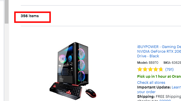
Trying to find the one that suits your needs out of 356 options without the help of filters would be a nightmare. Imagine having to scroll through all 356 just to find a computer with the right specs. No thank you.
And 356 is very conservative. This item count often gets up to the four and sometimes even five figures on these massive retailer sites. You can see how this can turn into a nightmare if there are no filters.
In contrast, when doing this with the help of filters, it becomes a breeze. I know that I want an NVIDIA GeForce RTX 2080 Ti graphics card, Intel Core i9 processor, and 32 gigabytes of RAM. I apply those filters and voila:
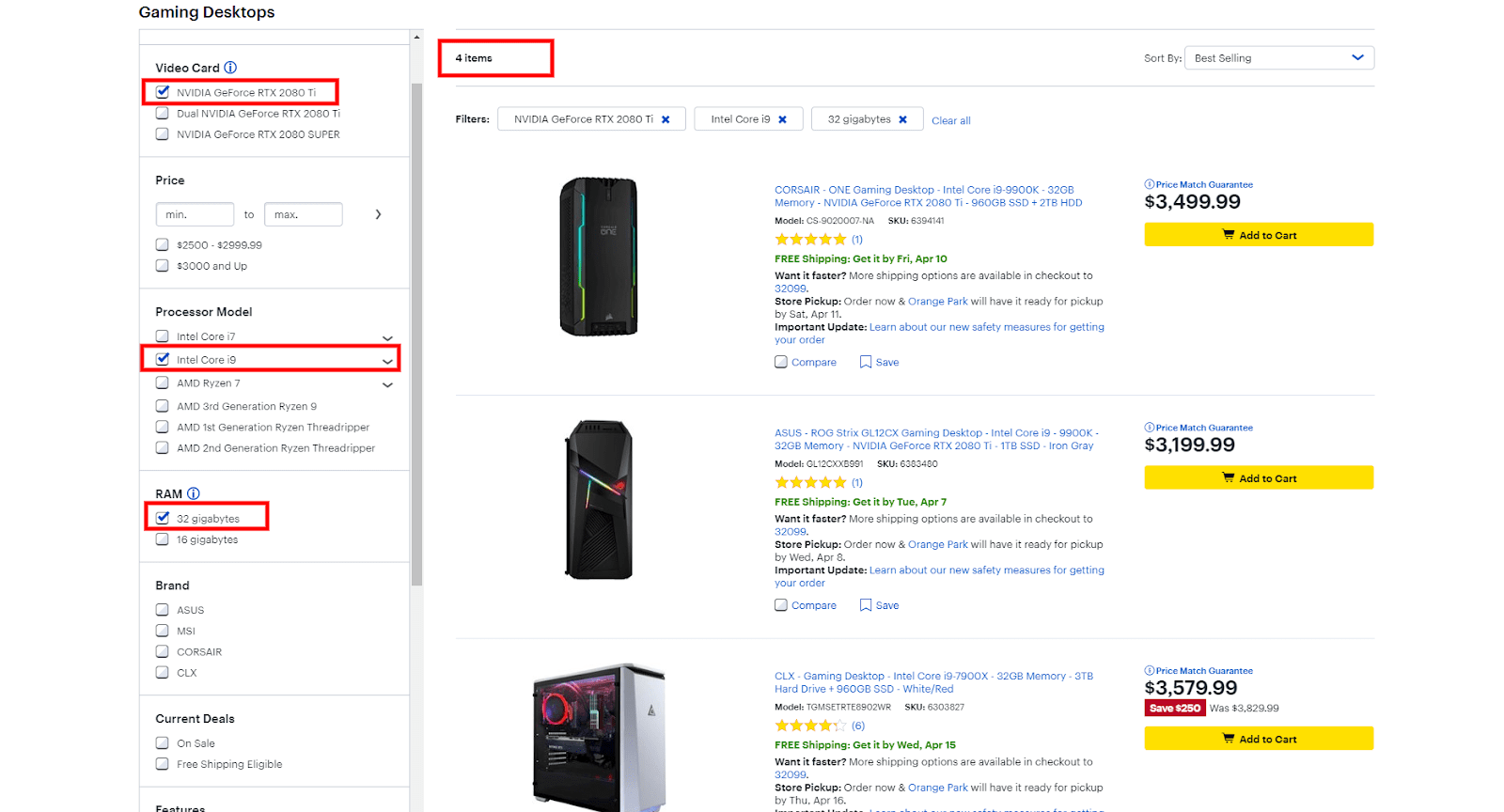
I only need to compare four computers instead of 356. No brainer, right?
Why would you not give the same advantage to your customers and make it easy for them to find what they want?
I see this every day. A majority of the store owners think that because they know how their products are categorized and where to find them, their customers will know too.
But that couldn’t be further from the truth. Don’t let yourself be fooled.
When it comes to filters, the key to creating the right ones on your category pages is to identify the criteria by which your customers make buying decisions when shopping for the type of products you sell.
In other words, the key is to use criteria that your customers care about, not criteria that you think your customers care about. You need to figure that out for yourself and find out what matters to your customers.
Obviously, there are always filters that are a given (like price, size, and color for a clothing store). But the rest you need to figure out by talking to your customers, whether it’s via phone or surveys. Ask them what matters when shopping for the types of products you sell.
For example, Best Buy is doing a very good job with their filters. They have filters for the graphics card, the processor, the RAM, the HDD size and so on. All of these are things that their customers care about. (I would know, because I’m a big nerd myself and buy all of my tech from Best Buy.)
In the case of Best Buy, or any other store that sells technical products for that matter, it is very important to have filters for both tech-savvy people and not-so-tech-savvy people. You should have filters for all knowledge levels.
So that means you should have filters for CPU, RAM, HDD and VGA for the nerds like me … but also filters for rating, color, price, etc. Just make sure you use criteria that your customers care about.
If you have filters for the color of the processor cooling fan, but nobody cares about it, that’s going to be just a distraction for your customers. It will hurt rather than help.
Make sense?
The typical placement for filters is the left-hand menu, like on Best Buy.com. This is what you usually want to start with—your default option. But there could be times where filters at the top of the screen are better. This can be the case when you don’t have a lot of filters, so they can all fit horizontally in one line.
2. Sorting
People want to be in control, especially while shopping online. Product sorting is how we give people that control. Together with filters, sorting is the most important element on a category page.

Filters set hard, definitive boundaries that the products must match. Sorting sets softer boundaries by listing all products, ordered by the chosen sorting attribute. This allows visitors to browse all products without specific hard cutoff points.
The benefit of this is very simple. Let’s say you’re looking for a new TV at Best Buy. You know the rough price range that you are willing to work with, but there is no hard cutoff.
If you set a price range from $0 to $500 with the filters, you won’t see any TVs that are $501 and up. But what if the perfect TV that you like costs $509, and you have no problem paying the extra $9? You would never see it if you use the price filter. Instead, by using the “Price, low to high” sorting option, you are able to see that TV as well as buy it.
Visitors often want to apply these soft boundaries when they aren’t very familiar with the niche. Or they may care about a certain attribute (price in the previous example), but because they are not married to a specific value of that attribute, they don’t want to remove all other options.
This is one example with the price as a sorting type. However, you should offer the top one to three most important product attributes within each category as sort types as well (technically, the one to three most important filters—this will ease the complexity of the implementation). For the example with the TVs above, you should also have the screen size as a sorting type, because that’s the second most important TV attribute.
Just like people are able to sort by “Price, low to high” or “Price, high to low,” they should be able to sort by “Screen size, low to high” and “Screen size, high to low,” for the same reasons explained above.
Sorting is all about displaying the products in a way that your customers care about: sorting by “Best Sellers,” “Price” (low to high and vice versa), “Rating” and so on, as well as by the top one to three most important product attributes. Don’t give them an option to sort by SKU or some other random attribute that your customers don’t care about.
Default sorting type
Products should be sorted by best sellers by default (on page load), because that typically works best. Think about it: the best-selling products are best sellers for a reason. Why push them down below the fold, making it harder for people to find them? This generally applies to single-product-type category pages.

The exceptions to this are the all-products category, some thematic categories, and any product categories that feature a wide enough selection of product types that it is unclear what is in the category.
In these cases, the site should use a so-called diversity-based “Relevance” as the default sorting type. What this means is that the site shows the one to three best-selling products of every product type within the first 10 to 20 products. This helps people see the range of product types contained in that category.
For example, a camera category might have cameras and cases, as well as tripods and lenses. While cameras may be the best-selling product in the whole category, cases, tripods and lenses should have at least one to three best-selling products in the top 10 to 20 items, so that a visitor to the page understands that the category also includes cases, lenses and tripods … not only cameras.
If this is not implemented properly, then that specific camera category will be dominated by cameras for the majority of the first page … or even beyond, because the cameras are the best-selling product type. This will cause your visitors to reject the category as irrelevant, even though that category does contain what they are looking for. They just aren’t able to see it.
Admittedly, this can get complex from a coding perspective. If, for whatever reason, you’re not in a place where you can have this implemented in the near term, stick with Shopify’s “Best seller” sorting type as the default for your single-product-type categories, and manually sort the products for the “All products” category so that within the first 10 to 20 products, you have the one to three best-selling products from each product type, as described above.
3. Badges
While filters and sorting are the most important elements on a category page, badges are also very important. Filters help people narrow down choice, while badges help certain products stand out to make the final decision process easier.
For instance, you may want to put a badge on higher-margin products that you want to push, or products that are simply most popular.
Have you ever been to a liquor store and picked up a bottle that had a sticker on it that said “Most popular” or “Best seller”? You did it because it seemed like a safe option. The idea behind badges is that nobody wants to make bad choices, especially when they can get criticized for it.
Here’s an example from Kylie Cosmetics:
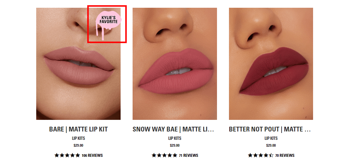
You can’t go wrong with “Kylie’s favorite,” right? It has to be her favorite for a reason. So you are basically providing safe options for people and reducing their perceived risk.
Badges can be image-based (like on the previous screenshot) or text-based. Here is an example of a text-based badge:
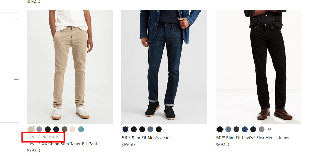
Text-based badges don’t work as well as image-based ones because they don’t stand out nearly as much. Still, those Levi’s cream chinos will definitely stand out more than the other two without badges (although, in this case, not that much because the badge text is gray and not at all prominent). I recommend you stick with image-based badges only, like the example from Kylie’s site.
One very important thing to note is that badges will only work when used sparingly and when they are self-explanatory.
Don’t try to be clever with your branded badges, like Sephora does with their “Clean at Sephora” or “Sephora Quality Very-Nice Price” badges:
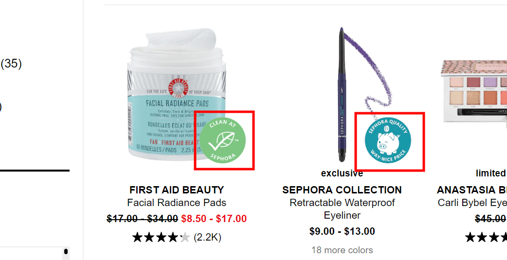
These are not self-explanatory badges. I have no clue what they mean. Granted, I’m not in their target audience, but still … I would bet money that the majority of their customers have no idea what those badges mean either.
The goal here is to help make people’s decisions easier, not confuse them. If the visitor is not familiar with the badge text, it becomes meaningless … a noise and a distraction—a wasted opportunity.
A self-explanatory badge is one that a new visitor reads and understands without any explanation. For instance, there is no doubt what the badge “Kylie’s favorite” means.
Other examples include “Exclusive,” “On Sale,” “Staff Pick,” “Organic,” “Most Popular,” “BPA Free” and so on..
The second very important recommendation is to use them sparingly.
Here’s a great example of badges that are used sparingly:
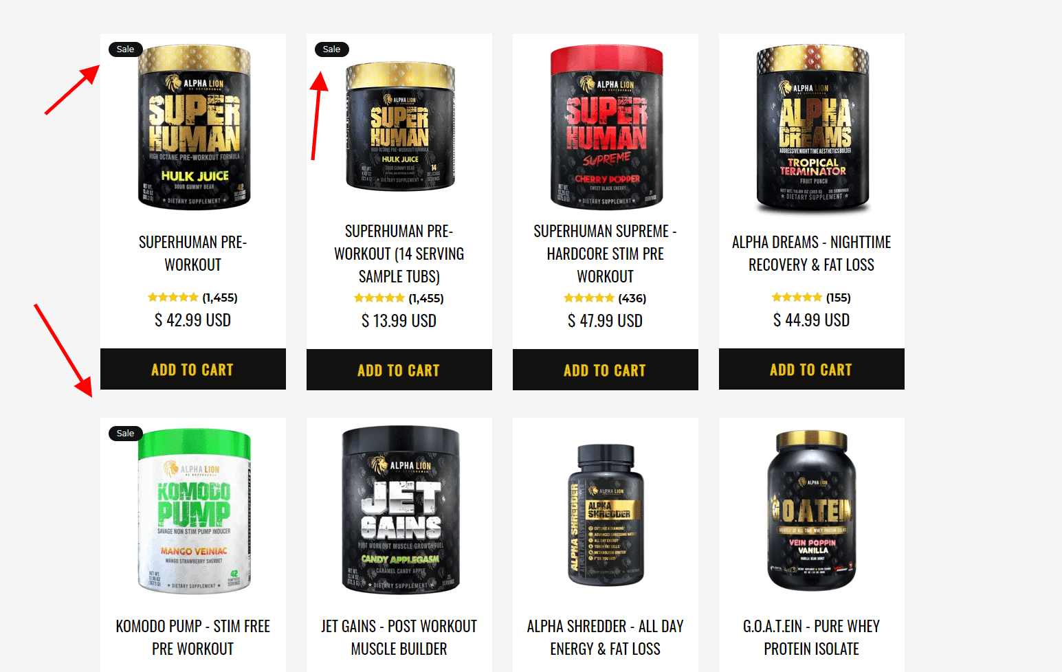
You’ll notice that only three of eight products have badges.
Here’s what you don’t want to do:

This is too much. Instead of reducing the noise by helping a few products stand out, this is adding to the noise and has the opposite effect. This use of badges has a double-whammy negative effect, because the badge used is the “On Sale” one.
If almost every single product on your store is on sale, what does that say about your brand? It suggests that you are trying to deceive your customers because your products are not as valuable as you present them to be. It just devalues your brand, so don’t do it.
Remember—use badges sparingly and make them self-explanatory.
4. Loading more products
When it comes to loading more products on a category page, you should stick with the “Load More” method. Avoid using pagination and infinite scroll.
Pagination
Here’s what I mean about pagination:
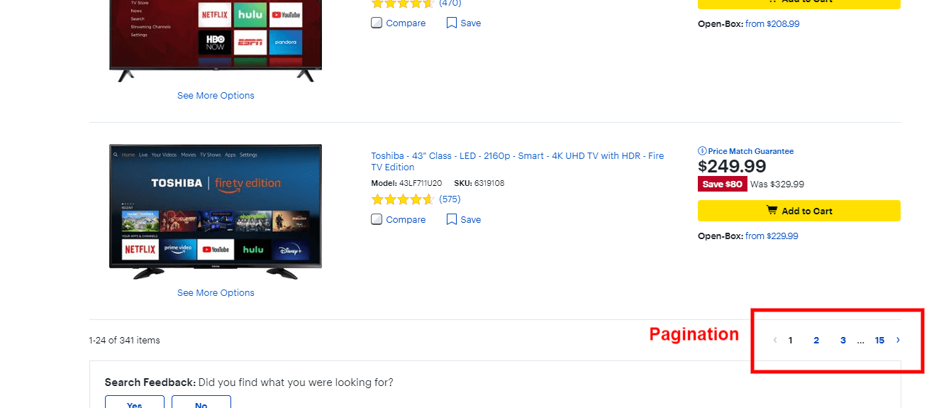
This method loads more products by splitting the list of products into multiple pages, which requires clicking on those small numbers in the right corner, where the clickable area is very small. It would be even worse on mobile to have to tap those small numbers on a little screen.
You can see how that can immediately become an issue. It is simply annoying to be clicking through so many pages, and people often get discouraged from browsing the entire list when they see so many links (15 pages in the example above).
Also, with pagination, people can’t efficiently compare products from different pages (for example a product on page 2 and another on page 6). The reason is obvious. They will need to click back and forth between the different pages to make a comparison, unless they open those two pages in different tabs, which is not something that the majority of users lean into.
Infinite scroll
The second method that you don’t want to use is the infinite scroll. Here’s an example of what I mean.
This video makes it easy to see how this can become a problem. It’s practically impossible for me to get to the end of the page and reach the footer, if I need to.
Also, the infinite scroll can be overwhelming to some people because of the quantity of products being loaded. And this is amplified on mobile. People will simply lose track of the quantity of products, which makes them feel out of control. And, as mentioned above, people want to be in control. When that’s taken away from them, they typically get frustrated and give up.
This is amplified in stores with a massive amount of SKUs. We had the same problem on one of our POD (print on demand) stores that had over 5,000 SKUs. After watching some good old session recordings and checking Google Analytics data, it was obvious that this was a bad user experience. Stay away from it.
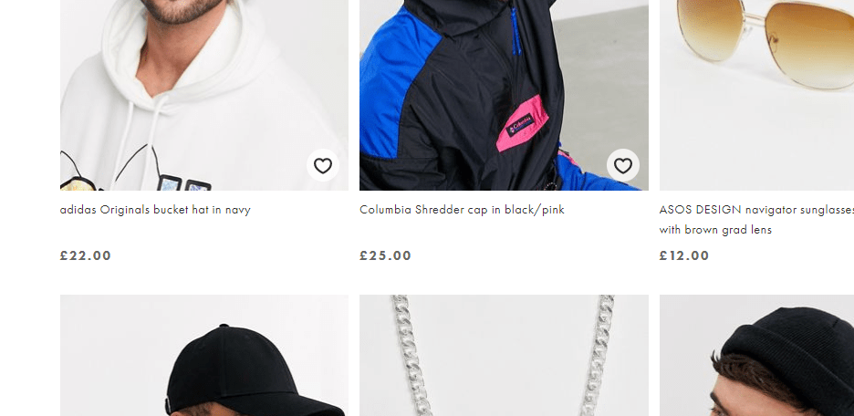
The “Load More” method
What you want to use instead is the “Load More” method of loading and presenting products. This is an approach where we place a “Load More” button at the bottom of the page, which allows users to load more products just by tapping that button.
Here’s an example from Asos:
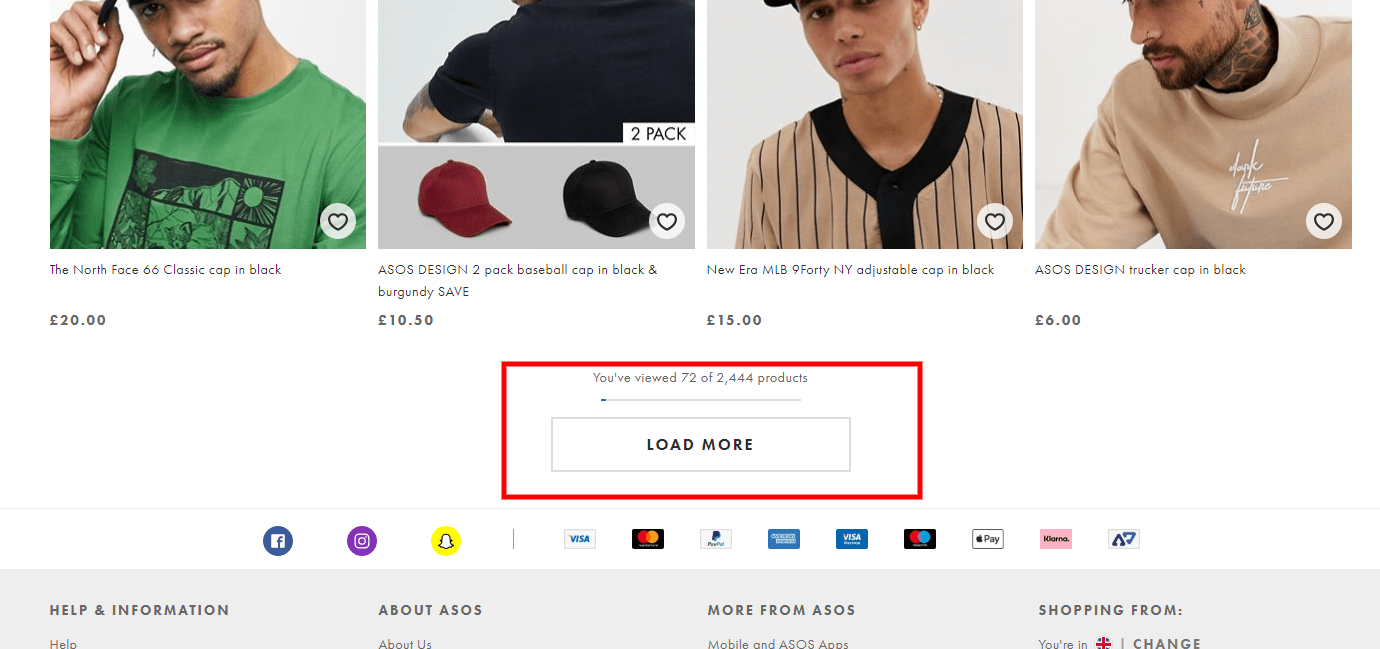
This method has multiple benefits compared to pagination and infinite scroll. It takes the best of those two methods by allowing users to decide whether they want to see more products or not (pagination benefit) as well as giving them the ability to see all products on a single page (infinite scroll benefit) for easy comparison and without clicking through between pages.
This method also avoids the main problems with both pagination and infinite scroll. Presenting a single large “Load More” button eliminates those many small page links with very small clickable areas, which is especially important on mobile.
It also eliminates the infinite scroll problem of making the footer effectively inaccessible by giving people control over the loading of the products. Plus, it won’t overwhelm people with a seemingly infinite number of automatically loading products.
Here is the “Load More” method in action.
The “Load More” implementation
When it comes to “Load More” implementation, there are three very important things to keep in mind. First, you should use a lazy-loading technique for loading the products. Show 10 to 30 products on the initial page load, and then lazy-load another 10 to 30 products until you’ve loaded 50 to 100 products. At that point, you show the “Load More” button, and you do the same on the next page. This is done simply to reduce load times.
The second is critical: you need to support the browser “Back” button. Here’s what that means …
If I scroll down and click the “Load More” button twice, and then click on a product on the third page, clicking the “Back” button on the browser should bring me back to the exact same spot on the category page that I started from. If it doesn’t, the “Load More” implementation will hurt more than help.
Why? Because if not done right, clicking the “Back” browser button will reload the entire category page and I will have to go through the same process of scrolling down, clicking the “Load More” button twice, and then trying to find the last product I checked, so that I can then move forward.
It’s obvious that this will be a major problem. Here is an example of how this should work.
The third thing you should implement is the “Load Previous” button, which works hand in hand with the browser “Back” button. If we’re where we left off in the example above, and we scroll up, the “Load Previous” button should show at the top of the “third page” of loaded products. When clicked, the previous products should load in the same way they did when I was moving forward—they should show 10 to 30 products on initial load and lazy-load the rest.
Here is a demonstration.
The reason to do this is, again, to reduce load times … because if this isn’t implemented, it will hurt the load time of the page a lot, since it will require loading potentially hundreds of products before loading the products that are relevant, so the customer can see them.
5. Present the right information (product attributes)
Last but not least, make sure you show all of the crucial product attributes in each product listing on your category pages. This seems obvious, but it is crazy how many store owners get it wrong.
If you want people to be able to properly assess whether a product is worth clicking and investigating further, you need to show all of the necessary and relevant information about every product on the category page. If you don’t, people will ignore potentially perfectly matching products.
None of the stuff we talked about so far will matter or help, if this is not done right. All of the filters and sorting options in the world won’t help if people can’t tell whether the filtered and sorted products are suitable for them or not.
A well-executed product listing on a category page gives people just enough information to determine the relevance of the products and enables them to compare multiple relevant products.
There are two types of attributes that you should include: essential attributes and category-specific attributes. The essential attributes are necessary for pretty much all product types, whereas the category-specific ones are unique to each product type and will vary.
Essential attributes
There are five essential attributes:
- Product image/thumbnail
- Product title
- Product price
- Product ratings
- Product variants
These attributes are a must and should be displayed in every product listing on a category page.
1. Product image/thumbnail
The product image/thumbnail is obviously the first thing that will get people’s attention. Images are essential, obviously. Nobody will buy a product if they don’t know what it looks like. People completely ignore those listings.
We’ve talked in depth about the importance of product images and what well-executed product images look like. To learn more about that, read my previous article on optimizing the product pages here. Also read “How to Turn Your Product Photos Into Stories That Sell” for more info on the best product imagery for e-commerce
2. Product title
Obviously, this is crucial as well. People will ignore products that have vague, incomplete, or nonexistent product titles. The title assures people that what they see on the product thumbnails is actually correct.
It also clears up any confusion or uncertainty about the product’s similarity to what they are looking for. For example, a customer searching for phone cases for a Samsung Galaxy Note 9 is reassured by seeing “Note 9” in the title and will consider comparing that product to other products.
If that information is not present in the title, the customer will most likely ignore the product. And that leads me to my next point: a feature-rich product title gives people more information with which to compare products on the category page itself. “Waterproof and Dustproof Samsung Galaxy Note 9 Case” is significantly better than “Samsung Galaxy Note 9 Case.”
Just make sure you don’t overdo it like some Amazon listings with titles that are multiple lines long on mobile. List the top one to three features max. With more features, you are causing too much cognitive load, distracting your users, and potentially leading them to mistake the title for a description.
3. Product price
This is a given. It’s obvious that price is a critical piece of information. However, I still see many stores that hide the price until the product page, or even worse, until you add the product to the cart, which is ridiculous. Don’t do that.
The price should be nice and big, visible at all times, and stand out from the product title and the other attributes. This is a good example of a price that stands out nicely:
However, they are missing review stars between the title and the price, and that is my next point.
4. Product reviews
I don’t know about you, but I never click on a product that has 4 stars or less. It has to have a 4+ rating for me to even give it any consideration. In fact, testing shows that this is the case for pretty much everybody. It is crucial to have the product’s rating below the titles to help people decide which products they want to investigate further.
Also, make sure that next to the reviews stars, you include the numerical rating (for example, “4.7 stars”) and number of reviews that the rating is based on, as described in detail in my previous article about optimizing product pages.
5. Product variants
This is a very important attribute to include for products that have multiple variants, like colors or sizes. People often ignore a perfectly suitable product if those variants are not listed on the category page, because they base their decision on what they see on the product thumbnail.
For example, the thumbnail shows a shirt in black, but the customer is looking for one in navy. Even though that color is listed on the product page, if it isn’t shown on the category page, people will often ignore that product.
Note that not all product variants should be shown on the category page. For example, it would be important to show the available sizes or shapes for a couch, but it wouldn’t be that important to show available sizes for a T-shirt because it is assumed that a shirt is available in multiple sizes.
Category-specific attributes
Many niches will have other important attributes that people need to help them decide, while scanning the category page, whether to investigate a product further or completely skip it.
These will be unique to the product type and will vary between niches. For tech products, for instance, it’s important to have compatibility information on the product listings.
For example, I was shopping for a Bluetooth adapter for my desktop computer the other day. Now, a product listing should provide compatibility information as an attribute, telling me which mice, keyboards, printers, headphones, etc. it’s compatible with. Since I was looking for an adapter for my Bluetooth headset, that was crucial information for my research.
Side note: As I mentioned, be careful with the length of product titles, a problem in the example above. In this example, the compatibility information for the devices and the operating system would look a lot cleaner and more readable if displayed in a bullet format below the product title.
If you sell tech products and your titles get too long (maximum three to four lines on mobile), consider using bullets in combination with a list layout instead of the grid style shown above.
That’s the best layout for tech products, since you typically need to include many product attributes to make it easier for people to analyze the products. For apparel and other visually driven products, the grid layout is a better style of presentation.
Final Words
OK, that was a lot of information. There are so many things we can talk about when it comes to optimizing your category pages, but the ones I’ve just described are the most important ones by far.
As usual, reread this article if you need to, and get to work … because there’s a lot more coming!
Be on the lookout for my next article about optimizing your homepage. And of course, feel free to read other articles of mine on optimizing these pages:
Until next time …
Aleks out.