

Shopping Cart Optimization: How to Sell More on Shopify (Even If You’re on a Budget) Part 2 of 6
In the previous article, we were talking about optimizing your checkout. Go here to read it (if you haven’t yet), before digging into this one.
This is the second of a 6-part series that will go deep into optimizing every step of the buyer’s journey.
Here is the full breakdown:
- Checkout
- Shopping Cart
- Product pages
- Category pages
- Homepage
- Thank You page
Now that we’ve covered optimizing the checkout, the next step is optimizing the cart (continuing to work our way from back to front).
So, let’s get started!
Part 2: Shopping Cart Optimization
If the checkout is the most important page of your store to optimize, the cart is the second most important.
When people add a product to their shopping cart, they are no longer browsing—they are “shopping.”
It is very critical that we get this page right, because it’s typically one of the biggest drop-off pages.
In fact, as mentioned in the previous article, the current global average cart abandonment rate is 69%.
Now, to be fair, not all of those abandons are because of the cart and checkout flow design.
Many of them are due to typical user behavior in the ecommerce space, where a lot of people window shop and do price comparisons.
We certainly can’t recover all of those abandons, but we can definitely recover some.
In fact, according to Baymard Insitute’s large scale usability testing, we can achieve as much as a 35% increase in conversion rate with a better cart and checkout flow design.
And we have definitely confirmed that to be true through our own testing.
Now let’s dive into the top cart optimizations you can do today to increase your cart’s conversion rate.
As with the checkout, there is no way that we can possibly cover all shopping cart optimizations … however, we are going to cover the most important ones.
1. Give clear confirmation
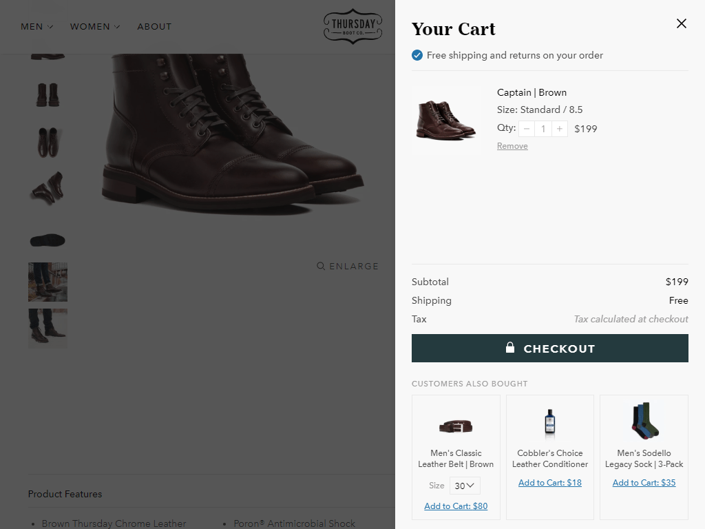
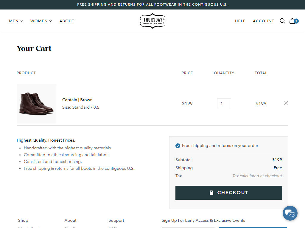
When people add a product to their cart, you can either take them straight to the cart page or show them a drawer cart (e.g. Ajax) that slides in from the right.
Example of a drawer cart:
Example of a standard cart:
Both work very well and we’ve used both with a lot of success. On some stores, one performs better than the other … so you’ll need to test each one to see what works best for you.
No matter which one you decide to use, the single most important thing that your cart should do is give clear confirmation that a product has been added to the cart. This is the most important shopping cart optimization that you can make.
Side note: If you use a drawer cart, you still need to make the actual cart page available by providing a link to it on the drawer cart.
Why? Because a certain portion of your customer base will use the cart to compare multiple items, remove what they don’t like, and save for later what they like but are not yet ready to buy.
Also worth mentioning … there are many other implementations for cart overlays and cart drop-downs, but we’re not going to talk about each of them separately.
Everything that applies to a drawer cart applies to all cart overlays or cart drop-downs.
Drawer cart confirmation example:
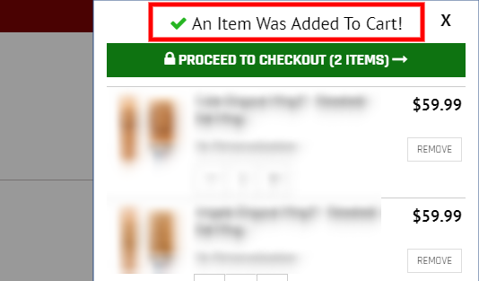
Standard cart confirmation example:
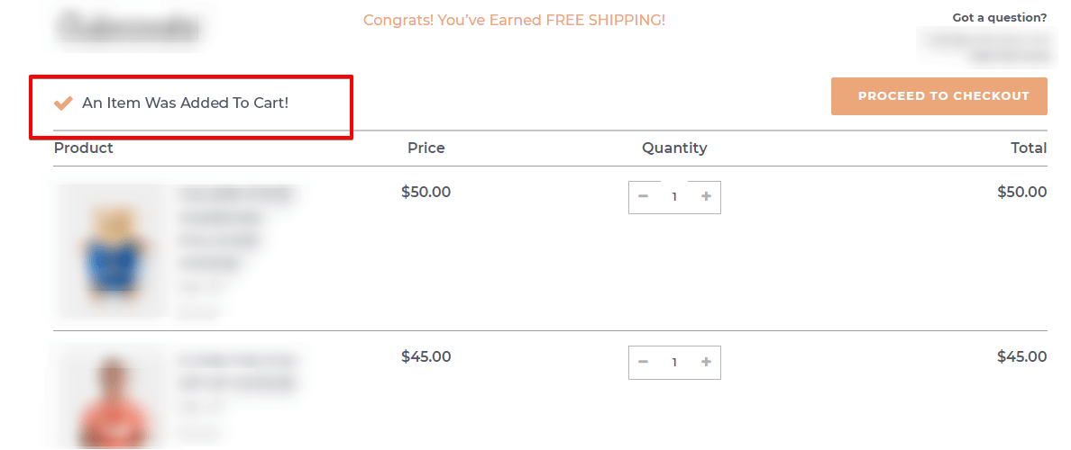
It may look like an insignificant thing to do (because it seems obvious that a product was added to the cart), but you’d be surprised how “not obvious” it is, considering the countless cart implementations that are out there.
2. Be very clear about the next steps
If confirmation that a product was added to the cart is at the top of the information hierarchy of the cart … the very next thing you should ensure is that the next steps are visually prominent (i.e., they stand out). This is the second most important shopping cart optimization that you can do.
There are three call-to-action options if you are using a drawer cart, and two options if you are sticking with the cart page only.
For the drawer cart, we have:
- “Checkout“
- “View Cart”
- “Continue Shopping”
And for the cart page:
- “Checkout”
- “Continue Shopping”
Out of the three, the “Checkout” button should be the most prominent element on the cart page, because that’s the next step we want them to take.
Here’s one example of a cart page:
It is obvious which element is the most prominent on this page. There is no confusion about what we want them to do next (i.e., go to the checkout).
The “Continue Shopping” CTA (call to action) is on the left side, below the cart content, as a link. It typically works better as a link, because then it’s not taking attention away from the checkout button(s).
Speaking of which … it is recommended to have two checkout buttons—one above the fold (above the cart content) and one below the cart content.
If you only have a single checkout button below the cart content (as most stores do), whenever a user has more than one product in the cart, the checkout button will most likely go below the fold … which is never a good idea.
You don’t want to make people scroll to find the button, so make sure you have a secondary one at the top.
Ideally, the button at the top should show dynamically, only when the bottom button is hidden below the fold.
Now, you might be wondering about third-party payment options.
Never show third-party payment provider CTAs on the cart page.
This is a huge no-no:
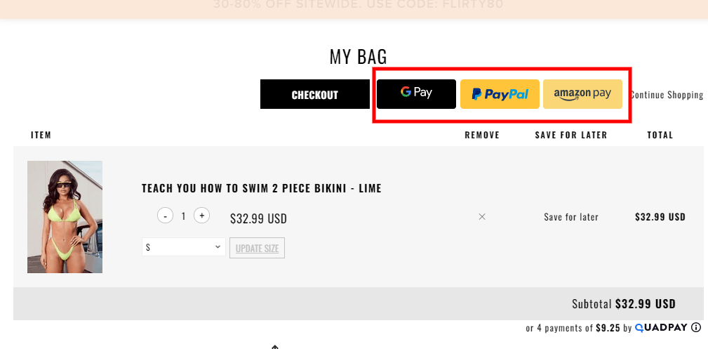
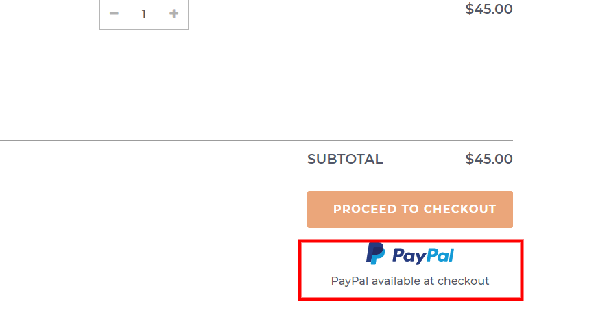
Only show static images to let people know that those options are available later in the funnel, because the third-party payment buttons are super distracting.
This is a much better way to do it:
And here’s a good drawer cart example:
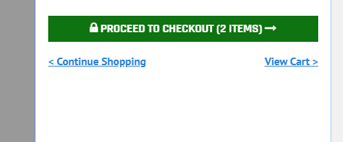
Notice that we have the “Continue Shopping” and “View Cart” links close to the checkout button, to let people know they have those options as well.
Again, we style the “Continue Shopping” and “View Cart” CTAs as links, so they don’t take focus away from the checkout button. Pretty simple.
Now, onto the next shopping cart optimization !
3. Cross-sells should have a tertiary focus
Visually, cross-sells should be the third most prominent element on the cart page. And they work … but you need to be very careful how you present them, because they can easily distract and confuse your visitors.
Cross-sells cause the majority of issues on drawer carts and cart overlays. Typically, we advise that you stay away from them. However, if you must have them, make sure you follow a few important rules.
Never show cross-sell products above the cart content and the “next steps” buttons.
Styling cross-sells like the below image makes people think they already have those items in their cart.
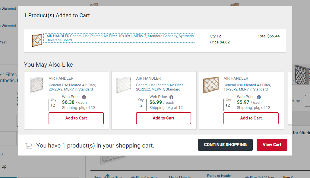
Cross-sells should never be styled as primary cart content. They should be given a tertiary focus. Meaning, they should be well below the cart content and look visually smaller than the cart content items.
On the contrary, however, in the screenshot above, the cross-sells are even larger than the added item (not good).
Here’s a good example of well-executed cross-sells.
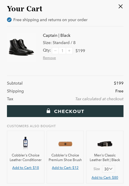
Notice how the cross-sell products are visually smaller than the main cart content product, and they are below the main CTA.
This drawer cart is not perfect. However, the cross-sell section is well executed, at least from a visual hierarchy standpoint.
Another important point relates to the cross-sell CTAs. Notice that they are just “Add to cart” links and not buttons.
You don’t want to have multiple “Add to cart” buttons here, because they will be very distracting and take attention away from the checkout button.
Show only relevant products in the cross-sell section.
This is a given, but it’s so important that I can’t leave it out. Don’t recklessly show cross-sells in hopes that you will sell more. Show only those that are highly relevant to the product that has been added to the cart.
Notice the image example above. I added boots to the cart and got offered a leather conditioner and shoe brush, both of which are extremely relevant.
The belt is not nearly as relevant, but it could still qualify if a lot of people typically buy those products together.
Avoid irrelevant items here like the plague, because any irrelevance at this stage will be significantly amplified and reduce the trust in the website (because people are so close to placing an order).
If there are no highly-relevant products available, the cross-sell section should be completely left out. I can’t emphasize this enough.
Example of a bad cross-sell section:
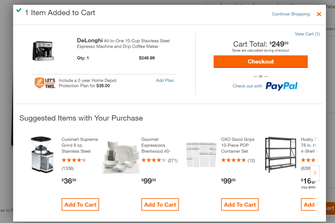
I added an espresso machine to the cart and got cross-sell suggestions for a plate set, container set and a shelf … all of which are completely irrelevant to my purchase.
Instead, they could have shown me some coffee blends, which are in stock and actually relevant to my purchase. Even coffee mugs would be better than plates. And there are probably tons of other in-stock products that would have made sense to offer here.
(For more info on the proper use of upsells, read this article.)
And, last but not least …
Clearly label the cross-sell section.
The label above the cross-sell section should clearly indicate that the shown items are “suggested” items. One good option: “Customers that bought [name of product in cart] also bought [cross-sell option names].”
Or, simply: “Customers also bought [cross-sell option names]”, like in the screenshot with the boots above.
Moving on to the next shopping cart optimization…
4. Auto-update cart totals
There is nothing more annoying than a cart that asks you to click an “Update” button every time you adjust the quantity.
One, it hurts usability. Two, the “Update” button is super distracting and takes attention away from the “Checkout” button.
And three … many people won’t even realize they need to update their cart after adjusting their quantity, and are surprised when they see a much higher price in the checkout compared to what they saw in their cart.
And, sure enough, many of them get turned off and abandon.
Example of what NOT to do:
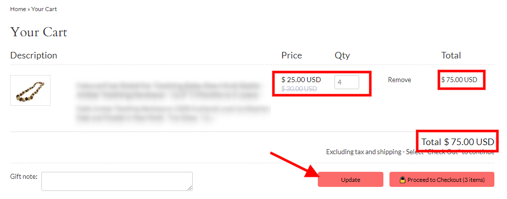
Instead, when a product quantity is adjusted, the cart totals should auto-update without the customer having to do anything.
By the way, do you see the “Qty” box at the top of the image? That’s a very poor implementation, because it forces customers to type the quantity in, which is something they might not want to do.
(This issue is significantly magnified on mobile.)
The solution: Allow for typing the quantity and provide “+” and “-” buttons, so users can adjust the quantity by clicking … like this:
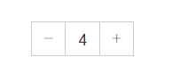
One important note here is that the cart should update as soon as people type the new quantity number.
It should not require them to click away from the box in order to update.
Also, the quantity box should allow an entry of “0” … which, if used, would cause the product to be removed from the cart.
The same thing should happen when people click/tap the “-” when the quantity is “1”.
Although, in this instance, make sure you ask people if they are sure that they want to remove the product from their cart, because sometimes they might click/tap it by accident.
A small pop-up in the vicinity of the quantity box will suffice.
One last bonus tip …
5. Allow users to save their cart items for later
Amazon is really good at this. If you’ve ever shopped on Amazon, I can almost guarantee that you have used this functionality at least once.
There is no reason why people should not be able to do the same on your store.
A certain percentage of your users will use the cart as a comparison tool.
For instance, some users will add a bunch of products to their cart that they find interesting, and may not necessarily intend to buy them right now … but want to keep them there for future reference/possible purchase.
So, the “Save for Later” function is the perfect alternative in that type of situation.
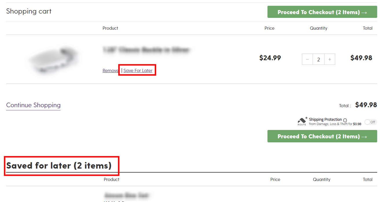
Here’s an example:
There are a few things to keep in mind when implementing this functionality.
This should be a cart functionality.
People expect this functionality on the cart page, so don’t implement it as a separate page somewhere on the site. Avoid at all costs redirecting people to a different page after they click the “Save for Later” link.
This section should be implemented at the bottom of the cart, as shown in the image above. To prevent people missing this section (as it will typically be below the fold), I recommend using some sort of notification that tells them they have items saved in their cart. Obviously, this should only show if they have saved items.
Do not auto-scroll visitors down, but still make it obvious that they’ve successfully saved the item.
When people click on the “Save for Later” link, they should not be auto-scrolled down to the saved items section.
Instead, they should stay in exactly the same spot on the page that they were prior to clicking the “Save for Later” link.
To make it obvious that they successfully saved the item, you can show a simple animation of the item moving down to the section with the saved items.
Clearly label the section with the saved items.
Because the cart content and “Saved for Later” sections should typically look very similar, we need to make it obvious that they, in fact, are not the same.
In the previous screenshot, you will see that the section is labeled with a big, bold title saying, “Saved for later (2 items).” You want to do something similar to that.
Don’t require an account to save items for later.
People should be able to save their items for later without creating an account. That can be done using a browser cookie.
Keep in mind that you should clearly tell your visitors that they won’t be able to see the saved items on another device … and that if they want to be able to see them, they need to create an account.
If they choose to create an account or simply sign in to a previously existing account, make sure that you keep the saved items from their guest session, so they don’t need to re-save them.
Or, if there was content in their cart from a previous session when they were logged in, make sure you merge the content from both the account session and the guest session.
One last thing before we wrap up!
Remember to show the cart totals properly.
We talked about this in the previous article, but it bears repeating.
The solution is simple: Right above the cart “Total” amount, show a “Shipping” row that shows the estimated shipping. Even if your shipping is free, you should still show this.
This also applies to any sales tax, so you should have another line that shows the “Estimated Tax” as well. Something like this image:
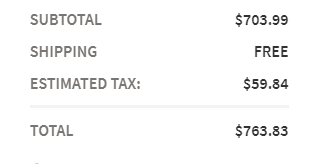
This will ensure that your visitors are not turned off by unexpected costs at the checkout step, where they are closest to the money.
We go a lot further in depth on this in the previous article, so click here if you want to learn more about checkout optimization.
If not, get started working on everything we discussed today about shopping cart optimizations as soon as possible.
Until next time …
Aleks out.


About the author
Aleksandar Nikoloski
Aleks is BGS’s Head of Revenue Optimization, an author, and a speaker. He has helped rapid-scale dozens of 6, 7, and multiple 8-figure stores as part of BGS’s Amplify Partnership program. He has gotten one store from $2.6 million a year to $6.7 million a year in 24 months, while another from doing $300k/month to doing over $2 million/month in less than 6 months, just to mention a few. The BGS team calls him the “Site Whisperer” because of his ability to find site nuances that derail the customers’ journey and cause purchase friction. Extremely meticulous and analytical, he credits all of this success to data and accurate interpretation of that data, as well as his ability to implement and test new ideas almost immediately.