

How to Sell More on Shopify—Even If You’re on a Budget: Part 1 of 6: Shopify Checkout Optimization

Part 1 of 6: Introduction to Revenue Optimization & Shopify Store Checkout
One of the main issues that I see ecommerce people struggling with today is traffic. The number one question people who are not familiar with our way of doing business is:
“How can I get more traffic to my store?”
No one, however, has ever approached us asking: “How can I make the most out of the traffic that’s already coming to my store?”
Which is a shame, because the answer to that question is at the core of what we do at Build Grow Scale.
Everybody thinks that traffic is the answer. “If I only had more traffic, all of my problems would be gone. Or, “If I only had more traffic, I could finally break even and scale.”
If that’s you, then you’re in for a surprise, my friend. Because I’m here to tell you that TRAFFIC IS NOT YOUR PROBLEM.
Yes. You heard (or read) correctly: traffic is not your problem.
If you’ve been in this space for some time and know how to properly run an ad and do the targeting, chances are you are already better at traffic than you need to be.
What you need to work on is controlling what happens AFTER the click (i.e., after people land on your site).
Most people think that’s completely out of their control, but in reality, you have more control over your buyer’s journey than you think. It’s simple science.
Let me share a quick illustration with you …
The Leaky Bucket

Imagine that you have a bucket. And you need to fill that bucket with water from the nearby stream, so you can take it home to your family to drink. Only one problem: this bucket is riddled with holes.
What do you think will happen when you start pouring water into it?
Yep … it’s going to leak out. And if those holes are big enough, chances are you’ll never be able to fill that bucket and make it home with any water left.
Do you think it’s smart to keep pouring water into a bucket that’s in this state? Of course not.

So, what’s the best course of action to take? Patch up the holes, right?
Yes! Any human being in their right mind would say that.
Once you patch those holes, you’ll be able to fill that bucket all the way up and successfully get it to your family.
In fact, now you can run to the stream as many times as you want and get as much water as you need, because your bucket doesn’t leak anymore.
Heck, you can even create a business around it and start selling water to your neighbors, and eventually expand to your entire community.
The sky’s the limit now. Right?
What if I told you that this bucket represents your store?
Unfortunately for you, however, your store resembles the former bucket, not the latter.
We call this “Leaky Bucket Syndrome.” It’s the number one problem every single ecommerce business owner we’ve come across has had … but not one of them was aware of it.
Question: Do you like throwing money away?
I bet you answered, “No!”
But even though I don’t know you and haven’t seen your website, I can guarantee that that’s exactly what you’re doing if you currently send paid traffic to your store.
If your store is the bucket, and the traffic you send to it is the water, no matter how much water (traffic) you try to pour into the bucket (store), 98% of it will leak out (global ecommerce conversion rate is around 2% at the time of writing this article).
The problem is, most people ignore the leaks and try to solve the problem by buying more traffic. This leads to things like:
- Increasing cost per acquisition beyond what you can afford
- Losing the majority of your potential new customers (who otherwise would have purchased)
- Stunting the growth of your business
In today’s world of ever-increasing advertising costs, who can afford all of this? It’s no wonder that over 50% of all ecommerce stores fail in their first year.
Obviously, driving more traffic to your store is not the solution.
The solution is to focus on fixing as many bucket leaks as you can, BEFORE spending any more money on traffic … so you can make the most of the traffic that’s ALREADY coming to your store.
Profound, right?
Far from it. Yet nobody’s doing it.
Everybody’s focusing on driving more traffic, hoping that “maybe this audience will be better,” or “maybe that segment will finally give me 3x ROAS.”
But, as I’m sure you’ve already experienced, it doesn’t work that way. If you try to scale a broken system, you will only accelerate your journey to the bottom.
Think about it: Would you rather spend money on traffic with a store full of leaks, knowing that most of it will leak out?
Or, would you rather plug the leaks first and then drive traffic to your store, knowing that you have the best chance of converting your visitors into customers?
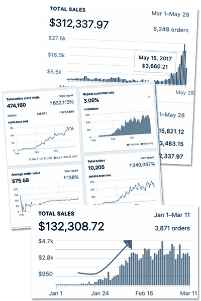
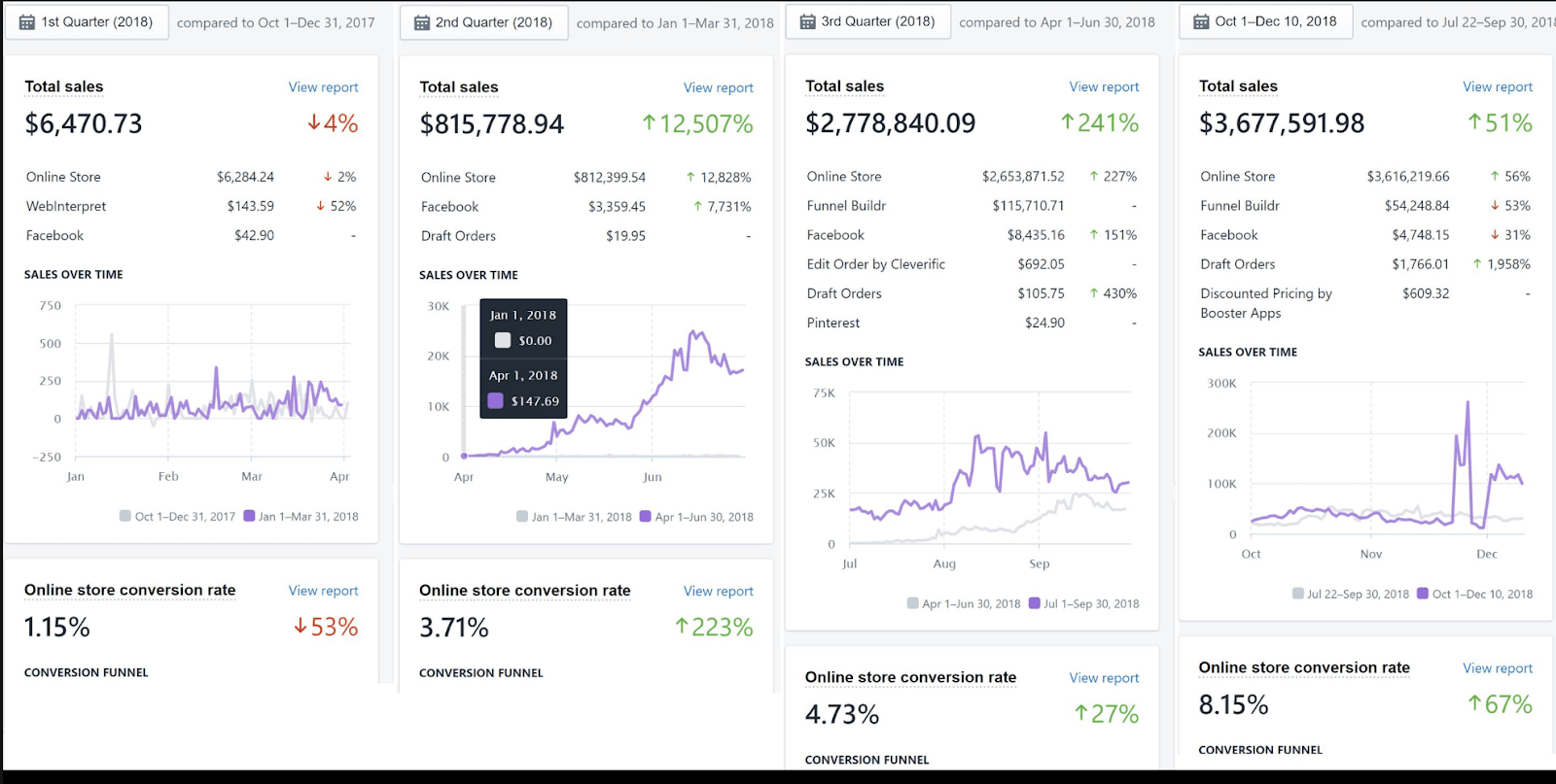
The best part is, once you plug those leaks, you get exponential growth because all of your traffic sources convert significantly better now. That’s how you get to the famous “hockey stick” growth curve.
The charts on the right are an everyday occurrence for our students and partners, because we focus on plugging the holes FIRST (before spending more money on traffic).
The fancy name for plugging the leaks in your store (and business in general) is called “Revenue Optimization.”
Revenue Optimization is the foundation of everything that we do at Build Grow Scale.
It is a system for optimizing (plugging the leaks on) each step of your buyer’s journey.
There are many different phases of the buyer’s journey, but the one that we need to focus on right now is the Onsite Buyer’s Journey (depicted below):
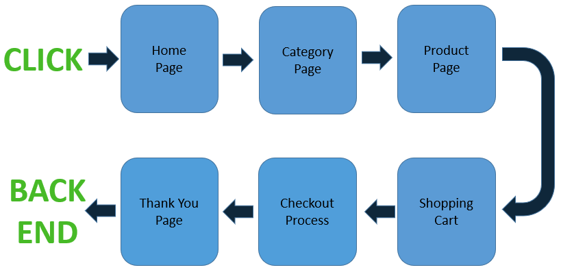
The above image represents the main steps of your store’s funnel … and on each step, there are dozens of leaks (big and small) that are causing revenue leakage in your business.
The secret to all of our successful student and partner stores is that they have made optimizing the buyer’s journey (plugging all the leaks) their number one focus.
As simple as it sounds, that’s really all there is to it. I guarantee you: If you shift your focus to revenue optimization, your store’s performance will skyrocket faster than you ever thought possible.
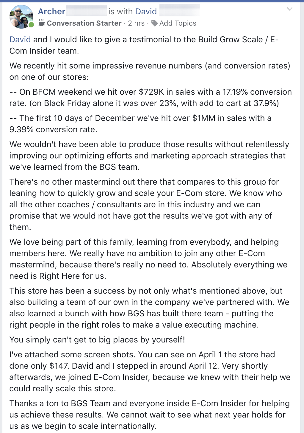
Just to demonstrate this and show you why you need to pay attention to what I’ll be sharing with you next, here is a testimonial from Archer, an Ecom Insider member who focused exclusively on revenue optimization.
Now that that’s out of the way, let’s dig in.
Over the last few years that I’ve been doing this, working on more businesses than I can count (ranging from multiple-six figures to multiple-eight figures a year), I have learned that there is no quicker way to grow and scale an ecommerce business than revenue optimization.
That’s why today I want to tell you how you can benefit from it and sell more—even if you’re on a budget—by focusing on optimizing (plugging the leaks on) the 6 key areas of your store.
And the best part …
Many of the things that I’m going to share with you will be instant gains once you apply them. Not only that, but the more holes you plug, the faster you will see results.
This will be a 6-part series that delves deep into optimizing each and every step of the buyer’s journey:
The reason why we are breaking it up is simple: This article would turn into a small book if we talked about everything in one sitting.
So today we will specifically be covering optimizing your Shopify checkout.
Let’s Dive In!
Step 1: Optimizing Your Shopify Checkout
The very first page we optimize whenever we start working on a new store is the checkout page. Now, you might be thinking … “Aleks, why optimize the checkout? I want to optimize my homepage or product page first, because those are the first pages my visitors see.”
Which is true—those are the first pages they see. But you don’t want to start there.
And here’s why …
When your visitors are on your checkout page, they are the closest to the money (hence the reason why we call the checkout your “money page”).
And any potential lift here will be significantly bigger, because of the simple reason that they are only a step away from giving you their money … compared to the homepage, which is an indefinitely multiple number of steps away.
If you start with the homepage, there are so many steps (and thus opportunities for things to go wrong) between there and the checkout, that your homepage optimization won’t even matter. At least not yet.
That’s why we start at the end and work backward … optimizing the checkout first, then the cart, product page, category page and lastly, the homepage. That is the typical Shopify store funnel.
Now when it comes to optimizing the checkout, there are so many things that need to be done right, that we could spend this entire blog talking about it and still not cover everything.
We also need to consider the fact that Shopify (and most other ecommerce platforms) don’t allow you to play with their checkout a lot. Hence, we are limited to what we can do … and that’s why I’m only going to give you things that you can actually implement.
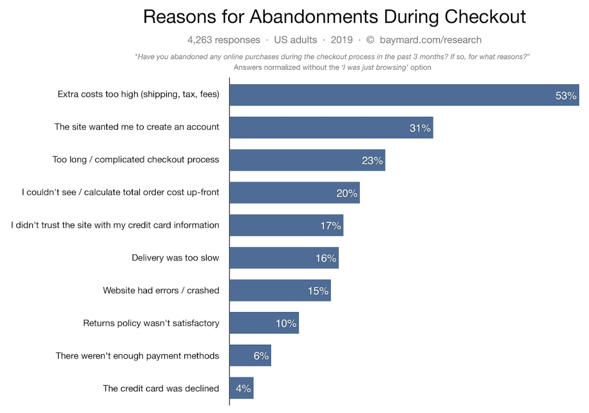
According to the Baymard Institute, the global average cart abandonment is 69% and the top three reasons for this abandonment are as follows:
- Too-high extra costs (like shipping, taxes and other unexpected fees)
- Asking for account creation before checking out
- Checkout process is too long and complicated
Whether the site forces you to create an account or the guest checkout option is so poorly designed that people assume account creation is required … it’s all the same from a user’s perspective.
This perfectly matches our own findings over the years, and all of the remedies I’m going to give you address these top three issues.
So, without further ado …
1. Never force your customers to create accounts
This is one of the biggest issues in the ecommerce industry as a whole. And it is also the simplest one to solve.
The research shows that lacking guest checkout and forcing account creation causes up to 37% checkout abandonment.
There simply is no upside to doing this, no matter what your business model might look like. We all have more accounts than we’d like to as it is.
Nobody is happy about creating yet another account, with yet another set of login information to remember. Especially during an ecommerce shopping experience, where people simply don’t see the reason (and understandably so) for creating an account.
Side note: This mostly refers to new customers. If you are a returning customer and loyal to the brand, you will have a different perspective on account creation and its role in making your shopping experience easier.
One recent example that personally really frustrated me (even though I understand all of this stuff) is when I bought my Keto Mojo glucose and ketones meter. I clicked the “Checkout” button and this is what I saw:
Aleks out.
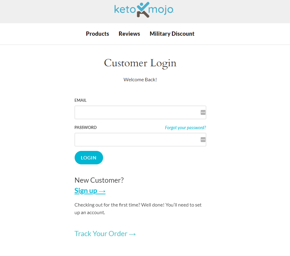
I immediately wanted to abandon the site, simply because of this. I only stuck with it because they are the best out there when it comes to this product and I really wanted to buy this meter.
Now I’m not picking on Keto Mojo. I love Keto Mojo—it’s one of my favorite devices that I use.
However, when initially trying to buy their product, I got really frustrated … because I didn’t want to create an account! I wanted to give them money, satisfy my shopping itch and BUY my keto meter.
Instead, they were interrupting my shopping experience with account creation.
I get where they’re coming from, considering the fact that this is a product that will need a constant re-supply of glucose and ketone strips. However, that didn’t change my perception or reaction.
As a first-time customer, I wasn’t sure if I would want to order more ketone and glucose strips. I didn’t even know if I was going to like the product or not at this stage, much less reorder strips.
And that’s probably the main reason why people dislike account creation so much. It’s asking them for a commitment that they are not yet ready for, and they can’t possibly know whether it’s worth it or not (again, this mostly refers to new customers).
The solution is plain and simple: DO NOT force your customers to create accounts. When they click on your checkout button, they should be taken straight to the “Guest” checkout. Having a “Log In” link above the form is enough (see below).
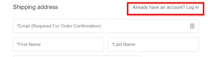
The customers that already have accounts will find that link. Or, they will log in prior to coming to your checkout.
The time to offer account creation is on the Thank You page.
Think about it …
You’ve collected almost everything you need in order to create their account at that point.
The only piece of information you still need is their password. So, show them one field to put their password in on the “Thank You” page and say something like, “Enter your desired password in order to create an account for checking the status of your order and faster checkout in the future.”
Or, if you have a rewards program, you can even incentivize the account creation by telling them that they will earn X-amount of points by creating an account.
Of course, you have to make sure that you are properly syncing their account page with the rewards program app, so there are no discrepancies between the points data they see on the account page and on the app.
Side note: Shopify’s default account page is pretty bad, so make sure you put some work into optimizing that page as well. That’s a topic for a future article.
One last thing to mention here is to make sure that you prefill their email and name in the account creation form on the “Thank You” page.
I previously said that you should only show them a password field. However, from an implementation standpoint (on Shopify, at least), you will need to show them email and name fields as well.
Make sure those are prefilled using the information they gave you during checkout.
OK, enough about that. Let’s move onto the next thing!
2. Reduce the length and complexity of the checkout form
It’s common sense that the longer and more complex a form is, the lower the completion rate will be. That’s the basic premise of this issue.
Long checkout forms intimidate people and often cause them to abandon.
As we mentioned above, it’s the third biggest reason for checkout abandonment. Because of that, our main focus here will be reducing the length and complexity of the checkout form.
There are a few things we can do to reduce the form length. The main rule of thumb is that you should not ask for any information that you don’t ABSOLUTELY need.
Here is what the default Shopify checkout form looks like:
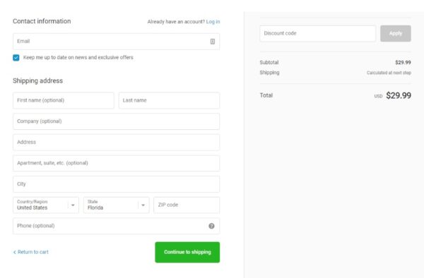
It’s crazy how many stores we come across that have this default Shopify checkout. This form is … not good, to say the least.
By information you “absolutely need,” I mean their email or their shipping address … because you can’t fulfill their order without it. But you don’t necessarily need their phone number, and you certainly don’t need their company.
So, first and foremost, hide the “Company” and “Phone” fields (since they’re optional in this case), unless you absolutely need them (e.g., for SMS recovery).
If you’re going to keep the “Phone” field, change the microcopy to “Required” (instead of “Optional”) and make sure you explain why you need that information.
Asking for sensitive information—like email and phone number—is also one of the main reasons for checkout form abandonment.
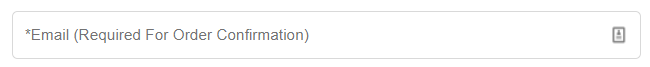
Make sure you tell people WHY you’re asking for that information. Shopify’s default tooltip information is better than nothing, but not good enough (see below).

What works best for us is having a microcopy label on the “Phone” field that reads, “Phone (Required for Shipping Notifications)” … and for the “Email” field, “Email (Required for Order Confirmation)” works best.

Side note: There are certain laws (like the TCPA, GDPR and others) that apply to collecting your customers’ phone numbers and/or emails and messaging them via SMS and/or email. So, make sure you talk to a lawyer about how to properly ask for your customers’ consent.
I am not a lawyer, so I can’t give you advice on that. I can only tell you what has worked best for us, so apply what you see here at your own risk. If you want to stay on the safe side, just remove the “Phone” field completely and you should be OK—at least as far as the “Phone” laws are concerned.
The next step is to hide any required optional fields behind a link. On Shopify, those are the optional “Address Line 2” field and the “Discount” field.
The purpose of hiding the “Address Line 2” field behind a link (as you already know) is to reduce the length of the form and make it look less intimidating. The same reason applies for hiding the “Discount” field as well.
However, there is another more important reason why we want to hide the “Discount” field behind a link. When a visitor comes to your checkout and sees an open and prominent discount field, he/she will feel left out.
The “Discount” field is basically screaming at them, saying that they could get their product for cheaper … but they are not able to because they don’t have a discount code.
And guess what? Many of them will leave your site searching for coupons on Google or Groupon, never to return again. That’s why you want to hide it behind a link. And yes, your customers that have discount codes will find that link.
Don’t be swayed by edge cases. Having the discount field open will hurt you a lot more than those few outlier customers who will reach out to you because they can’t find it. If that ever happens to you, try bolding the discount link—that should help.
Taking into consideration everything that we’ve talked about so far, your checkout form should ideally look like this:
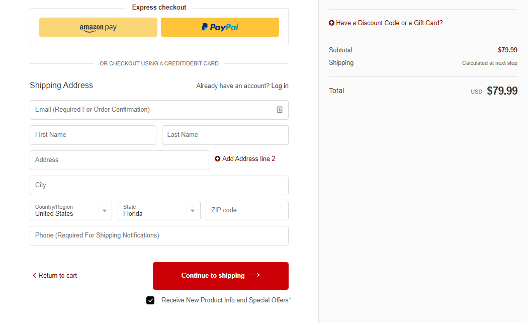
Notice the microcopy on the “Email” and “Phone” fields, as well as how the “Discount” and “Address Line 2” fields are hidden behind links.
When you click on those links, the fields should open and the cursor should automatically focus in the fields, so people can start typing immediately.
Also worth noting: There are “PayPal” and “Amazon Pay” third party express checkout options in the screenshot above. That’s because on this specific site, the take rate of those options is pretty significant.
However, if your customers don’t use “Amazon Pay” a lot, remove it from this first step, because it’s just another distraction.
The same goes for “Google Pay,” “Apple Pay,” etc. What we typically see on the majority of our sites is that it only makes sense for “PayPal” to be available as an option on the first step of the checkout, because it is very well known and widely used.
Keep in mind that “remove Amazon Pay,” does not mean “completely disable it as a payment option.” It means suppress it until the last payment step.
Bonus: One last thing to mention is combining the “First Name” and “Last Name” fields into a single field.
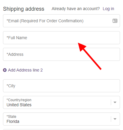
The reason for this is simple: People often think of their name as a single entity. A single “Full Name” field also solves many issues with people’s perception of middle names and titles (like Dr., PhD., etc.). Of course, it also helps with our main goal, which is to make the form less intimidating.
At the beginning of this step, I mentioned that we can only do so much when it comes to editing the checkout on Shopify.
Optimizing the Shopify checkout if you are not on Shopify Plus is quite difficult … which is why we developed our Checkout Bump App (the app we use on our stores and give to our Ecom Insider members).
One important thing worth mentioning is the fact that Shopify “locked” the “Additional Scripts” section in your store’s “Online Preferences” section for any newly created stores (not sure what the cut-off date was).
And that is where the script that does all of the above-mentioned edits goes. Older stores won’t have this problem, but newly created stores will.
They did this for obvious security reasons, because this is where Shopify collects customers’ sensitive data.
In this case, you will need to reach out to Shopify’s support and ask to have that section unlocked.
You might need to do it multiple times until you succeed, because it is not easy to get it unlocked.
But many of our students reported that they managed to get that section unlocked, so it is not impossible. Expect some failed attempts … but it will definitely pay off once you get it unlocked.
Now, on to the next to-do for optimizing your checkout!
3. Be upfront about the shipping costs and present the delivery times in a customer-centric way
This is the number one reason for checkout abandonment. If you look at the chart I shared earlier, you will see that 53% of people abandon checkout because of extra costs.
The reason we are talking about this last is simply because the previous two points apply to the first step of the checkout on Shopify, and this applies to the second step.
The first part of this guideline is pretty obvious: Nobody wants hidden and unexpected costs. Every single online shopper wonders about the shipping at some point of their shopping journey.
So, the sooner we can ease those customer concerns, the better. Ideally, this should be addressed as early as the product page (especially if you offer free shipping), near the “Add to Cart” button. However, it should be addressed no later than the cart page.
This is what not to do:
The solution is simple. Right above the cart “Total” amount, show a “Shipping” row that states the estimated shipping. Even if your shipping is free, you should still show this.
This also applies to any sales tax, so you should have a line that provides the “Estimated Tax” as well. Something like this:
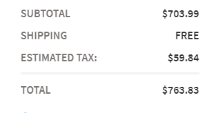
This will ensure that your visitors are not turned off by unexpected costs at the checkout step, when they are closest to purchasing.
Another reason why you want to present the total costs in the cart is to increase your AOV (Average Order Value) and make it easier for your customers to buy more stuff.
Let’s say you have a “Free Shipping” threshold above $50. If a customer adds $10-worth of product to their cart, you should show them a dynamic message telling them how far they are from getting free shipping.
It should be placed near the “Checkout” button and change dynamically, based on the total amount that’s already in the cart. So, in this case, the message should say, “Add $40 more to get free shipping” or something similar.
Here’s an example:
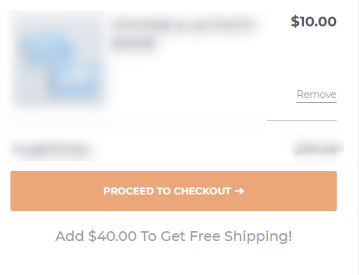
If they add $25 more, the same message should change to “Add $15 more to get free shipping,” … and so on, until they meet the minimum dollar amount.
Once that happens, the message can read, “Congratulations! You get free shipping” or “Congratulations! We Pay for Shipping.” Here’s a great example:
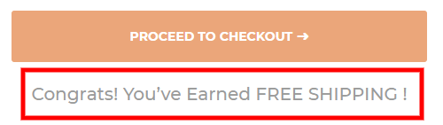
Side note: We found that the “Congratulations! We Pay for Shipping.” message works really well, because it changes the whole perception about shipping.
Instead of something that is “Free” … now it is something that “We pay for.”
Because, technically that’s what happens. No shipping is actually free—somebody always pays for it.
By letting people know that explicitly, it changes their perception of it and increases the perceived value, consequently increasing conversion.
This “Free Shipping” threshold message is the reason why you should show the estimated shipping costs in the cart. It will make it easier for customers to continue shopping from the cart, compared to going a couple of steps back from the checkout (which the majority of people won’t even bother to do).
Another side note: When using the “Free Shipping” threshold as a tool for increasing your AOV, keep in mind that your threshold should be 15-20% higher than your AOV. For example, if your current AOV is $100, your “Free Shipping” threshold should be set to $115 or $120.
That’s the only case in which this strategy helps to increase your AOV. Otherwise, if your AOV is $100 and you set your “Free Shipping” threshold to $75, then it offers no value and won’t help increase the motivation of the majority of your customers.
Something also worth mentioning when it comes to shipping, is the obvious fact that everyone wants free shipping.
In this Amazon Prime age, we are all conditioned to expect free shipping. And whenever a store doesn’t have free shipping, it will inevitably get a hit to its bottom line.
What we have found over and over again, is that building the shipping costs into the products’ price and offering free shipping works much better than offering cheaper products and charging for shipping.
Of course, this will be on a case-by-case basis … but for the majority of the stores that we tested, building shipping into the prices won. This is more of a business decision than an optimization decision, however, it’s worth considering.
Now that we’ve covered the shipping cost issue, we need to talk about the proper presentation of delivery times. The number one question that we need to answer here is, “When will I receive my product?”
That’s it. Nothing more, nothing less. The proper way to do this is in a customer-centric way, not a business-centric way.
What do I mean by customer-centric and business-centric?
It’s pretty simple:
- Customer-centric = presentation from the customer’s point of view
- Business-centric = presentation from the business’ point of view
An example of a business-centric statement would be, “Standard Shipping (4-5 business days).” That’s great … but how on earth is your customer supposed to know what that means?
Another example of what not to do:
This forces people to calculate and guess when they will receive their product.
Does this include processing time or not?
Are holidays considered to be a business day?
Or, for stores that don’t even specify “business days” (like the example above, which actually does both), are weekends and holidays included in that estimate?
What if I choose “1-Day Shipping” or “Next Day Shipping” on a Friday night, and the warehouse doesn’t ship until Monday?
How is your customer supposed to know if your warehouse counts today as “day one” or not?
This is essentially making your business’ problem your customer’s problem … which is something that you NEVER want to do. Your customers are not the ones that should deal with this.
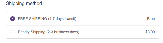
The proper, “customer-centric” way of presenting the delivery time is to give your customer the delivery date (the actual date when they will receive their order).
Presenting the information this way removes any doubts and uncertainties about when they will receive their order.
Now they don’t have to account for cut-off times, business days, current day of the week or holidays.
Even if it’s only an estimate, it is better than the business-centric presentation.
Here’s an example of what this might look like:
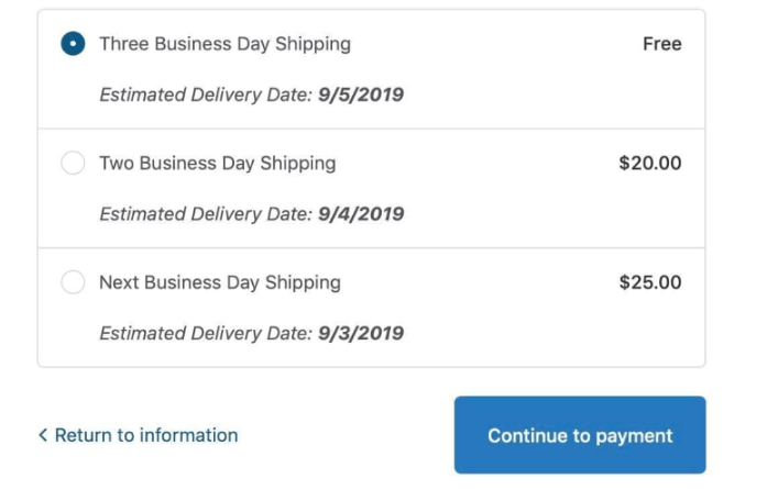
If you can’t give people a specific date, then give them a date range … like, “Estimated delivery: Dec 24-27” or “Get it by Dec 24-27.”
This is still much easier to interpret than “4-7 business days.”
Important: You want to keep this delivery date as accurate as possible. If your buffer is too big, your customers may get discouraged if the shipping is taking longer than they expected.
On the flip side, too small of a buffer and you might end up with a customer-service nightmare on your hands.
That’s why it is very important for this delivery estimate to account for any processing times (especially during peak seasons and holidays) and any potential delays to a specific shipping zone.
OK … that was a lot of information!
We’ve only scratched the surface here, but those are the three most important things that you need to fix on your Shopify checkout if you want to optimize it.
What now?
Take a deep breath and start plugging away on everything I’ve shared on how to sell more on shopify.
And, stay tuned for the second part of this series (coming soon), where we will be talking about optimizing the second most important page on your store: the cart page.
If you haven’t yet, make sure you subscribe, so you get an email whenever we drop a new article.
Until next time …
Aleks out.


About the author
Aleksandar Nikoloski
Aleks is BGS’s Head of Revenue Optimization, an author, and a speaker. He has helped rapid-scale dozens of 6, 7, and multiple 8-figure stores as part of BGS’s Amplify Partnership program. He has gotten one store from $2.6 million a year to $6.7 million a year in 24 months, while another from doing $300k/month to doing over $2 million/month in less than 6 months, just to mention a few. The BGS team calls him the “Site Whisperer” because of his ability to find site nuances that derail the customers’ journey and cause purchase friction. Extremely meticulous and analytical, he credits all of this success to data and accurate interpretation of that data, as well as his ability to implement and test new ideas almost immediately.