

3 Simple Ways to Improve Your Shopify Store’s Function
A beautiful website is the objective of many business owners. They so badly want to mimic the aesthetics of big brands like Apple and Nike, but most of them aren’t operating at the same multi-billion dollar mark yet.
So, if they shouldn’t just blindly mimic top-grossing companies … what should they do?
The simple truth is that they need to focus their attention on the function of their website—not the aesthetics.
Now, this doesn’t mean they should forego having a visually appealing website. And certainly don’t take it as an excuse to upload less-than-stellar quality product images.
It just means that a website should, first and foremost, focus on ease of use.
In this article, I’ll show you three ways you’re killing your store’s conversions by prioritizing aesthetics (complete with visuals) … and what to do about each.
I will also share two amazing ways to pinpoint your site’s specific usability pitfalls.
Let’s dig in!
1. Search Bar
You’d be surprised by what many business owners assume is common knowledge (that truly isn’t). For example, many people assume that the all-too-often-used magnifying glass icon very clearly illustrates that users can perform a search to find what they’re looking for.
The unfortunate reality is that many users don’t actually understand what that icon was intended to represent.
Take a look at the figures below. The first is an example of a poorly-executed search bar and the second, a well-executed one.
Figure 1.
*Sensitive information hidden
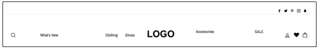
As you can see, this search function is pretty much hidden from users. I frequent this site and it took me more time than I’d like to admit to find the search bar. (If you still haven’t found it, check the upper left of the image.)
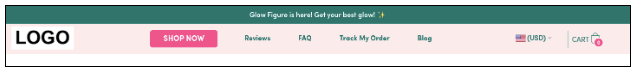
Figure 2.
*Sensitive information hidden
This search bar was implemented as part of an A/B split test and resulted in a massive win for the client’s site. It was placed at the very top of the page on desktop and mobile (which accounts for 80% of the traffic on this site).
Instead of providing only the magnifying glass icon, we’ve created a full-length bar that goes as far as to suggest what the user can search for. And the search terms provided were not picked at random, but rather by checking the search terms report under “Site Search” in Google Analytics (which reports the most-searched terms).
Note: what your users are searching for is always changing, so be sure to update the search terms regularly.
So, why did this search bar beat the original in our A/B test?
Customers who use the search box are 3x more likely to convert, so it stands to reason that we should make it big and noticeable. That way, a customer can easily identify the search box and actually use it.
We call this the Principle of Visual Hierarchy. Which basically just means that you make the most important aspects of your website big, bright, and in-your-face.
2. Main Menu Navigation
Far too often, I see disastrous main menu navigations … especially on mobile (which is unfortunate, because most traffic is from mobile users).
Using wildly unorganized menus and/or category and subcategory names that can only be understood by insiders should be avoided at all costs. After all, if a user can’t find what they’re looking for, how can they buy it?
When organizing your menu, be sure to order the categories from highest to lowest converting. And only include relevant category links in your main menu navigation.
For example, if your website sells clothing and your biggest friction point is sizing, it could be wise to include a link to the size guide in your main menu navigation. However, it might be unnecessary to include a site map link (A/B testing is the only true way to know for sure).
Below are examples showing poorly-done vs. well-done main menu navigation.
Figure 3.
*Sensitive information hidden
What exactly makes this navigation so bad? A couple things:
- The word “shop” causes a lot of friction, because it requires the customer to commit to your product before they’re fully informed about it.
- You’re not able to tell this from the photo, but this store offers many product options in various different categories. So, it might be better for them to use their valuable site real estate to present their best-selling categories, and use a sub-menu to house the best-selling products under each category.
Figure 4.
*Sensitive information hidden
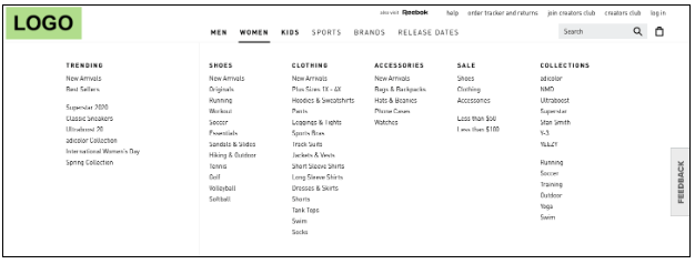
This main menu navigation is pretty much perfect. As this is a clothing brand, the categories are broken down by gender and age (i.e., men’s, women’s, kids’), and from there, all sub-categories relating to the main category are tucked nicely under the drop-down menu.
What I especially like about this menu is that it provides the option to purchase by type of athletic shoe (based on different sports) and brand.
The only thing I’d change: either remove the site-wide navigation (i.e., help, order tracker, creators club, feedback, etc.) or make a clear distinction between it and the main menu navigation.
3. Add-to-Cart Button
As mentioned earlier, “visual hierarchy” (a term all optimizers should have seared into their brains) simply means that the most important elements on a page should be the most prominent.
So, since the goal of a product page is for the customer to “add to cart” … the add-to-cart (ATC) button needs to stand out.
In other words, the ATC button should be high in the visual hierarchy of the site.
Here’s an example of a poorly-executed add-to-cart button.
Figure 5.
What makes this add-to-cart button so bad? It’s below the fold! Meaning, users can’t even see it when they land on the page … they have to scroll to find it.
Once the user scrolls, a black “ADD TO CART” hidden in the background is “revealed.”
If you take one thing away from this article, let it be this:
DON’T HIDE IMPORTANT BUTTONS FROM YOUR CUSTOMER.
In Figure 6, you’ll see an example of our tried and tested, best-converting ATC button.
Figure 6.
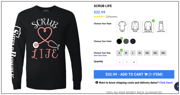
This ATC button may seem simple and ugly at first glance, but remember … function comes before aesthetics for a reason! You’ll notice that this button is big and blue, so you can’t miss it (visual hierarchy).
It also gives the user very valuable information that provides additional clarity. It tells them how much the product costs, what quantity will be added to their cart, and where they’re headed once they click the button.
Disclaimer: The color of the button does not matter. In this case, blue works well because the site is primarily gray. However, they could technically have used lime green instead. It really doesn’t matter what color you choose, as long as it is noticeably different from the rest of the color scheme.
Now that we’ve covered three awesome and easy-to-implement solutions for low usability …I’m going to share two (even easier) ways to pinpoint your site’s very specific usability challenges.
Because no, you can’t just blindly copy what you’re told—you need to address your site specifically.
User Testing and Surveys/Polls
By utilizing user testing and surveys/polls, you can quickly determine what areas of your site your customers find the most challenging to use.
User Testing
User testing is a qualitative tool that every website optimizer needs to have in their arsenal. User testing platforms like trymyui.com (my personal favorite) and usertesting.com are easy-to-use tools that allow you to set up a test and present it to users. Each user is recorded while completing the test, so you can play it back and gather valuable feedback.
Surveys/Polls
Another way to get quick and valuable feedback is through the use of surveys and polls. While there are various great ways to run them, two of my favorite are:
- Directly on the site through a software called luckyorange.com
- As post-purchase survey emails
To easily create a survey to include in your post-purchase email(s), I recommend using wufoo.com. It’s super intuitive, but if you’re unsure or would like to learn more, I recommend reading this article about polls and surveys.
And if you’re interested in finding out how we execute them for our clients’ stores, I recommend reading the Ecom Insider G.S.D. report from August 2018.
Not a member already? Click here to find out more about Ecom Insider.


About the author
Haley Spindler
Haley is a Revenue Optimization Expert with Build Grow Scale. Optimizing underperforming pages is her passion and data is how she gets it done. Haley is quite the expert on the subject and has been dedicated to mentoring the future revenue optimizers of Build Grow Scale as the company’s Director of Training. Haley is an avid animal lover and when she’s not in the virtual office, she can be found at the beach with her dog.