

How to Sell More on Shopify (Even If You’re on a Budget) Part 3 of 6: Product Pages Optimization

In the previous article, we were talking about optimizing your cart. Go here to read it (if you haven’t yet), before digging into this one.
This is the third of a 6-part series that will go deep into optimizing every step of the buyer’s journey.
Here is the full breakdown:
- Checkout
- Shopping Cart
- Product pages
- Category pages
- Homepage
- Thank You page
Now that we’ve covered optimizing the checkout and cart, the next step is optimizing the product pages (continuing to work our way from back to front).
So, let’s get started!
Part 3: Optimizing Your Product Pages
In the first two parts of this series, we talked about how the checkout is the most important page of your store and the cart the second most important.
However, in order for your customer to get to your cart and checkout (and eventually buy), they first need to go through your product pages.
It’s on these pages that your visitors turn from browsers to shoppers.
Previously, they were just browsing for a product that matched their needs. But, after clicking the “Add to Cart” button, they have demonstrated shopping intent, and thus become shoppers.
So, our main goal with product pages is to turn as many people as possible from browsers into shoppers. That’s why optimizing your product pages is so critical.
What matters?
On a product page, the product images and copy are most important (because they are what sells the product), followed by the customer reviews.
So, those three areas will be the optimization focus today.
Let’s get started!
1. Product images
Product images are crucial. Why?
For the simple reason that people can’t physically touch and try out the product(s) that you’re selling. This is especially critical for wearable products, gadgets, and basically any/all products that are not supplements or cosmetics.
Don’t get me wrong. Images for supplements and things like skincare, shampoo, toothpaste, etc. are very important … but not to the same extent that they are for other industries, because the way a cream or supplement powder looks doesn’t really matter (as long as it does what it promises to do).
For these types of products, the ingredients and nutrition facts label will typically be a lot more important than having multiple images of the container. It’s always good to have a nutrition label as an image on these types of products … just make sure you have a separate one that is readable on mobile.
What constitutes a “good” product image?
To start, let’s first talk about what is NOT a good product image.
Basically any image that is blurry and low quality will make your site look amateurish and hurt your brand’s credibility … which will translate to lost sales.
That being said, even high-quality images can be detrimental, if they don’t show what your customers need to see.
Let me explain.
The main purpose of providing more than one product image is to show different perspectives of the product, even if the product is simple and not visually interesting.
This is crucial, because people heavily rely on images to evaluate and decide whether or not they like a product. They will often create their first impression solely based on the product images.
In fact, more than half of people will immediately start clicking through images before looking at any other product information (e.g., title, price, description, reviews, etc.).
That’s why you should give people images (at least three to five) that show the product from all relevant angles, with no more than one from each vantage point.
Every product image should give value to the customer. That value could be a product’s perspective that was not seen before (e.g., a side shot of the frame on sunglasses or capsules on a supplement), or product information (e.g., nutrition label).
There are three types of product images (at minimum) that should always be included for the majority of products:
- Images that show the product from a few different angles
- Images that highlight specific product features (e.g., a close-up shot showing intricate details of a ring, or the texture of fabric)
- Images that show the product next to other objects, in context (to provide a relative idea of size/scale)
Of course, this is not the be-all and end-all. Ideally, you should have lifestyle images as well, to get people to visualize themselves using the products (and excited about doing so).
You can also include UGC (user-generated content) images, which are typically part of a separate gallery or actual customer reviews.
Side note: It’s OK to have more than five images, as long as they are all different.
People judge your products and site based on the images you present to them. So, failing to provide them with the aforementioned images will hurt your credibility and make people perceive your product(s) and brand as worse than they actually are.
Now let’s look at some examples of well-executed product images!
Check out this product page from MVMT watches and you’ll see a well-executed image gallery.
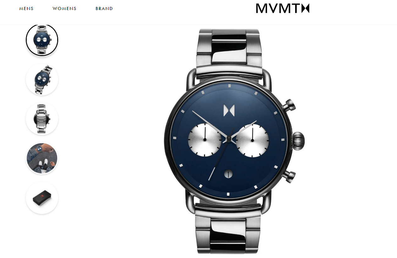
You’ll notice that the first image is from the front. The second image (see thumbnails on the left) is a shot from the side that gives us a better view of the side buttons.
Next, we’re shown the back of the watch and details of the clasp mechanism followed by the watch on someone’s wrist and finally, the packaging.
Looking at these images, all three product image types are represented (multiple perspectives, highlight of specific features and the product in context).
This is not necessarily “perfect” … but it gets the jobs done. Personally, I would have liked to see the back of the dial and an up-close shot of the strap latch mechanism (because they’re typically quite tricky on watches).
That being said, the image gallery is still decent.
Ideal Image Size
What is an ideal image size in terms of resolution and image weight (in kB)?
This is a very important question to ask. If you go too low on the resolution, you’ll have low quality images that will hurt your brand’s credibility.
But, go too big and your images will be way too heavy, sending your product page load time through the roof (not good).
So what’s the happy medium?
A good rule of thumb: Go as big as you can on the resolution, while keeping the image weight below 100 kB (ideally under 70 kB).
Anything bigger than that and you’ll cause severe damage to your page load time. On our sites we typically keep images at 600 x 600-pixel JPGs (up to 800 x 800). However, the images for the MVMT watch from earlier are 1200 x 1200 pixels, yet still under 100kB (which is awesome).
So, if you can achieve that … go for it!
Product Image Zoom
Product image zoom is important (especially for products that have a lot of tiny details and features), but can be a little difficult to get right.
It’s important to ensure that the images enlarge to an appropriate size (i.e., a size that meaningfully shows details the unzoomed image doesn’t), but not fill the entire screen.
It should be easy for users to bring other parts of the image into focus, while still being able to minimize the image quickly to interact with other elements of the page.
If you implement a hover zoom, ensure the hover zoom has a delay, to avoid flashing the zoom when users move their mouse quickly across images.
Hover zooms often work better than click-to-zooms, but you want to ensure that any hover zoom has a 400 to 600 ms delay before the hover zoom activates (to avoid flickering).
Another good option is the one MVMT watches uses. They have a decent zoom implementation that typically works well.
OK, enough about product images.
Let’s move onto the next most important piece.
2. Copy
In this case, “copy” refers to the text on your product pages and can be defined as selling in written form.
Obviously, you need to provide at least the minimum amount of copy a customer needs to make a purchase decision.
There are only two reasons why your visitors don’t buy from you:
- They don’t trust you.
- They have questions that haven’t been answered yet (copy is how you answer those questions).
Now, I’m not going to teach you how to be a great copywriter—that is not my expertise (although I know a thing or two).
I’m going to teach you how to optimize the readability of your copy, so more people read what you have written.
Before we get into that, however, know this about copy …
You need to provide all of the necessary information for your customers to make an informed buying decision.
Think about how many times you’ve gone to Amazon, found a product you liked based on images and ratings, but then been disappointed by an insufficient product description and consequently bounced.
I don’t want that to happen to your customers.
When it comes to copy formatting, there are a few rules of thumb that you should follow.
No walls of text
This is a big one I see all the time.
People have these massive paragraphs of text that nobody will read. It doesn’t matter how good your copy is if nobody is reading it. It won’t help you.
Here’s a prime example:
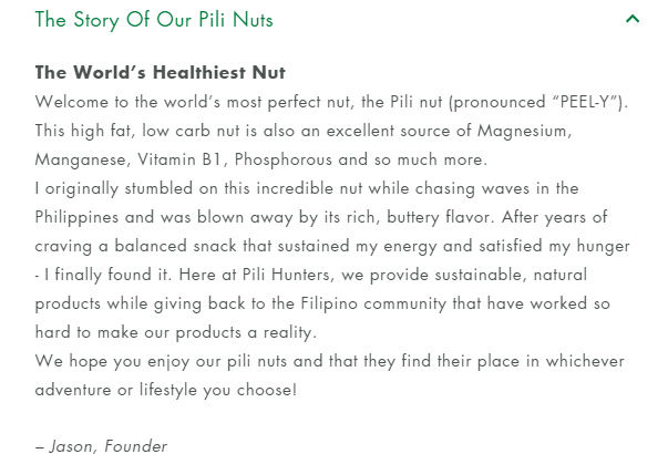
Now, I’m not picking on Pili Nuts (I’m actually a happy returning customer of theirs) … I’m just illustrating my point. Nobody is going to read this.
To avoid walls of text in your product descriptions, be sure to break your copy into paragraphs of no more than 3-4 lines. This goes for desktop as well as mobile (obviously, it will look slightly different on mobile, because you’ll have smaller paragraphs).
Don’t use small font sizes
While having walls of text is the biggest issue I see, the second most prevalent issue is using font sizes that are too small.
The font size of all copy on your site should be at least 16 points (up to 18, depending on the font family).
This is even more crucial if your demographic is 40+ years of age. There is literally no down side to increasing the font size. Obviously, don’t get obnoxious with it … but 16 points is usually perfect on the majority of websites.
(The font size in the example image from eatpilihunters.com should definitely be bigger.)
Don’t use fancy fonts
Nothing hurts readability like fancy fonts.
Even if you have a wall of text and your font size is small, a stubborn person can still read it if they want to. But they won’t be able to read anything if you use a hard-to-read font.
So, avoid any font that looks like handwriting, is serif heavy, or that is an unusual style you wouldn’t see in your typical magazine or blog post.
Just stick with standard fonts that people are used to reading (e.g., Arial, Helvetica, Georgia).
Stick to one font style and color
The fourth copy issue I encounter is the use of multiple font styles and colors.
When it comes to optimizing your website, it’s all about consistency and visual hierarchy of focus. You want consistency across the board, and that includes your font choice. The more font styles you use, the more difficult it will be for your customers to read what you want them to read.
And when it comes to colors, if you use too many colors, you will hurt the visual hierarchy of focus on your website.
Both of these issues will hurt your site’s credibility.
Never center-align copy
Whenever copy is center-aligned, it hurts readability tremendously. You always want your copy left-aligned (with the exception of headlines and subheadlines).
Optimize for skimmers
Many people don’t read descriptions. In fact, the majority don’t. That’s why your copy format needs to be optimized for skimmers (people who just want to skim through product descriptions).
As mentioned earlier, no paragraph should be longer than 3-4 lines. Additionally, a halfway decent description should have at least a couple of paragraphs. What you don’t want is too many paragraphs without a break.
That’s why you should have a subheading for every two paragraphs. The subheadline should summarize—in one short sentence—what the following two paragraphs are about … to the point that even if someone only reads the subheadings, they will get the gist of what the paragraphs contain.
This is very important because, as I said earlier, the copy and images are what do the selling on product pages. And if the majority of your visitors are skimmers and your copy is not optimized for skimmers … you’ll lose a lot of sales.
If you do everything we just discussed, you’ll be golden as far as product copy goes.
Now, let’s talk briefly about customer reviews.
3. Reviews
I don’t need to spend a lot of time here, because you know from personal experience how important customer reviews are. Even if you are a beginner in this space. I can almost guarantee that you’ve shopped on Amazon before.
Whether you purchased or not … did you read reviews for products you viewed? Of course you did. I don’t know of a single person that doesn’t read customer reviews.
Now, there are a couple of things you need to keep in mind when it comes to customer reviews and the way you present them.
Curate customer reviews
First of all, you need to curate them. You need to have an automatic flow in place to gather as many reviews as possible. Just make sure the flow you use (in Shopify’s case, an app) asks for a minimum amount of information from customers leaving reviews (just name and state/country).
Any extra information and you will reduce your review submissions. It’s just like on the checkout (if you haven’t read that post, you can read it here). The more information you request from your customers, the lower the completion rates on the form will be.
So keep it simple.
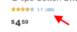
Review stars under the product titles
You should have review stars below your product titles to increase trust, credibility and motivation. The reviews shown under the title should link to the reviews widget below. This should be done with a smooth auto-scroll down, not a “teleportation.” Otherwise, people have no idea where they were redirected to.
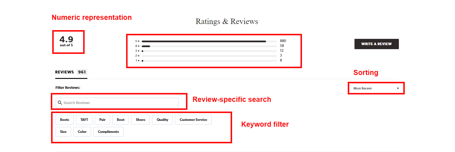
Also, next to those stars you should have a numeric representation of the product rating, as well as the number of reviews.
Here’s an example:
Sorting, filtering and review-specific search
It is extremely important that the reviews can be both sorted AND filtered based on specific customer keywords, to make it easier for people to find the feedback they care about.
You should also have a reviews-specific search bar. This goes back to the topic of people wanting to be in control. The purpose of reviews is not to make sales … it is to help people make educated decisions.
Rating distribution chart
Without this summary at the top of the reviews widget section, users will typically make a judgement about the overall product rating, based on the first few reviews they see. This misleads users, because, if all of the reviews they see at the top are positive, they will think they’re fake.
The opposite is also true. If the majority of reviews at the top are negative, people will falsely believe that the overall product rating is negative, because they don’t have a quantifiable overview of the overall rating … which is why we need a rating distribution chart.
Having this summary gives users a clear picture of the actual product rating, removes any possibility for misinterpretation, and makes people trust in the authenticity of the reviews. Just be sure that users can click on the rating chart to filter the reviews by stars, so they can jump to the low ratings as needed.
One thing to keep in mind is that you don’t want to show this summary on products with up to 10 reviews, because it makes no sense when there are so few. It gives no additional value. In this case, make sure you hide it dynamically with a simple script for such products.
When everything is said and done, this is how your reviews widget should look:
Publish both positive and negative reviews
Customers rely heavily on reviews—both good and bad—to make informed decisions about their purchases. It’s highly unlikely that your product will be absolutely perfect for everyone, and customers know and understand that.
Having too many positive (4- and 5-star) reviews in comparison to negative (1-, 2-, or 3-star) reviews creates doubt about their authenticity. And the larger that ratio, the more that doubt increases.
On our sites, customers who sort reviews by the lowest rating convert the highest. The reason for that is the simple fact that everybody knows no product or company is perfect. It doesn’t matter how amazing your product or company is … there will be people who don’t like it or won’t be happy with their experience with it, and you will have some negative reviews.
People understand that. Whether it’s because of a product flaw, a package that never arrived, or a customer that’s being a jerk … you will have some negative reviews.
The key is what you do about them. I highly suggest you embrace negative reviews when you receive them. Not only do they provide more credibility to the ratings overall (as some level of negativity is often expected), but they can also show your business in a good light by allowing you to reply. This shows you’re not afraid to admit to mistakes and are active about resolving them.
So always make sure you respond to the negative reviews before you publish them. That’s all your customers care about. They want to see that you will take care of them if they are unsatisfied with their purchase for whatever reason. That’s the purpose of negative reviews. If you do this, they will help you. But if you don’t respond to them and publish them anyway, they will hurt you.
Don’t show the widget on products without reviews
You should always hide the stars and reviews widget from products that don’t have reviews yet … otherwise, it will hurt you.
It’s called negative social proof. Nobody wants to be the first one to try a product.
But what you can do is have a script that dynamically shows the reviews widget the moment you publish a review on that product page.
Don’t hide reviews behind a tab
Reviews are something that should be visible on the product page, without the customer needing to dig to find them.
You want to have your standard reviews widget below your product description. You can still have them behind a tab, but that’s secondary. Primarily, you should have them visible below the description.
Which app should you use on Shopify?
Of all the review apps out there, my favorite (by far) is Stamped.io, because it has all the features I mentioned above. In fact, the screenshot above that shows the reviews widget is from the Stamped.io app.
Of course, you have control over the styling and how you want it to look, but the main thing is the functionality. It has it all (including the final feature below).
Show the image and video reviews at the top
What the Stamped.io app can do that isn’t shown in the previous screenshot is curate reviews with images and show the image/video gallery from the reviews at the top of the widget (see below).
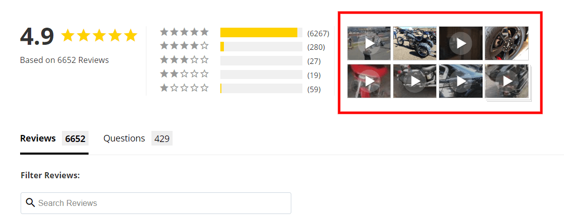
This is very important, because people that click on these reviews typically convert the highest. So make sure you add these as well.
Again, Stamped.io does all of this and it doesn’t cost an arm and a leg. I highly recommend you give it a shot.
Phew!
That was a lot to digest, so I’ll leave you to process everything discussed today,
As always, go back and re-read a portion of this if you need to, but more importantly … take action.
To your success.
Aleks out!


About the author
Aleksandar Nikoloski
Aleks is BGS’s Head of Revenue Optimization, an author, and a speaker. He has helped rapid-scale dozens of 6, 7, and multiple 8-figure stores as part of BGS’s Amplify Partnership program. He has gotten one store from $2.6 million a year to $6.7 million a year in 24 months, while another from doing $300k/month to doing over $2 million/month in less than 6 months, just to mention a few. The BGS team calls him the “Site Whisperer” because of his ability to find site nuances that derail the customers’ journey and cause purchase friction. Extremely meticulous and analytical, he credits all of this success to data and accurate interpretation of that data, as well as his ability to implement and test new ideas almost immediately.