
Howdy! Welcome to part 5 of this six-part series about optimizing every step of your buyer’s journey on your store. So far, we’ve talked about optimizing these pages:
If you haven’t read these, make sure you give them a read and, more important, apply what I teach you there.
Now we’re going to talk about getting the most out of your homepage.
Step 5: Optimizing Your Homepage
Your homepage is the most important real estate in your store, so you have to make sure you use it wisely and optimize it. We can talk about many things when it comes to getting your homepage done right, but here are the three most important components:
If you do these three things right, I assure you that you’ll make more money. Let’s start with the first one.
1. Value Proposition
The value proposition is probably the most important thing to get right if you want to build a real and sustainable ecommerce business (or any business for that matter).
I could easily write an entire article about just the value proposition, but, for the sake of time, I’ll make it concise. (If you want more information, definitely check out my podcast episode on the topic.)
Why is the value proposition so important?
The value proposition is the thing to test and optimize on your website. In fact, it’s so important that if there’s only one thing that we at BGS can test on a website, it will be the value proposition.
It’s the main factor that determines if people bother reading more about your product (or service) or hit the back button and bounce. An unclear or nonexistent value proposition is, in my opinion, the single biggest reason people bounce off your site.
Further, the less well-known your company is, the better your value proposition needs to be. For example, Apple doesn’t need to worry about creating a compelling value proposition because it’s a huge brand and everybody knows what it’s about.
However, for a less well-known company, a compelling value proposition is crucial in order to compete in the marketplace.
The whole idea is that when people see your value proposition, they should instantly know and be able to decide between: “Oh, this is not for me” (in which case, they leave) or “Oh, this is interesting. Lemme see what they have” (in which case, they keep browsing and potentially become customers).
You never want your potential customers to leave your website in a state of confusion. If they’re confused, they’ll never come back to your website—not through retargeting or email followup.
That’s why it’s crucial that your value proposition is communicated clearly and concisely. Clarity is everything.
What is a value proposition?
Your value proposition (VP for short) is a promise of value that you deliver to your customers, and it’s the main reason you offer to somebody to explain why they should buy from you. Your VP should communicate what’s in it for your customers by clearly stating:
- What your business is about: How your products or services solve your customers’ problems or improve their situation
- What your business offers: The specific benefits for your customers
- Why your business is better: The reason your ideal customers should buy from you instead of your competitors
The key when writing your VP is to write it in your customers’ language. Your value proposition statement should connect with the conversation that customers already have in their minds, because the way you talk about your products and services is completely different from how they talk about them.
If you use lingo that your target audience does not use, it causes a disconnect and you’ll lose them right then and there. So make sure you write it in your customers’ language. To do that, you have to learn your customers’ language, and there’s no better way to do just that than talking to your customers.
And by talking to them, I don’t just mean talking on the phone. I mean that you should learn from every single communication you get from them:
- Customer reviews
- User-generated Q&As on your reviews widget
- Social media comments
- Comments on ads
- Surveys
- Polls
- Customer support chat logs
- And pretty much every other communication you might get from your customers
We personally love using customer surveys to learn our customers’ language. In one of our post-purchase surveys, we have a question that goes something like this: “How would you describe our product to a friend?”
When we analyze the answers to that question, there’s always a pattern of words that emerges. Our customers typically use only a few words to describe our products. Once we find those words, we pepper them throughout our value propositions and elsewhere in our businesses: product descriptions, emails, ads, social media posts, content blogs, and so on. I recommend you do the same.
Value proposition structure
The typical VP structure is a banner image with copy on it, which should contain a headline, subheadline, three to four bullet points, a clear and prominent CTA (call to action), and a self-explanatory visual:
- Headline: The headline should communicate the main end benefit you’re offering or the main problem that your product or service is solving. This is the hook, the attention grabber. It is what gets people interested and reading further.
- Subheadline: This can be anything from one line to a two-to-three sentence paragraph. It provides further explanation of your offer, who it’s for, and why it’s useful.
- Bullet points (three to four): These are the key benefits or features—the reasons why your customers should buy from you instead of your competitors. It’s critical that at least one of these benefits or features be 100% unique to your company if or when it’s compared to your competitors. Note: This unique thing should also be something that your customers actually care about. There’s no point in being unique just for the sake of being unique.
- Clear and prominent CTA: A call to action is typically a button on the banner image that says something like, “Learn more,” “View product,” “View collection,” or whatever makes sense in the context of your offer. Note: Avoid using “Shop now” as your CTA because it asks for too much commitment from customers too soon.
A secondary CTA is also an option. This is a regular practice for SAAS companies where the primary CTA (a button) is “Sign up now” and the secondary CTA (a link) is “Watch demo” or something like that.
- Self-explanatory visual: This is the actual banner image that’s the foundation and the background for your VP. This is one of, if not the most, important elements of your VP. Why? Because we are visual beings and can decipher an image much faster than we do text.
The key word here is “self-explanatory.” A self-explanatory visual is an image that communicates your value proposition in such a way that, even if your customers didn’t read any of your VP text, they will “get” what your offer is.
The visual can also be a short video demonstrating your product’s functionality. This is good for any product but especially good for products that might be novel or that have a lot of moving parts. You can test to see whether an image or a video works better for your product(s).
How to create a unique value proposition
The best VP is clear, so always aim for clarity first. One of our mantras is, “Clarity trumps persuasion every single time” meaning that no matter how awesome your offer’s copy is, it won’t mean diddly-squat if it’s not clear.
When everything’s said and done, your value proposition should clearly answer these questions:
- What products or services is your company selling? What is your offer?
- What’s the end benefit of using them?
- Who’s the ideal customer for your offer?
- What makes your offer unique and different from that of your competitors?
If your VP answers all of these questions clearly, you’re on the right path.
Another important purpose of your VP is to make your company stand out from the competitors. It should come from something that you do better than others do. The way you stand out is by standing for something.
If you’re not standing for something already, it’s time to start—whether it’s the environment, giving back to charities, delicious keto snacks, saving the forest, saving the oceans, changing the world … whatever.
When you stand for something, other people will stand with you. It’s as simple
as that.
In a “red ocean” of companies (that is, in a highly competitive market) selling the same stuff as everybody else, customer service is the best way to stand out. Many customer surveys out there prove that customer service is much more important to people than low prices. Treat your customers like a family, and soon enough you’ll have a tribe of raving fans.
Note: According to TeleFaction Data Research, customers who give you the highest rating—five stars—are six times more apt to come back to your store to make another purchase than those who give you “just” 4.8 stars.
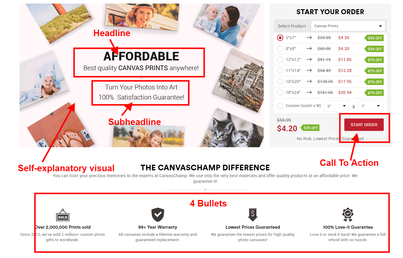
Here’s an example value proposition for one of our partner brands.

If you look at this picture and then look at the four questions above, you’ll notice that this VP answers all of those questions clearly. It also has the structure mentioned above, with the visual being an autoplay video. We tested six variations of this VP, and this one was the winner.
This should give you an idea of what your VP would look like. Of course, know that you won’t get it right the first time. That’s okay; just keep iterating and eventually you’ll get to a winner.
2. Clear Navigation
Once you have your potential customers interested because of your clear and compelling value proposition, the next step is to make it very easy for them to find what they’re looking for. You do that with clear navigation and an optimized search functionality. We’re going to talk about navigation in this section.
When it comes to clear navigation, it’s very simple: put only money-making links in your main navigation—meaning only provide links to locations where people can buy something.
Never do this.
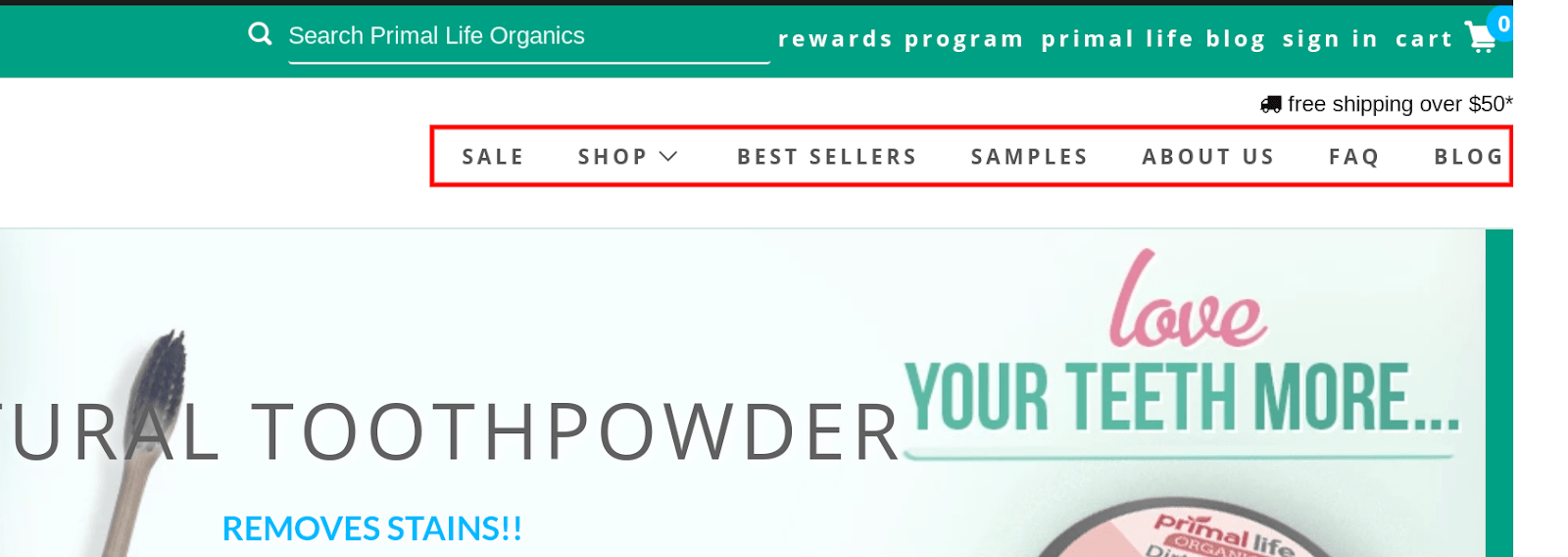
This is the #1 issue that we see over and over in stores. Don’t put all kinds of random miscellaneous links in your main navigation, like “Contact Us,” “Blog,” “Customer Reviews,” “Order Tracking,” “About Us,” and the like. All such links should go in your footer. Note: Unless your story is a huge part of your brand and a big reason why your customers buy from you, don’t put that in the main navigation either.
The second major issue that we see is that business owners put all of their categories in the main navigation (probably just because they have them) even though they don’t make any money.
Do not put links to categories or products in your main navigation if they aren’t making you any money. They become simply extra stuff that your potential customers have to process, and that makes them a distraction.
Here’s what we do on our partner stores and recommend to our students:
- We always follow the 80/20 rule. Only include links in your main navigation to the collections/products that are responsible for 80%+ of your revenue.
- Don’t put links there to collections from which you sell one or two products here and there.
A clear navigation is a focused navigation. Focus your main navigation on the biggest revenue generators, and take care of the rest with an optimized search functionality.
3. Optimized Search Functionality
Your search visitors are your most valuable visitors by far because they have a very high buyer intent. In fact, on all of our sites across the board, the visitors who use search convert at two or more times the rate of the visitors who don’t use search. Here’s an example from one of our stores.
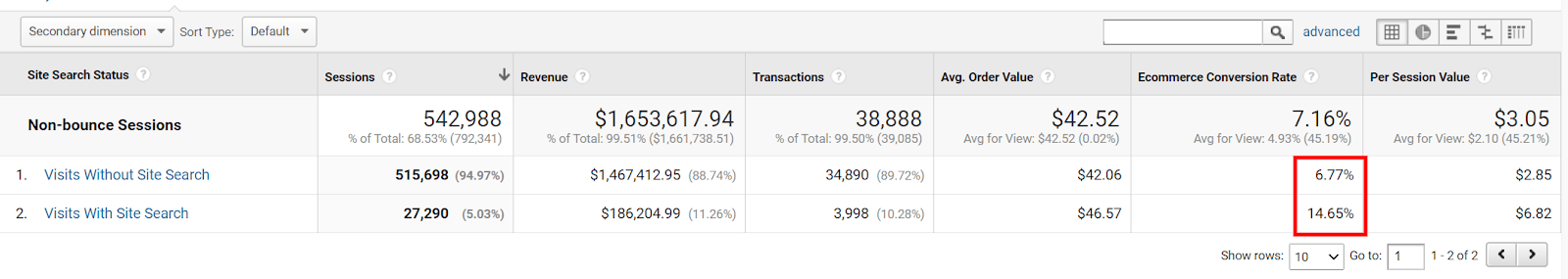
As shown above, visitors who didn’t use the search converted at 6.77% whereas visitors who used the search converted at 14.65%—which is more than twice the conversion rate from one to the other.
There is no doubt that these are very valuable visitors. So you have to optimize the search functionality as much as possible to make it easier for them to find what they want.
And if you think, “Oh, I only have one or two products, so I don’t need a search,” think again. When tracked properly, the search is a goldmine for what your most valuable visitors are, literally, looking for.
There’s a report in Google Analytics called “Search Terms” that shows you everything that your visitors are searching for on your site. Here you can find all kinds of things, some that make sense and others that don’t.
What we really care about, however, is any popular searches for products that you have not yet offered on your store. This kind of search tells you which products to launch next on your store to cater to those potential customers. It’s a goldmine for new product ideas.
When I say “goldmine,” I’m not exaggerating. On one of our brands, a search term for a specific product that we did not yet have was the most popular term for over seven months. And what did we do? We went to our suppliers, prototyped the product, and offered it on our store. We had an almost $500K product launch in only two days.
If that’s not a goldmine, I don’t know what is. And I’ll also add that this is a store that only had one product (with multiple variations) at the time. So don’t add a search functionality on your store if you hate money. Now, onward …
There are a few key features that your search functionality should support. There are many more that need to be implemented, but here I will focus on the few most important ones. Depending on your tech savviness and your budget, you can have some or all of these functionalities implemented. Note: Most of these can be handled by an app, if you’re on Shopify. I’ll make some app suggestions later.
Something is better than nothing, so try at least a couple of them. Let’s begin.
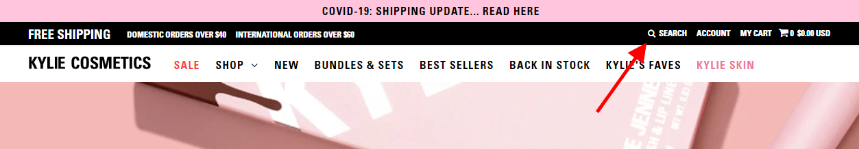
Make search more prominent
If the visitors who use the search convert at two or more times the rate of those who don’t search, it only makes sense to increase the number of visitors who use it. The simple way to do that is by making it more visually prominent so that it stands out from the rest of the site and people can see it.
This … is useless.
Nobody can even see that little search icon, much less use it. What’s worse, many stores don’t even add the label “Search” next to the icon, leaving only the magnifying glass icon. Don’t do that.
What you want to do is make your search big and prominent so it pops. Think Amazon.
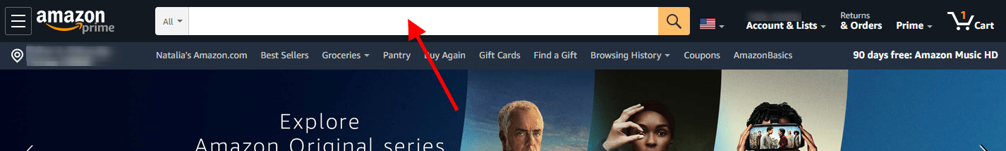
There’s no way that you can miss this search bar. If you do it like Amazon, you’re on the right track.
Search suggestions
This is an obvious one, but so many stores don’t do this. When people start typing, your search should populate a drop-down list with popular search terms, collections, and products. The specific suggested products should have the product title, price, and thumbnail shown on the drop-down. Here’s an example.

Your search should also be able to “read” synonyms and different spellings for the same word as well as to autocorrect obvious misspellings:
- Reading synonyms makes sense because a certain product can be called so many different names depending on the country, region, or even local lingo.
- Being able to interpret various spellings is a good idea because different people spell the same word in many ways: is it a “shirt,” “t-shirt,” “tshirt,” or a “tee”? Which one is correct? The answer is “All of them”—because your search should be smart enough to generate the correct results for all of those spellings.
- As for the misspelled words, it’s clear: none of us is perfect, and we all misspell words all the time. That’s especially true on mobile, where it’s very easy to make a mistake. Your search should recognize and autocorrect the obvious misspelled words (e.g., change “unbrella” to “umbrella”) without forcing the user to have to correct it. But also make sure to give your visitors the option to revert to their original search term if there are results for that original search term.
Search filters and sorting
The “Search Results” page is just another category page, in this case, refined by the visitor’s instead of the company’s choice. Since it’s just another category page, it should have all of the elements and functionalities of a normal category page.
Mainly, I’m referring to having filters, sorting capability, and badges, and properly loading more products and presenting the right information for each product listing. I go into detail about these five things in my previous article about optimizing your category pages. If you haven’t read that one, make sure you do.
All I’ll say here is that the filters that show on your “Search Results” page should be dynamic and shown or hidden based on the products that are fetched on that page. Here are some examples:
- If you have an apparel store that sells shoes, pants, and shirts, and somebody searches for “Cap Toe Boots,” you shouldn’t present a “Length” filter on the results page because that would only apply to pants and there won’t be any pants shown for that keyword—or at least there shouldn’t be … If there are, something’s wrong with your search and needs to be fixed!
- If you have an electronics store and somebody searches for “laptops,” the “Search Results” page should only show filters that are relevant to laptops, not filters that are intended for smart watches. BestBuy does this right:
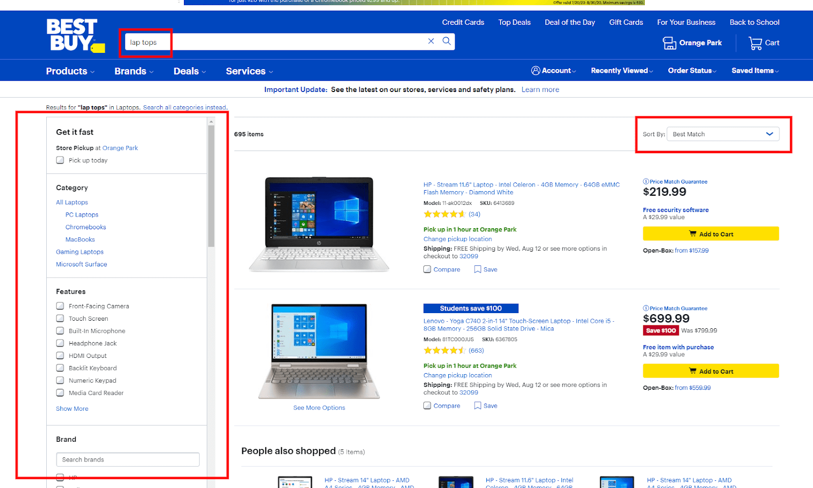
If you look closely at the image above, you’ll see that the search term is “lap tops” and the filters on the left are all intended for laptops. There’s a “Category” filter, “Features” filter, and, below that, a “Brand” filter and so on. Also, list these filter categories in order of importance. The most frequently used ones should be at the top. There’s also the sort-by selector on the right.
If you are on Shopify, the search filters and sorting as well as the search suggestions are typically decently handled by any third-party search app. On our sites, we’ve used Instant Search+ and Boost Product Filter & Search, but really, any search app should be able to do these things.
You might need to have a developer do some CSS coding to make the filters look the way you want them to, but it shouldn’t be anything crazy. Also, you might need to do a little bit of work on your own, like defining the synonyms and different spellings for the same word in Instant Search+, but, for the most part, these apps are decent right out of the box.
“No Search Results” page configuration
The dreaded “No Search Results” page—nobody wants to see it, but it happens to most people at some point or another. There could be a few reasons why. For example, the site may not have what the visitor is looking for; alternatively, the search engine may not have been optimized and doesn’t recognize complex keywords or some keyword types.
We can’t do much about the first reason (unless there’s a product that many of your visitors are searching for, which you can then cater to by adding the product, as explained above).
We can do something about the second reason, however.
Many search dead ends can be prevented by optimizing your store’s search engine to recognize the most popular search query types. I won’t go into too many details on the specific search type. Note: My colleague Eric Kwoka has talked about this in depth, and you can read all about search query types in this article.
At some point, however, no matter how well-optimized your search engine is, some visitors will still type a complex search query for which not even the best search engine can deliver relevant results.
This is when the “No Search Results” page will appear. Without going into too many details, remember that you never want to show nothing to your visitors, leaving them at a dead end when they browse your website. You never want to do this.
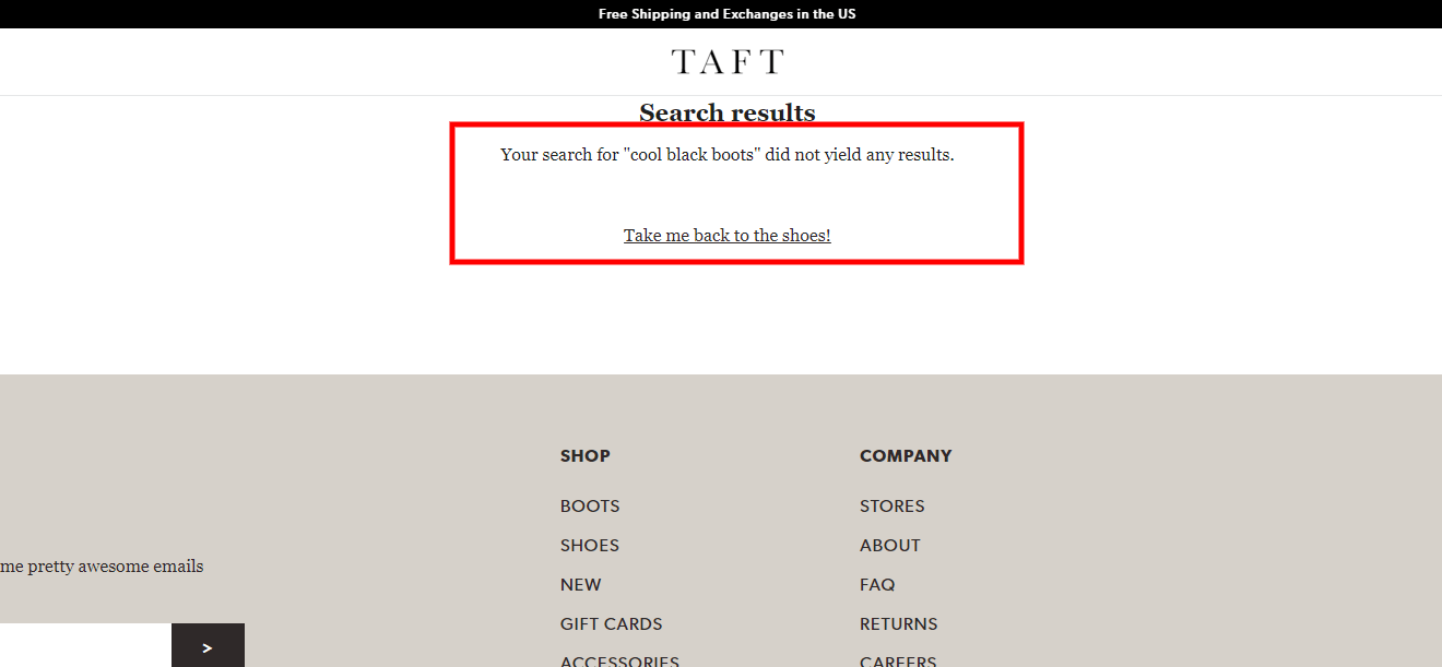
You always want to give them alternative paths and some content on the “No Search Results” page. We can get complex here, but really, all you need to do to help your visitors find what they’re looking for is show them your top four to eight best-selling products as well as your phone number and/or a live chat, which should open directly from the “No Search Results” page. This doesn’t require any significant amount of custom coding. It is very simple and straightforward for any developer to do.
Conclusion
Phew … that was a lot. What I shared with you here is probably one of the most important steps that you can take when optimizing your store to make more money, from the value proposition to making your navigation clear and focused to optimizing your store’s search engine.
Traffic is not your problem. Your unoptimized store is the problem. If you haven’t read my other articles in this series, give them a read here:
- Checkout
- Cart
- Product pages
- Category pages
- Homepage (this)
And apply everything you can from them. Also, be on the lookout for the sixth and final article in this Revenue Optimization series where I’ll be teaching you how to optimize your “Thank You” page and get the most out of it for you and your customers.
Until then …
Take care and stay safe.
Aleks out.
Resources
Shaw, C. (2013). 15 Statistics that should change the business world—but haven’t. Beyond Philosophy. Statistic originally from TeleFaction Data Research.

")
Reader Comments