

How to Sell More on Shopify…Part 6 of 6: The “Thank You” Page Optimization
Hello, hello … Welcome to part 6 of this six-part series about optimizing every step of your buyer’s journey on your store. As a reminder, here’s what we talked about in the last five articles:
- Checkout
- Cart
- Product pages
- Category pages
- Homepage
- Thank You page
If you haven’t read these, make sure you give them a read—and, more importantly—apply what I teach you there. They are listed in order of importance, so I suggest you start with the first article.
Now let’s wrap this series up with some cool stuff about the “Thank You” page, also known as the “Order Confirmation” page.
Step 6: Optimizing Your “Thank You” Page
The “Thank You” page—it’s one of the most underutilized and misused pieces of real estate in the ecommerce space and the whole online space in general. This is a critical stage of the customers’ shopping experience, yet most business owners don’t put any effort into optimizing it.
Why is it a critical stage? Because it is very easy for a customer to feel buyer’s remorse, and if you don’t do anything to minimize or alleviate it, you give people the opportunity to feel it.
According to Google Dictionary, “buyer’s remorse” is defined as “a feeling of regret experienced after making a purchase, typically one regarded as unnecessary or extravagant.”
Let’s be real … on a physiological level, all we need to survive is food, shelter, and human connection. Everything else is, in truth, unnecessary. So it’s very easy for people to feel buyer’s remorse.
With the “Thank You” page (TYP), our goal is to make people feel confident and good about their purchase with the end goal of minimizing or, even better, completely alleviating buyer’s remorse. How do we do that?
We do two very important things. First and most important, we need to give our customers confirmation that the order was made. Second, we need to manage their expectations about what’s going to happen next (which is where almost everybody messes up).
Everything else that I will talk about is secondary. They are good to have, but not necessary. In total, there are six things that you can do on the “Thank You” page. The bold ones are a must. The others are a bonus:
- Order confirmation
- Managing expectations
- Social sharing icons
- Account creation
- Referral offers
- Offers to buy more
Order Confirmation
This one is a must and is the main purpose of the “Thank You” Page. Yet, it’s unbelievable how many people mess this up. I’ve mainly seen problems on digital products websites.
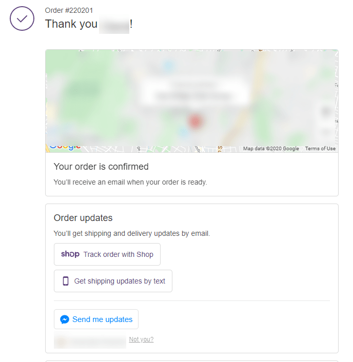
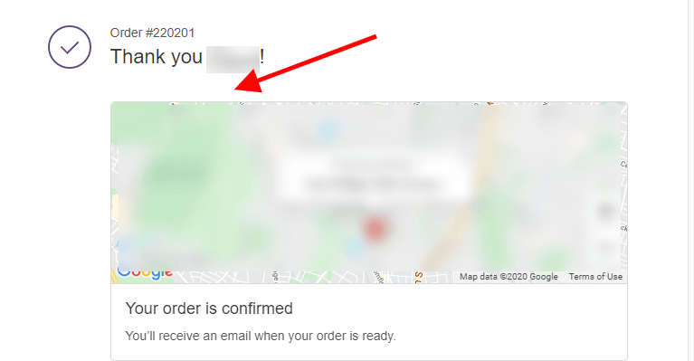
Ecommerce platforms generally do a good job at it. For example, Shopify does it well, with a prominent “Thank you” message and a map showing the shipping address. (Shopify also gives customers the option to sign up for shipping updates, which is an added bonus.)
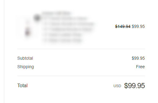
An overview of the shipping and billing details follow. And of course, there should be an order summary on the right-hand side that includes the products bought and total charges.
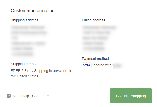
If you’re on Shopify, or any other ecommerce platform that does something similar to this, you’re good. If not, make sure you have this information on your “Thank You” page:
- Order-confirmation “Thank you” message
- Order summary
- Shipping and billing address
- Google map of the shipping address (bonus)
- Shipping updates (bonus)
That’s it—it’s pretty simple!
Now, let’s look at where most people mess up, which is the second–most-important purpose of the TYP.
Managing Expectations
This is so important, yet almost nobody’s doing it. All you need to do is simply tell your customers in a few sentences what will happen next, whatever that might be for your company. It can be in text format, a video, or both. Both are recommended because some people want to read whereas others prefer to watch a video.
Shopify does provide one sentence by default below the map. It says, “Your order is confirmed; you’ll receive an email when your order is ready,” but that’s nothing. It’s generic. It’s transactional. There’s no personality behind it.
Managing expectations is the most important piece when it comes to reducing or eliminating buyer’s remorse. People will start regretting their purchase decision if their “Thank You” page experience was terrible.
It happened to me not that long ago. I bought the latest workout program—Transform :20 by Shaun T (on Beachbody)—and, after all the time I put into reading the sales page, filling out my information, and getting excited about that product … all I got was: “Thank you for your order number xxxxxxx.”
That’s it—no order summary, no expectations, no shipping or billing details … nothing. How do you think that made me feel? Now, I’m aware of all of this stuff and I know the psychology behind it on a deep level, but it still made me feel “mehhh.” I felt buyer’s remorse.
And I love Shaun T and his workouts; I’ve gone through many of them. But that doesn’t change that my shopping experience was no good.
I want you to get this. This stuff is very powerful. The “Thank You” page experience clouds the perception of the whole product or service. After my lousy experience, I felt, not just less excited about my purchase, but also less assured about the company’s ability to deliver on their promises.
Are you familiar with the “halo effect”? The halo effect is a cognitive bias that we all have: we tend to judge the whole based on an impression of a single part.
That means that if I’m not happy with even one small piece of the whole experience, I’ll apply that judgment to my entire experience. This is it. This is the “halo effect” in action. In my mind, I’m putting this product down, making it seem less valuable now, just because of that negative TYP experience.
And, no—emailing your customers after they’ve purchased does not meet their TYP expectations. It complements it. So you should do both.
The question is, how?
Well, first, thank your customers and tell them how excited you are to have them on your team or family or whatever term you use to refer to your customers.
Make it personal, like you’re talking to one person, not many people. And use your brand’s voice. Make it sound like a real person is saying those words. Make it conversational. Here’s an example:
Hey Aleksandar, Thank you so much for trusting us enough to let us serve you. I want to personally congratulate you on your decision to melt that fat away once and for all. If you follow the program, your life will never be the same!
By now, you should have received your order confirmation email containing all of the shipping information and order details plus a little surprise from me. 🙂
As for your BeachBody digital membership, you can use it to start burning fat immediately. Access it right away by clicking on the “My Account” button in the top-right corner of your screen.
You’ll also receive an email from your personal FREE BeachBody coach, who will help you and support you on every step of your fat-burning journey.
If you have any questions or need help, please reach out to my support team at 888-888-8888 or at support@beachbody.com, and they’ll help you with any issues you might be experiencing.
I am super excited for you and can’t wait to hear about your results. Make sure you send us an email (at results@beachbody.com) with your results after you finish your program, and I will personally mail you a FREE Transform :20 official T-shirt to wear proudly.
Shaun T
Signature
If I had received something like this, do you think it would have made me feel better and more excited about my purchase? Heck yeah, it would have.
I would even add a “Congratulations” video where Shaun T himself welcomes me. That would have made me even more excited and committed to the program.
Do you think that after reading that, I would have let issues I was concerned about slide? Heck yeah.
Something actually did happen, and it made me resent my purchase even more. But if I had had an awesome “Thank You” page message like this, I wouldn’t have cared about the problem at all.
I hope this makes sense, because it’s crucial!
I recommend that, on Shopify, you add the video (or text) right below the “Thank You” message and above the map, on both desktop and mobile.
That way people will see it. They will see the “Thank you” message confirming their order was indeed placed, and then they will have their expectations set properly. The rest of the information will follow after. Okay? Let’s continue …
Social Sharing Icons
We always teach our students to remove the social sharing icons from their product pages and from your site completely. Why? Because nobody wants to share a site before they buy from it. Why would they? Would you share a random product on a random site, just because there was a button there? I wouldn’t either.
The TYP is where we put the social sharing icons, where your customers actually have a reason to share your product, especially if you did a good job at the last step (managing expectations on the TYP) and you got them excited about their purchase rather than regretting it.
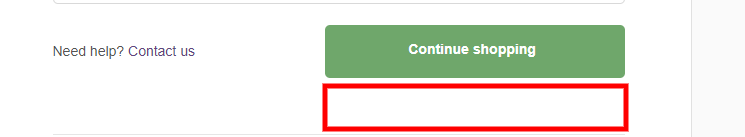
Here, if you add your sharing icons, a portion of your customers will actually do it. A good spot to add those icons is below the main call to action, which on Shopify is “Continue Shopping.”
Account Creation
This is another thing that wayyy too many stores do wrong. They force you to create an account before you can check out, which is one of the biggest conversion killers out there. In fact, according to the Baymard Institute, up to 37% of users will abandon a website because they were forced to create an account in order to complete their purchase.
The time to ask for account creation is after they place their order, on the “Thank You” page. Why? Simple:
- Now they actually have a reason to create an account. They just purchased from you. And if you incentivize them to create one (which you 100% should), they will be happy to do so.
- You already have enough of their information to create an account for them. You just need a password from them to finish creating their account—and that’s the only thing that you ask them for.
This is especially useful if you have or are trying to build a solid rewards/loyalty program. Here’s an example of how we’ve done this.
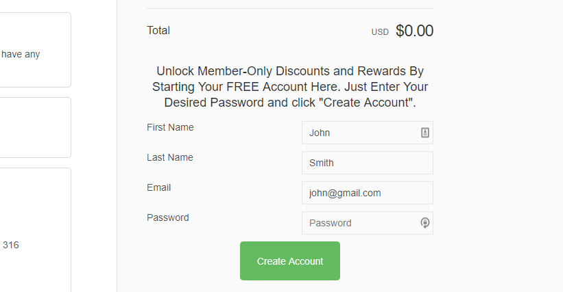
The name and email are prepopulated, and the user only needs to add a password. It’s simple but effective. If you don’t have a rewards program or don’t care about one, just say something like “Create your free account below to access all of your orders in one place and receive order updates and for faster ordering in the future” or something like that.
Customers who have accounts and log into their accounts when shopping generally convert significantly higher, so it is smart to incentivize them to create accounts. Of course, those accounts will be meaningless to them if your account dashboard page is terrible, but that’s a topic for another article entirely. For now, just remember what has been said here about account creation.
Referral Offers
Another thing you can do is to ask people for referrals. Referral traffic always converts on the high end, so it’s a good idea to offer incentives to customers for referring their friends.
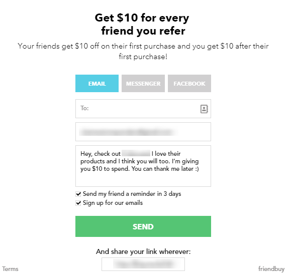
On Shopify, there are many apps that do this. The screenshot above is from an app called Friendbuy, but any other app will do; just search for a referral app on Shopify’s app store and pick from any that have good reviews.
Offers to Buy More
Last but not least, offer your customers the opportunity to buy more stuff. Link directly to other products from your store or simply offer them a discount for their next purchase.
You can go fancy here and use an app (some of those referral apps have an option for this as well; Friendbuy does not). Or simply add another line of text in the same message where you manage expectations. It’s simple, but it works.
That being said, remember that these discounts (or any incentive in general) work better if you are not throwing them around everywhere on your site. After all, you want to make your customers feel special. This should not be a discount that they can get anywhere else on your site. Keep that in mind.
Conclusion
And that wraps up our section for the “Thank you” page. Make sure you apply at least the first two practices on your store. As for the other four TYP customizations, they aren’t necessary but they’re good to have.
Buyer’s remorse is a real thing. The better you are at minimizing or alleviating it, the happier your customers will be and the higher the probability that they’ll come and buy again or refer you to a friend.
I hope you enjoyed this six-part series about optimizing revenue at your store. As a reminder, here’s everything covered in this series:
- Checkout
- Cart
- Product pages
- Category pages
- Homepage
- The “Thank You” page in this article
I covered a lot in these articles, but this is just the tip of the revenue optimization “iceberg.”
If you want to experience the powerful effect of revenue optimization on your business, you’ll want to read every single word on this sales page and grab your BGS Done-for-You Store Audit today. Let our team of 50+ revenue optimization experts audit your store. They’ll list every single issue and optimization opportunity on your store website, and they’ll deliver it to you on a silver platter, structured as a 30+-page pdf document.
If this isn’t the right timing for you, that’s perfectly okay. You are welcome to read all the articles listed above as well as the articles on this blog written by my colleagues. The information contained in this blog alone will make you a lot of money, if you apply it.
And with that said … it’s time for me to sign off.
To your success!
Aleks out.
Resources
Holst, C. (2018). Offer “delayed account creation” at the confirmation step (38% don’t). Baymard Institute.


About the author
Aleksandar Nikoloski
Aleks is BGS’s Head of Revenue Optimization, an author, and a speaker. He has helped rapid-scale dozens of 6, 7, and multiple 8-figure stores as part of BGS’s Amplify Partnership program. He has gotten one store from $2.6 million a year to $6.7 million a year in 24 months, while another from doing $300k/month to doing over $2 million/month in less than 6 months, just to mention a few. The BGS team calls him the “Site Whisperer” because of his ability to find site nuances that derail the customers’ journey and cause purchase friction. Extremely meticulous and analytical, he credits all of this success to data and accurate interpretation of that data, as well as his ability to implement and test new ideas almost immediately.