

Critical Ecommerce Usability Guidelines That No One’s Talking About!


How do you achieve critical usability for your store? Are there special guidelines or even an ABC-style usability guide that everyone should follow when building an ecommerce store?
We can answer some of these questions when you have a better understanding of your store, which you can get by reviewing your store’s current usability to see how intuitive it is to use. We can also look at how to make sure that homepage content, search automation, customer trust, and site style all work properly in your store.
But before we do that, let’s analyze how a successful ecommerce business has capitalized on using some key user experience features to its advantage.
Amazon
One of the largest ecommerce shopping retailers, Amazon, finds that their search automation feature works well for them and their customers. According to a Visual Objects study of user experience on some of the most popular websites, Amazon’s user experience is rated very highly (in first or second place) across most age groups. That’s why Amazon highlights this feature on all pages. Amazon’s search function is easy to use for an older generation who have started shopping online. It’s also very easy for young people to use. Although they prefer video content to text content, they are very familiar (and comfortable) with digital interfaces—not surprising given the time they spend online on different stores and apps.
The search function also has an autocomplete feature that finishes your search keyword before you’ve keyed all of it in. According to Crazy Egg, an autocomplete feature makes it easier to find specific products and provides keyword potential for more sales through product suggestions of similar type.
The second most interesting feature that Amazon uses is the algorithm that allows users to have a customized experience based on their current browsing history. The algorithm designs personalized recommendations of new products or product categories that may interest the user, to drive future sales.
Tailoring Ecommerce Usability to Your Users
Looking at the strongest Shopify ecommerce stores, you can see that they’ve worked hard to ensure that the user experience is world class and fits their customers. How can you ensure that the same is true for your site?
Ensuring that usability of your Shopify store is tailored to your users depends on what users are looking for when they visit your store. This is where we use data to define your user experience:
- You can use Google Analytics (GA) to determine numbers for the most frequently visited pages. You can also find out where in the user’s journey you lost them as well as what product(s) users from different regions are searching for or are more interested in.
- Heatmap tools such as Lucky Orange and Hotjar allow you to track your user’s journey, letting you know when they reach their destination page, perform actions, and drop off.
A combination of GA and heatmap data provides you with important information that tells you what you need to change or improve about your business to improve user experience. When you review the heatmaps and click maps, you can segment the data to identify the root cause of a user experience problem:
- Are mobile users unable to click some items?
- Does the image zoom feature make it difficult to scroll down?
- Do users click on some images or text that are not clickable?
These are all questions that can be answered when you look at the data. Those answers can help you fix problems that have led to plummeting sales.
In the sections below, I’ll describe some of the most common usability issues to consider before you use data to customize your users’ experiences.
Homepage: What Should You Show Visitors?
The homepage is the face of your business and must display what you sell. A well-designed homepage ensures that users know right away what your business is selling. Just as with a retail display window, your homepage also needs to attract the attention of visitors who have landed at the store because of an ad and of passersby who may have arrived there by chance but may be interested in your products.
In the desktop view, make sure that all your categories are displayed in the menu bar above the header image. In the mobile phone view, those categories should be available in the “hamburger” menu near the top-left corner of the screen.


Also include the best-seller categories or new arrivals in large, eye-catching banners. These should be placed below the header image to highlight the product categories in a visual way.
And don’t forget the search function. It should be located in the top section of the page so that users can search for specific products right away.
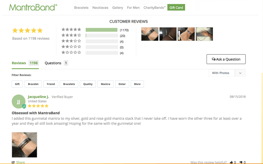
Be sure to include a “trust section” on the homepage where you can give users a reason to trust you:
- If you are a big brand and have been featured in several magazines or shows, you can add an “As seen in” section to indicate this.
- If you are a start-up brand and haven’t yet been introduced, you can increase trust by using customer reviews. Let users know what your customers have to say about you.
This trust section should be placed just above the footer section so that it’s visible to users before they get to the footer in the bottom section of the page.
Style: Making Consistent Choices That Go Hand in Hand with Usability
Font type and size
There are millions of fonts, and deciding which one to use for your business can be tedious. It can be easier to exclude the ones you shouldn’t use. For example, you don’t want to select a font that accidentally changes the meaning of the text. Some good examples of font-related errors can be seen here.
When choosing a font, make sure it is legible, matches your brand personality, and appeals to the eye.
Color
The definition of your brand through color is very important because this is how your customers remember you. Amazon uses an orange arrow/smile in their logo and also uses the color in other elements on the site. The blue in Facebook’s letter “f” logo is used throughout that site.
Just as big brands do, choose a color that matches your brand and then stick with it. Remember that it’s important to make the right choice once. Rebranding and changing your style can cost you customers or force you to work twice as hard to make users trust that you’re the same brand you were before the rebranding.
Navigation: Rules You Won’t Want to Miss
People like similarity so you don’t want to do something completely different from other ecommerce businesses. In fact, it’s good to follow the norms of navigation that are listed below:
- In a browser, an index finger indicates that an item is clickable.
- An arrow pointing to the left means that you can return to the previous page, while an arrow pointing to the right means that you can go to the next page.
- At the bottom of a collection page, “1,” “2,” “3,” and so on indicate pagination. If you click on “2,” you expect to go to page 2 to see more products.
- If you click a drop-down arrow, more options appear.
- If you click an X in a pop-up, the pop-up closes.
- A cogwheel icon indicates that settings are located there.
- If you click a shopping cart icon, you are taken to the shopping cart page.
- A “404 error” means that that page is not available.
- Clicking the “Add to Cart” button adds the product to the shopping cart.
- If you paste the coupon code in the coupon box and click on the “Apply Coupon/ Discount” button, the discount amount offered is deducted from your total cost.
- A “Checkout” button redirects you to the checkout page.
- A “Complete Payment” button means that you are about to add your credit card details to complete the payment.
When you use these navigation rules, your users know how to navigate because they are already familiar with them. If you change your navigation rules, you risk confusing your users. They could even drop off because you’re introducing them to something that they’re not interested in and that they’re sure shouldn’t work that way.
Conclusion
Critical usability depends on so many factors, especially the needs of your users. Sometimes successful ecommerce usability depends on doing things in a way that’s similar to many other ecommerce stores, as with navigation rules. In a future article, we’ll look at navigation details page by page so that you can add or delete elements in your store to improve the user experience.
Resources
Low, J. (2018). Five fundamental guidelines for ecommerce usability design. Crazy Egg.
McKeon, K. (2019). How different generations view and use the top websites. Visual Objects.


About the author
Irene Wanja
Irene, a skilled Revenue Optimization Specialist for Build Grow Scale, combines an unparalleled focus on user research and a deep understanding of the ecommerce customer journey to orchestrate optimal shopping experiences. With an uncanny knack for detecting and addressing customer pain points through meticulous user testing, she utilizes tools such as moderated user tests, heatmaps, scrollmaps, and clickmaps to fast-track improvements in user experience and usability. Her keen eye for detail aids in swiftly spotting potential issues and implementing solutions, all while working closely with store owners and applying her intricate comprehension of user interactions. Passionate about software and technology, Irene immerses herself in enhancing her clients' business clarity, efficiency, and user satisfaction. Even though the value of user experience doesn't conform to a conventional numerical scale, the tangible outcomes of her work—improved user experience, amplified retention rates, and reduced customer support issues—are testaments to her prowess. Beyond her revenue optimization skills, Irene is a skilled writer and copywriter. She weaves her profound insights into engaging prose, crafting content that not only resonates with diverse audiences but also demystifies the complexities of user experience, consequently benefitting businesses worldwide.