

Fine-Tuning Your Ecommerce Micro Conversions for Big Wins: Cart Page, Part 4 of 5
This is the fourth article in a five-part ecommerce optimization series on using micro-conversions to increase that one glorious metric all business owners and optimizers obsess over—conversion rate.
If you’re interested in learning all about the micro-conversions associated with each step of the funnel and how each micro-conversion helps increase the overall conversion rate of the store, read on (and also stay tuned for the last article in this series!).
Note: You can see part 1 on micro conversions and the homepage here, part 2 on micro conversions and the category page here, and part 3 on micro conversions and product pages here.
If you’re not familiar with micro-conversions, don’t worry! Here’s a quick overview:
- A conversion often refers to the final transaction on the checkout page—payment. (This is the “conversion” referenced in the “conversion rate” metric.)
- A micro conversion refers to any single step a customer takes anywhere in the funnel. For example, on a product page, the micro conversion is to add a product to a cart (this action is called an add to cart or ATC). On the cart page, the micro conversion is to proceed to checkout, and so on.
So what are some super-simple things you can do to help improve those micro conversions and ultimately improve your overall conversion rate?
In this article, I’ll address some best practices that Build Grow Scale (BGS) uses to improve the performance of the cart page.
Cart Page
The main goal of the cart page is to get the customer to move to the checkout. It’s that simple. To accomplish that goal, make sure to:
- Be clear and concise in your messaging. For example, make it incredibly obvious that an item has been added to the cart by adding a confirmation announcing that something has been added.
- Keep distractions to a minimum. Many ecom store owners try to upsell or cross-sell here. Although it can work for some stores, the complex nature of combining an upsell with the simple needs of a cart makes it difficult to execute properly. That’s why I advise most people to relocate their upsells when I see that they’re in the cart.
- Make your call to action (CTA) the most prominent feature. You want visitors to move on to checkout, don’t you? In order to do that, they need to actually see the CTA.
- Place your “Add to Cart” (ATC) button above the fold.
Note: “Above the fold” refers to the upper portion of a webpage, where content is visible when a user first interacts with that page. No scrolling is required to see the element—in this case, the ATC button.
Although a different issue than the points above, here’s something I often see done poorly that should be corrected as soon as possible: The “Continue Shopping” button should act to close the cart. It should not reroute users to the homepage or elsewhere. It should put them back on the page they were on before they added the product to their cart. This helps keep confusion over navigation to a minimum.
There are other tactics you can use to increase the percentage of users who move on to the cart page. But starting with the four points above will help ensure that your cart pages get a boost in the micro-conversion.
Best Practices
Now that you know about the micro-conversion on the cart page (the percentage of people who continue to the checkout), we can look at what best practices you can implement to increase micro conversions.
Note: Keep in mind that best practices aren’t foolproof and only work about 65% of the time, even when implemented correctly. Any change made to your site should be tested, regardless of what you think is best!
1. Clear messaging
When a user takes action on your site, they shouldn’t have to guess whether or not the action they took has happened. The same applies to your cart page. When a user adds something to the cart, make it absolutely clear that the action went through.
Things like confirmation messages, cart quantity count, and so on can help users confirm that their action actually took place. The following recommendations can help to do just that:
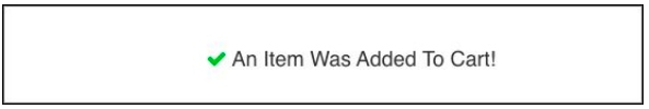
- Use a confirmation message.
Note: We use this confirmation message for one of our Amplified Partner stores. It appears when an item is added to the cart.
- Use an item-quantity counter on the cart icon.
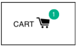
Note: The teal bubble with the item number tracks the quantity of items in the cart.
By implementing these two messages, you ensure that users won’t be wondering if the ATC button is working. They’ll understand that an item has been added to their cart.
2. Distractions
Distractions are counterproductive to the main goal of the cart page (having the user move to checkout). In most cases, adding distractions to the cart page greatly hinders micro-conversion performance in the cart.
The following screenshot captures a cart that’s handling this poorly. You can see how easily a customer could be distracted by the additional products on the page.
In this case, there are a few things this cart does that mitigate distraction:
- The products being offered are stickers, so customers aren’t required to abandon the cart to explore sizing, finish, and so on.
- The CTA is massive, making it incredibly difficult to overlook.
Given these factors, this cart’s upsell may do well.
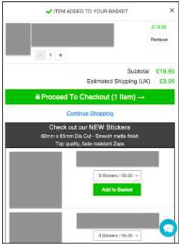
But, as mentioned above, it‘s better not to tamper with the page if you’re new to the world of revenue optimization (RO) and aren’t sure how to test your changes to measure if there is any improvement.
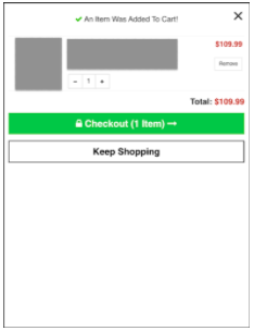
Here’s an image of a well-executed, high-performing slide-out cart. Compared to the previous cart, you can clearly see how much simpler it is. Do not be fooled, there’s power in simplicity, and utilizing it will leave you with very thankful users.
In both examples there are two things that I’d like to highlight:
- The CTA is very prominent. How could users possibly ignore it?
- The “Keep/Continue Shopping,” when clicked only closes the cart. It doesn’t transport users elsewhere. It returns users to the page they were previously on. It’s a small change, but helpful.
Each example of this button may be executed differently, and that’s alright because different audiences respond to different things.
Conclusion
When it comes to optimizing ecommerce stores, there really isn’t much emphasis placed on micro conversions. Most people focus on that one main metric—conversion rate. Although it’s a great metric—and I’m certainly not advocating that we ignore it—it’s only one metric that’s meant to measure checkout-page performance.
What would happen if, instead, we focused our attention on earlier stages in the funnel with the goal of moving more customers deeper into the funnel? Always remember that the main goal of the cart page is to funnel customers to the checkout page, so make sure to use the concepts outlined in this article to accomplish that goal!
Start to pay attention to your micro conversions and let me know if any of these best practices help your cart page!
And stay tuned for the fifth article in this series, which covers the final step in the funnel—the checkout page.


About the author
Haley Spindler
Haley is a Revenue Optimization Expert with Build Grow Scale. Optimizing underperforming pages is her passion and data is how she gets it done. Haley is quite the expert on the subject and has been dedicated to mentoring the future revenue optimizers of Build Grow Scale as the company’s Director of Training. Haley is an avid animal lover and when she’s not in the virtual office, she can be found at the beach with her dog.