

Fine-Tuning Your Micro Conversions for Big Wins: Homepage, Part 1 of 5

This five-part mini series is all about micro conversions and how to use them to increase the one glorious metric all business owners and optimizers obsess over—conversion rate. If you are interested in learning all about the micro conversions associated with each step of the funnel and how each micro conversion aides in increasing the overall conversion rate of the store, read on (and stay tuned for the next four articles in this series!).
If you’re not familiar with micro conversions, don’t worry! A conversion often refers to the final transaction on the checkout page (and is the “conversion” referenced in the “conversion rate” metric). A micro conversion refers to any single step a customer takes anywhere in the funnel. For example, on product pages, the micro conversion is “add to carts” (ATCs); on the cart page, the micro conversion is “proceed to checkouts,” and so on.
So what are some super-simple things we can do to help improve those micro conversions and ultimately improve our overall conversion rate?
In this article, I’ll address some best practices Build Grow Scale (BGS) uses to increase the performance of the homepage (stay tuned for the other steps of the funnel later in this series of articles).
Homepage
Before we start making changes to the homepage, it’s important to know what the homepage should do. It has a few primary functions:
- It should clearly articulate to customers what you sell. It needs to be so clear that customers (1) immediately know that they are in the right spot, meaning that they have, indeed, landed on the website they intended to visit and (2) have no questions about what you offer.
- It should provide incredibly clear navigation. This is important because your navigation will be the road your customers use to get to the next step in their buying journey. If that next step is unclear or difficult to use, customers aren’t likely to continue the journey. (If it is really hard to use, it’s completely possible that they will be unable to use it even if they want to.) Remember, customers probably won’t take the time to work through things—if it’s difficult, they’ll bounce.
There are other things that the homepage should do, but focusing on these two alleviates most of the pain points your customers face.
Now that we know about clarity and ease of use on the homepage, what best practices can we implement to increase the number of customers who view the collections page(s)?
Note: Best practices are not foolproof and only work about 70% to 85% of the time, even when implemented correctly. Any change made to your site should be tested, regardless of what I say or of what you think is best!
1. Main menu navigation
The main menu navigation should be obvious to all users. People should not have to guess if they’re looking at a navigational tool—it’s function should be super clear. The clearer the navigation, the better it is at facilitating the desired micro conversion on this page—proceeding to category or product pages.
The easiest way to accomplish foolproof navigation is to make it prototypical, meaning that it’s what people are used to seeing. That way, when they see your navigation, they automatically know how to operate it.
In addition to being easy to operate, it should be incredibly clear to the user where they’ll be taken to once they make a selection in the navigation. The easiest way to accomplish this is to give the navigation destinations abundantly straightforward names.
For example, if you sell clothing, don’t call the navigation destination “Saturday Night Looks.” Instead, call it “Black Mini Dresses” or whatever is most fitting for the actual product. As long as the name gives users a “look” at what’s on the other side of the selection customers are making, navigation will be clear.
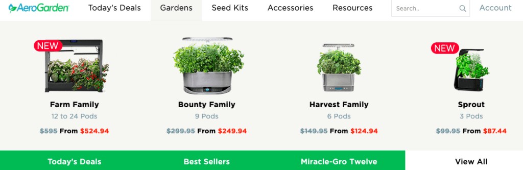
The navigation pictured above does a lot of things wrong, but something it does really well is the addition of micro text under the product name to increase clarity. If you give your products hard-to-interpret names, consider adding elements like this to improve clarity!
Note: You’ll likely notice that about 80% of your traffic is mobile (as is usually the case), so make sure to give a little extra TLC to your mobile experience! An easy way to do this is to ensure that you’ve labeled your mobile hamburger icon as “MENU.”
2. Main menu category organization
You probably have multiple categories in your store’s main menu navigation. For example, if you sell clothing, you may have men’s, women’s, and children’s clothing. You may also have dresses, pants, skirts, tops, and shoes.
If so, your category organization is very important to the success of this micro conversion (which is to “proceed to category pages” or “have session with category page views”). What’s the easiest way to ensure that success? Organize from most to least popular.
For example, if your best category is women’s clothing, followed by children’s, then men’s, you should put the menu items in that order. Then take it a step further. If under the women’s category, the best- to least-converting subcategories are shoes, dresses, skirts, pants, and then tops—it should be organized in that manner under the women’s main category. The same applies to the children’s and men’s clothing categories.
Also remember that for those people who read from left to right, you’ll want to place the categories in descending order from the left in a horizontal menu. For those reading right to left, descending order would start at the right for the same type of menu. If your menu is vertical, people will read top to bottom and the menu should be organized from top to bottom, in best-converting to least-converting order.
3. Search bar
What about those customers who still can’t find what they’re looking for despite your navigation being foolproof? Search bar! The most important thing about a search bar is visual hierarchy. Make the search bar super prominent so nobody can miss it, in that way supporting the micro conversion here, which is to proceed to product or category pages (depending on the next step of your funnel).
See the example below of the search bar on a BGS Amplify partner’s store on desktop and mobile. You’ll notice how large it is and that the actual button is a color that stands out from the rest of the colors on the page to draw the user’s attention.
We’ve also included the most-searched-for search terms as suggested text in the actual search bar. This has a huge effect on the way people search. In fact, in most stores, visitors who use the search bar are anywhere from three to seven times more likely to make the final conversion than visitors who don’t. So it makes sense to give the search bar a front row seat!

Note: Track your search terms so that you can pull Google Analytics data on what your true most-searched-for terms are. Then use those in the search bar instead of guessing what they might be.
Conclusion
When it comes to optimizing ecommerce stores, there really isn’t much emphasis placed on micro conversions. Most people focus on that one main metric—conversion rate. And although it’s a great metric—and I’m certainly not saying to ignore it—it’s only one metric, intended to measure checkout-page performance.
What would happen if we focused our attention on moving more customers later into the funnel? Start to pay attention to your micro conversions, and let me know if any of these best practices help your homepage!
And stay tuned for the next article in this series, which covers the step in the funnel after the homepage—category pages.


About the author
Haley Spindler
Haley is a Revenue Optimization Expert with Build Grow Scale. Optimizing underperforming pages is her passion and data is how she gets it done. Haley is quite the expert on the subject and has been dedicated to mentoring the future revenue optimizers of Build Grow Scale as the company’s Director of Training. Haley is an avid animal lover and when she’s not in the virtual office, she can be found at the beach with her dog.