

How Less Form Fields Transform E-commerce Checkout Experiences
Are you tired of spending endless minutes filling out long and tedious checkout form fields when shopping online? Well, you’re not alone.
As anyone who has ever made an online purchase knows, the process can be fraught with difficulties. Even when you’re sure you’ve found the perfect item at the right price, the checkout page can be a frustrating obstacle. All too often, your ecommerce store’s customers are left feeling confused and frustrated by the checkout process, and we are well aware of this. Users face a number of problems on at checkout, which can lead to frustration and ultimately … lost sales.
One of the biggest problems ecom store owners share with us is that their customers are often confused about how to complete a purchase. This can be due to unclear instructions, a lack of guidance from the store or long checkout form fields that exhaust the user. As a result, customers may abandon their purchases altogether.
Your customers’ problems are your problems
NO PURCHASES = NO REVENUE
The Impact of Excessive Checkout Form Fields
Excessive checkout form fields can overwhelm and frustrate customers, leading to cart abandonment. When customers are faced with a lengthy and complicated checkout form, they may become discouraged and decide to abandon their purchase altogether.
Imagine the frustration of having to fill in unnecessary information, such as multiple phone numbers or detailed personal preferences. This not only wastes the customers’ time but also creates a negative experience that can deter them from completing the transaction.
The checkout page is one of the most important pages on your store, and a long or confusing form field can quickly lead to lost sales. There are a few reasons why you might be considering a long checkout form for your online store. Maybe you’re trying to collect too much information upfront, or you’re requiring customers to create an account before they can complete their purchase. Whatever the reason, it’s important to remember that a long and complicated checkout process will inevitably lead to lost sales.
Customers are simply not willing to take the time to fill out a lengthy form, especially if they’re not sure what information is actually required. If you want to improve your conversion rate and increase sales, it’s essential to reduce the length and complexity of your checkout form. By making the process quick and easy, you’ll give your customers the best possible experience—and that’s sure to pay off in the long run.
Picture this …
You’ve just found the perfect item, added it to your cart, and then you’re faced with a page of questions that takes forever to fill out while you’re just trying to make a quick purchase.
The question for you is …
If you were the customer, would you
leave the store or proceed with the purchase?
Understanding Customer Frustrations With Lengthy Form Fields
To truly grasp the frustrations customers face with lengthy form fields, you should closely observe their behavior and listen to customer feedback. When customers encounter a checkout form with numerous fields to fill out, they often become overwhelmed and frustrated. They may abandon the purchase altogether or provide inaccurate information just to speed up the process.
Lengthy form fields require customers to spend more time and effort, which can lead to a negative user experience. Customers want a seamless and efficient checkout process; lengthy form fields hinder that. By understanding and addressing customer frustrations with lengthy form fields, businesses can improve their conversion rates and customer satisfaction.
Simplifying the form fields and only asking for essential information will make the checkout process smoother and more enjoyable for customers.
Why you need to A/B test form fields to find out the best length
You’ll find that understanding the effectiveness of your checkout form’s length is crucial, and it’s through the process of A/B testing that this knowledge emerges. Without any doubt, A/B testing is a potent way, capable of revealing significant insights about your customers’ behaviors and preferences.
When you conduct A/B testing, you’re comparing two versions of your checkout form to see which one performs better. You might think that a lengthy form with all possible queries will gather more information about your customer. However, data suggests otherwise. It’s clear: fewer form fields lead to less friction, causing users to complete their purchase more swiftly.
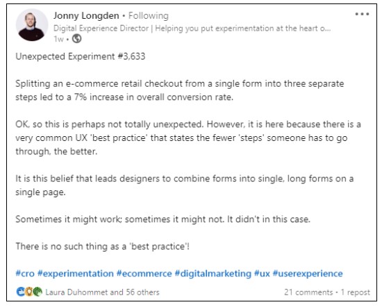
Johnny Longden of Journey Further conducted an A/B test of the form fields and here is what he had to say..
Splitting an e-commerce retail checkout from a single form into three separate steps led to a 7% increase in overall conversion rate.
OK, so this is perhaps not totally unexpected. However, it is here because there is a very common UX ‘best practice’ that states the fewer ‘steps’ someone has to go through, the better.
It is this belief that leads designers to combine forms into single, long forms on a single page.
Sometimes it might work; sometimes it might not. It didn’t in this case.
There is no such thing as a ‘best practice’!
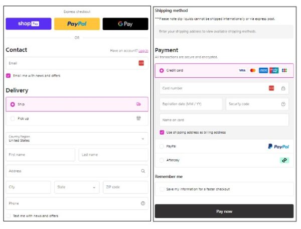
Still, this doesn’t mean you should eliminate all fields. It’s about striking that perfect balance. So, which fields should you keep? That’s where user-centricity comes in. You must understand your customers’ comfort level in sharing information. For instance, while email and shipping address are usually non-negotiable, queries about age, income, or profession might be seen as intrusive.
Now, how would you know if you’ve achieved the right balance? You guessed it – A/B testing. By continuously testing and tweaking, you can ensure your checkout form is as streamlined and efficient as possible, leading to higher conversion rates and happier customers. Remember, it’s not about what you want to know about your customers; it’s about what they’re willing to share.
Provide Clear Information on the Checkout Form Fields
Additionally, in ecommerce, being upfront about shipping costs and delivery times is crucial for maintaining a good relationship with your customers. On the checkout page, customers should be given clear information about how much it will cost to ship their order, including all hidden fees and taxes.
Furthermore, the delivery times should be presented in a customer-centric way, rather than in terms of the business’s operations. For example, if a customer orders an item on Monday and your store only ships orders on Wednesdays, it’s better to say that the estimated delivery time is “3-5 days” rather than “2 days.” Being transparent about shipping costs and delivery times will help build trust with your customers and ensure a smooth shopping experience.
Additionally, in ecommerce, being upfront about shipping costs and delivery times is crucial for maintaining a good relationship with your customers. On the checkout page, customers should be given clear information about how much it will cost to ship their order, including all hidden fees and taxes. Furthermore, the delivery times should be presented in a customer-centric way, rather than in terms of the business’s operations. For example, if a customer orders an item on Monday and your store only ships orders on Wednesdays, it’s better to say that the estimated delivery time is “3-5 days” rather than “2 days.” Being transparent about shipping costs and delivery times will help build trust with your customers and ensure a smooth shopping experience.
Preventing Errors on The Checkout Form Fields
While you might enjoy the convenience of password managers, they can often introduce a number of unexpected form field errors, and this is particularly problematic in the ecommerce checkout process. These handy tools are meant to make your life easier, but sometimes they can do just the opposite.
According to research, about 75% of online shoppers abandon their carts due to frustration with the checkout process, and password managers can contribute to this. They often fill in the wrong information or fail to fill in required fields, leading to errors and delays that can push customers away.
Case in point, password managers might auto-fill your shipping address in a billing address field, or vice versa. Similarly, they might enter an old, saved password instead of a new one you’ve just created. They might even populate credit card fields with incorrect or outdated information. Each of these errors can cause checkout delays, leading to customer frustration.
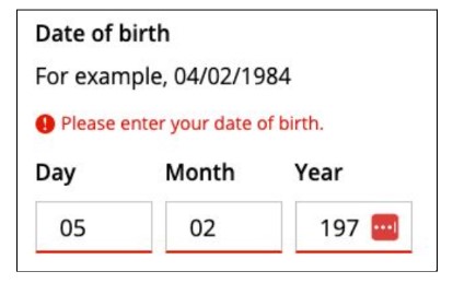
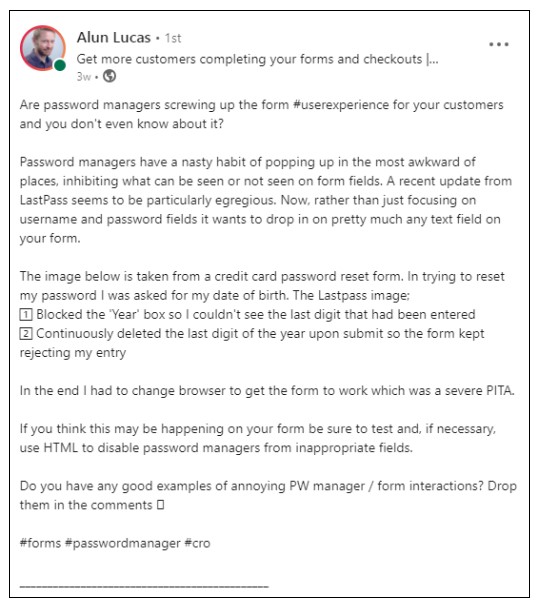
Alun Lucas from Zuko Analytics says…
Password managers have a nasty habit of popping up in the most awkward of places, inhibiting what can be seen or not seen on form fields. A recent update from LastPass seems to be particularly egregious. Now, rather than just focusing on username and password form fields, it wants to drop in on pretty much any text field on your form.
The image below is taken from a credit card password reset form. In trying to reset my password, I was asked for my date of birth. The Lastpass image;
- Blocked the ‘Year’ box so I couldn’t see the last digit that had been entered
- Continuously deleted the last digit of the year upon submit so the form kept rejecting my entry
In the end I had to change browser to get the form to work which was a severe PITA.
If you think this may be happening on your form be sure to test and, if necessary, use HTML to disable password managers from inappropriate fields.
Building Trust in Customers in the Checkout Form Fields
Another important thing to keep in mind is that customers need to feel confident their personal information is safe when they’re shopping with you. Unfortunately, many websites don’t do a good job of protecting their customers’ data. People want to know their information is safe when they input it on a checkout page, and ecommerce businesses need to be transparent about how they’re protecting customer data.
There are a few ways to build trust with customers in this area. First, make sure your website is encrypted and secure. This will show customers that you take their security seriously. Second, be clear about what information you’re collecting and why. Customers will be more likely to trust you if they understand why you need their personal information. Finally, to ensure a good user experience and effective customer journey, give customers the option to control their own
To wrap things up …
At Build Grow Scale, we’re extremely well-versed in the challenges ecom store owners face regarding their checkout page, as well as the importance of making sure your customers have a smooth and easy experience when completing a purchase with you. Thankfully, BGS can give you step-by-step guidance to overcome these obstacles and ensure your checkout process is smooth and user-friendly. Also, the recent update from Shopify having all stores with the one-page checkout form has made the checkout process clearer for customers while increasing conversions for store owners.
Frequently Asked Questions


About the author
Aleksandar Nikoloski
Aleks is BGS’s Head of Revenue Optimization, an author, and a speaker. He has helped rapid-scale dozens of 6, 7, and multiple 8-figure stores as part of BGS’s Amplify Partnership program. He has gotten one store from $2.6 million a year to $6.7 million a year in 24 months, while another from doing $300k/month to doing over $2 million/month in less than 6 months, just to mention a few. The BGS team calls him the “Site Whisperer” because of his ability to find site nuances that derail the customers’ journey and cause purchase friction. Extremely meticulous and analytical, he credits all of this success to data and accurate interpretation of that data, as well as his ability to implement and test new ideas almost immediately.