

The Hierarchy of Conversions: A Five-Step Guideline to Optimizing Your Store
I’ve had the privilege of coaching at many Build Grow Scale (BGS) events (learn more about BGS Live 2020 here). As a result, I’ve worked one on one with hundreds of business owners who are concerned with sustainably increasing their conversion rates.
Every time I sit down to take a look at a site, owners are completely flabbergasted that I spend the first part of our session clicking buttons, checking fonts, assessing site speed, running the site through BrowserStack (a good tool for testing other operating systems and for cross-browser testing), and the like rather than addressing things that they think an optimizer “should” spend their time doing (like working on copywriting, offers, designs, or even color schemes, for example).
The truth is that most people could experience a drastic increase in conversion rate if they just focus on more of the technical aspects of their websites. In this article, I’ll walk you through the hierarchy of conversions that Build Grow Scale uses to conduct optimization practices on all our clients’ stores.
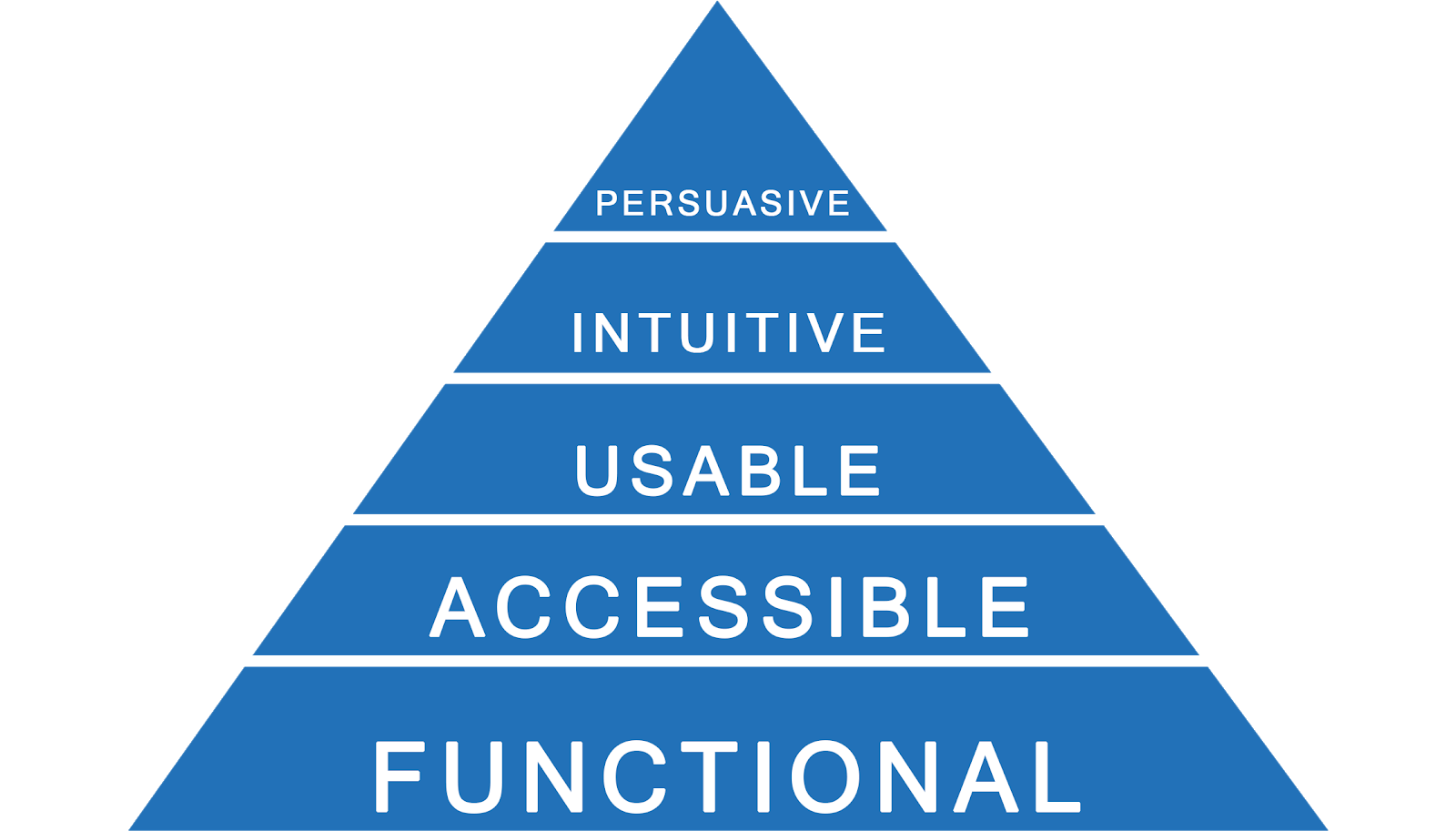
This pyramid showcases the five steps you can take to improve your store’s conversions. The first step, function, is about making your site error-free so that it functions perfectly—which is an easy way to improve the experience of users. Improving accessibility (so that users can operate your site) and then usability (so they can more easily understand it) are more complex than catching and fixing errors but also more rewarding. Intuitive improvements are about answering customer questions when they need those answers. The final step, being persuasive—that is, increasing customer motivation—is possibly the most complex and rewarding of the five steps, but it shouldn’t be tackled until all other steps are finished.
1. Functional
First and foremost, your website should function properly. This is my absolute favorite step when working with clients because it usually produces the easiest and quickest wins. You can even complete this step without tracking (although I’m certainly not advocating that you forego tracking! In fact, this step of improving function would be way easier with tracking).
It is vital for your business that you track via Google Tag Manager (GTM) and Google Analytics (GA) to get proper insight into the current workings of your website. Interested in setting up tracking but you’re not sure how? Learn more about our Google Tag Manager and Analytics tracking services.
Focusing on function means finding and fixing any and all errors and bugs on your website. Are there links that are sending users to a 404 page? Do you have images that aren’t rendering? Is your shoppable Instagram not displaying correctly? Does your site work on all operating systems and browsers?
It’s imperative that all errors be fixed before addressing anything else. It’s actually so important that we have team members whose sole job it is to hunt for any errors on our amplified partner stores.
Take this scenario for example: You sell gym shoes online, and your average order value (AOV) is $100. You typically average about a thousand orders per day. Roughly 60% of your orders are from Safari, 30% from Chrome, and the remaining 10% from Internet Explorer. If your “Add to Cart” button (ATC) suddenly loses function for Internet Explorer browsers, you will automatically lose 10% of sales. That means you automatically lose $10,000 in revenue … from a bug that is literally not allowing customers to give you their money. Sure, you might ask yourself, “Who even uses Internet Explorer anymore?” but what could you do with an extra $10,000 that you might get by making a simple fix?
That is obviously an extreme example, but it just goes to show you how important the function of your site truly is. Again, that’s why I say this is my favorite part!
2. Accessible
After you are sure that your site functions properly, the next step in the hierarchy of conversions is accessibility. Accessibility ensures that all people of all skill sets and backgrounds are capable of using your site.
For example, a client store of BGS serves a primarily older demographic. When the font size was increased sitewide, there was a dramatic increase in conversion rate. An easy way to make sure that your site is truly at its best in terms of accessibility is to work with this accessibility checklist. If you’re not too savvy about coding, I suggest working side by side with your developer.
Another great way to assess where your site might have accessibility pitfalls is through user testing. If you’ve been following BGS for any length of time, you’ve heard us proselytizing the massive importance of user testing for the overall health of your website. If you’re not yet familiar with user testing, I suggest reading this article written by another revenue optimization wizard, Casey Brown.
3. Usable
After you are sure that your website is completely accessible, it’s time to move on to usability. When it comes to usability, it’s important that you consider the ease of use for people. How easy is it to use your site? Are the page designs consistent throughout? Is cognitive load at a minimum? Many people confuse usability and accessibility. Accessibility is the step that ensures that the user has the ability to operate the site (e.g., bigger font sizes for an older demographic). Usability ensures that the user can comprehend (with little to no effort) how to use the site. This is what I call the “Homer Simpson” step. Simplify your site—yes, dumb it down! Even the most tech-savvy, “knock your socks off with their intelligence” type of people don’t want to have to think about using your site. If they have to think about it or have to put effort into it, they will leave your site.
User testing is helpful for this step too. When running your user tests, make sure to pay close attention to what your users are doing. Is there a certain point in the funnel where customers are getting lost, stuck, overwhelmed, and so on? If the answer is yes at any point in the user test, then you know you need to focus some attention on hypothesizing split tests to address your findings. TryMyUI is great for user testing. Although it is a pricier option than some, you are paying for the quality.
Convert is great for A/B testing, although I highly recommend that you don’t rely on its provided statistics. I recommend you link your test to a custom report in Google Analytics (in Convert you can link to your custom report by choosing Google Analytics, Universal Analytics, and then the corresponding dimension associated with the custom report you have set up in Google Analytics). There you can trust the data and make informed decisions on your test. Remember that every test needs to reach statistical significance before you can definitively make an informed decision backed by data and not by guesses! If you’re unfamiliar with proper testing statistics, then I suggest using an online significance calculator to help with your calculations—there are plenty of them out there!
4. Intuitive
Now that your website is usable, it’s time to focus on making it intuitive. This step requires that you pay attention to what your users need and when they need it. It’s absolutely imperative that you answer your customer’s questions at the appropriate point so that you reduce friction for them.
That also means that it’s time to ditch the dreaded (and usually completely fabricated) FAQ page. If you have a FAQ page, it indicates that you (1) haven’t allocated time to actually making sure that your site is intuitive and answers the user’s questions and (2) that you probably didn’t even put actual FAQs on that page and instead chose to use the FAQ page as an opportunity to “sell” (which your users see through, by the way). If I have a clothing site and my number one friction point is “unclear sizing,” then it would be wise for me to include a sizing chart on the product page of each product. This step is truly about addressing friction at the right point on your website.
5. Persuasive
The final step in the hierarchy of conversions is persuasion. This is the step that the vast majority of people that I’ve coached have tried to do first. That’s because it usually produces the highest returns and therefore is the most attractive step.
It’s the step that really focuses on giving users a reason to want to complete the checkout. All the other steps were about creating an environment that gave users the ability to use the site, but this step is unique because it focuses on increasing their motivation for completing their purchase.
Unfortunately, though, this step won’t work if all the other steps before it aren’t yet completed. Think about it: if you’re practically giving away your sneakers, but your ATC button isn’t functioning properly on Internet Explorer browsers, then it doesn’t matter how great your deal is because people literally can’t buy (and you’d be losing that 10% of sales).
Overview
The order in which you begin to optimize a website is massively important. You wouldn’t put your shoes on before your socks. Similarly, you don’t want to begin optimizing your website by focusing on persuasion.
Resources
Henry, S. L. (ed.). (2018). Web content accessibility guidelines (WCAG) overview. W3C Web Accessibility Initiative (WAI). https://www.w3.org/WAI/standards-guidelines/wcag/


About the author
Haley Spindler
Haley is a Revenue Optimization Expert with Build Grow Scale. Optimizing underperforming pages is her passion and data is how she gets it done. Haley is quite the expert on the subject and has been dedicated to mentoring the future revenue optimizers of Build Grow Scale as the company’s Director of Training. Haley is an avid animal lover and when she’s not in the virtual office, she can be found at the beach with her dog.