

User Testing: The Massively Underutilized Holy Grail of Increasing Your Shopify Store’s Conversion Rate
Your ecommerce store is leaking money
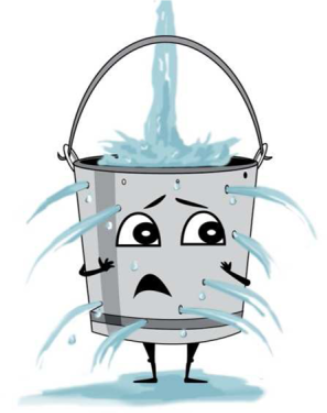
Imagine you have a bucket with multiple holes in it and you’re filling it with water. That water represents the potential sales and revenue escaping through the holes.
Your store is very similar—however, with an actual bucket, you can clearly see where the holes are, making them easy to fix. Unfortunately, though, we are pretty much blind when it comes to our own websites.
Nobody has issues understanding or navigating a website they personally designed. And that’s the problem.
Is your website UX (user experience) designed for you … or for your customers?
The “holes” in the leaky bucket analogy represent anything that causes friction in the buying process in your ecommerce store: issues with clarity, poor navigation, bugs, slow speed, failure to address common objections, etc. And they are extremely difficult to spot. So, how do we find them? Without a doubt, the single best method for finding the holes in the leaky bucket is user testing.
User testing is simply a process of finding people to browse your online store and perform certain tasks, while both their screen and voice are being recorded. They complete tasks as they narrate their thoughts out loud, so you can go back later to watch and analyze the recordings. One such task might be “Browse the site, find a pair of dark denim jeans that are on sale (size 32 waist), and add them to the cart.”
Of everything involved in the optimization of your Shopify store—surveys, Google Analytics analysis, even A/B split testing—conducting user testing is the single highest return-on-investment (ROI) activity you can do. Nothing is more powerful in terms of quickly and accurately identifying the biggest points of friction that are killing your sales.
Results from user testing
The screenshot below shows a 22% increase in conversion rate and a 25% increase in per-session value. This is the second biggest win I’ve ever achieved from a single test, and I’ve run 200+ A/B tests in my career.
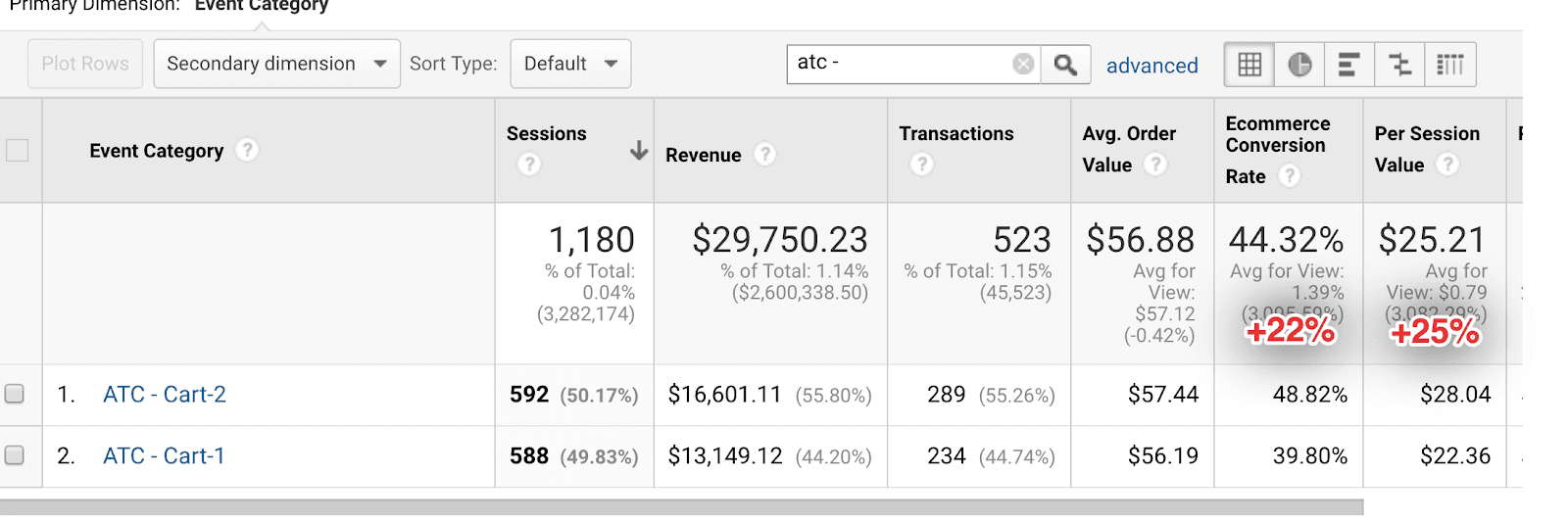
The inspiration for this test came from user testing. Without user testing, the change we made that led to these huge gains would have gone unnoticed to this day.
Note: For the A/B testing aficionados out there, if the sample size looks low, that’s because with a conversion rate this high, not a lot of visitors are needed to reach statistical significance. Also, this test was done on the cart page, so that’s why the conversion rate is so high. That is not the store’s overall conversion rate—I wish!
Two quick examples of banner blindness
Take a look at this website, especially the headline, “Spend less time tracking and more time growing.” Any idea what this website is about?

As an ecommerce business owner, you might find the service this website offers highly relevant. Yet, even though you are their target demographic, you probably have no idea what service they offer.
The website is HubStaff.com, and they offer software that tracks your employees’ working hours. Your employees download it and it tracks their mouse movements, takes screenshots every 30 seconds, etc., so you know they actually worked the hours they claimed they did and weren’t playing on social media instead.
With a headline as vague/undescriptive as “Spend less time tracking and more time growing,” it’s clear that this company has never run a single round of user testing.
In a properly run user-testing session, the first question is usually something like, “Can you explain what this product or service is about?” and the user is shown the website for only three seconds. This is often called the three-second test: if users don’t know what your website is about in the first three seconds of a visit, that’s basically death in ecommerce.
There is zero chance that anybody could know what this website does/offers in three seconds. Had the company run just one round of user testing, they would have seen that the poor confused user tester had no idea, and they could have addressed the problem by giving their website a clearer headline.
Here’s one more example …
The headline is “Introducing the next generation of wireless,” followed by the subheadline “Last week over 200,000 people changed the way they experience texting and calling. Today, it’s your turn.”
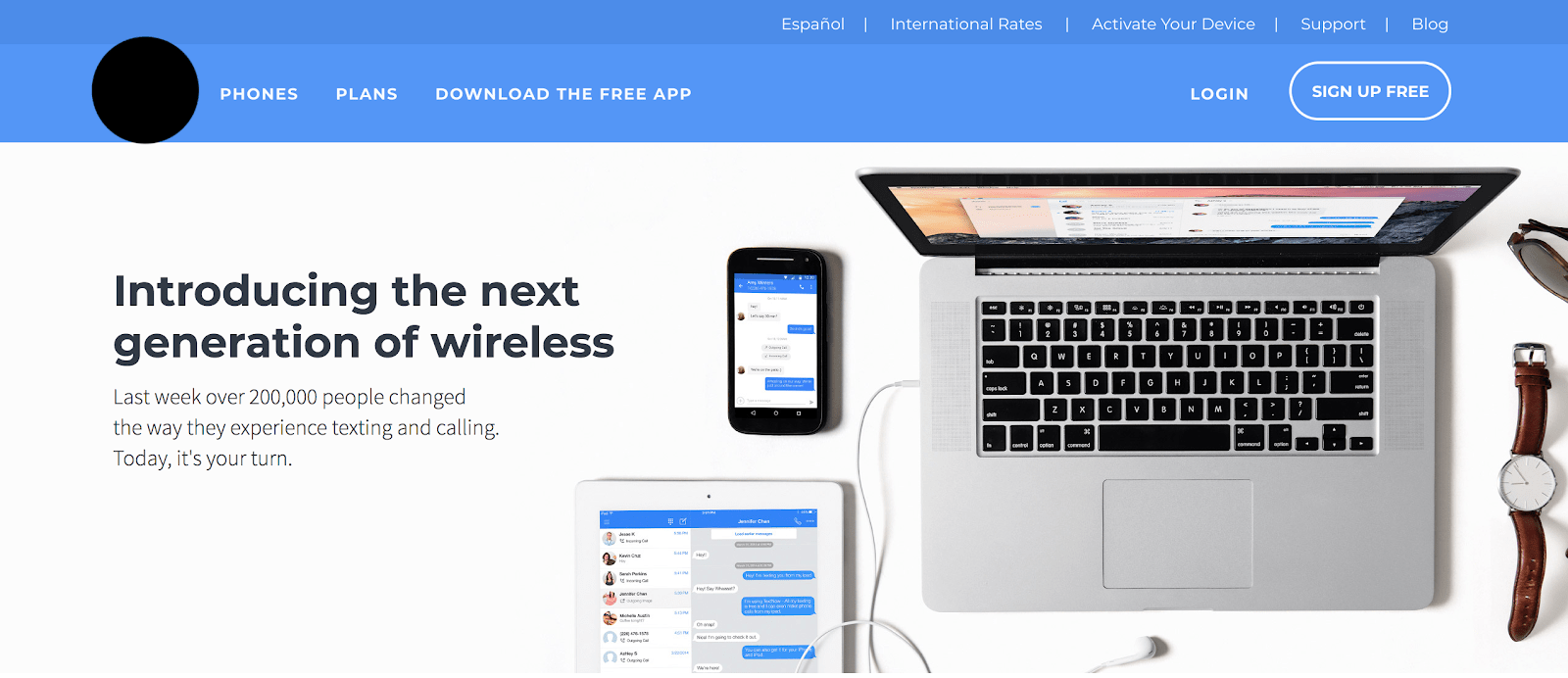
The main headline (most important) offers absolutely nothing about what service this website actually offers. The subheadline (less important) offers a bit more; at least you know it has something to do with calling and texting, but you probably aren’t sure.
The website referenced above is TextFree.us, and they provide free mobile phone numbers to call or text people from any device—laptop, cell phone or tablet.
Again, they do a terrible job of communicating this. With just one round of user testing, they would have found this massive clarity issue and addressed it with something much clearer, like “Call or text anyone in the USA for free from any device.” Much better, no?
You don’t know what you don’t know
These examples are meant to get you thinking about your own website. The owners of Hubstaff and TextFree designed and built their websites in a way that makes sense to them, but clearly not to their visitors. Is it possible that maybe you’re guilty of this too? (Hint: The answer is yes.)
- Have you addressed all common objections? How do you know?
- Do your customers think you are charging a fair price? How do you know?
- Is it easy for your customers to navigate your website? How do you know?
- Are the product descriptions clear and free of anything that is confusing, doubtful, or inaccurate? How do you know?
Noticing a pattern here? The only way to truly know for certain that your website is free of “holes” is to run user testing.
How to run user testing
User testing involves three components:
- Finding and hiring the people who will be doing the testing
- Thinking of meaningful tasks to give them
- Analyzing the screen recordings
Let’s go over each component in more detail.
Finding user testers
Thankfully there are a few shortcuts here. While Craigslist or any job recruitment site will work and yield excellent results, the process can be sort of a hassle. If you do go the Craigslist route, it’s likely that less than 10% of people who initially respond to your job posting will actually end up completing the tasks. Training them how to do it, producing an example for them to watch, and teaching them how to record their screen is also a huge hassle. If you want to go this route, it’s fine … but let’s also talk about the shortcuts, which I recommend for 99% of people reading this article.
Done-for-you user-testing services
Fortunately, there are a number of done-for-you services that connect entrepreneurs like us with folks who are ready to be user testers. Here are a few:
- Trymyui.com
- Usertesting.com
- Whatusersdo.com
- Usertest.io
- Userbob.com
The only one of these I have used personally is TryMyUI.com, and it’s quite good. I cannot comment on the others.
Typically, user testing sessions cost around $50-60 per test. If this seems expensive, trust me, it’s not when you consider the value you’re getting. With just 10 rounds of user testing, you can discover 90% of a website’s usability problems. If your business is doing any kind of volume, $500-600 is a bargain. You’ll recoup that cost in no time with your improved and higher-converting website.
Developing meaningful testing tasks
Here are some ideas to get the juices flowing, example tasks and questions for your user-testing sessions. Every ecommerce store, niche, and demographic will require different tasks and questions. I can’t cover all of them in this short article, but I’ve included some niche variety in the examples.
Example tasks
- Browse the site and find an inexpensive vaporizer you think would be good for a newbie. Add it to the cart, then move on to the next task.
This task will test site navigation, filters, clarity of product descriptions, and more. You may be shocked to see how many people use the search bar instead of the menu navigation. They may even search “vaporizer for newbies.” You’ll learn a lot about how actual users navigate your Shopify store.
- Find a piece of canvas wall art that you think would look good in your living room and contains a quote you like. Then, click “Browse” to upload your family’s picture into the canvas. Crop it the way you like and save it. Then, add it to the cart and proceed to checkout.
This tests how visitors deal with the interactive elements of your website, such as image uploading. It’s great for discovering any friction or problems they encounter in the process as well as finding any bugs that may be present, so you can address the issues. You’ll likely find quick wins for things you can change that were confusing to your visitors.
-
Pretend you’re buying your dad a drone for his birthday. Find a drone in the $200 to $400 price range that has a 4K camera. Add it to the cart, then move on to the next task.
Once again, this task tests for site navigation, filters, and clarity in product descriptions. After seeing how users browse, you may be inspired to add more tags to your products to allow for more specific filtering. Also, you’ll find out if anything is unclear or missing in your copy as they read through the product descriptions out loud. You may have that aha moment when you realize you forgot to put something important in the product description, like how long the battery life lasts. - Find a pair of running shoes that would work well for you. Add them to cart and proceed to checkout. Apply the coupon code “New10” to save 10%. Go to the last checkout page to complete the task.
In this example, you are testing to see if the user notices the “Size Guide” link under the “Add to Cart” (ATC) button. Size and fit are the primary concerns your customers have, as verified by surveys and customer service emails.
The “Size Guide” link, on this hypothetical website, launches a pop-up that asks them three short questions and then recommends a size:
- Do the user testers interact with it or just breeze past it?
- If they just breeze past it, could you make it bigger or more noticeable to increase engagement?
- If they do use it, does it make them feel confident about the size it recommends—in other words, do they trust it?
- Are there any bugs or questions that they find confusing or that cause them to feel doubt?
Example questions
Ask these at the beginning of the user-testing session, before the testers start the tasks:
- What is this site about as far as you can tell? (This is a good way to discover any clarity issues.)
- Why should you buy from this site and not some other site? (Here you want to find out if the company’s value propositions are clear and strong.)
- What do you think is the main benefit of owning this product? (And here you want to find out if the product’s value propositions are clear and strong.)
- Is there anything you notice about this “product type” that is different from others you’ve seen on the market? (This is another way to ask about the product’s value that will yield different responses.)
- Is there anything confusing, missing, or otherwise unclear about this website? (And this is another way to see if there are any clarity issues—which is very important, because clarity trumps persuasion every day of the week.)
Steal my exact, verbatim user-testing tasks and questions
For extra clarity and ideas, here are the user-testing tasks and questions I recently used for a client:
STEP 1. Browse this page for a moment. What are your initial impressions of this product and website?
STEP 2. Do you notice anything unique about this harness? Why buy this harness vs. others on the market?
STEP 3. Please choose a harness that you think would work for your dog, and tell us if there was anything difficult, confusing, or that gave you doubts.
STEP 4. Finally, add it to your cart and start the checkout process. Use the coupon code “SAVE10” to get 10% off. Once you make it to the last page of checkout where it asks you for credit card info, the test is over.
Analyze the screen recordings
This is the fun part. Watch users stumble and fumble to navigate your website. On even the simplest and most straightforward sites, people will often struggle.
Are users completely overlooking the tiny search icon in the top right corner? Consider replacing it with a full search bar that’s more noticeable.
Are they uncertain about what your product offers that the competition doesn’t? Think about adding a comparison chart that shows them.
Is there confusion about apparel sizing? Consider adding a size guide, disclosing the measurements of the models wearing the clothes, or providing a helpful video.
You get the idea. The best part about this process is that the users are narrating their thoughts out loud … which means there’s little mystery about what’s causing the issues. Simply fix the problems and you’ll see massively positive results.
A quick recap
I have been doing revenue optimization full-time on ecommerce websites for more than two years. In that time, I’ve worked on 20+ Shopify stores. Of all the tactics I’ve used, I can safely say that user testing is the most powerful of them all when it comes to making websites convert more effectively.
The easiest way to get started with user testing is to find a done-for-you service, such as one of the many I listed above. If you are reading this article in the morning and take action immediately, you could already be watching your first user-testing sessions this very evening.
When it comes to tasks and questions, don’t overthink it. Refer to the examples listed above and give it your best shot. If you find yourself getting stuck and spending more than a few hours on this, you’re overthinking it. Get your first few user testing sessions submitted first, and then go back to the drawing board. You’ll know if your questions and tasks were effective after watching just one or two recordings. Then you can go back, tweak your tasks and questions, and order more tests.
So, take action.
This is the closest thing to a magic bullet that exists in marketing, and it baffles me that it’s so underutilized (had you even heard of user testing before reading this article?). Do it now, and you’ll have a massive edge over the competition not taking advantage of this incredibly powerful technique.


About the author
Casey Brown
Casey Brown has been with BGS since 2017. As a former Shopify store owner and full-time direct response marketer for many years, he understands the challenges experienced by “ecompreneurs”. Casey has earned the reputation for being a master A/B tester. Inspired by cold hard data, experience, and a little bit of gut instinct, it’s not uncommon for Casey to get clients huge wins quickly. According to Casey, waking up to this job and working with people you love is a luxury few are blessed with.