
During one of our Ecom Insider Jam Sessions a few moons ago, I learned that store owners were having difficulty handling their images while also trying to keep page speed high.
Note: Jam Sessions are a weekly event for Ecom Insider members. During these sessions, revenue optimization experts look over EI members’ stores and give feedback. It’s a great opportunity for store owners to get another set of eyes on their store.
During this particular call, a store owner mentioned having difficulty resizing photos and images and then running them through TinyPNG to compress them. (The main concern was how annoying this workflow is!)
But let me tell you right now, you don’t need to do any of that. That was necessary in the past, but times have changed.
That’s right, Shopify makes it extremely easy to have high-quality images displayed for tiny data sizes, and developments in HTML code over the last few years have made it unnecessary to decide how to balance high-quality images and page speed on your website.
You can provide huge, highly detailed images, and have every visitor to your store be given exactly the image needed for a great experience.
The result should be a simpler workflow for you, faster site speed, and a better experience for your customers.
Note: If you aren’t using Shopify, the process may be a bit more complicated. But you can still use the information below to discuss with a developer the best way to accomplish this on your ecommerce platform.
Working with Developers
Be forewarned, this post will be a bit technical in nature. This isn’t provided for the purpose of teaching you how to code, and that probably isn’t the best use of your time for growing your store!
While freelance developers can be extremely talented, at the end of the day, they aren’t going to go above and beyond what you ask of them. Their tendency will be to provide the minimum amount of work that meets the stated deliverable.
When you say “Ensure that the design is mobile-responsive/optimized,” the developer can interpret this many ways and will mostly ignore the issue as long as the design doesn’t break on mobile. Additionally, not all developers will be intimately familiar with the constantly changing coding languages.
This article provides the basic knowledge around mobile-responsive images so that you can more clearly communicate the standards to a developer and validate that the work is being done correctly. Even if you can’t code, having an understanding of the tools your developer is using can guide you in planning and designing for your site.
Shopify Does All the Hard Work for You
Over the past few years, Shopify has really upped the backend technology that supports stores. In this case, this is all about the content delivery network (CDN, as in those image URLs you’ve probably seen that start with “cdn.shopify”).
A CDN is a global network of computers where your content (images, assets, templates, etc.) are distributed so that they can be closer to the end user when that user visits your website. A CDN is also capable of quickly processing that content for every user as needed.
Shopify serves modern image formats
Per the Shopify Partners blog, as of July 2019, Shopify’s CDN is capable of providing modern image formats like WebP. This format can serve up images at a much higher quality and a much smaller size for most images.
| Original Format | Original Size | WebP Size | % Difference |
| 4K resolution PNG | 8,450 KB | 1,600 KB | -81% |
| 4K resolution JPG | 1,720 KB | 1,600 KB | -7% |
This is done automatically. You upload a PNG to your product, or the files section. When it’s displayed to a user, Shopify chooses the format that will work best on that user’s device.
Compression is all well and good, but how big should you be making your images?
Shopify can dynamically resize images
You don’t need to resize anything. Shopify will do it all for you!
If you go to any image on Shopify and type “_600x” just before “.jpg,” you will produce an image like the one below.
Now the banner will be 600 pixels (px) wide. You can type any number in there, and it will resize to the size you indicated.

When this works alongside the WebP format, the CDN can serve up images much smaller than what you could do on your own.
Now let’s make a comparison between:
- The 4K resolution PNG mentioned above, when dynamically resized by the Shopify CDN
- A JPG that was resized and compressed before being uploaded
Both are being provided at 600 px wide in WebP format.
| Original Format | Original Size | WebP Size |
| 4K resolution PNG | 8,450 KB | 33.7 KB |
| 600 px compressed JPG | 73 KB | 40.7 KB |
This demonstrates that providing Shopify with much larger and higher-quality images actually improves the final results.
Here’s the result of Shopify resizing the PNG.
Here’s the result of Shopify converting the compressed JPG.
As you can see, the PNG is smaller and much less noisy.
Our recommendation is to always max out the Shopify upload limit at 20 MB per image when you have images that are that large. You’ll often get better results, and this also provides some future proofing for your images as technology gets better.
But none of this resizing matters if your theme doesn’t play nice with the CDN.
Your Theme Must Support Resizing
Shopify resizing your images hinges on your theme requesting a resized image.
By default, most themes like the Shopify official themes do have code in place to limit the maximum size of images, but they don’t go any further. They make sure that you aren’t overloading users with massive images but do little to tailor the experience to individual users’ devices.
Note: As of summer 2020, the BGS Super Theme fully supports all of this, serving high-quality images with powerful lazy loading to keep your pages high speed and beautiful on every display. The BGS Super Theme is limited to Ecom Insider members and students of the Ecommerce Business Blueprint.
To support dynamic resizing, we need to edit the theme code to include some additional bits of information. We recommend hiring a developer to do this, but we’ll go over some of the key terms and how the code works, so you can verify that this is done properly on your store.
(If you are not technically minded and you already have a developer on staff, send them this article and ask them to make sure this is being done!)
How to recognize responsive images in code
The easiest way to verify if your code is set up properly is right through the web browser. If you right-click on any image (such as the product image or main banner) and click on “Inspect,” you’ll enter the developer tools.
The code is correct
This long and mostly unintelligible code should be visible in the elements panel:
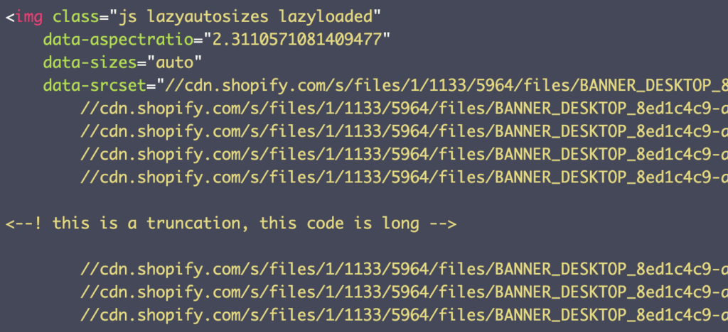
That is the code—done correctly (probably)—on the Kylie Cosmetics main banner. If you look closely, you can see that this code is mostly made up of a long list of image URLs.
The code is incorrect
But if you only have one URL, like this:

then the code is not correct!
It’s a good idea for you to check every image that displays on your site and keep notes on those that only have a single URL or otherwise seem conspicuously short. Here are some common problem images to check:
- Logo
- Homepage banner
- Homepage images
- Collection page thumbnails
- Product image gallery
- Product thumbnails
- Product page description images
But do also check all the images on your store:
- If all of them look like that first example above, then you’re good to go. You can safely start uploading huge 4K resolution (or larger) images all over your site.
- If you have some that don’t look like the first example—or worse, if none of them look like that—then you’ll need to make that list and get in contact with a developer.
Next, I’ll run through a few terms that could prove useful for clearly communicating your intent.
Image source set
Typically an image (img element) has only a single source (src=). But with a source set (srcset=), multiple potential images (versions of the same image in different sizes) are provided and the browser chooses whichever one it “wants” to load.
The browser makes this choice based on screen resolution, battery- or data-saver modes, and current internet connection, among other things. One browser may handle this differently than another—and even how a single browser makes that decision can change—but, bringing it back to a human perspective, the main goal is to respect users and provide them with a good experience.
The simplest situation is one where the browser simply chooses the image that most accurately fits (based on pixel count) where the image will display.
For example, say that my phone has a width of 1080 px, and the image will display across that whole width. The source set includes images that are 720, 1080, and 1440 px wide. The browser makes the “match” and simply downloads and displays the 1080 px image. In this way, users on smaller phones get the smaller image and users on larger phones get the larger image.
With this, your store no longer has to provide only low-quality images to keep some users loading quickly. You can provide the best image to everyone perfectly..
Here’s what that code looks like:
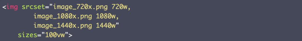
You can see that the source set contains the image in three sizes, each described by the width of the image. There’s also a sizes attribute that tells the browser how large this image will be in relation to the display. The browser uses that value to determine how big the image will be in reality and then picks the best version of the image.
In real-world applications, you’ll want to have many image options, with smaller size increments between them as the images get larger. Having 10 or more options is common.
Picture element
The new picture element behaves similarly to the classic img element, but it adds some cool new features.
The one we care about the most is the ability to provide two different source sets to users who are on different devices. This means that users on mobile can be given entirely different image content than users on desktop.
Note: In a previous blog article, I covered the three main reasons to provide different images to each user group and gave examples of how to design for these different purposes.
In the past, we got this result in ways that were basically Band-Aids and often didn’t work correctly. Interestingly, Kylie Cosmetics tries to do this the old way and it results in multiple banner images downloading when only one is being shown. That’s just sloppy code.
But the picture element makes this really easy. It would be structured like this:
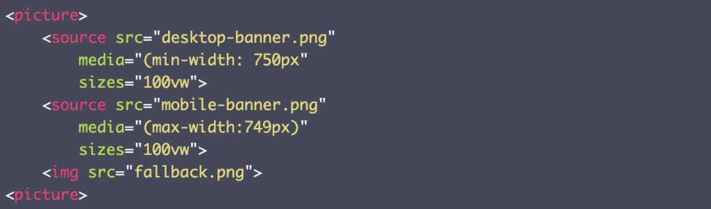
This code tells the browser, “Hey, if your device is 750 px and larger, show the desktop-banner, but when it’s below 750 px, show the mobile-banner.”
(The fallback.png is for users on devices and browsers that are too old to support the picture element. Those are few and far between.)
The picture element can be combined with the srcset to provide a large number of images for each display type so that users get exactly the experience that works best for them.
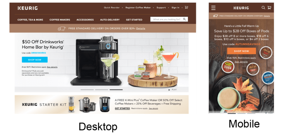
Here Keurig uses the picture element to provide different banners to different devices.
Get Sh*t Done
This is a very basic overview as my goal hasn’t been to teach you how to code but just to better understand this set of tools. If you want to know more (because you’re a developer or this just sounds like fun), you can learn a lot about these and other tags at W3Schools. And for a broader look at the topic, you can check out a podcast I participated in on mobile-responsive design and optimization.
For now, I hope this helps you to streamline your image workflow, improve your site speed, and provide an amazing experience to your customers!
Resources
Tse, T. (2019). Understanding progressive JPEG and WebP formats [blog article]. Web Design and Development Blog. Shopify Partners.
W3Schools.com. (n.d.). About W3Schools [webpage].


