 +1 (989) 614-0089


Optimized Ecommerce EP 030 – Mobile Responsive Design and Optimization for Your Ecommerce Store
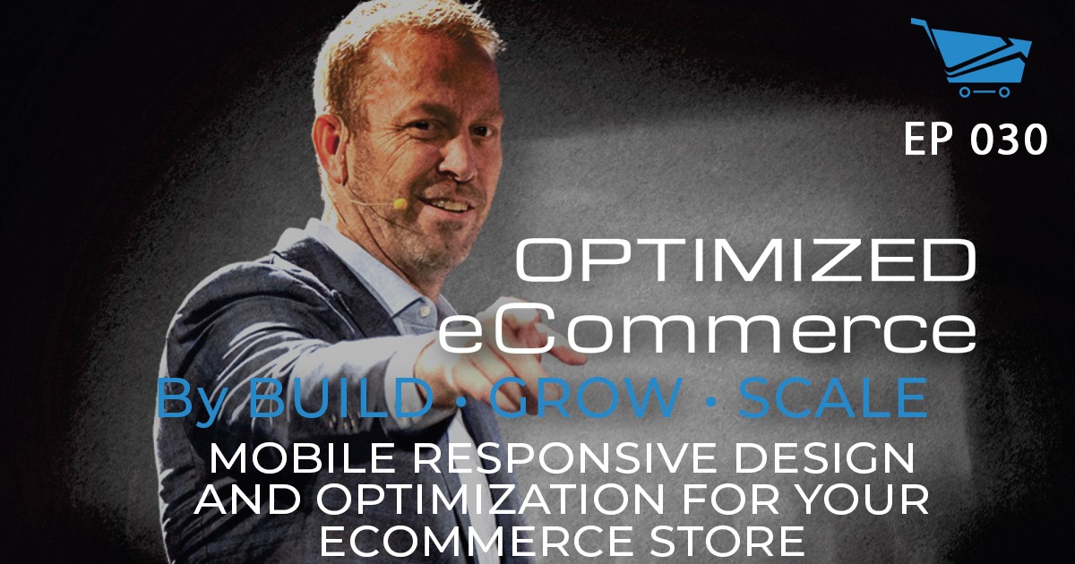


Welcome to Episode 030 of Optimized Ecommerce – Mobile Responsive Design and Optimization for Your Ecommerce Store. I’m your host, Tanner Larsson CEO of BGS.
BGS means Build Grow Scale! It is a community that we founded where eCommerce entrepreneurs and physical product sellers come to learn how to take their businesses to the next level.
Eric Kwoka has been with BGS for almost two years, he is our mobile revenue optimization expert. He has deep knowledge and expertise in mobile optimization and responsive design for Ecommerce stores.
Here’s just a taste of what we talked about today:
The difference between desktop and mobile, why do these two need to be treated differently?
Compared to desktop mobile screens are much smaller and show bits of information about a certain product or service. In this case, store owners should pay more attention to what’s being shown on those small screens.
People act differently when they are on their phones compared when they sit comfortably right in front of their desktop or laptop. With mobile phones, distractions are more likely to occur due to a bunch of information they see on their feed while desktop or laptop offers easy and more digestible information and calls to action.
The difference between mobile responsive design and mobile optimization, how do store owners cram everything consumers see on a desktop into mobile phones.
Many people screw up on mobile optimization because they often optimize their site through a computer rather than a mobile phone.
Store owners should not think their site is all good because of the mobile responsive theme. Having this type of theme means a quasi smart template that’s going to take your desktop version and scale it down for mobile phones. This does not mean that the site is optimized well for mobile.
It is better to think about the designs on a mobile phone first and think of the desktop design afterward. This is because it is much easier to work on the small site and add additional functionality onto the desktop.
We also discussed a few other fun topics, including:
- Eric’s mobile responsive design recommendations for store owners and designers.
- How do different behaviors and consumer interactions translate into Ecommerce results and performance?
- What does mobile-optimized design mean?
- Eric discusses the best practices people can start utilizing when it comes to mobile optimization design.
- How can Ecom stores effectively optimize the hero space on mobile?
But you’ll have to watch or listen to the episode to hear about those!
How To Stay Connected With Eric Kwoka
Want to stay connected with Eric? Please check out their social profiles below.
- Website: BuildGrowScale.com/author/eric/
Resources
Also, Eric mentioned the following items on the show. You can find that on:
- The 3 Reasons Your Store Needs a Mobile-Optimized Banner by Eric Kwoka
- Scaling a Struggling Brand Like Crazy! From $0 to $10M in 9 Months with Archer Worsham
- Material.io – is a design system that helps in building a high-quality digital experience.