 +1 (989) 614-0089


The 3 Reasons Your Store Needs a Mobile-Optimized Banner

More and more ecommerce traffic is happening on mobile devices. While desktop still tends to win in total sales dollars, mobile is edging into the lead for sessions.
Many customers visit your store on their phone after seeing an ad. Later, after carefully reading through everything on desktop, they complete the purchase. It’s simply a reality that your website is going to be seen on a wide range of screen sizes and shapes.
So why do so many sites try to show the same banner to everyone, regardless of screen type?
1. The Screen-Size Problem
The first mobile-optimization hurdle is the shape and size of the screen. Phone screens are physically smaller than desktop monitors and are used in a vertical orientation. This makes the width of the mobile display much smaller than it is on desktop.
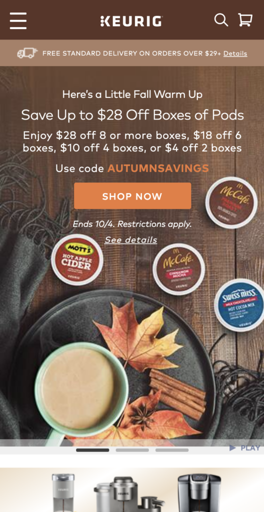
Without addressing this, we can end up with banners that “translate” like this.
While a user can easily read this banner on a desktop display, that’s not the case for the mobile display. No one can gather meaningful information from the mobile display of this banner. Most mobile users stumbling upon this site will lose trust in it. (Luckily, Keurig’s site design isn’t this bad; this is a mockup.)
In fact, the various Shopify-provided store themes default to this sort of behavior, albeit often by moving the text content down below the hero image (the large banner image users first see on the site). They simply take a hero image designed for desktop and squash it to fit on a mobile screen.
Use wide banners on desktop, tall banners on mobile
Hero images on desktop are often twice as wide as they are tall, which translates to being a thin sliver at the top of the screen on mobile.
Enter: The Instagram square image!
Users are very used to seeing Instagram-style images with a 1:1 ratio. This is definitely the place to start when handling the mobile version of your hero image. You can squeeze or stretch it a bit in either direction as your content dictates—just don’t push it too far.
When designing a mobile hero image, don’t simply crop the desktop hero image. This is the way many themes handle a kind of false mobile-responsiveness. The theme crops the edges visually on the screen, leaving the rest hanging in the void, off-screen.
The problem here is that information can be lost or misconstrued. Imagine watching a movie only seeing the middle third of the screen.
That’s just not going to work.
It’s important to take the content of the hero image into account. This can be accomplished in multiple ways: you can adjust the content flow, isolate a key visual, or even use a totally different piece of content.
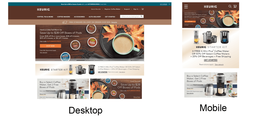
For example, Keurig actually uses an adjusted composite of the desktop hero image.
In the original desktop hero image, the cup and plate are on the right side with the K-Cups on the left. Meanwhile, in the real mobile version, the cup and plate are at the bottom, with the K-Cups arranged above them. The K-Cups are even rotated so they can be read normally. It’s not a very large change, but it does properly adjust the content to fit in the mobile viewport.
The best solution for your own banner will depend on the message the image is meant to convey. The key thing here is intentionality. Be intentional with the designs on both desktop and mobile. Don’t just reuse the design from one on the other.
2. The Accessibility Problem
When text is baked into the hero image itself, it contributes to a poor cross-platform experience. A lot of stores do this when they don’t have anyone who is able to code. Positioning and styling text in an image editor like Photoshop is so easy; doing the same with CSS and HTML is significantly more complicated.
However, there’s a high cost to taking this convenient path: the browser doesn’t know that text is being shown.
This is a problem for mobile-responsiveness and accessible design, which often align.
Having properly designed text elements is key to ensuring that text is readable. Even without fully mobile-responsive design in place, just coding the text correctly drastically improves the browser’s ability to handle the switch from desktop to mobile.
Rather than scaling the text down to a size of a few unreadable pixels, the browser can maintain text size while simply adjusting the shape of the container for the text. It may not look perfect every time, but at least it’s readable. From there, properly coding it to respond to mobile conditions is relatively simple.
Possibly even more important, having the text baked into images drastically impacts the accessibility of the site. Users who have poor eyesight or are colorblind can’t easily adjust text size, contrast, or style for better legibility. And users who are blind are not able to access the information at all because the screen reader has no information to read to them.
As your store grows, this can become a serious issue. According to the Next Web, lawsuits related to website accessibility are on the rise with lack of screen-reader support being one of the major points. If it’s so easy to avoid, why bet against your own success? While alt-text parameters can help in this regard, they are only supposed to be used to cover the truly visual content of the images in question, not to communicate text presented in image form.
3. The Content Problem
The next issue that tends to present itself in regards to mobile-responsiveness and hero images, even on well-designed sites, is that of content optimization. This is because it ties into the very top of the hierarchy of conversions—persuasion, which is most closely related to the psychology of users and the messaging used to convert them.
This is the hardest piece of mobile-responsiveness to address, but it has the greatest potential for serious wins.
Mobile users aren’t like desktop users
A person is often in a totally different mind frame when quickly browsing on a phone than when getting things done on desktop. If you can identify meaningful differences in the fears, uncertainties, and doubts of a user when on mobile and on desktop, you can actually tune the messaging in your banners to these differences.
Content prioritization
When people only used computers while sitting at a desk, web designers didn’t need to think about what the user was also doing or what might drag that user’s attention away. It was easy. Everyone was settled in.
But now, users can be on a train to work, taking a quick break at the gym, or any number of other activities. You’ve probably even been getting work done on your computer and then hopped on your phone really quickly to do a search before returning to your computer. The user situation on mobile can vary wildly. But you still need to ensure that the important information gets to them first.
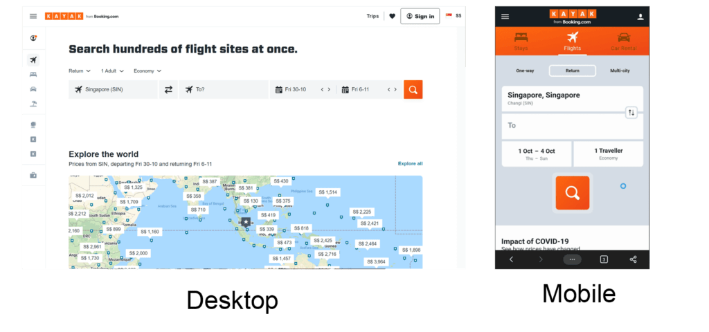
Kayak starts to do this by removing the headline for users viewing the website on a mobile device.
The difficulty in getting the important information to a user compounds with the size of the screen. If users need to scroll too far to find what they’re after, they won’t ever make it. On a desktop, it’s easy to fill up a page with important things, and users can prioritize the things they want to see rather easily. On mobile, this isn’t as simple.
That’s why optimizing the content of the banner itself to prioritize the most important information has serious value here. Desktop users may be willing to really satisfy their curiosity with an in-depth review of your site, but mobile users want to get to the point.
To address this, desktop can feature a more thought-out and comprehensive initial hero text, while mobile can stick to a shorter and more tantalizing explanation.
An ecommerce store can look at the data based on what products or product types are more likely to be browsed or bought on mobile, rather than desktop, and feature a banner that presents those products first and foremost.
For instance, what if Keurig sees that users on desktop are more likely to buy full machines, while on mobile, they only buy replacement K-Cups? Because of this difference in behaviors, Keurig can show different information and offers to the two user types.
A Mobile Banner Checklist
In sum, these are the main questions to ask yourself to best prepare your desktop banner for mobile-responsiveness:
- Is text soft-coded rather than baked into the banner image?
- Does the site provide different purpose-built banner images for desktop and mobile?
- Does the banner content of each focus on what matters most to these two user segments?
Resources
Hak, A. (2020). Why your website’s lack of accessibility options is opening you up to lawsuits. The Next Web.


About the author
Eric Kwoka
Eric Kwoka is currently a BGS Revenue Optimizer and Coach for the Store Audit Team. He has a history of service with the United States Marine Corps and is learning while traveling the world with minimal adult supervision. He once committed to a multi-day horseback ride through the Tien Shan (Celestial) Mountains in Kyrgyzstan, despite never having rode a horse before.