Optimized Ecommerce EP 040 – Expert and Recommended Ways to Optimize Your Store’s Individual Pages
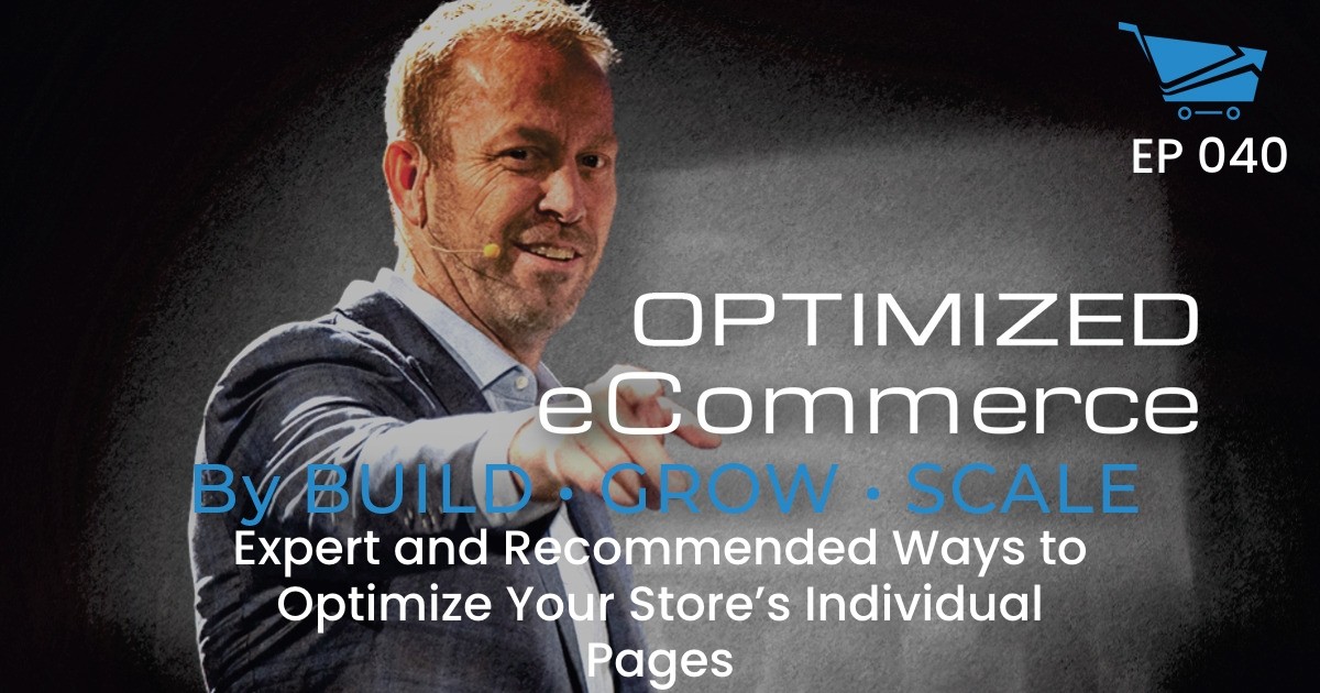
Today on The Optimized Ecommerce Podcast, Mariana Dourado joins Tanner Larsson to talk about the expert ways to optimize your store’s individual pages. Join us in today’s episode and discover some of the unique individual goals of your store’s pages and how you can optimize these pages to boost your sales! Also, subscribe
Show Notes
Welcome to Episode #040 of Optimized Ecommerce – Expert and Recommended Ways to Optimize Your Store’s Individual Pages. I’m your host, Tanner Larsson, CEO of BGS.
BGS means Build Grow Scale! It is a community that we founded where eCommerce entrepreneurs and physical product sellers come to learn how to take their businesses to the next level.
Mariana Dourado is one of BGS Revenue Optimization Experts. She has been working with BGS for over two years doing audits, analyzing websites, and finding what works better for the sites.
Mariana also works on some of BGS Amplified Partnership Stores, she does a lot of the initial heuristic analysis, where she takes a look at the site to figure out where we can add value, how we can help them, and if we can help them.
Here’s just a taste of what we talked about today:
Mariana discussed the importance of not adding the Add to Cart Button on the homepage.
It is important to not add the Add to Cart Button on the homepage because its main purpose is to build trust and to provide clarity on the next steps.
The homepage should be a page where people would be convinced that your product is amazing, it is where you can give them details of why they should buy that product from your store.
This context is similar to a physical store behavior, when a customer enters a store they are looking at the items and probably don’t want someone pushing them to take something. Adding an Add to Cart button on the homepage will more likely scare your customers and will probably not be convinced to add the item to the cart.
Then we talked about what pages should be optimized first, in what order, and why?
When it comes to revenue optimization, the process starts backward. We first optimize the checkout page, cart, product pages, category pages, and then the homepage.
The reason why we do the process backward is because once people reach the checkout page,then it is much easier to convert. They have already been through the funnel. So working on the improvement is much easier and makes more sense because people are already willing to convert.
We also discussed a few other fun topics, including:
- Reasons why the product page is not the only page that matters.
- How does a buyer’s journey happen for people?
- Why isn’t it advisable to add a lot of elements on your pages such as the Add To Cart Button and Buy Now Button?
- What does a store have to do with third party payment methods like PayPal or Shop Pay?
- Is it a good idea to provide so much information on every page?
All that and more! But you’ll have to watch or listen to the episode to hear about those!
How To Stay Connected With Mariana Dourado
Want to stay connected with Mariana? Please check out their social profiles below.
- Website: BuildGrowScale.com
Resources
Also, Mariana mentioned these resources on the show. You can find them on:
Tanner Larsson 0:07
Hey, everybody, welcome back to the Optimized Ecommerce Podcast. I’m your host, Tanner Larson. And today we have a special guest from the BGS team. Her name is Mariana Dourado. And I know I said her name wrong because I can not roll the R the correct way or my tongue just doesn’t work that way. So she’s gonna slap me next time she sees me because I continuously butcher her name, even though she coached me prior to us getting on this podcast. But anyway, aside from the fact that I can’t pronounce your last name, she is a very talented Revenue Optimization Expert working with BGS. She’s been with us for about two years now. And I just call her Mariana. So I don’t get in trouble. I don’t ever try to say miss your last name or anything like that, because clearly, I’m not capable. But today, what we’re going to talk about with Mariana is kind of the the function and purpose, or goal, so to speak, of each page of your store. Now, most people look at their store kind of as a whole thing like this is my store, well actually you need to break it down into your individual pages. And we all know there are pages like your homepage, your category page, your product page, your checkout page, obviously, then you got your cart, and all that kind of stuff as well then you may have about us pages and other things like that. But they work very well together, obviously to along the buyers journey to get convert the sale. But more importantly than that every page has its own unique individual goal, the goal of the store is not to make the sale. Okay, the goal of the store is to effect the buyers journey. And the goal of each page of the of the store is what allows that buyers journey to happen. So each page has a specific goal, which is not the sale in order to advance the prospect of the visitor further along the process so that eventually you do get a sale. And a lot of people seem to mix that up. They kind of think that every page of their store is designed to sell or make the sale or whatever like that. That’s just not the case. And that’s what Mariana is going to be going through today. As we jump in. But before we do that, Mariana, thank you for jumping on
Mariana Dourado 2:09
Yeah It’s a pleasure to be here.
Tanner Larsson 2:11
And so Mariana, why don’t we start with since it’s your your first episode with us? Why don’t you start with a little bit of background? Like, who are you how you came to be? What worked with BGS? What you do that kind of stuff?
Mariana Dourado 2:22
Yeah, so I’ve been working at BGS for almost two years now. I was one of the interns in the internship program. So yeah, and I love doing audits and analyzing the websites and find, finding what typically works better for most of the sites, right, so we can come up with the best solution possible. And yeah, that’s basically it.
Tanner Larsson 2:51
Where do you live?
Mariana Dourado 2:52
I live in Brazil. That’s why the R is different.
Tanner Larsson 2:57
Yep. So she’s down in Brazil, and definitely is one of our, you know, better RO’s in terms of talent and knowledge. She’s been with us for a long time. So she she really knows her stuff works on some of our amplified partnership stores. Also, when we’re onboarding a new amplified partner, or talking with new companies that want to work with us, or whatever, she does a lot of the initial heuristic analysis stuff where we take a look at the site to figure out where we can add value, how we can help them and if we can help them because you know, sometimes they’re stores that aren’t the right fit for us that we can’t provide value, so we obviously wouldn’t work with them. But in Mariana’s job, she gets to really look at a lot of different sites, and see how they work basically, and what works and what doesn’t across these different sites. So the goals, though, that of each page are fairly consistent across any site, any industry. And so we’re gonna go ahead and dive right into that. So Mariana what, let’s see. First question we were going to go through is, you know, why is it important to not add add to carts, like to the homepage, to try to like skip ahead. Because we see people doing that all the time, right, we see people with a homepage, and they’ve got by now add to cart prices, discount sales on their homepage.
Mariana Dourado 4:11
Yeah. So mainly because the main purpose of the homepage is to build trust, and to provide clarity on the next steps. So if you if you already add an Add to Cart button to your homepage, you’re wasting the step where people would be convinced where you could actually persuade your customers and convince them that your product is amazing, which is the product page right? Where you can give them details of why they should get that product from you. And it’s very similar to a physical store behavior. When you enter a store. you’re browsing right? You’re just looking at the items and you probably don’t want someone pushing you to take something So you don’t want to scare your customers. And if you already have an ATC, they’ll probably not be convinced it can work for specific stores in specific contexts. But they’re probably not be convinced enough to to add the item to the cart. So they’ll most likely be scared and run away. And it’s much easier to to close a window or tab, than leaving the store right, then you’re talking to someone and they’re just most likely give up.
Tanner Larsson 5:36
Yep. And as an example of that, guys think about when you, we’ve all done it, you go to a furniture store, you walk into the furniture store, and you get mobbed by salespeople, Hey, can I help you? Can I help you? Can I What can I show you? What can I do? And you’re just like, I just, I haven’t even walked in, I don’t know what you have. I don’t know if you can help me, I want to look or you go to a car lot and you get mobbed by the salesman before you’ve even stepped on the lot. That’s kind of like adding your buy buttons or add to cart buttons to your homepage or where they don’t make any sense. Same Same thing goes, I would assume for the category pages, right?
Mariana Dourado 6:09
Yeah, right. I mean, of course, that’s something you can test. But the main purpose of the category page is to show the range of products you offer. And then people will be able to select from what you offer, what makes sense for them. And then once they proceed to the to the product page, they’ll have the details and make sure that’s what they’re looking for or not. So yeah, the chances that you waste. the customer’s journey is high. That’s why you should pay attention to that.
Tanner Larsson 6:41
It’s just if you think about it, guys think about the way you shop, like when you go to an online store. Now the thing as a store owners, we usually don’t treat our store the same way we want to be treated when we shop on other stores, we have a different mindset on it or whatever. And it’s kind of weird the way we do that. But if you think about the fact that when you go to an online store, and you click on a category, like you say, shoes, the shoes pop up, right and you’re browsing, and you’re looking for some nine inch stilettos or some crazy shoe right? And you’re looking at all these hit crazy shoes. Are you ready on that category page to buy them? Do you like if they just say add to cart? Well, how do you buy a shoe without actually selecting your size? First? Maybe they have wide narrow, maybe they have different actual, you know, obviously the different sizes? And then you also have, what does it look like from the other angles? what’s the what’s it made out of all these different questions that are not answered on the homepage or the category page or these other pages. So when you’re adding a buy now or an Add to Cart button, in these early steps of the process, you’re putting the cart before the horse, the customer doesn’t have the information, just like you wouldn’t have the information if you were Shopping for Shoes, they can’t make the decision. So what you do is you just basically turn them off. And whereas the button should say learn more or see item or you know, something along those lines. And so that’s where Mariana is going with. You’re basically putting the cart before the horse and killing your chances to the sale.
Mariana Dourado 8:07
Yeah, exactly.
Tanner Larsson 8:09
So we that’s it. That’s one of the big ones we talked about. But like what are the other things I want to get into with you is, when it comes to we obviously we’re an optimization company. So we optimize the entire store. But there’s a process for that. So what pages should be optimized first, in what order and why.
Mariana Dourado 8:27
So when you come to revenue optimization, we work backwards. So first, we optimize the checkout, then cart, product pages, category pages, and then the homepage. And the reason for that is because once people have already reached to the checkout page is much easier to convert. Right. So they have already been through the funnel. So working on the improvement is much easier makes makes more sense because you know, people are willing to convert. So that’s why we do the opposite process. It’s backwards.
Tanner Larsson 9:04
And the other side of that guys is the fact that if when we’re optimizing the store, we’re obviously optimizing the store for max revenue and performance and everything else. If you have a store, we’re just start working on like your store. And the first optimization you make is on the front. Instead of going back to front, like Mariana said, you optimize something on the homepage first, okay. But you have all these other broken areas behind that it negates the power of that optimization, you won’t see the results from it, unless it’s just a click, you know, if you’re just trying to get a click to the next page, you might see it but you don’t get the benefit of that optimization carrying through your entire sales funnel. If you start from the back and work your way out every optimization that you make after that first one builds on the one behind it and you get a more synergistic effect of your optimizations. And it’s also easier to truly track what’s happening. So now you is that to say you can’t just optimize a specific point No, we’re talking to from a starting from scratch or optimizing the entire thing, you’re going to want to start from the back, work your way forwards. Otherwise, you’re kind of going to miss out on some of the power of what you’re doing. And you may actually make an optimization, that would be a winning optimization, if it wasn’t broken somewhere else down the buyers journey. Correct. So, how about some tips, let’s just cover a bunch of tips and stuff that’ll help people, right. So some other tips for their store that can help them you know, optimize these specific pages. And we can be pretty specific here.
Mariana Dourado 10:30
Yeah, the most general things I would say are clarity, and consistency. So people should never try to guess what’s going on, on your on your website, you should always provide a clear navigation effect, which means if you have let’s say, CTA buttons on the homepage, and you just say get item, this is very wide. So if it takes you to the collection page, it should say, See collections go to collections, something like that. So and also, every page should be should look like part of your website, they shouldn’t look like random pages. And so that’s why I would say clarity and consistency are the two most important things. When we talk about the general website.
Tanner Larsson 11:20
Now people get really, obviously we know, because we see people all the time in our programs and stuff, the page they care about the most is the product page. Right? That they they pretend like the rest of the site doesn’t matter, because the product pages all that happens. But that’s not really the case. But first two things. One, why don’t you tell them why the product page is not the only page it’s matter, like how the buyers journey actually happens for people? Go ahead and start there, then I have a follow up question for you. Okay,
Mariana Dourado 11:48
let’s start from the homepage, right. And then we can cover each step and what we can do on each one. So on the homepage, as you mentioned, the main goals are to build trust, and to provide clarity on the next step. So customers should land on your website and know exactly what you sell. So what we typically recommend is putting three to four bullet points with your unique features. Why are you awesome? Why is your product awesome? And then people can easily understand what you’re selling, and also to add an image that shows what you’re selling. And that’s something really important because one of our clients when he first started, I ran the first user test, and people were extremely confused with images, he actually sells masks and users were like, is that underwear is he selling clothes, and they were completely confused. But the interesting thing is that the features, the masks features were there. So if they read it, they would be able to understand, but they they don’t really most of the people don’t read it. And we know that. So that’s why it’s important to match. And once we updated the main banner image, this never happened again. So also on one of the last change Gen sessions, one of the stores was selling clothes to kids. And their best selling products were like four to five year old items, but they were promoting the newborn items. So you got to figure out if it makes sense, what you’re promoting what you’re highlighting. And of course, if you have a strategy for that, that’s okay. But you got to pay attention to everything. Absolutely. And as we mentioned, the CTA buttons need to be clear. So people don’t have to try to guess what’s going to happen once they click it. And the navigation should also be be clear, they should understand what are the pages what are the collections. And when it comes to search. visitors who use the search typically converted like many times more, maybe four to five times more seeing that several times. So it’s very important to have it permanent and optimized as well. And then when we talk about the collection pages, the main goal is to show which products you sell. So then customers can can choose from from the available options, what what products they want to see in detail, right. So filters in sort options are the most important things in these pages. And you got to make sure you have relevant filters. So I was analyzing a website, I did first store audit a while ago, and they were selling t shirts, but the only filters they provided were collections and I didn’t know their brand. Their collection seems totally random thing to me, because I was not familiar with it. So I couldn’t filter by color by size, by pattern.
By price, so it was super confusing, you got to find what is relevant to your audience and then add this kind of filters. And also the ability to to sort. So typically, from high to low price and from low to high and from dates are the most used ones. And also, you got to pay attention to your images. Because this, when people see your your images in the category pages, they will choose if they proceed to the next page or not. So we’ve got to use high quality images and make sure they are consistent as well. So if we use the T shirt example, if the main image, the first one is an item with a white background, and then the second one is a lifestyle image, and then the third one is like a colored background, it’s totally confusing, and really hurts your credibility. So having consistent images and high quality ones are very important as well. And then, when we talk about the product page, this is the step where your customers will decide if what you’re offering fits what they’re looking for or not. So you got to pay attention to the copy right to the descriptions, to the images as well, and to the reviews. So you got to make sure you you don’t have walls of text. So it’s not tiring to read your your product descriptions, especially on mobile, right, because people are not going to stop and read a bunch of stuff. What I would say is having paragraphs or have four or five lines maximum. And then the images, obviously showing different angles, whatever is relevant to your audience, people wearing it, if you find out they that’s what they want to see, you should edit. And also the reviews layout, you should always provide it. And visitors should be able to sort to filter into search through the the reviews, because this is a huge trust factor. Right? And much more important than not having bad reviews, because I know some people get worried about it. If Oh, someone complained about our product, is that going to hurt me. But much more important than that is how you deal with the bad evaluations and customers pay attention today. So if you exclude all of your bad reviews, to only have five star products, this will probably look scammy and then customers won’t won’t believe your good evaluation, right? So this is very important as well.
Tanner Larsson 17:59
Absolutely.
Mariana Dourado 18:01
Yeah. And another important thing is the add to cart. We’ve tested by now several times against the add to cart, but by now it’s very confusing. So I don’t know if this will take me to the checkout, or to the cart page. So you got to say add to cart and make sure you’re prominent and that are no bugs when people click it. And you said you wanted to talk about something on the product page, right?
Tanner Larsson 18:37
Yeah, I wanted one of the big mistakes, you actually just touched on it, there was two things the product page, but like, people are always asking us like, you know, I have my Add to Cart button. And aside from those, I have a Buy Now button as well, or i or i want to put my paypal button right there on my add to cart page or my product page. And I wanted you to kind of touch on that as to why we think and we from our testing, it shows that’s not a good idea.
Mariana Dourado 19:03
Yeah. So the thing is, you don’t want to add a lot of elements to your pages, like extra elements. So having like PayPal buttons, for example, it’s something we don’t recommend not even in the cart, we recommend having the images instead, because customers will know that once they go to the checkout, it will be there. But it can be really distracting and cause like extra cognitive load. So yeah, I wouldn’t add not even the icons at this step unless it’s a very important trust factor or if it’s very, very important to your audience.
Tanner Larsson 19:48
And there’s that just the issue of hierarchy of focus as well, right. They don’t know what what to click on so they don’t click on anything.
Mariana Dourado 19:55
Yeah, and that’s the main the main issue with having both Buy now and Add to Cart, because I mean, what’s the difference between them? That’s not clear to everyone. So yeah, that’s why you should stick with Add to Cart.
Tanner Larsson 20:10
And then from a marketing standpoint, guys, if you have we see it a lot people add that PayPal button straight to their product page. And yes, it does work. If you put a PayPal button there, people who would like to pay with PayPal, if they’re going to add to cart will most likely click that PayPal button and go on. Right, that doesn’t actually mean they purchase. So when people see is when people click it, so it must be working. The problem that you’re creating for your business there from a longevity standpoint, and an effective marketing standpoint is once they click that PayPal button, this is the same reason we don’t have it in the cart, by the way, it takes them off of your store, to paypal. So from there, if they abandon the purchase, you’re done, you have no chance of cart retargeting, email cart abandonment or anything, you need them to stay on your site until they go through all the different steps. So that you collect the data, get the cookies placed all that stuff so that you can do dynamic cart retargeting if they abandoned cart, you can do cart, abandonment, email, SMS, you know, Facebook Messenger, follow up whatever you’re using to trigger that. But if they if they leave your site, because they click on the Pay Pal button in the cart, or on the product page, you’ve lost that opportunity. And cart abandonment is a massive, massive win for our stores, right?
Mariana Dourado 21:21
Yeah, that’s correct. And then when we go to the to the cart page, the main goal is to make customers proceed, proceed to checkout easily, right. So for example, the AJAX cart, the main goal is to show that the item was added to the cart. And then the Proceed to Checkout button need to be a button has to be prominent, and then you can provide a continuous shopping link. And why a link another button because it makes more sense to to incentivize people to complete the purchase, then take them back like a few steps and maybe lose them. So I mean, for people who want to keep shopping, the link is there, but it’s not as prominent as the the Proceed Checkout button. Absolutely. So there shouldn’t be any distractions on the cart. That’s why we recommend removing the navigation as well. And being very careful with pop ups and extra fields. Of course, that’s something that has to be tested if it can work on specific stores. But it can also be extremely distracting. And people can get annoyed with pop ups and upsells. That’s why you got to be extra careful about it. And for example, a special instructions field, the majority of your visitors won’t have a special instruction to it. And that’s something you can add to the thank you page or to a confirmation email. So there’s no reason to be on the cart page because the main goal is to make them Proceed to Checkout without any friction points. And then finally, when we talk about the checkout page, the obvious goal is to complete the purchase easily so the steps should be clear and simple as concise as possible. And you should only ask for information information you actually need. So for example, why would you ask them for their birthday if you’re not using it the same thing for the phone number if there is no purpose to ask for that just don’t to make the steps easier and better to to fill in. Also the breadcrumbs are very important to show where customers are at so what we use is the cart and then customer information. Then shipping and then the payment but also a very clean and concise layout.
Tanner Larsson 24:09
And then what do we do with third party payment so like PayPal, PayPal or you know shop pay or whatever what do we do with those?
Mariana Dourado 24:16
Yeah Then on the you should add it to the payments step you can have like many options like after pay PayPal but then when they are already in the payment step.
Tanner Larsson 24:29
So we suppress it from the actual customer information page and have it only show up when they actually get to the credit card field section.
Mariana Dourado 24:36
Yeah. Which means Yeah, they have already gone through the customer information to shipping and also it’s very important to to call shipping times out so the customer shouldn’t have to guess when they’re getting their products. So always put in how many days you you’ll be sending their their items in or how many days they’ll be receiving it.
Tanner Larsson 24:59
Awesome. So, the other thing that we want to talk about that we see stores do a lot is they provide either Well, there’s a couple things either provide no information, or the opposite end of that is providing a ton of information on every page, or specifically the product page and whatnot. What’s kind of that? Is that a good idea that provides so much information? Or is there a kind of a sweet spot for how that should work?
Mariana Dourado 25:23
No, providing a lot of information is not at all the best option? I mean, you should provide enough information and enough information will be extremely contextual. So let’s say I sell paper clips, how long can I talk about paper clips without making the process process exhausting. So probably not much, right? It tatally different from selling cameras that I need to to explain the specifications, and to give much more details of how it works and the features and everything. So the secret is to find the sweet spot, which is enough information for your specific audience, but not just throw a lot of information to them, because again, they can get scared or bored and just close the window in you’ve lost
Tanner Larsson 26:14
you’ve lost the purchase. Now, in some cases, though, there’s lots of you know, like, like you’re saying, selling cameras, there’s about the model, there’s the specifications, there’s the technical stuff, then then there’s the other things that people want to know about, like shipping and returns and all of that. So on that can turn into a rather a lot of information. So what’s the best way for them to not overwhelm their customer, but still present everything that needs to be presented?
Mariana Dourado 26:41
Okay, so for example, the most extensive information about shipping and returns you can have a separate page for that, and then keeping a shipping and returns tab in the product. Next to the product description. And also using see more the See More link functionality is a goood call, because then you can have a lot of text without making it visually tiring. So on really long pages, let’s say product pages, using a table of contents is a good call. So you can have like different sections in the table of contents and people. When they scroll through the page, they can choose which tech section they want to see. So they will go to more specific, specific sections, specific information. And of course, you can always have a FAQs page. Ideally, your website shouldn’t need FAQs. Because everything will be so well explained that you wouldn’t need them. But you can keep a separate page for that, just in case. Yup,
Tanner Larsson 27:56
Now, the See More tab or the Table of Contents can also be combined into a progressive disclosure, this progressive disclosure piece, which is where you’d have like it may have, let’s say, three or five pages worth of documentation that you need to share. But it’s all hidden behind little clickable buttons that are titled like product description, product specifications, technical details, shipping and returns, and they don’t expand until the customer actually clicks on them. So if it’s not like me, if I don’t care about the shipping returns, and I just want to know the technical stuff, I opened that it’s right there, cool. I can buy. Mariana comes along and she’s like, well, I want to know what my return policy is, before I even look at anything else. Because I’ve been burned in the past, she can open that and then go jump around wherever she wants to. But it’s not all in your face, where you have to wade through it to find the information that you need. And it’s really all about as Mariana said earlier, it’s clarity. But it’s it’s making it a pleasant and subconscious shopping experience. We don’t want the shopping experience to be in the conscious part of the brain, we want it to be in the subconscious part of the brain, shopping, buying all of that happens best in the subconscious. It’s the most lowest barrier, lowest trust barrier, everything is just easier to have happened, the more they have to think the more they have to consider and go Where is this? What do I do? How does this work? What is that? Is this right? All that you’re getting them trapped in their own head. And the purchase the rate of completion of purchase is going to start dropping dramatically every time they have to think it’s going to lower so everything Maryann is talking about is helping to make that completely subconscious because we know how to shop online. Most people are very used to it some people aren’t as used to it. But if you have it very consistent where it’s very clean and easy to use, and just instinctive the sales process happened and that’s what increases conversions. And a lot of cases right Mariana we wind up the people think we have to add a bunch of stuff but really what we wind up doing is taking a lot of stuff away.
Mariana Dourado 29:56
Yeah, and keeping the the relevant elements of course. I mean, the main goal is to to let them go to the to the checkout and it feels like a pleasant process right without any headaches without any any bugs or where they’re not struggling to, to complete their purchase. Because, I mean, unless they really really want your product. They’re not gonna stay if it’s a hard process, and you can count on that.
Tanner Larsson 30:28
Totally. Well, guys, we’ve covered a lot today. This is really good stuff. Thank you very much. Mariana. What you guys need to do right now is subscribe to the optimized ecommerce podcast, whether that’s on iTunes, if you’re watching the video version, or if you’re on, you know, iTunes or Stitcher or whatever, subscribe there. If you need links to the podcast or the show notes or anything like that. Go to build grow scale.com forward slash podcast. Everything is there. Every episode is there full shownotes the video podcast links to all the different places you can listen, everything is there that you need at build, grow scale.com forward slash podcast. And also guys if you enjoyed the episode, if you liked the podcast, leave us a review. Let us know what you thought also give us ideas for future episodes. And maybe we can bring you on or record some content that actually helps you a specific question that you have, right. So with that, guys, thank you and we will see you on the next episode.
Ecommerce Store Audit
Want us to do an Audit on your e-commerce store and show you how you can make some quick changes that will dramatically increase sales and profits without increasing your traffic?
Tanner Larsson
Ecommerce Store Audit
Want us to do an Audit on your e-commerce store and show you how you can make some quick changes that will dramatically increase sales and profits without increasing your traffic?