

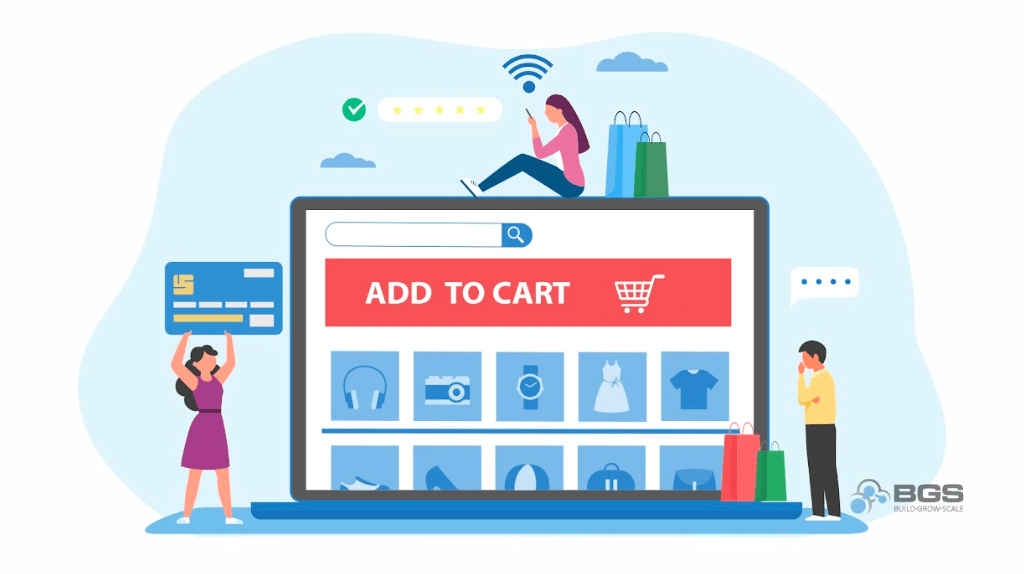
The Highest-Converting Color for Your Add-to-Cart Button
When it comes to optimizing your ecommerce store, it should come as no surprise that not just any layout or color scheme will do. And while there is a myriad of things to consider when it comes to designing your store, one of the most frequently asked questions we get from students in our Ecom Insider mastermind is, “What color should my ‘Add to Cart’ button be?”
Once we tell them the answer, they have an aha moment, apply what we told them, and immediately see an uplift in their numbers.
Visual Hierarchy of Focus
When it comes to the color of your ATC (add-to-cart) buttons, there’s only one principle you need to remember. It’s called visual hierarchy of focus.
In psychology, visual hierarchy of focus refers to the visual order of the elements on your website, such that some elements are more prominent than others. The elements that attract more attention suggest a hierarchy of importance.
In simpler terms, the more an element stands out, the more important it will seem in the eyes of your visitors.
Now, this applied to your ATC button means that the more visually obvious your add-to-cart button is, the more it will draw your visitors’ attention, and the more clicks it will get … which is exactly what you want.
The Magic Color
Now for the answer you’ve been waiting for … The highest-converting add-to-cart button color is (drum roll, please) … any color! The only caveat is that it absolutely must be the most prominent color on the page.
Generally speaking, this color should be unique, meaning that it’s not present anywhere else on your site except the ATC buttons. For example, if your brand’s color scheme is generally green with a lot of green shades, you don’t want green ATC buttons because they’ll blend in with the rest of the page and won’t attract attention (or clicks). Instead, you should choose a darker color to create more contrast.
Here’s the rule of thumb: The higher the contrast between the color of your add-to-cart button and the rest of the product page, the better it will perform.
To help you pick a button color that contrasts as much as possible with your brand’s general color scheme, I suggest consulting the color wheel.
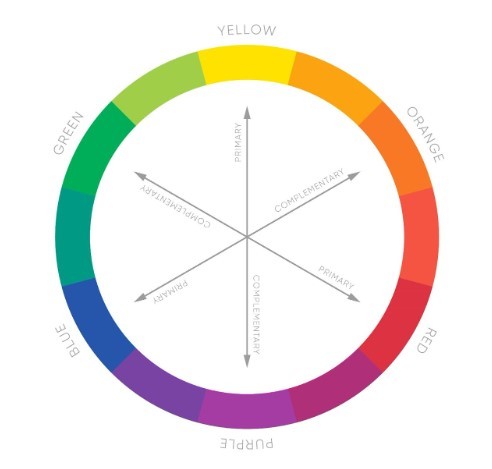
Directly opposite each color is its greatest contrast, so if your brand’s color scheme is generally blue, then orange buttons would stand out the most.
Ghastly Ghost Buttons
Another really important thing to remember is to never use ghost buttons. I repeat, never use ghost buttons on your website.
The ATC button below is a prime example of a ghost button.
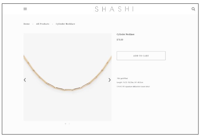
The problem here is pretty obvious: Both the page and add-to-cart button are white. And while they do look kind of fancy and cool, they’re completely useless if they disappear into the background of the page nobody can see them.
So, what color should they have made this button? Black. Because that would make it the most prominent element on the page. It’s that simple.
Having ghost buttons on your website is like hiding the cash register of your retail store in the bathroom. It’s just not going to work. You’ll lose a ton of business because nobody’s going to find the cash register there. And if your visitors need to look for your button, you’ve already lost them.
Consistency is Key
The last thing you want to ensure when it comes to button colors on your site is that all of the primary buttons in your store’s funnel are the same color.
By “primary buttons,” I mean these:
- “Add to Cart”
- “Checkout”
- “Continue Shopping”
- And any other buttons in your checkout process
Lack of consistency with these buttons will cause a disconnect in your visitors’ minds, making them have to stop and think … and potentially causing them to leave your website. You want your ecom store’s shopping experience to be as fast and intuitive as possible, and to require the least extraneous thought possible, so you can quickly secure the sale.
Wrap-Up
As you work on optimizing your ecommerce store, remember to apply everything you’ve learned here today. Make sure your ATC buttons stand out as the most prominent color on the page, don’t use ghost buttons, and be consistent. Your bottom line will thank you.


About the author
Aleksandar Nikoloski
Aleks is BGS’s Head of Revenue Optimization, an author, and a speaker. He has helped rapid-scale dozens of 6, 7, and multiple 8-figure stores as part of BGS’s Amplify Partnership program. He has gotten one store from $2.6 million a year to $6.7 million a year in 24 months, while another from doing $300k/month to doing over $2 million/month in less than 6 months, just to mention a few. The BGS team calls him the “Site Whisperer” because of his ability to find site nuances that derail the customers’ journey and cause purchase friction. Extremely meticulous and analytical, he credits all of this success to data and accurate interpretation of that data, as well as his ability to implement and test new ideas almost immediately.