

Fine-Tuning Your Ecommerce Micro Conversions for Big Wins: Category Pages, Part 2 of 5

This is the second article in a five-part ecommerce optimization series on using micro conversions to increase that one glorious metric all business owners and optimizers obsess over—conversion rate.
If you’re interested in learning all about the micro conversions associated with each step of the funnel and how each micro conversion helps increase the overall conversion rate of the store, read on (and also stay tuned for the next three articles in this series!).
Note: You can see part 1 of this series—on micro conversions and the homepage—here.
If you’re not familiar with micro conversions, don’t worry! Here’s a quick overview:
- A conversion often refers to the final transaction on the checkout page—payment. (This is the “conversion” referenced in the “conversion rate” metric.)
- A micro conversion refers to any single step a customer takes anywhere in the funnel. For example, on a product page, the micro conversion is to add a product to a cart (this action is called an add to cart or ATC). On the cart page, the micro conversion is to proceed to checkout, and so on.
So what are some super-simple things we can do to help improve those micro conversions and ultimately improve our overall conversion rate?
In this article, I’ll address some best practices that Build Grow Scale (BGS) uses to improve the performance of category pages.
Category Page
The main goal of the category page is to help customers narrow their choices based on their preferences.
There are other things that the category page should do, but focusing on this one key function alleviates most of the pain points your customers face with this page.
Best Practices
Now that we know about the main function of the category page, we can look at what best practices we can implement to increase the number of customers who view the category page.
Note: Best practices aren’t foolproof and, in our experience at BGS, only work about 65% of the time, even when implemented correctly. Any change made to your site should be tested, regardless of what you think is best!
1. Filters
Users expect to find filters on category pages. In fact, whenever I’ve executed user testing and have asked a user to locate a specific item, filters are used. In fact, we at Build Grow Scale (BGS) like to say that filters are essential and it’s all about your execution of them. If you think about the principles of optimization, you’ll see that it’s imperative to have filters from a usability standpoint.
The easiest way to successfully employ filters is to identify what your customers think is important. What do they use to make a decision? For example, in a clothing store, size, price, and color are probably important to customers. If that’s true, it makes perfect sense to include those categories in filtering.
Note: You’ll likely notice that about 80% of your traffic is mobile, so be sure to give a little extra TLC to the mobile experience on your store! Many stores accomplish this by having a “Filter by” button that drops down to reveal the filters.
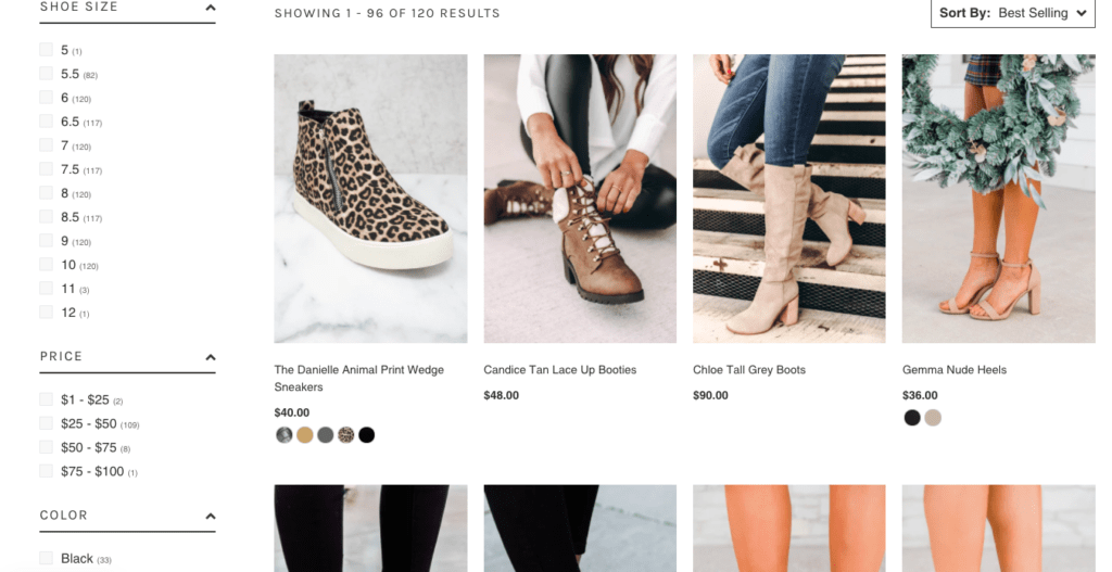
2. Badges
Badges on category pages can be incredibly helpful to users. The badges are placed over product images to help certain products to stand out, in this way helping customers decide which products they’d like to investigate further.
Badges can be image- or text-based elements. Typical badges include “NEW,” “MOST POPULAR,” or even “SALE.”
Keep these two things in mind when you’re creating your badges:
- Use badges sparingly. It’s a huge red flag for customers if all your products are labeled as new or on sale.
- Your badges must make sense, and users should be able to intuitively understand what each badge offers. If a customer can’t understand what you mean with a few short words, reevaluate the text you’re planning to use on your badge.
For example, a badge that says “Free shipping and free returns” is too long and should be condensed. Decide which of the two statements is more important to your customer. For example, a clothing brand may find that “Free Returns” yields the highest return whereas a competitor that handles a great deal of international shipping may find that “Free Shipping” works best for them. Either way, keeping the badge text condensed is important!
It’s a good idea to address an objection that your customer base may have—for example, that the price may be too high. Here’s an excellent example.
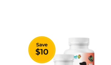
This badge is being used well. Users intuitively understand what it means, and it stands out.
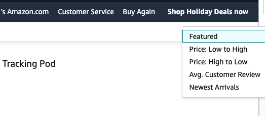
3. “Sort by” functionality
The “Sort by” functionality is a staple of most category pages. A lot of business owners don’t feel it’s important. Don’t underestimate the importance of this function or shortchange it by not giving it the TLC it needs.
For example, a sort by feature that sorts by product ID or stock number would not be useful to users. However, sorting by price, date, best sellers, customer ratings, and so on could all be helpful to users. Amazon’s sort by feature is pretty spot on. I recommend that people start looking there if they’re not yet sure what’s most important for their audience.
Maybe you sell cameras and think that people would like to sort by “disposable” or “digital” or maybe they’d like to sort by pixel resolution. Only your own research will tell you what’s important to the customer.
As with all things you’re thinking about changing on your site, make sure to test! Amazon’s “Sort by” feature is a good place to start, but be sure to uncover what it is that your customers will respond best to. Uncover this by using qualitative forms of data collection—like user tests, session recordings, surveys, and so on.
Conclusion
When it comes to optimizing ecommerce stores, there really isn’t much emphasis placed on micro conversions. Most people focus on that one main metric—conversion rate. And although it’s a great metric—and I’m certainly not saying to ignore it—it’s only one metric and meant to measure checkout-page performance.
With category pages, always remember that the top goal on a category page is to help customers find what they’re looking for. So do away with random clutter on the category page.
And always ask yourself: “Does this element on my category page help customers find what they’re looking for?” If the answer is no, test your page without that element! And as always, let me know how your category page does when you’ve implemented the changes I’ve recommended in this article!
What would happen if we focused our attention on moving more customers deeper into the funnel? Start to pay attention to your micro conversions, and let me know if any of these best practices help your category page!
And stay tuned for the third article in this series, which covers the next step in the funnel—the product page.


About the author
Haley Spindler
Haley is a Revenue Optimization Expert with Build Grow Scale. Optimizing underperforming pages is her passion and data is how she gets it done. Haley is quite the expert on the subject and has been dedicated to mentoring the future revenue optimizers of Build Grow Scale as the company’s Director of Training. Haley is an avid animal lover and when she’s not in the virtual office, she can be found at the beach with her dog.