You’ve Got Your Ecom Customers’ Attention for 8 Seconds—What Can You Do?

Irene Wanja | Mar 23, 2021
Reading Time: 5 minutesAccording to Digital Information World, the human attention span has declined considerably over the last decade: In 2000, humans had an attention span of about 12 seconds. By 2015, it was down to 8.25!
Worse yet, people are so easily distracted. Just as everyday activities like phone notifications, funny videos, and social media can be distracting in our lives, so elements in your store (like slides on your homepage or too many product images) can interrupt your visitors’ journey or even bring it to a halt.
So, if you’re dealing with short attention spans and a ton of distractions, how can you keep shoppers engaged and hold their focus?
You can improve the quality of the journey. As soon as a visitor arrives at your store, and throughout their shopping experience, make their journey as easy, fast, and engaging as possible.
How Do You Keep Your Customers’ Attention?
It’s simple, you need to learn the art of keeping them engaged by utilizing methods that increase their focus.
1. Keep it simple, stupid (KISS)

You want to create written and visual content that’s engaging but also easy for your target audience to consume. Per Digital Information World, most people in an ecommerce setting typically consume an average of 20% of the content—which means they’re basically just skimming. They don’t have enough time to read the content word for word, especially if they find it too long or it takes a while for them to understand the dense or wordy text.
Applying the KISS principle is an effective way to produce content that’s brief, clear, and concise.
Here are a few ways to implement this principle on your ecommerce store:
- Speak the language of your customer. This means communicating product features in the same way that customers tell you what’s important to them in their reviews and survey responses. If they’re concerned about durability, features can include the fine materials of a product so sturdy it can be handed down to others (and with a lifetime warranty).
- Use icons next to written content. Adding small, colorful icons next to the text grabs the user’s attention and also defines the written message in a different way.
- Highlight important aspects of a product description. For example, use bold text to emphasize what you consider to be the most important feature of a product.
- Use bullet points to simplify a product description.
2. Present content in multiple ways

When creating content for your products in your ecommerce store, remember to provide multiple presentation formats (images, text, and videos). While the information you provide won’t be completely duplicated in each format, there should be enough key information in each of the formats that visitors can absorb content based on their preferences.
A study conducted by MIT found that the human brain can identify an image in 13 milliseconds, so that may well be the simplest and fastest way to deliver information to a visitor who is skimming a page.
Videos can hold users’ attention. Digital Information World notes that people will watch a video for 2.7 minutes on average (and that’s despite having an attention span of 8.25 seconds!).
If you provide content in written, image-based, and video formats in your ecom store, no matter what format your audience chooses, they get important information about your product that you hope will motivate them to move on to the next step of buying your product.
3. Help visitors process product information
The human brain spends all day capturing and analyzing visual information. If users are overwhelmed by data, they can become paralyzed when it comes to making choices. You can improve the experience for visitors to your store by doing some of the analysis for them.
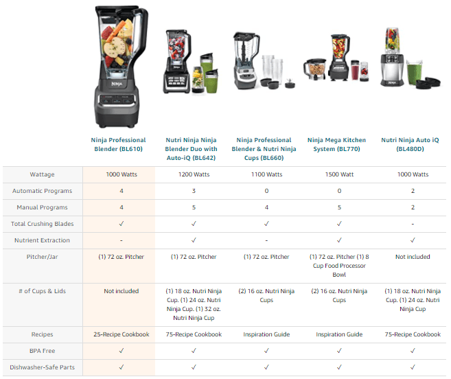
For example, ecommerce owners can provide comparison charts:
- These can show customers why they might prefer your product over those of your competitors.
- As in the screen image above, comparison charts can show customers why they should choose product A over B in the list of products you offer. Here the primary product the user has landed on is in the first column, highlighted with a distinct color, and is shown as larger than the other models. This helps users focus on that product in particular while also making comparisons with other products easy.
Displaying information in this way can also speed up the decision-making process for customers because it’s brief, precise, and to the point.
4. Implement easy-to-use navigation
The way a customer moves through your ecom store is highly dependent on the journey you’ve designed for them. Make sure that the navigation you provide is clear and consistent so as not to confuse your potential customers.

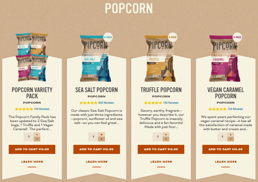
Also use motivation to increase or enhance visitors’ interactions with the content you provide. For example, ensure that anything that looks like a click-to-action element is truly clickable. This helps eliminate the kind of friction that would keep them from taking the next step.
Remember that you want the shopping journey to be quick and memorable, not one that makes them question their understanding of the store’s navigation or functionalities.
5. Increase site speed
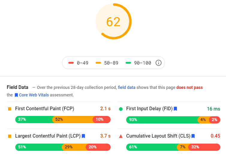
A site analysis using Google page-speed insights
Last but not least, website speed is very important for an ecommerce store. The ideal loading time for a page is no more than 3 seconds. If pages on your store (particularly the ones that convert) take longer, then you simply lose a lot of customers. People won’t have the patience to wait or spend money on a store that makes them wait due to slow page-load speed. That’s especially true if they can find a similar product in another store.
As an ecommerce store owner, make sure that your website doesn’t derail the customer journey. With a human attention span of about 8 seconds, you don’t want page-load speed taking too much of that. Use tools like Google’s PageSpeed Insights to get data on your store’s page-loading speed, and use their suggestions to maximize your store’s full potential when it comes to speed.
Conclusion
The human attention span has decreased and may be decreasing even further, but that doesn’t mean there aren’t ways to boost your ecommerce customers’ engagement with your store.
As just described, ecommerce store owners can use visuals and text that resonate for potential customers and also motivate them to take action. The key goal to keep in mind is to make the users’ journey from homepage to checkout page as easy, interesting, and friction-free as possible.
Resources
Digital Information World Web Desk. (2018). The human attention span [infographic]. Digital Information World.
Trafton, A. (2014). In the blink of an eye. MIT News.



Table of Contents
How Do You Keep Your Customers’ Attention?1. Keep it simple, stupid (KISS)2. Present content in multiple ways3. Help visitors process product information 4. Implement easy-to-use navigation5. Increase site speedConclusionResourcesTable of ContentsAbout the authorLeave a Comment Cancel ReplyAbout the author
Irene Wanja
Irene, a skilled Revenue Optimization Specialist for Build Grow Scale, combines an unparalleled focus on user research and a deep understanding of the ecommerce customer journey to orchestrate optimal shopping experiences. With an uncanny knack for detecting and addressing customer pain points through meticulous user testing, she utilizes tools such as moderated user tests, heatmaps, scrollmaps, and clickmaps to fast-track improvements in user experience and usability. Her keen eye for detail aids in swiftly spotting potential issues and implementing solutions, all while working closely with store owners and applying her intricate comprehension of user interactions. Passionate about software and technology, Irene immerses herself in enhancing her clients' business clarity, efficiency, and user satisfaction. Even though the value of user experience doesn't conform to a conventional numerical scale, the tangible outcomes of her work—improved user experience, amplified retention rates, and reduced customer support issues—are testaments to her prowess. Beyond her revenue optimization skills, Irene is a skilled writer and copywriter. She weaves her profound insights into engaging prose, crafting content that not only resonates with diverse audiences but also demystifies the complexities of user experience, consequently benefitting businesses worldwide.


