Amazon is the titan of the ecommerce world. According to TechCrunch, nearly half of all dollars spent online in the United States is spent at Amazon, and nearly two-thirds of the population of the US visit Amazon.com each month! Naturally, this results in many newer store owners seeing Amazon as the ultimate beacon of what an online store should be. As a result, we’re often hounded by questions about Amazon’s features and haunted by stores that poorly implement things they saw there.
It’s true that, being a market leader, Amazon presents things and operates in ways that teaches users what to expect as well as the meaning of various designs (e.g., two-day shipping and review-star color, respectively).
But that doesn’t mean that users expect, or even benefit from, everything Amazon does. They may even react negatively when they see Amazon attributes on a site that isn’t Amazon.
Blindly Copying Amazon Could Destroy Your Business!
The core problem is that you should not be blindly implementing anything, regardless of the quality of evidence supporting it. You should be testing!
Smaller stores have trouble doing tests on every single thing because their traffic is limited. Implementing strongly supported practices can be worthwhile, overall, even if some practices turn out to be individual losses.
The key here is “strongly supported.” A competitor—even a testing powerhouse like Amazon—doesn’t provide particularly strong evidence.
Here, we’re going to go over some of the business reasons you can’t simply copy Amazon. We’ll also provide examples of specific design decisions Amazon uses that are very likely to hurt your business.
Note: Many of the reasons you can’t and shouldn’t copy Amazon can be applied to copying things implemented by your industry’s leaders and close competitors. Just because Amazon (or your close competitors) do something doesn’t mean it will benefit your store.
You’re not Amazon
This goes without saying, but it often needs to be repeated.
Amazon is monstrous. They are likely to be many orders of magnitude larger than your store in number of products and unique visitors. It’s just not comparable to your business at all.
Amazon can build a business in a dramatically different way than you can. Most importantly, you don’t have a clue about how well they’re doing or how their business model allows them to earn money.
In fact, Amazon is rather notorious for making extremely low profits. Somehow, Amazon can lose money on every sale and still make it up in volume.
Here’s an example: According to Alphabridge, Amazon can maintain a negative operating cycle. In common language, this means that Amazon can get paid by the customer for the sale before Amazon has paid their supplier for that product. During the time between Amazon being paid and them paying the supplier, they can invest this money into expanding the business or employ other investment strategies.
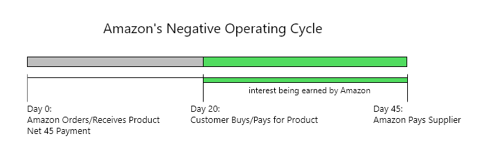
While this is a fraction of pennies on the dollar, when you have an $86 billion business, that can easily become hundreds of millions of extra dollars.
Meanwhile, virtually every other retailer, likely including you, takes longer to sell their products, has shorter repayment periods to their suppliers, and has limited means to take advantage of this idle cash. This allows Amazon to dramatically cut their margins to close to nothing (or even a negative) and still benefit.
Even when your company is seven figures, this negative operating cycle will still only be in the four figures—not worth it for you, but very worth it for Amazon.
Amazon’s product recommendations are just ads
One common Amazon feature I see on other stores is having cross-sells extend the entire width of the page just under the initial image gallery and summary description. Doing this is almost guaranteed to be hurting your store. Serving up links to other products before your users have seen enough information about the current product is very likely to cause issues. Those cross-sells very strongly usher users away from seeing necessary information for evaluating if that product is for them.
Essentially, it sends a big signal that there’s no more information on that product, but that isn’t usually the case! Often there’s a lot more information below these cross-sells as well as the reviews, which are amazing converters.
The reason Amazon gets away with this is that they don’t actually care if the user buys that product, because they make money off redirecting the users. Just look at this.
That’s an entire viewport worth of cross-sells right near the top of the product page, and all of them are sponsored links. Remember, Amazon is a marketplace as well as a retailer, so other sellers are competing to sell products and Amazon takes a cut. They can increase their earnings by also charging for the clicks on these ads, and then they don’t even need to ship anything.
You’re likely not a marketplace so can’t make any money off users who keep clicking through products and never buying. In the past, Amazon even served up ads to off-site sellers because they knew that users who clicked those ads were still very likely to come back to Amazon to buy.
But this conspiracy goes even deeper than just that. We have conclusive proof that Amazon knows this is bad for conversions: Amazon doesn’t have these sections on its own branded products.
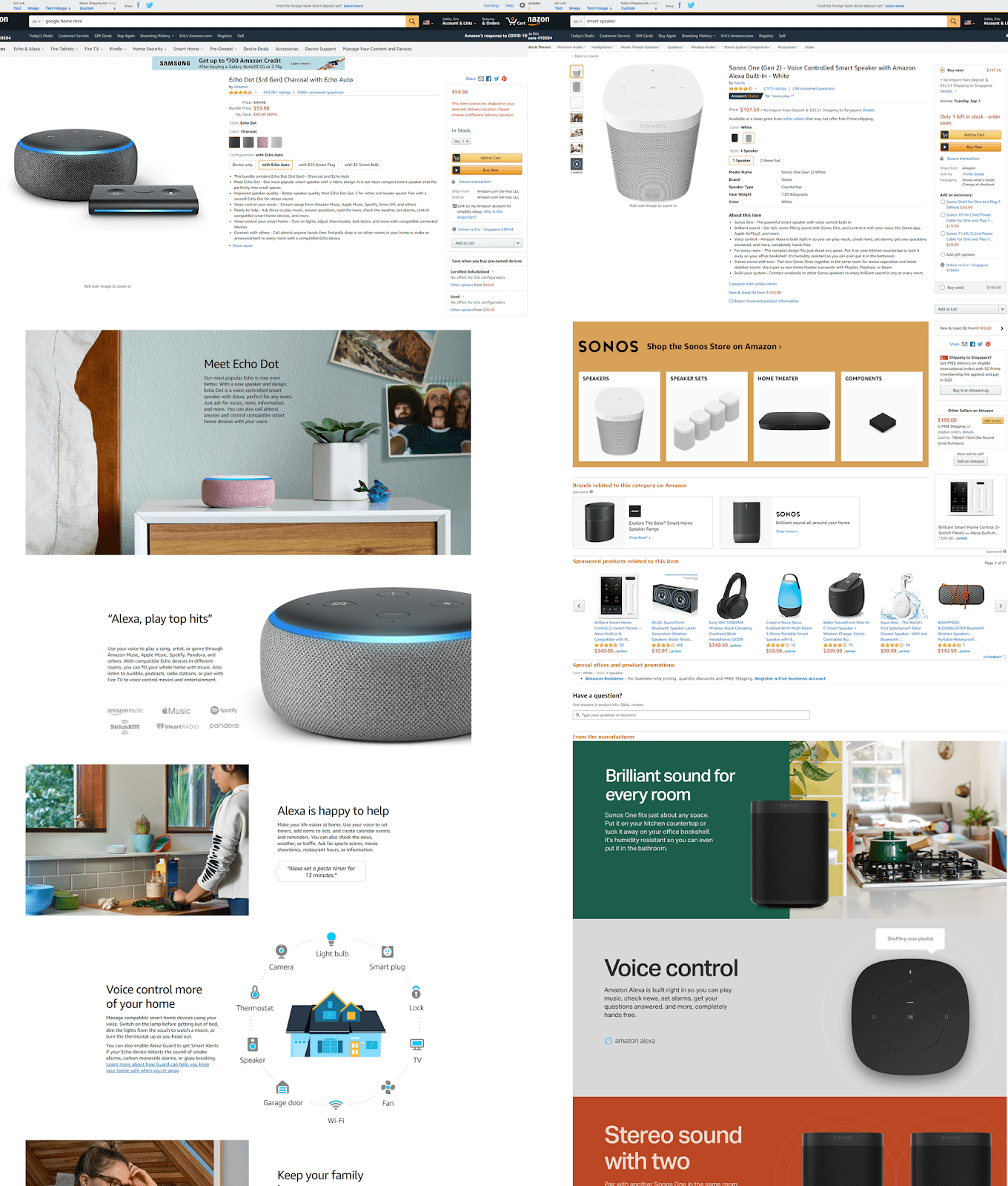
On the left is the product page for Amazon’s own Echo smart speaker—and there’s not an ad or a product recommendation in sight! Meanwhile, on the right is a Sonos smart speaker. Amazon has packed that side full of ads for competing products and brands.
On their own products, Amazon relegates cross-sells and recommendations to the extreme bottom of the page, after the visitor has seen everything about their Echo product. This is what we always recommend to stores: put your cross-sells after all of your product information. This allows users to fully consider the current product, decide maybe it isn’t for them, and move on to other options fully informed.
Don’t forget to craft a compelling marketing angle when scaling your product information, ads, copywriting and more inside your store.
Amazon sells 12 million different products
Actually, it’s over 50 million if you include Fulfillment by Amazon (FBA) and other sellers on the site, but who’s counting?
Amazon is a mass retailer to the extreme, so a lot of the things that work for them are about finding the best design on average. They can’t really allow different product types to have totally different page layouts and features because continuity is often even more important.
However, the best design for clothing isn’t the best design for supplements. That is, the Amazon site design is very unlikely to be the best kind of design for your specific product category. If you sell supplements, why would you want to follow Amazon’s designs made for selling everything from skateboards and TVs?
Changes Amazon does make are based on product type
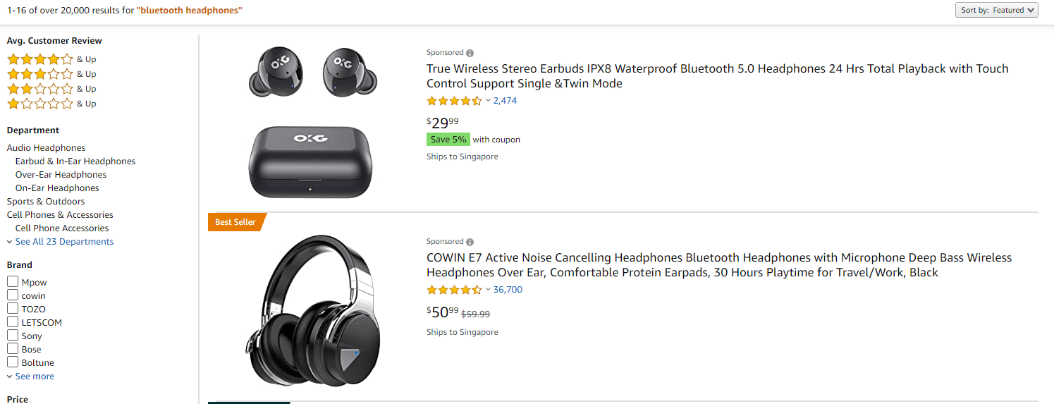
But there is one change Amazon does actually make to the site based on the product category a user is browsing. On more technical product categories, like wireless headphones, Amazon displays items in a list format, giving lots of room to the title and item specifications.
Meanwhile, on visual product categories, like shirts, Amazon displays the items in a grid format so that users can more quickly and easily compare product images.
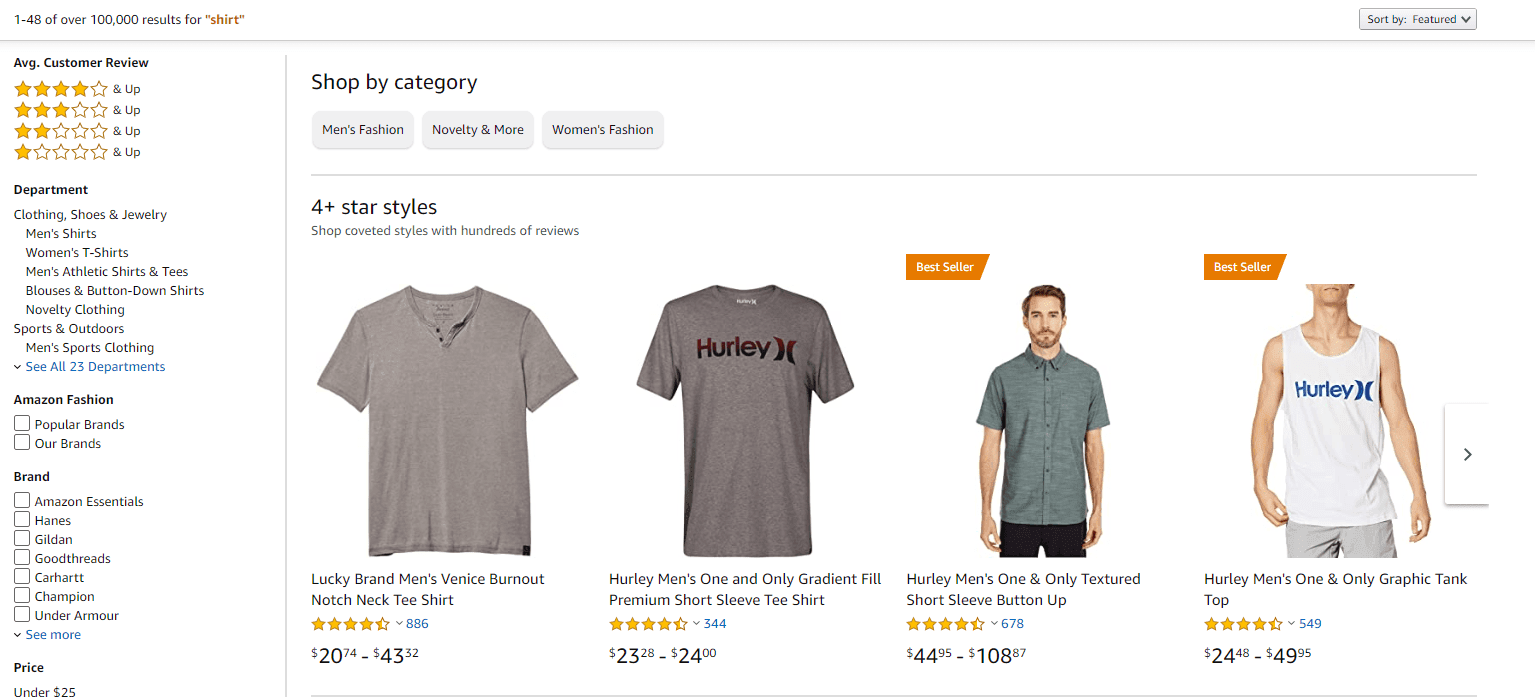
Now, this is definitely something that Amazon does that should be replicated. Category pages for technical products should allow users to evaluate some of the product’s nonvisual characteristics by providing the content in a list view. Visual products category pages should instead focus on the product images.
If you weren’t aware of these differences and looked at the wrong product type when evaluating how Amazon lays out its product categories, you could end up following bad advice!
Where Amazon’s generalized design fails them
But this also shows where Amazon has issues conveying information, owing to the standardized layouts and uncooperative third-party sellers. You’ll notice that the product title on the headphones is just jam-packed with specifications, with no consistency in what information is included or the order in which it’s shown. Sellers are competing against each other for customers instead of working together to provide a world-class experience.
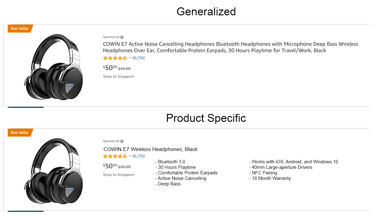
If Amazon was a more focused store (like you are!)—without the marketplace component—they could offload this technical information from the titles, present it in a legible manner, and enforce a standard order.
Doing this would allow their users to quickly compare products and understand differences between them. This is something you can and should do on your store!
Instead, because Amazon is not like your store, they lose out on a lot of the advantages of having a focused design and presentation.
This becomes even more dramatic when you factor in that Amazon must also work well for the “average user” across the entire user-demographic spectrum. They can’t narrow the focus of their design for how middle-aged women browse for purses or teenage boys browse for video games. Amazon has to have a general design that works well enough for everyone buying everything.
But you don’t! You can make the best site for your specific products and your specific audience.
Amazon gets it wrong, sometimes
Throughout its time, Amazon has sometimes gotten things very, very wrong. According to a large-scale usability study conducted by Baymard Institute, new users on Amazon have issues. This is another reason why emulating Amazon designs can cause all kinds of problems.
Amazon can often weather bad user experiences because users come to their site with a lot of love, familiarity, and goodwill. This can cause users to be more forgiving of issues and less likely to run off to a competitor (because, seriously, who is a competitor to Amazon?). This can effectively mask the usability differences between two designs. Meanwhile your users, especially ones who have never heard of you, have very little reason to push onward when they encounter friction.
In other words, looking at Amazon’s site can’t give you any knowledge about which elements are helping, which are hurting, or how Amazon decided to implement these designs. You might even be seeing a losing variant in a test when you’re browsing their site.
Changes may have been made and test results interpreted based on metrics that don’t apply to your business. Amazon may have made decisions based on their business goals at the time that decision was made. If that goal has changed, that decision is no longer the best one for their site, let alone your site.
This gets even more serious when you are looking at smaller competitors to your brand and not Amazon. Amazon is a testing powerhouse, but it’s possible your competitor doesn’t really do any testing. Instead, they may just be opting for whatever trendy change the stakeholders think will do great. Or maybe they do test their designs, but they are really bad at picking winners! If your competitors don’t truly know if their designs are working well, how could you expect them to work well for you?
How to Properly Use Amazon (and Competing Stores)
You shouldn’t take all this to mean you can’t check out how other stores are doing things. It’s actually a great source of inspiration, and we at BGS do this all the time.
But it’s important that you not simply jump to implementing some cool thing you saw without looking to see what purpose it serves and what problems it may address. Your customer research, analytics, user testing, and expert review of your store should still be your starting point. You need to see what your customers care about, where they are running into issues, and what aspects of your design or copy may be causing problems or falling short of expectations.
From there, you can look at competitors’ stores, stores outside your product category, and, yes, even Amazon, to see if they have elements that may address these problems.
It can be a great idea to maintain a folder or two where you keep screenshots and screen recordings of interesting things you find when looking at other stores. That gives you a resource you can reference when you need inspiration or are looking for a possible solution to a problem elsewhere.
Don’t get excited about something another store is doing. And don’t try to reverse-engineer reasons why someone else’s design will solve all of your store’s problems!
Always Be Testing
It wouldn’t be a BGS blog if I didn’t hark on this principle until you’re sick of hearing it. You need to test new designs!
Even if the research you do supports the possibility that X is causing problem Y, the solution you find may be worse or cause totally different problems. If you aren’t testing, you may end up trashing your own conversion rate in totally avoidable ways.
If you just don’t have enough traffic to test everything perfectly, test what you can. You may end up with poor statistical significance, but even 70% confidence is better than 0%.
Resources
Clement, J. (2020). Monthly unique visitors to U.S. retail websites 2019. Statista.
Holst, C (2013). Exploring 10 fundamental aspects of m-commerce usability. Smashing Magazine.
Lau, J. (2018). Amazon’s negative cash conversion cycle. Alphabridge.
Lunden, I. (2018). Amazon’s share of the US e-commerce market is now 49%, or 5% of all retail spend. TechCrunch.