In the modern era, where online shopping is the preferred way to shop, every ecom owner in the market space is trying to use their knowledge and skills in every possible way to grab the attention of users across different devices.
That’s why it’s important to know how to grab the attention of visitors to your ecommerce store. You want to guide them through sections and pages—to provide them with a map for their journey—and you can do that by using a visual hierarchy.
Visual hierarchy in the design highlights the most important elements in your store. It uses visual prominence to indicate the relative importance of information to users. By using visual hierarchy, commerce store owners can ensure that webpage design is easy for users to navigate, which enhances the user experience (UX) during their shopping journey.

Ecommerce store owners can use the following characteristics to improve their store’s visual hierarchy.
1. Size and Weight
The size of elements on a page (such as buttons, images, and text) can clarify for users the hierarchy they should follow when reading the content of that page. Element size can also help draw attention to an element: the larger the button, text, or image, the more attention it will receive.
Font weight also communicates relative importance. If banner text is large and bold, it will attract more attention than if it’s small and set at a lighter weight.
Ecommerce owners need to know how to use header tags (i.e., H1, H2, and H3) to indicate the relative importance of content. Differences in text sizes and word arrangement help users easily read and absorb the information presented.
But it’s also very important not to maximize the size of every element on a page. This can confuse users by drawing their focus to too many areas of the page.
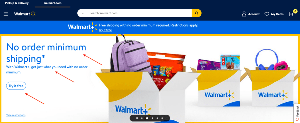 Walmart uses elements and text in many sizes and weights in the homepage banner. They do this to draw the focus of users to ensure that they don’t miss the vital information.
2. Color
Color is one of the most important characteristics of visual hierarchy. Ecommerce business owners should consider color when designing their store pages.
We’re drawn to color when it’s used to highlight certain elements on a page. Color can direct users to a specific focal point. When used correctly, it can draw users’ attention to the elements with which they’re most likely to interact.
Choose a color theme that fits your business, but don’t use too many colors. A big mix of colors reduces the usefulness of color in a visual hierarchy, leading to distraction.
Practice good information architecture (the organization of text and images in a frictionless manner that users can absorb and interact with easily) when designing an ecommerce store by using bold colors to highlight call-to-action buttons or click-to-action links. That’s a good strategy for making elements stand out, and it motivates users to interact with them.
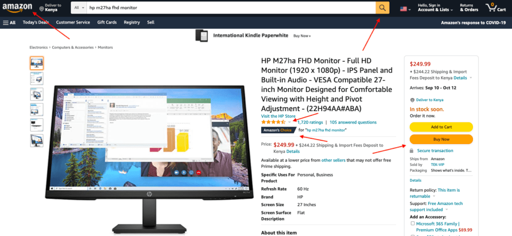 Amazon uses bold colors to highlight call-to-action buttons and draw users’ attention to interact with them.
3. Proximity
Proximity is about keeping things that are related to each other in the same area or near each other. When you group related elements on a webpage, users can better understand that there’s a relationship between those elements.
These elements on a page provide some examples:
- A product title is placed near that product’s images. Together, they highlight the product features and convey those features better than either one, alone, would do.
- A banner at the top of the homepage contains a button that prompts action. That button is next to text that informs the user about an offer or a specific product. Together, they encourage action and make it easy to take that action.
Keeping related elements close together helps users on an ecom store to better understand their purchase journey. This reduces friction and improves the user experience by promoting easy-to-understand navigation.
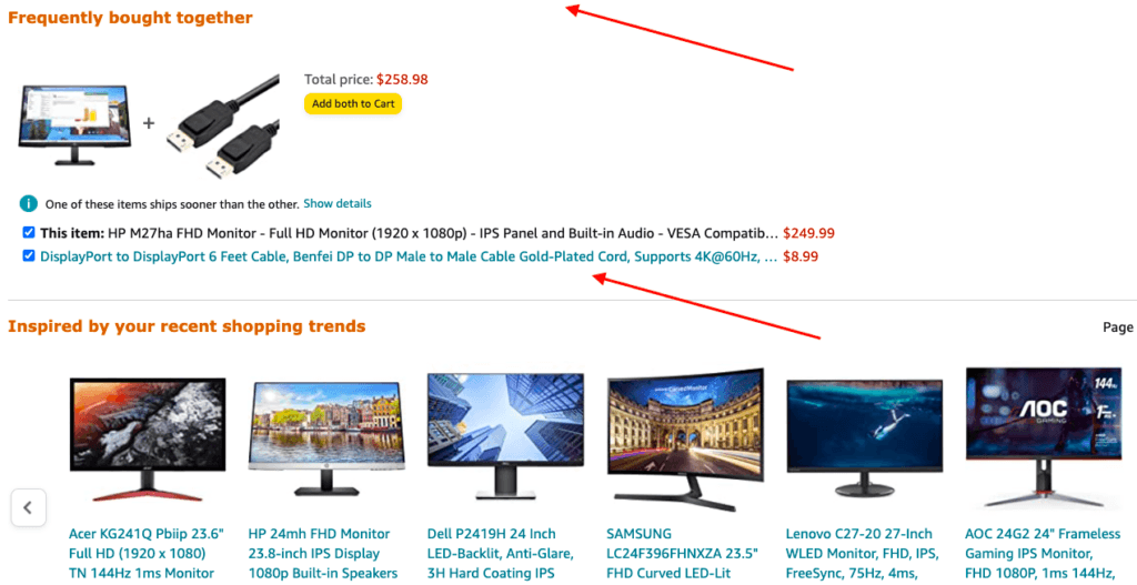
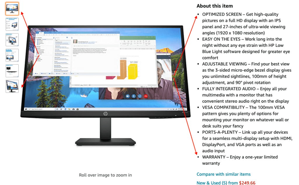 On this product page, Amazon uses proximity to group product descriptions and thumbnail images. That helps the user easily understand that they’re connected.
4. Perspective
Perspective affects customer perceptions. For example, ecom owners can use a homepage banner image of a person looking in the direction of important information. When a user arrives at that page, the user’s gaze follows the character’s gaze toward that important information.
Perspective can also be used in product photos. When you show images of products alongside props, you help users understand the actual size of the product you’re selling. For example, showing a portable power bank next to a mobile phone gives users a fast way to determine the size of the power bank, helping them make their decisions more quickly.
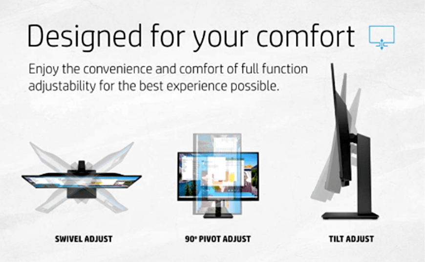 This is a 27-inch HP monitor shown in different angles, helping users envision how they can tilt the monitor.
5. White Space
White space on a page is tremendously important. It allows users to visually separate the elements of the page design. It provides them with “breathing space” to relax a bit before moving on to another element on the page.
Ecom owners should not stuff pages on their store with information just because there’s empty space. Stuffed pages become clutter and make it very difficult for users to figure out where to start and what to look at on the page. Ecom pages with a simple design and plenty of white space are easy and attractive for users to view.
 The white space on this Amazon page creates “breathing space” for users as they scroll up or down the page.
6. Scanning Pattern
Visitors scan ecom-store web pages in different ways while navigating, using “F” and “Z” scanning patterns:
- For pages containing a lot of information, such as blog pages, they use the “F” method (going from top left to top right, returning to the left, and then reading horizontally to the right again.
- For pages like product pages (which contain important information that may be scattered around the page), they use the “Z” pattern for visually scanning, starting at the top left, moving their eyes horizontally to the top right, and then scroll while viewing the page diagonally. When they stop scrolling, they move from left to right and back again (horizontally).
As an owner, you can define how you want users to capture information as they scroll through the various pages of your ecom store. This can also help you place and organize the content of various store pages for better user interaction.
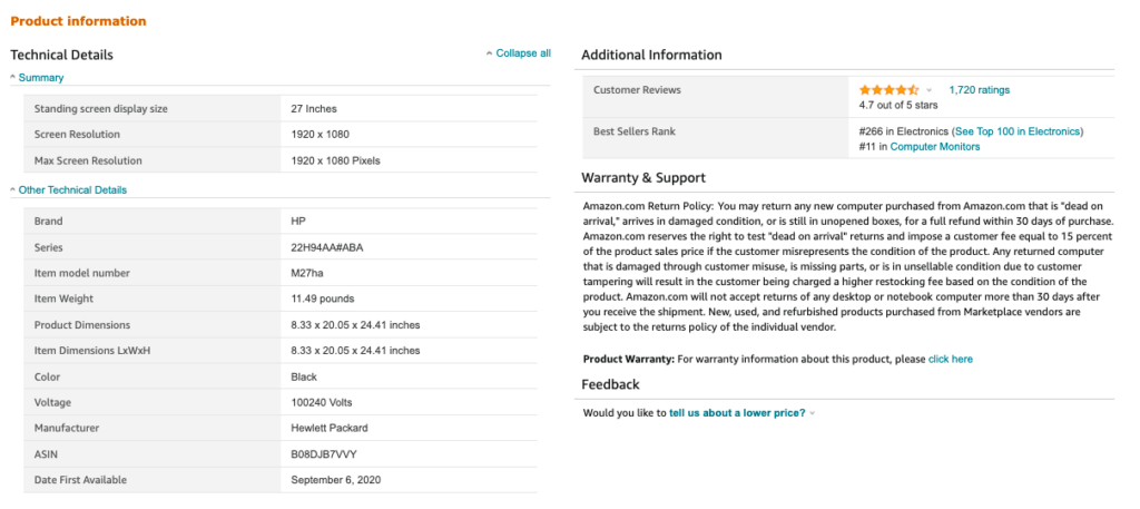 This Amazon product information is organized in a way that promotes the “F” pattern of information scanning.
Conclusion
The characteristics of visual hierarchy play an important role in enhancing the usability of an ecommerce store. When working on their store pages, ecom owners should consider these design factors (such as size and weight, color, proximity, perspective, white space, and scanning pattern). Doing so ensures that they’ll be implemented on web pages according to the hierarchy in use. That way, users have easy time-consuming information, interacting with the store, and navigating.