3 Tips for Optimizing Your Ecom Footer
Brad Owens | May 10, 2022
Reading Time: 4 minutesThe footer on an ecommerce store is a section that every website has, but yet it is often underutilized. In fact, you could say it’s the “Jan Brady” of your webpage … the section that’s often overlooked but begging for attention. In this article, we’re going to talk about optimizing the unloved, often forgotten, and sometimes neglected footer.
You may be wondering why you should even care about the footer? Well, you should care because your customer cares enough to scroll down the depths of your page to get to it, for various reasons why. They could still be trying to figure out what your site is about, they may be genuinely interested in the content on your home page, or they might be looking to find specific information.
Initially, when a customer comes to your site, you have two or three seconds to really communicate what your site is about and why they should care. When visiting your footer, a customer scrolls down past your main banner, products, categories, any videos, other banners, reviews, and so on. Actually reaching your footer is a big feat! It means that either the user is interested enough to keep scrolling or they’re looking for specific information.
So, now that I’ve explained why the footer matters, here are three tips for optimizing it (that can also help generate more revenue for your ecommerce business).
Tip #1: Provide Contact Information
You should have some contact information above the fold (the part of the screen that a user sees when they land on your website without having to scroll down), but users are used to going to the footer to find what they’re looking for. So, make sure that you have a phone number or email address (ideally both) visible, not hidden behind a link. Also, display a physical address and hours of operation. This builds trust with the user and also provides clarity about your working hours. Likewise, if you have live chat, you can link it here.
This is also the place to put your “Contact Us” link. Some sites make the mistake of providing their contact link in the top-level navigation. This is not recommended unless done specifically to generate revenue (in some cases, it can lead to revenue and lead generation for high-end and complex products). Additionally, your “Contact Us” page should have minimal fields—only ones that are absolutely necessary—because the easier it is for the customer to fill out, the better.
Tip #2: Keep It Classy (Organized)
Let’s take a look at Hot Topic’s footer. They have A LOT going on—not only a large number of products and categories on their site, but also retail locations, affiliate links, reward programs, jobs, charitable donations, and more. They have a lot more links than most ecommerce sites, but everything is nice and organized, so customers can easily find what they’re looking for. Their footer is divided into five sections/columns: Customer Service, Helpful Links, About Hot Topic, Site Info, and Follow Us, which contains their social media links.
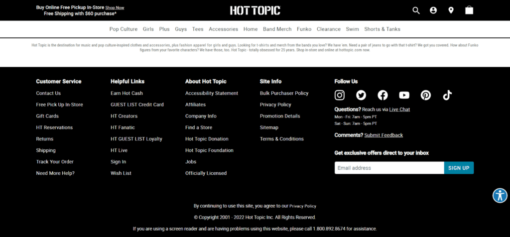
When organizing your footer, think of it like a bookstore. What if you walk into a bookstore and they don’t have their books organized at all? You’re looking for a specific book or a book on a specific topic and there are just books randomly on shelves. You most likely wouldn’t be able to find your book and leave. This can also happen on your ecom website. You want to make it as easy as possible for customers to locate the information they’re going to your footer to find. Are they looking for information about returns, or shipping, or even your company (this is a great place for an “About Us” link)? Label your sections clearly so there’s no confusion. A well-organized footer not only makes it easier and more convenient for your customers, but it’s more professional looking. No one likes a dirty store, and the last thing you want to do is devalue your brand by having a messy, unorganized site.
Tip #3: Build Your List with a Newsletter Sign-Up
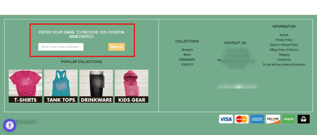
If a user has scrolled all the way to your footer, why not try to monetize it and build your list? The footer is a great place to add a newsletter sign-up! However, don’t fall into the trap of saying “Subscribe to my newsletter for offers and updates!” Very few people are going to want to constantly receive your emails … unless you’re offering value or they already know you (e.g., in the case of a celebrity).
Instead, offer something of value for signing up, like a discount code, free digital product, or free gift. Be very clear about what you’re offering and make sure it’s delivered right away, without the customer having to leave your site and open their email to receive a coupon code.
Also, be specific as to what information they need to enter in the field (e.g., “Enter your email address”) as well as with the copy on your call-to-action button (e.g., “Sign up” or “Sign up for 10% OFF).
Action Steps
Now that you have a better understanding of why your footer shouldn’t be ignored and how you can optimize it, take a look at yours. Do you have contact information, like phone number or email address, clearly visible (not hidden behind a link)? Is the layout set up in an organized manner, with section or column headings? Are you collecting either email addresses or mobile numbers for text/SMS messaging? Make a list of what needs to be worked on and then take action!
About the author
Brad Owens
Brad Owens is a BGS Revenue Optimization expert, instructor, and coach with Ecommerce Business Blueprint (EBB) and EBB Elite. He started working in ecommerce back when Amazon had auctions (hint: that was a long time ago!) and has extensive experience with marketplaces, stores, and retail—even owning a comic shop for eight years. A graduate of the Atlanta Institute of Music, he can sometimes be spotted around Atlanta playing guitar in his hard-rock disco band.


