Ecommerce store owners populate their stores with a variety of products and product options with the goal of capturing a large market share and catering to the increased demand for online shopping. But providing too many options for a particular type of product is not the best way to make sales. Actually, too many options can paralyze your customers, creating choice paralysis.

What is Choice Paralysis?
According to the book The Paradox of Choice, freedom of choice is crucial for shoppers but having too many options can create choice paralysis. This “paralysis” occurs when customers are so overwhelmed by options that they don’t know where to start. They may not be comfortable making comparisons, let alone choosing a product to buy. It might even make them drop off your website.
You can help reduce shoppers’ anxiety about what choice to make simply by reducing the number of choices to something easily manageable.
The Rule of Three
According to an article on Insider, people have an affinity for groups of three. For example, we award prizes to winners in first, second, and third place. Designers and artists often use the rule of thirds to create a pleasing composition. In marketing, there are frequently three price points, three flavors, and so on.
Similarly, you can apply the rule of three to the products or services options you offer to help buyers make comparisons and buying decisions.
Enhancing the Presentation
Highlighting
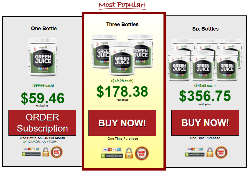
It’s important to package the options in a way that makes the decision-making process easy. A presentation that highlights the best-seller (or most-preferred) option among the three options offered is very important.
Customers want to make an informed decision and a big part of that is seeing what other people are buying as well as if that product meets their needs. Keeping the strong influence that other customers’ decisions have on them, let potential customers know which product others have chosen.
Centering
If you sell a high-priced product or your ecommerce business sells only one product, you may decide to bundle the display of a single product at different price points. If so, place the offer you most want customers to buy in the middle. In a 2009 research article on position-based beliefs, the authors describe the center-stage effect: when multiple products appear together on a screen (horizontally or vertically), people most often prefer the product in the middle to other options. Why? The article proposes that consumers believe that a product placed in the middle is the most popular one.

Organifi uses the center-stage effect as well as highlighting to emphasize the most popular option on their sales page.
Using the center-stage effect in your ecom store minimizes choice paralysis, making the decision-making process much easier and thus increasing conversion. This also helps your customers speed things up while shopping online, especially important when you take into account that they may not have much time to shop or are easily distracted while shopping online, making them forget all about the purchase they were about to make.
Why not two options?
The saying “less is more” is often true, but that doesn’t mean that you should offer only two choices. I’ve observed that if you offer just two options, shoppers typically choose the cheapest one or the one with the best value. There’s nothing wrong with either of those motivations, but by offering three options and using highlighting and centering you are more likely to be able to encourage a purchase of the central product option. They may not choose either option if they feel the products are too similar to each other.
Does the Rule of Three Apply to Product Listings?
Do you have a lot of products in your ecom store? If so, how much, if any, should you cut to reduce choice paralysis? The good news is that you don’t have to pare down your store to just three products. There are other ways to reduce choice paralysis. For example, consider using product filters to help potential buyers customize their choices in relation to their preferences and reduce the number of options in view. You can also eliminate products that may be filling your store but not converting at all. To make those decisions, you’ll need to consult your data.
Note: See this article for more about the paradox of choice and using data to eliminate products that aren’t performing well.
Conclusion
Customers like to have options, but too many options can lead to customer anxiety. It’s very important to do what you can to reduce that anxiety over buying decisions in your ecom store. Be careful not to paralyze customers with decision-making tasks. Instead, simplify your customers’ buying decisions by limiting product options for each type of product to three and highlighting and centering the preferred or best-selling options.
Resources
Chernev, A., U. Böckenholt, and J. Goodman. (2015). Choice overload: A conceptual review and meta-analysis. Journal of Consumer Psychology.
Chief Outsider. (2016). The marketing power of three. CEO Blog, Chief Outsiders.
Kalb, I. (2013). Marketers must understand the power of three. Insider.
Schwartz, B. (2004). Paradox of choice: Why more is less.Valenzuela, A., and P. Raghubir. (2009). Position-based beliefs: The center-stage effect. Journal of Consumer Psychology.


