

The 10 Optimizations to Make on Your Ecom Apparel Store
There are ten actions you can take right away to optimize your apparel store website. You’ll be presented with actions to be taken on multiple steps in the purchasing flow and why they’re important, best practices (and why they work), and the benefits you can get with implementation.
As you probably know, there are optimizations you can make that any ecom store website can benefit from in terms of clarity, readability, consistency, trustworthiness, and so on. On the other hand, some optimizations are very contextual and specific and depend on an ecom store’s segment.
Although we touch on some of the general optimizations, the focus here is on functionality and practices for apparel stores. Other visually driven niches (like home decor, accessories, and beauty products) can take huge advantage of these optimizations too.
1. Provide High-Quality Imagery and Design
Apparel stores require special attention to imagery and design since product aesthetics play an essential role in the purchasing decision. Make sure you provide excellent-quality imagery and design that create desire in users when they see your website.
These images need to capture your visitors’ attention and make them interested in proceeding to the next step. Users’ positive impressions tend to make them more loyal to the site, so bespoke imagery and design are indispensable for the homepage and very beneficial when applied sitewide.
2. Include Main Navigation Categories on the Homepage
Many sites struggle with ambiguous, vague, and thematic search query types. That’s why category browsing tends to be a much better strategy than a keyword search when it comes to this kind of industry. Using category browsing can improve your website’s clarity and make your customers’ journeys much easier, as it helps narrow down their options in a much more accurate way.
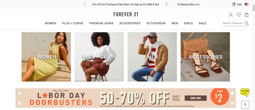
Forever 21 provides category options on the homepage. Ideally, you should add the best-selling and more popular collections here.
3. Indicate That a Product Has Been Added to the Cart
During longer product-finding journeys, especially those that are multi-session (which is often the case when people browse apparel stores), users may want to reevaluate one or more items they’ve already added to their cart and may not remember every product page they’ve already visited. If they waste their time making repeat visits to product pages because they’re not aware the item has already been added to their cart—or to the cart because they aren’t sure they’ve added the product—the probability that they will be frustrated is huge. That’s obviously something you should avoid at all costs.
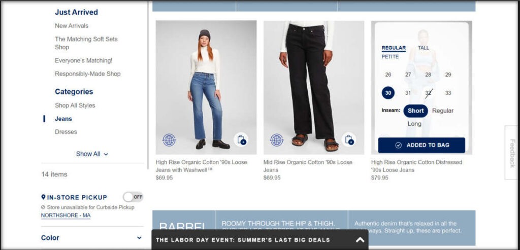
The image and text at the far left on this collection page indicate that the item has already been added to the cart. Messages like “Added to Bag/Cart” should be “sticky” (which means it shouldn’t disappear), even when users click out of the image.
4. Provide Color Swatches on Collection Pages
Make sure users can see the color variants for a product without having to go to the product page. In this case, you want to provide all available color swatches for the product. This helps potential customers avoid wasting time and clicks. They can quickly learn if you offer a product in a color they like, and it eliminates the frustration of going to a product page to discover that they won’t find what they want.
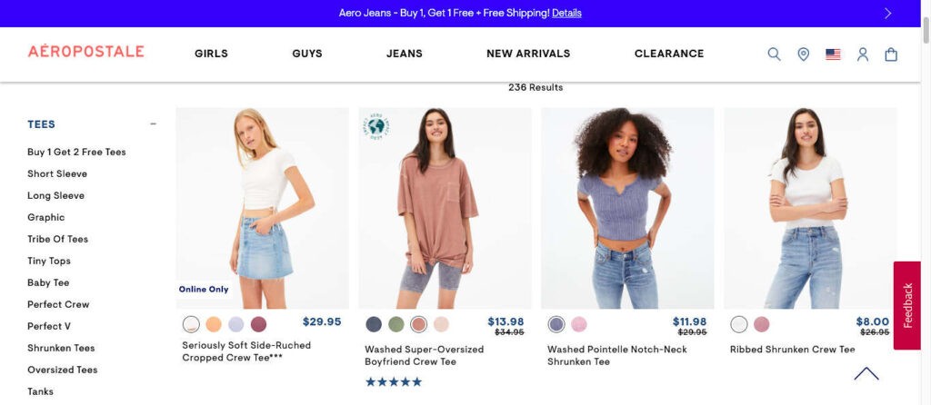
Aéropostale shows the swatches on products that have other color variants.
5. Provide a Minimum Number of Images for Each Product on Product Pages
Pay close attention to your best-selling products—both the most important and the most visited. These are the most relevant items for your website and the items you should focus on first in case it’s not possible to apply this consideration to all product pages.
Be sure to provide three to five images, including the following:
- One image should show the scale of the product by including other objects, a different setting, or a model/human frame to allow users to make a size comparison with the product.
- One image should highlight the product’s features.
- One image should show the product from a different angle (there’s no point in adding very similar images).
- If there are accessories that come with a product—and the purchase price already includes those accessories—include one image showing the product alongside those items.
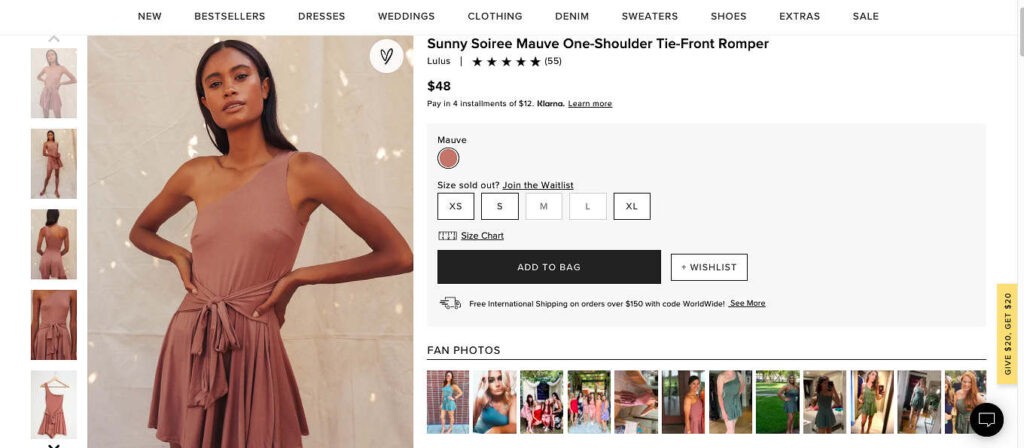
Lulu’s provides images of a human model, from different angles and highlighting the product features.
6. Use One or More Models to Provide Color and Fit Reference
This is especially important for apparel and beauty products as a single item can look very different on each individual. Users should be able to get an idea of how product color and fit work on more than one skin tone and on different bodies. That can help to resolve multiple questions users may have when they first see an item and can make a huge improvement in the number and cost of returns.
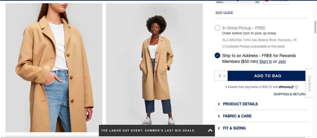
Gap uses different models to provide skin-tone references.
7. Use Large Thumbnails on Collection Pages
On collection pages, take advantage of the space that’s available by having large thumbnails to make the products more interesting and desirable. If users are not able to easily see how the product looks, there’s a big chance that they won’t proceed to the next step. As previously mentioned, images are extremely important for visually driven segments, which means this element should be a top priority in your store.
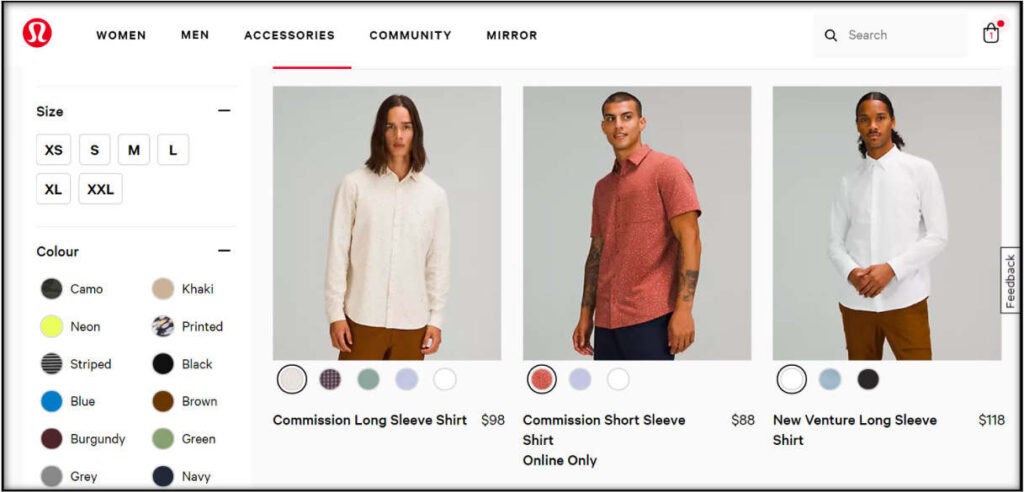
Lululemon takes advantage of the space by providing large thumbnails.
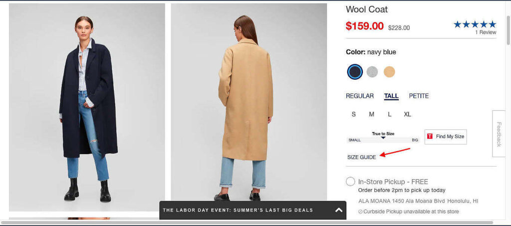
8. Provide a Size Guide Near the Size Selection on Product Pages
When it comes to apparel stores, having a size guide is mandatory. A well-built size guide can drastically reduce your returns rate (and, therefore, your costs).
The size guide (or “Sizing” tab, if you have one) should be accessed via a link near the size selector on product pages. Size guides should do the following:
- Provide detailed instructions for taking accurate measurements.
- Provide size conversions, showing international sizing when that’s relevant to your store.
- Make sure all sizing and measuring information is relevant to the product that’s being shown. This means that the size guide should be tailored to each product type to avoid creating too much cognitive load and confusion by adding irrelevant information for that specific item. (In other words, don’t provide waist measurements for a hat.)
- Provide a clear and easy “Close” option on both mobile and desktop. When users click or tap the “Back” button on the browser, the guide should be closed, and users should be taken back to the product page in which they opened the size guide. They should not be taken to the page they were on before they reached that product page.
- Also, ensure you provide the model’s measurements as well as the size worn as a reference to improve clarity about fit.
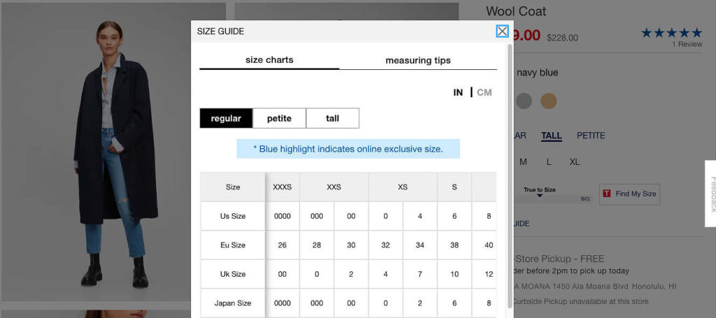
Gap offers a size guide near the size selector that provides measuring tips as well as measurements in both inches and centimeters.
9. Make Sure Your Cart Provides Images, Specifications, and Links
According to Baymard Institute, about 26% of users use the cart as a storage and comparison tool. This means that many of them will add several products they like to their cart in order to decide which one is their favorite and that they may not intend to purchase any of the items right away.
If you provide large thumbnail images, important product specifications, and links back to specific product pages, it makes their journey much easier if they’re trying to decide what to buy.
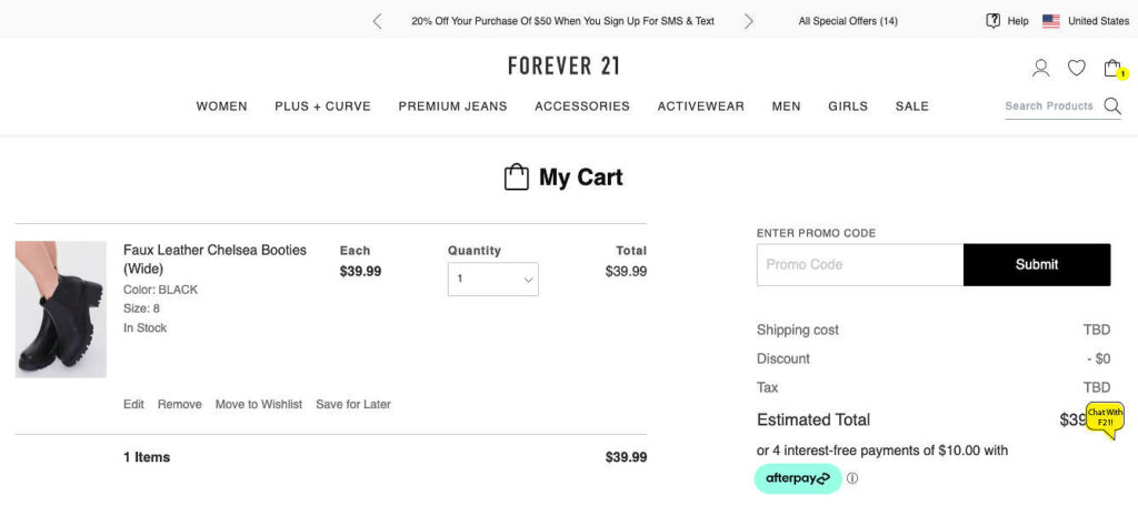
Forever 21 offers an item’s specifications in the cart. Clicking the product title or image takes users back to the product page in case they want to see any other details.
10. Allow Users to Save or Favorite Items in the Cart
Whenever a visitor to your ecom store uses the cart as a storage and comparison tool, give them the option to save an item for later, put it on a wishlist, or favorite it. Someone may not purchase a product right away, but you still want them to be able to access those items later. You can also target them later if you have a wish list app, for example.
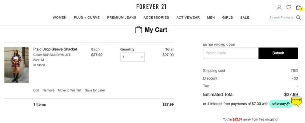
Forever 21 provides the option both to add the product to the wish list and save it for later.
Conclusion
Use this article as a guide to the most important optimizations and start working on your apparel store purchasing flow immediately!
Always keep in mind that apparel stores are visually driven, so pay extra attention to everything visual.
Make sure you provide an easy and clear navigational path and give your customers all the information they need to be able to make a purchasing decision.
Every presented guideline was extensively tested, so do your best to optimize all the steps covered in the article, to make sure you improve the overall site performance. Do not underestimate any step!
Note: If you need assistance from a trained expert who can make recommendations based on a multitude of test results and research, I highly recommend Build Grow Scale.
Resources
Baymard Institute. (2016–2021). Allow users to ‘save’ cart items and place saved items within the cart page. Guideline #622. Baymard Institute.


About the author
Mariana Dourado
I am a Revenue Optimization expert for Build Grow Scale. I love doing research and finding low-hanging fruit on website analysis, and I'm sure clarity and consistency are a perfect match. I'm also passionate about the ongoing process that is Revenue Optimization. As a typical Brazilian, I love sports and going to the beach. All of my work is supervised by Shakira, my cute sausage dog, who requires a snack and a walk after each day of work.