The #1 Reviews App for Your Ecom Store

Aleksandar Nikoloski | Jun 22, 2021
Reading Time: 7 minutesWith so many choices out there, it’s hard to know which ecom reviews app would be the best for your ecommerce store. Which apps are good? What makes a reviews app good? Can a reviews app have pros and cons? Does it really matter as long as your ecom store is getting reviews?
It can get frustrating enough that you end up choosing an app, not sure if it’s going to work well for you.
If that’s your experience, you’re definitely not alone. This is one of the most frequently asked questions by our Ecom Insider mastermind members. Once we give them an explanation, it all clicks and they’re able to choose a ecom reviews app that’s right for them.
I draw from my experience with Shopify apps, but the principles that I’m going to share apply to any ecom platform out there. By the end of this article, you’ll know exactly what makes a great reviews app. You’ll also know which app we recommend. So, let’s get into it.
What Makes a Great Reviews App?
1. Automatic review requests
First and foremost, you need to collect reviews. Pretty much all of the ecom apps out there have an automatic review request feature with this basic process: whenever somebody places an order, an automatic review request is automatically sent to them via email.
When putting together this email, keep in mind that the review collection process should be as simple as possible. Don’t ask for a lot of personal information, like gender, birth date, or any of that sort of information. You could ask for country and state, but really, if you ask for and get just the name, you’re good to go.
Why? It’s no different than checkout forms or any form for that matter: the more fields your form has, the more you’re asking from people … and the lower the likelihood of them completing it. So keep it simple … and make sure that the review requests are going out automatically.
2. Review stars and auto scroll
A good reviews app places rating stars below the title, as indicated in the image below.
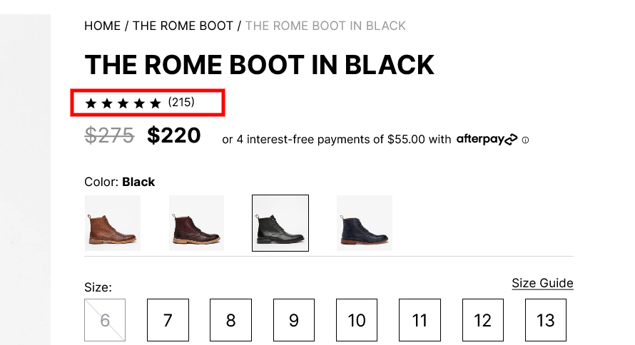
When people see—right below the title—that this product has 215 reviews, they immediately conclude that people like this product. They’re also reassured that they won’t be the first person buying it. Nobody wants to be the first person to try a product out!
A key feature of these stars is that they’re clickable and link to the reviews widget. After clicking them, a visitor should be auto scrolled down to the reviews widget. They should not be “teleported” there! That’s not a good user experience. It throws people off because they’re thinking, “Where am I now?” So make sure it’s an auto-scroll.
3. Review-specific search, keyword filters, and sorting
A really good reviews app should give people control. This is really crucial. You can do this by providing review-specific search, keyword filters, and sorting functionality.

This lets people choose what reviews they want to see and saves them from wading through hundreds of reviews. Here are some examples:
- I’m curious if this boot is easily scratched. If I search for the word “scratch” in the search bar, I see only the reviews that contain the word “scratch.”
- Maybe I care about the overall quality of the boot. In that case, I can just click on the “Quality” keyword filter (see previous image) to pull up all the reviews that contain the word “quality.”
Note: The keywords below the search bar are generated automatically based on the most frequently used keywords in the reviews. As people use these keywords in their reviews, they pop up below the search bar and are listed, in order, by popularity.
- I also want to read about the sizing of this boot. Is it a good fit? Does it run small, large, or is it perfect? These are crucial pieces of information to know about a shoe. I simply click on the “Size” keyword filter, and voilà … all of the reviews that mention size will pop up.
Visitors get easy-to-use help from the search function and keyword filters: they’re able to find the specific information that interests them as they consider buying the products.
Last but not least is to provide sort functionality for the reviews.
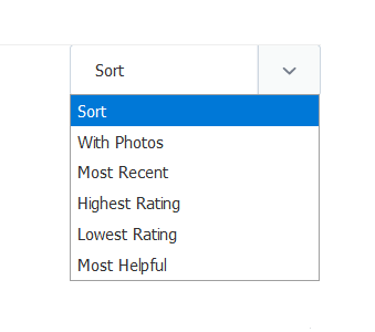
Being able to sort provides another layer of control for your visitors. On our sites, when people sort by reviews with photos, they typically convert the highest. Sorting by the lowest rating is the second-highest converting segment (more on that below).
When I’m shopping online, I always sort by the most recent reviews. That gives me an idea of how the company and product have been doing in recent months. This is a great thing to check when you really like a product that doesn’t have the best overall rating. When you sort by most recent reviews, you may discover that most of the recent reviews are positive and that issues from the older negative reviews are no longer coming. This is a sign that the company has addressed those issues, so it might be okay to buy the product.
Your visitors are doing the same thing, so the bottom line is this: give your visitors the ability to sort the reviews in ways that are relevant to them.
4. Rating-distribution chart
The next feature of a great reviews app is the rating-distribution chart.
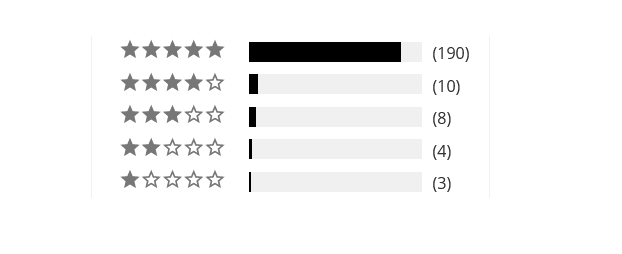
This chart gives people an overview of all the ratings of the product. It builds authenticity and increases trust in the reviews because it gives the whole picture.
If you don’t provide this, people can easily make the mistake of judging the product based on the first couple of reviews that they see at the top of the reviews widget. If those first few reviews they see are positive, and there’s no quantifiable overview of the overall rating, people think the positive ratings are fake. If those first few reviews are negative, people falsely conclude that your product is not that good.
But when you provide a rating-distribution chart, people see the big picture and realize that, in spite of the negative reviews at the top, the overall rating of the product is still great. This makes them feel more comfortable buying it.
There’s one more reason that this chart is great to have: the filtering of reviews by star rating. All of the bars on this chart should be clickable. When I click on the 1-star bar, I should be able to read only the 1-star reviews and so on, up to the 5-star reviews.
Important: Don’t show this chart for products that have less than 10 reviews because the sample size is too small. You can have your developer write a small script that hides this widget for products that have less than 10 reviews. The script can automatically show the chart when the review count is 10 or more. This isn’t a deal breaker, but it’s definitely a plus.
5. Numeric rating average
You also want your reviews app to display a numeric rating average. In the screen that follows, that’s an average rating of 4.8 stars based on 215 reviews.
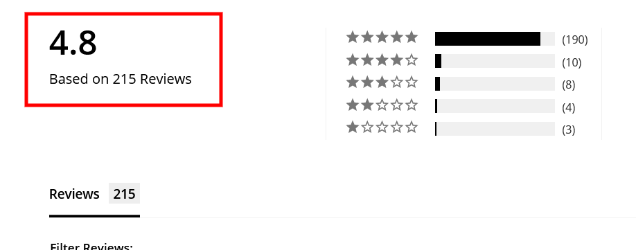
Visually, your visitors can see that the rating is 4.x (based on the reviews stars below the title). But they can’t know for sure whether it’s 4.3, 4.7, or something else. So be sure to place the numeric rating average next to the stars.
6. User-generated content (UGC) gallery
Last, but not least … A great reviews app has a UGC gallery from the reviews. It should be displayed right next to the rating-distribution chart, just like on this picture below:
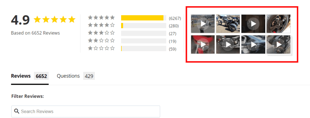
As I mentioned earlier, the people who look through these images on our websites (or use sort to show the reviews that have photos), represent one of the highest-converting segments on our sites. So, you definitely want to provide this review-specific gallery. Everybody loves to review the images and videos generated by other people who’ve bought and used the product.
The #1 Reviews App
So … what is the mysterious #1 ecom app?
This is our favorite reviews ecom app at BGS. It has all of the important features mentioned above. The best part is, it doesn’t cost an arm and a leg, which isn’t true of some of the other apps out there that don’t offer this full a set of features.
For instance, Yotpo can either have the filter, search, and sorting section or the rating-distribution chart, but it can’t offer both at the same time. It also costs an arm and a leg.
I don’t have anything against Yotpo—I’ve used it on multiple stores in the past—but at this point, I think they really need to up their game and stop resting on their laurels, especially since they’re charging a premium.
In my opinion and experience, Stamped.io is the best value that you can get … at least at the time of writing this article!
Note: There’s no affiliation whatsoever between BGS and Stamped.io. This is simply what we use, and I wanted to share that with you.
By the way … Stamped.io is not the only reviews app that we use on all of our partners’ stores. We use others too, depending on the brand and the product that we sell. However, Stamped.io is the best for most cases because it’s the most well-rounded and robust app out there.
Conclusion
So, here’s what we know so far:
- To get reviews, you first have to collect them using automatic review requests.
- Your reviews app should place-review stars below your product titles.
- When these review stars are clicked, users should be auto scrolled, not “teleported,” to the reviews widget,
- Your reviews app should provide review-specific search, filters, and sort capability.
- It should also provide a rating-distribution chart, a numeric rating representation, and, last but not least, a user-generated content gallery.
Our favorite ecom app, Stamped.io, has all of these features. If you find another app that has all of the above-mentioned features, and makes sense for you and your business, by all means, go for it!

Table of Contents
What Makes a Great Reviews App?1. Automatic review requests2. Review stars and auto scroll3. Review-specific search, keyword filters, and sorting4. Rating-distribution chart5. Numeric rating average6. User-generated content (UGC) galleryThe #1 Reviews AppConclusionTable of ContentsAbout the authorLeave a Comment Cancel ReplyAbout the author
Aleksandar Nikoloski
Aleks is BGS’s Head of Revenue Optimization, an author, and a speaker. He has helped rapid-scale dozens of 6, 7, and multiple 8-figure stores as part of BGS’s Amplify Partnership program. He has gotten one store from $2.6 million a year to $6.7 million a year in 24 months, while another from doing $300k/month to doing over $2 million/month in less than 6 months, just to mention a few. The BGS team calls him the “Site Whisperer” because of his ability to find site nuances that derail the customers’ journey and cause purchase friction. Extremely meticulous and analytical, he credits all of this success to data and accurate interpretation of that data, as well as his ability to implement and test new ideas almost immediately.


