If you choose not to make the distinctions between product and navigation options obvious, visitors to your online store will face an unavoidable choice paralysis. This happens to be one of the major causes of store abandonment as customers face too many choices, which tends to overwhelm them, leaving them with no choice but to leave your store.
Choice paralysis doesn’t only occur on product selections but also applies to navigation elements that are placed on the store as well as the vital sought-after information provided.
Today, we’re going to explore how to eradicate this paralysis on different elements and contexts in your ecom store.
Product Category Options Menu
When users land on any page of your store without knowing exactly what they want to purchase, there has to be a way to guide them through what the store carries, helping them make choices faster. That way, they tend to sort out the category or store collections first.
Typically, most store categories are broken down into main categories followed by subcategories. Many store owners tend to add a lot of subcategories, unaware that this overwhelms users who are trying to find and figure out what to buy. It’s important to limit the subcategory options to eliminate choice paralysis.
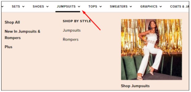
 Subcategory options on the Jumpsuits category at Fashion Nova.
Here are some ways to effectively eliminate choice paralysis in category options:
- Have categories or subcategories that are not similar to one another
- Limit the number of category options by displaying the ones that get the most traffic from store visitors
- Hide the other options behind a “More” button, so they have to willingly choose to click it to see more choices
Homepage Category Banners
While ecommerce store owners often like to add a couple of product category banners on their homepage to help customers see the range of products they sell, it’s important to limit the provided options to improve user experience and avoid choice paralysis. Follow the “Rule of Three” in this case: offer a limit of only three options to make it easier for users to make a substantive choice easier and faster.
To find out which product categories have the most visitors or sales, look at your store’s analytics, pick the top three, and design banners that will appear on the homepage. I would advise against randomly choosing categories to display on your homepage unless you’re testing it out to see how it will perform when given a grand, front-and-center placement. You can check out this article of mine to find out why the Rule of Three eradicates choice paralysis.
Product Page
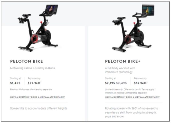
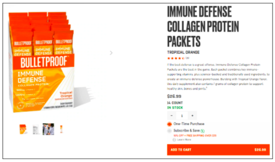
When an ecom store has products of a similar type or a variety of product bundles, it is necessary to help users determine which products to choose by introducing comparison charts. Through these charts, you will be in a position to point out the differences between each product or product bundle, giving your customers a better understanding of why they should choose product or bundle A instead of product or bundle B.
Helping people identify the distinctive differences between two similar items on a product page reduces the chances of choice paralysis because the additional information provided encourages quick decision-making.
It’s also vital to employ clarity on your product pages by providing all the information customers need in the product description or specifications. For instance, if you’re selling jewelry, like a ring, mention whether it’s for men, women, or both (unisex), tell the customer what material it’s made of, whether it tarnishes or not, and include how to care for it in order to retain its new-like condition for a long period of time.
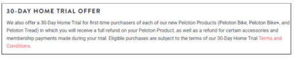
Shipping & Returns
The decision to purchase from your store relies heavily on the trustworthiness you’ve communicated through your copy, images, video, and other information on your website, and detailed shipping and returns information is a vital piece of the puzzle in doing just that. Providing unrealistic shipping and returns policy will turn people off and likely send them to shop at another store. However, an outstanding shipping and returns policy gives users confidence in shopping with you because they believe that if anything goes wrong with their order, you’ve got their back and will handle it with top-notch customer service.
Click-to-Action Buttons
Avoid presenting users with too many choices when it comes to actions required to move to the next step of their shopping journey. For example, some stores choose to have two buttons on the product page: “Add to Cart” and “Buy Now.” These two choices can create cognitive load if the user doesn’t know which page each button takes them to. They may “think” they know based on previous shopping experiences at other stores, but that doesn’t mean your site will be the same. Limiting yourself to one button here—one that clearly conveys where it will lead—can help avoid all of that confusion and unnecessary cognitive load.
Wrap-Up
Making choices can be cumbersome for ecommerce customers if your store lacks clarity regarding the differences between products and/or navigational elements. To keep people from bouncing to a competitor’s site, always err on the side of “more information is better,” and provide streamlined, crystal-clear copy, images, video, etc. Because the more confidence you can instill in your products and company, the more likely people are to buy from you (and come back for more)!