

Make Your Product Prices PROMINENT

Hey, how’s it going? Alex here from Build Grow Scale, and in this training, we’re going to talk about your product pricing and how you should display your price on your product pages properly so your customers see it immediately when they land on a page. Okay, so let’s get started.
Why is price so important? It’s obvious it’s one of the most important factors when it comes to a customer making a purchase decision. Other than the ratings and the available obvious options that they have (for example, if you have the size that they need). Other than those factors, price is obviously the most important one, so it needs to be visible immediately.
The number one thing that you don’t want to do is hide your price or make it very hard to notice and very easy to overlook ….
So, let me give you a few examples of what not to do, and then we’re going to talk about what to do instead when it comes to positioning your price and making it prominent and very easy to see.
All right—let me share my screen in a sec.
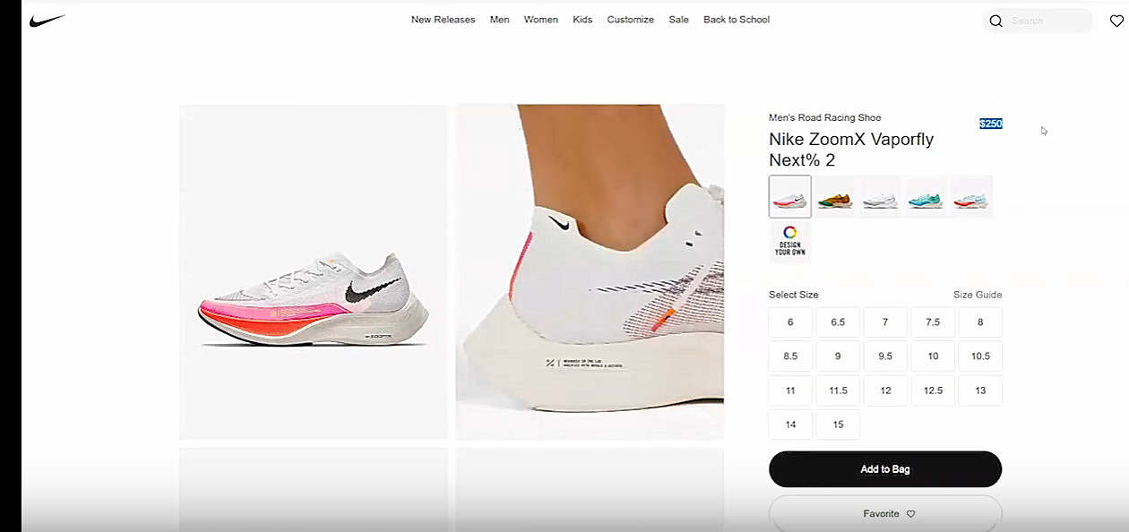
So, if you can look here on Nike, this price is barely visible and it’s in the top-right corner over here and it’s in a very kind of weird spot. It’s out of the typical visual flow. So, you don’t want to do that.
Another example is this: If you notice here, where’s the price? Oh, it’s right here. It’s so tiny, it’s so small, and it’s very crowded here with a lot of other text here. And it’s even smaller than this “Berlin Blue” color [label]. And this is another thing that you do not want to do. This is not a prominent price, and it’s very easy to overlook.
And it can get very annoying. Customers can literally bounce off of your website because they obviously can’t see the price. Or, even if they find it after a long time searching [for] it, they will feel generally negative about your website. They will literally form a negative opinion of your entire website just because they couldn’t find the price. And they will trust your site less because they think you were hiding this element from them. Does that make sense? So, never ever do this.
Here’s a third example of what you don’t want to do. Where’s the price here? We’ve got Nike. Oh, it’s right here. All right, this is literally very bad. This is violating the main rule very, very strongly.
So what do you want to do instead?
Rule #1
First of all, you want to include the price in the buy section (and when I say, ”in the buy section,” I mean, in this section where you have the “Add to Cart” button, the quantity selector, and maybe some variants—some options, sizes, colors, or whatever that are obvious. And ideally, it should be at the top of that section, unlike on Nike’s where it was in the top-right corner and that’s not a good placement for the price.
Rule #2
It should be really big. It needs to stand out, and this is the most effective way to make your price more prominent. It’s more prominent to have the size of the price font to be almost as big, if not as big, as the product title, maybe even a little bit bigger. But you don’t need to go that far. If the price is as big or nearly as big as the product title, you’re good to go.
Rule #3
It needs to be bold, so it stands out even more. One, it’s almost as big as the product [title], and now when you make it bold, there’s no way that people will miss it.
Rule #4
This is optional, but you can use a unique kind of distinguishing color that will stand out from the rest of the site. And also, it needs to be a high-contrast color. Even if you don’t use a different color, your price should always be a high-contrast color compared to the background. For example, if you have a gray background, you don’t want to use a little-bit-darker-gray price color or even [for] the other text, for that matter.
You always want as big of a contrast as possible between your background and your text. And in this case, on a white background, obviously you want to use black, bold color.
Rule #5
And, last but not least, you want to have empty space around the price. You don’t want a lot of text crowding the price just like in the example on Patagonia that I showed you a minute ago.
There should be a little bit of empty space so the price pops out even more. And obviously, you will sometimes need to have other text, like “free shipping or delivery” or whatever—make that text the same size as the rest of the body text, not as big as this price. The price should be the one biggest element in that section so it stands out the most …
Good Implementations
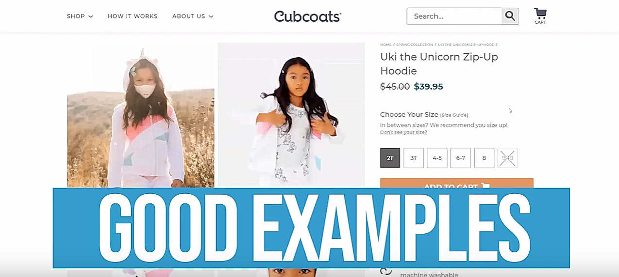
Let me show you a few examples of good price implementation. The first one is on Cubcoats, here. You notice, first of all, [that] the size is almost as big as the product title. Second, it is bold. And then, we have high contrast between the price color and the background. And there is plenty of white space around it, so it’s not too close to all of this other text here so it’s very easy to see. You can’t miss this price when you land on this product page.
Let’s go here, [to] B&H Foto. It’s obvious. You cannot miss it—there’s no way you will miss this price. And there’s not a lot of space around here. Yes, there’s quite a bit of other text around it, like the retail price and then this payment-option price or whatever. But in this case, it’s totally fine because this price is so massive that there’s no way you will miss it. It’s basically the same size as this product title. And it is bold, so you want to do the same thing.
And one last example, here—this is Best Buy. There’s no way you can miss this price. In this case, it’s even bigger than the product title, and that’s totally fine. It can be, as I said earlier, even bigger. And it is both so big [and] bold. Yes, there is other text here. They could have a little bit more empty space around it, but again, since it’s so big and prominent, that’s not hurting the website in this instance …
It’s pretty simple, so let me just summarize again: You want your price to be easily noticeable. You don’t want people to overlook it because, again, it’s a critical factor in making a purchase decision, and if they can’t see it or if it’s unclear or not very visible, they will instantly distrust your website and potentially even leave and bounce off of your website.
So, make sure, again:
- You include the price in the buy section.
- It’s big—as big as the [font size of the] title of the product.
- It’s bold.
- Optionally, you can have a distinguishable, unique color with high contrast, of course. But you can’t go wrong with black. If it’s black for the rest of your body-text color, you can use black for the price too as long as the size is right and it’s bold.
- You want to have some empty space around the price so it stands out even more. Or, if you need to have additional information (like I showed you in these examples), make sure that text is smaller so it doesn’t overcrowd the price …
If you like this video, please stay tuned because there will be a lot more videos where this one came from. And if you’re watching this on YouTube, make sure you subscribe. Click that notification bell on so that you get a notification every time we post a new video, which is almost every day now.
If you have any questions or comments, drop them below, and I’ll get to them as soon as I can. And if you want our help, just go to workwithbgs.com, just fill out a small application form. It’s a free strategy call, so you’ve got nothing to lose. So—workwithbgs.com. And until next time, take care and I’ll see you soon.


About the author
Aleksandar Nikoloski
Aleks is BGS’s Head of Revenue Optimization, an author, and a speaker. He has helped rapid-scale dozens of 6, 7, and multiple 8-figure stores as part of BGS’s Amplify Partnership program. He has gotten one store from $2.6 million a year to $6.7 million a year in 24 months, while another from doing $300k/month to doing over $2 million/month in less than 6 months, just to mention a few. The BGS team calls him the “Site Whisperer” because of his ability to find site nuances that derail the customers’ journey and cause purchase friction. Extremely meticulous and analytical, he credits all of this success to data and accurate interpretation of that data, as well as his ability to implement and test new ideas almost immediately.