

Is Your Default Collections Page Costing You Sales?
Most people in the ecom space will tell you to focus on the homepage and the product page because that’s where the money is. However, that’s not necessarily the whole truth. The page between the homepage and product page actually holds greater value to the customer, and it could make or break your next sale.
What is a Collection Page?
A collection page is an intermediary between the above-mentioned pages that is oftentimes forgotten or abandoned in default mode and can result in you losing a tremendous amount of sales.
Many eCommerce store owners do not give much attention to this page of their store, and as a result, when customers land on it, they tend to be lost. But you want to prevent that from happening because the collection page plays the following very important roles:
- Helps your store’s visitors find products easily
- Helps users discover other products you carry
- Helps reduce clutter by keeping products organized
- Ensures that customers have a good experience shopping your store
To avoid losing sales from this page, there are some important things that need to be present in your collection, so let’s go over them.
Collection Page Must-Haves
A collection page allows you to group similar types of products together. When designing a collection page on your eCommerce store, you need to design for both the users who come to your store knowing exactly what they want, and also for those that only have a general idea of what they’re looking for and need your guidance to find the right product for them.
To do that, you need to have all the elements in the screenshot below:
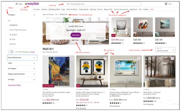
Let’s discuss each element in more depth.
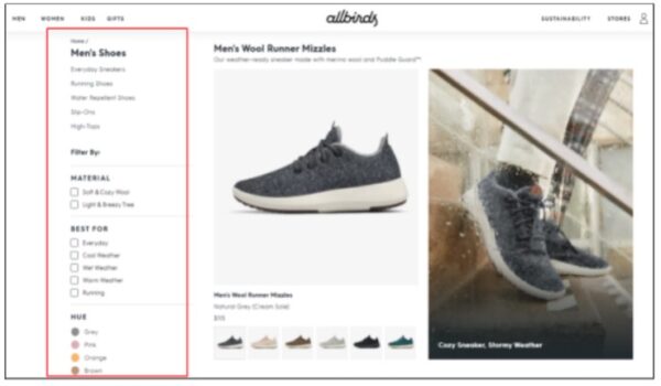
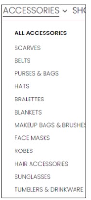
1. Filters
Having filters on the collection page is extremely important as it allows users to narrow down a large number of products quickly. Filters should be customized according to the products and product variants you offer so people can navigate them easily.
Additionally, it’s best to use checkboxes next to each filter title so that whenever one is clicked, the results displayed are only those products (and vice versa; when unclicked, the default showing all products is restored).
You also want to add as many relevant subfilter options as possible to ensure users can narrow down the selection (by things like size, color, price, gender, etc.) as much as possible to make their shopping experience quick and easy.
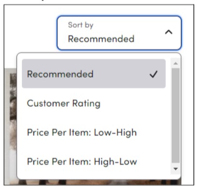
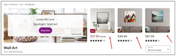
2. Sort-By Options
Sort-by options on a collection page allow users to further refine their search by viewing product results in a specific order (e.g., by highest-rated products, low to high price, high to low price, etc.). You want to give people the ability to drill down as much as possible to reduce the cognitive load from having to sift through a ton of products. The easier you make it on them, the more likely they’ll be to buy from you.
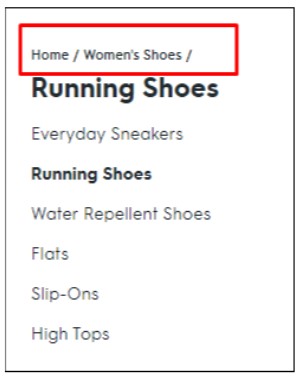
3. Breadcrumbs
Like every page of your ecom store, your collection page should contain breadcrumbs so users know not only where they came from, but also where they currently are on your site. They’re also helpful in navigating backward or to a different product collection, depending on their preference. This chain of navigation prevents shoppers from getting lost on your site, thus improving your store’s usability and the customer journey.
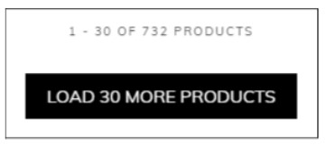
4. “Load More” Button
The “load more” button on a collection page is typically found toward the bottom part of the page, after the products, and is used to break up endless scrolling. When users click this button, they’re able to see more products under the same category. This particular button is best used in lieu of pagination as pagination is neither user-friendly nor a good optimization technique for user navigation on the collection page.
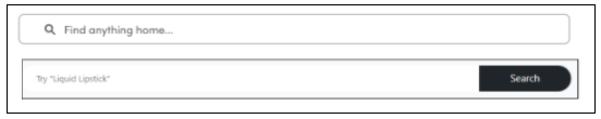
5. Search Bar
The search bar should also be present on the collection page to allow users to hard-search for the product they want in the event that the filtering and sorting options didn’t yield fruitful results.
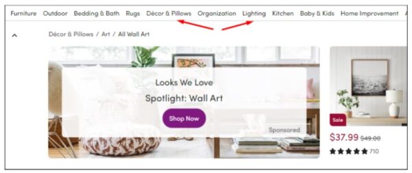
6. Collection Categories
Collection product categories should be located on the top-most part of your collection page; this will give users the option to navigate from one category to the next, depending on what they’re looking for. These categories usually vary from store to store based on the products being sold, and while stores with similar niches/audiences can have similar collection categories, you need to define your categories according to what your customers search for (vs. using default category options or your competitor’s category choices).
7. Store Logo
Having your store’s logo be visible from the collection page and linked to your homepage is a must-have user experience practice as it lets customers who want to get back to the homepage do so with just a click of a button instead of using the “back” button to walk through all previous pages they’ve visited.
8. Collections Banner
A collections banner can be a plus if utilized properly. It should be placed either above the product collections or on the side and should be of moderate size to ensure it doesn’t occupy too much space and push the products too far down. This banner can be used as a sales point to notify users of current offers or any newsworthy information they may find valuable.
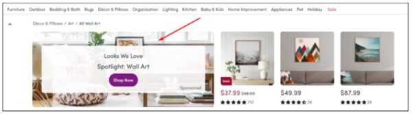
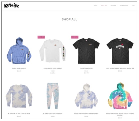
9. Product
Lastly, a collection page should contain products that are well-aligned and visually uniform. Products should be clear and optimized for speed to allow faster loading when users are browsing through the variety of products your store carries.
Collection Page No-Nos
1. Dropdown Menus
It’s important to avoid the use of dropdowns for expanding your store’s collection options. Dropdown menus tend to be somewhat messy, especially when people have to scroll through a long list of product collections. You’ll want to use checkboxes for this instead.
2. Flashy Background Colors
Flashy background colors on a collection page end up competing with products for users’ attention. Your products should be given visual hierarchy preference to ensure customers are paying attention to what you’re selling vs. getting distracted by gaudy background elements.
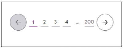
3. Pagination
As mentioned earlier, it’s not a good practice to use pagination as a means of navigation because it creates a bad user experience, especially for mobile users, being that they see so many fewer products at a time and pagination would require an insane number of clicks to view everything.
Wrap-Up
Instead of being just a gaping bridge from the homepage to the product page, a good collection page designed with the user in mind will help increase your store’s conversion rate by reducing drop-offs and making sure users proceed to the next step of their shopping journey. Creating collection pages that follow the guidelines in this article will not only help ensure that your customers feel well cared for, but also that they can find what they’re looking for quickly and easily. The easier and more convenient you make it on them, the more likely they’ll be to buy from you!


About the author
Irene Wanja
Irene, a skilled Revenue Optimization Specialist for Build Grow Scale, combines an unparalleled focus on user research and a deep understanding of the ecommerce customer journey to orchestrate optimal shopping experiences. With an uncanny knack for detecting and addressing customer pain points through meticulous user testing, she utilizes tools such as moderated user tests, heatmaps, scrollmaps, and clickmaps to fast-track improvements in user experience and usability. Her keen eye for detail aids in swiftly spotting potential issues and implementing solutions, all while working closely with store owners and applying her intricate comprehension of user interactions. Passionate about software and technology, Irene immerses herself in enhancing her clients' business clarity, efficiency, and user satisfaction. Even though the value of user experience doesn't conform to a conventional numerical scale, the tangible outcomes of her work—improved user experience, amplified retention rates, and reduced customer support issues—are testaments to her prowess. Beyond her revenue optimization skills, Irene is a skilled writer and copywriter. She weaves her profound insights into engaging prose, crafting content that not only resonates with diverse audiences but also demystifies the complexities of user experience, consequently benefitting businesses worldwide.