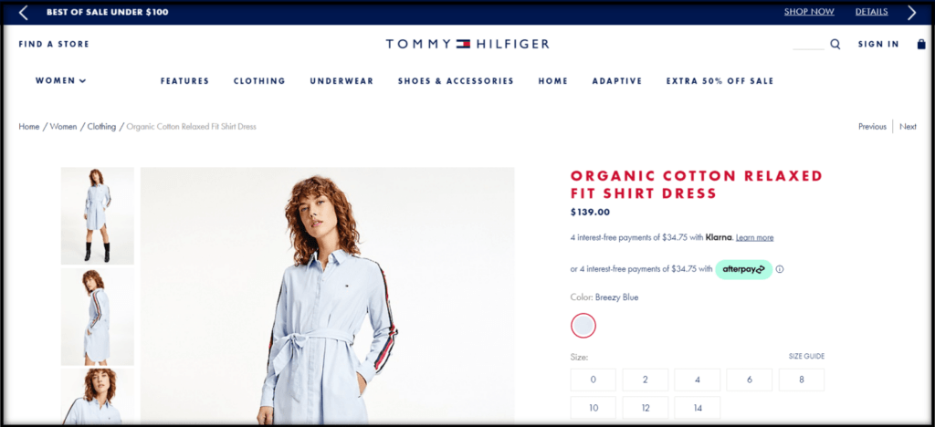
When it comes to your ecommerce store, size guides are an extremely important element that contribute to your bottom line. They not only help answer customers’ questions about your product but also instill confidence that they’re buying the right product to fit their needs.
In this article, we’re going to discuss how to create and implement the perfect size guide that will help your customers on their shopping journey and help you secure the sale!
Why Size Guides Are So Important
Simply put, when users are unsure about product sizing, it’s very likely that they’ll hesitate to take a chance on a purchase. They may even leave the product page (or your site altogether) looking for more details, and end up never returning … either because they become distracted by other things (social media, emails, a competitors’ product) or because you’re just making it too hard for them to buy from you. After all, there are only so many hours in a day and people only have so much time, energy, and patience to go around.
Your website is the closest users will be to your product before the purchase, and the information you provide is crucial in helping them decide if it’s worth buying your product or not. Because they don’t have the ability to physically handle or try it out in person, the onus is on you, as the store owner, to offer all the details needed to convert them from shoppers to customers.
Furthermore, if someone decides to take a risk and buy a product, but when it arrives it doesn’t fit, the item will need to be returned. Between the disappointment of the item not working out and the inconvenience of having to return or exchange it for the correct size, this can be a frustrating process for any customer. Or, they could decide to forego sending the product back and keep it even though they can’t use it. Either way, you end up with a negative experience that could lose the customer for good. Not only that, but take into consideration the cost to your own team—and profit margins—of being overwhelmed with and paying for returns and exchanges, all because of inadequate sizing information.
Imagine the hassle of returning something like ATV parts, for example. Or even the disappointment from realizing something like a t-shirt you really liked didn’t fit. It’s a negative experience no matter what the product is.
So, those are the main reasons why you should aim for an amazing implementation of size guides on your ecom store. Users will be more confident to buy from you, you can lower return costs drastically, decrease operational expenses, and free your customer support team from unnecessary (and avoidable) complaints. And all of these contribute to more money in your pocket at the end of the day!
Now, obviously each segment is different and might need to provide additional information in order to have the proper implementation. We will cover the general aspects and point out extra requirements for some specific niches.
Where to Put Your Size Guide
Size guides should be present as a link near the size selection on product pages. If you have a sizing tab on product pages and/or a separate sizing page, the guide should also be added to these. Another possible location is the FAQ page/section. The logic here is to show the guide where users typically search for size info and/or where they could take advantage of having the details.

What Information to Include in Your Size guide
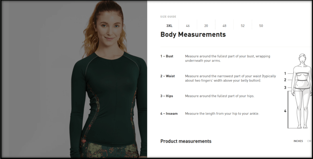
Besides the measurements of the product and its variations (if any), you should also provide detailed instructions for taking accurate measurements. If your store gets relevant international traffic and makes sales abroad, also be sure to include the conversions for international sizing—whatever options make sense for your audience.
Note: There might be a great discrepancy when it comes to sizing in other countries that can also be related to imperial and metric measurements, such as apparel stores.
Ensure all sizing and measuring information is relevant to the product that’s being shown. This means that size guides should be tailored to each product type to avoid creating too much cognitive load and confusion by adding irrelevant information for a specific item. In other words, don’t provide waist measurements for a hat, for example.
Keep in mind that you should also provide a clear and easy “Close” option on both mobile and desktop. When users click or tap the “Back” button on their browser, the guide should close, and they should be taken back to the page from which they opened the size guide … not the page they were on before going to the current page.
For some niches, such as furniture, appliances, and especially apparel, selecting the correct size is a highly important aspect of the purchase. The instructions above will already cover most of the requirements for these segments, but on apparel sites, you should also provide all models’ measurements as well as the size worn in each image as a reference to improve clarity about fit.

Things to Test Regarding Your Size Guide
It can also be interesting to show the product next to another item with which users are familiar so they have a more realistic idea of how big the product is. Typically, that’s something that should be added to the thumbnails on product pages, but it might be worth testing on the size guide as well, depending on what you sell.
Additionally, consider providing a link on the expanded size guide to contact your team or use live chat as extra help to guide customers in finding the right size. By making this option available, users are able to ask additional questions and get specific instructions about what they’re looking for, which will increase their confidence in proceeding with the purchase.
Wrap-Up
A study done by Baymard Institute verified that doubt around sizing is a common reason for product abandonment on both mobile and desktop. Users will not buy from a store if they don’t understand the information provided or the info is not enough to answer the questions they have.
As mentioned previously, unclear and/or insufficient sizing details can increase your returns and operational costs, and cause a lot of pre- and post-purchase frustration for customers (e.g., while they’re browsing and don’t know whether the item will fit, and/or when the product arrives but it’s not the size they expected). So, make sure you implement the covered topics in order to prevent unnecessary and avoidable issues, and increase your website’s clarity to make it customer-oriented. Doing so will make a positive difference in your ecommerce business, your customers’ experience with your store, and your company’s revenue!
Resources
Baymard Institute. (2017–2021). Provide a Comprehensive “Size Guide” that Includes a Measuring Guide and Conversions. Guideline #837. Baymard Institute.

