 +1 (989) 614-0089


Ecom Warning: Don’t Make the Same Mistakes as Ashley Furniture on Your Website
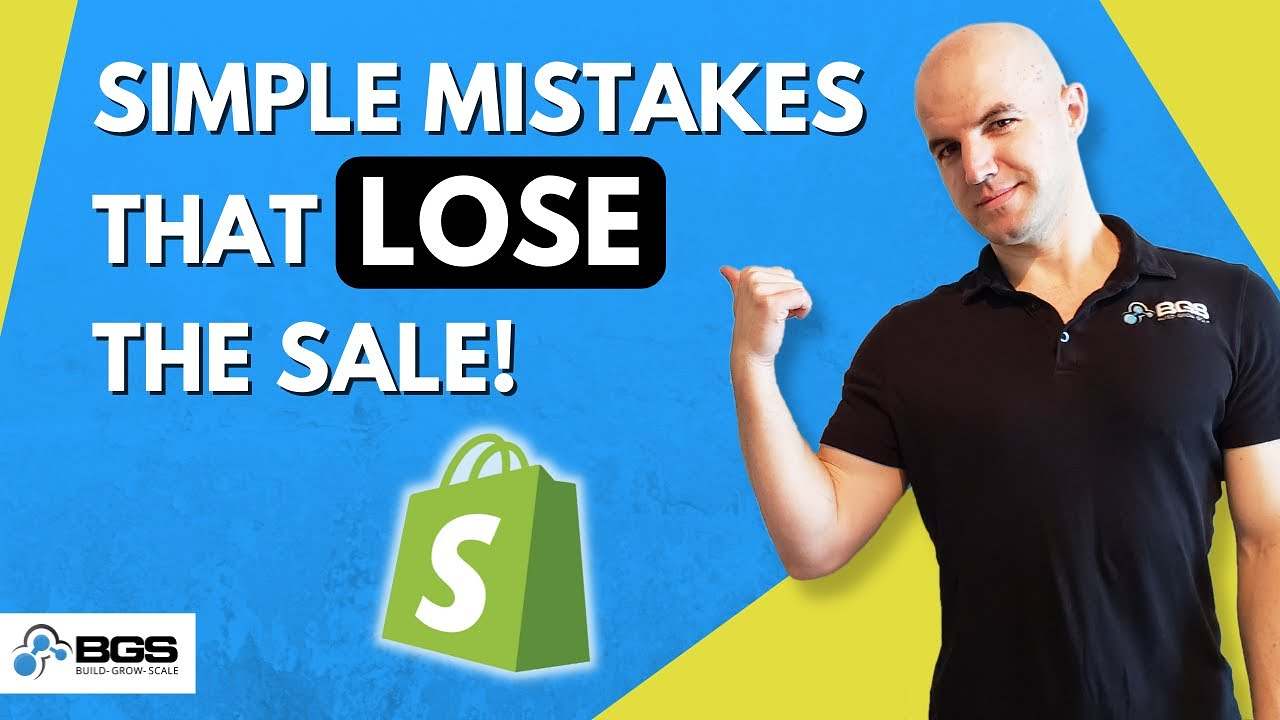
Aleksandar Nikoloski | Sep 23, 2021
Reading Time: 9 minutesHey—how’s it going? Alex here, from Build Grow Scale (BGS). I’m a Revenue Optimization expert and I help ecommerce businesses grow and scale through optimizing their stores.
And in this training, we’re going to talk about my shopping experience on Ashley Furniture [HomeStore] from the other day and the few problems/issues on their website … that really ticked me off, that I see very commonly on [other] ecommerce stores nowadays, [and] that you should definitely not be doing. So, stay tuned to find out what they are.
So, here’s what happened: I went to their website the other day and I was looking for a white shelf that I wanted to put on my wall, and that’s how I started my shopping experience—with that thought in mind.
I was on my phone, by the way, so I’m going to share my screen and I’m going “re-create” the scenario that I was going through so I can show you all of the issues that I faced during the shopping experience and make sure that you don’t do those same things on your website.
So, I’m going to share my screen now, and we’re going to get started. This is the website on mobile. I don’t have any better way of screen sharing on [a] mobile device … than this, so I hope you can clearly see what I’m going to do here.
So, here’s what happened: I wanted a shelf, so immediately I went to … “shelf”—
By the way: I didn’t plan to talk about this, but I typed “shelft,” like this, instead of “shelf,” and it’s good that it’s showing me this [“Did you mean: shelf?”], but it should have autocorrected and shown me “shelf” [in the Search bar] instead of showing me nothing. This is still better than nothing, but it should autocorrect, ideally. But anyway, that’s a whole other wormhole that I’m not going to go into. That’s a topic for [another] video on how the search should respond.
But, anyway, let’s type “shelf.” So, this is what I did. And what I did was sorted [by] “Price: low to high” and filtered by “Color: white.” And I saw this first shelf and I thought, “Oh, wow—this is perfect. This is exactly what I had in mind—one of these thicker floating shelves” or whatever.
I clicked on this, or rather, tapped on it, on my phone and I was brought to this product page. Now I look at it and I decide that I like it. I see a few of these images. I see the mounting mechanism.
And what’s the first issue here?—“Temporarily out of stock.” So, this is the very first problem that I faced. Why did it show me the white shelf when it’s temporarily out of stock? It should not show it to me in the filters; it should not show it to me here. If I filter by the color “white,” it should not show me products with the color white that are out of stock.
So, if I remove the color, let me show you, it will show me this color, which was in stock when I was searching [for] it the other day. And I’m going to talk about this in a second. Now it’s out of stock, but it was in stock, and, in that case, it’s okay to show me this color because it didn’t sort by any color. But once I sorted—I mean, filtered—by white, it showed me this, but it’s out of stock, so it should not show me a color that’s out of stock.
Now, to make things even worse, all of these other ones are out of stock. This is a problem: it should not give me an “out of stock” product at the top of the category page or the search results page, and not even have a badge here that says, “Out of Stock.” So, if that’s the case, it should at least have a badge here, “Out of Stock.”
Or if the other two colors were available and I’m filtering by white, this product should not pop out here at the top unless it’s temporarily out of stock, as it says here. If it’s temporarily out of stock, it could show it to me here but also allow me to purchase it and also show me what the expected delivery date is going to be. So, if it says, “Back in stock in three weeks” or whatever, it should say that here and still allow me to buy it if I want to. And then I can decide whether I want to wait or whether I want to go and look for this from another website. Does that make sense?
So, again, if it’s temporarily out of stock, it should allow me to buy it by showing me the extended delivery date. But, at the same time, it should also show that it’s out of stock here on the category page, so at least it saves me a couple of clicks—at least two clicks of going here and going back plus scrolling through the different colors, trying to find another color that might be in stock. I hope this is making sense and not confusing you.
But, if this is permanently out of stock and the product has been discontinued, it should not even show here. It should be totally pushed down all the way to the bottom. And it might not even show it, as well, or maybe [put it] under a category page called “Permanently out of stock” or “Discontinued” or something like that. But it should not be shown front and center. So, the right way to do this is to show “Out of stock.”
And then another thing: These swatches are not grayed out ([or] crossed out) to visually tell me that it’s out of stock—not there, not even here. And all of them are like that—they’re not crossed out. So that’s the second issue: there’s no visual feedback that this thing is out of stock.
Let’s continue: what are the other issues? Let’s talk about the colors, now that we’re into the color section. Look at these color swatches. This was another thing that really irritated me:
- First of all, where’s the color swatch now? I don’t see it, and it’s very hard to notice where the color selector is here. Why would they hide this?
- Second, these color swatches should be colored with the appropriate color. It’s cool that they have these labels, but it also should be colored.
- And third, it should not hide like this. Why would you make me tap (or click, in this case) one extra time every time I want to change a color and then hide this?
This is definitely not what you want to do. Your swatches should be colored and should be shown at all times, like this here, so you just go and tap on it but [don’t need] to tap twice here.
The next issue happened when I was scrolling through these images, and I decided I wanted to go back. I couldn’t. This is either broken or the tap area [is] so tiny that I thought, on my phone—
Here, with my mouse, I can clearly pinpoint it accurately, but on the phone, it’s very hard when it’s such a small tap area. So, there should be at least more space here to move the arrow a little bit more left and increase the tap area, so, even if I tap here in front of it with my finger, which will happen most of the time, this thing will still work. And … it’s the same thing on this side as well.
So, anyway, this is the next issue I faced, and I thought, “Okay, let me try and slide through these images.” The natural response is [to] scroll through these images, left. And look what happens: I cannot even scroll through these images. And this is another big issue on mobile.
This is not how you want to implement your zoom. On desktop, it’s fine, but not on mobile. On mobile, it should be pinched to zoom—that’s the natural, habitual response. Whenever we want to zoom into something, we usually pinch when there are two fingers or like this with these two fingers. That’s the typical user behavior, so that’s how the zoom should work on mobile. So, I couldn’t scroll back—I mean, scroll through these images—and I couldn’t go back to the other images and at that point I was super frustrated.
And the final issue that was the last straw and got me super frustrated and I just had to leave is—and I can’t even show it to you here because all these are out of stock (oh, same issue: temporarily out of stock). Here, the swatches are at least colored, so that’s good. But they hide again—that’s not good. So, they should be like this at all times (expanded).
But, same issue, … first of all, it doesn’t show me if it’s going to be back in stock and when would be the expected delivery date. So that’s a no-no. So, it makes me think that this is permanently out of stock, so shouldn’t be here at all. But, at the very least, it should have, as I said, an “Out of stock” badge or something here on the image so I don’t even waste my time clicking on it and waste the clicks.
Note: I’ve made another video on this about click depth. With every click or tap on a phone (especially an unnecessary click or tap), you’re reducing your probability of conversion rate. The less taps and clicks it takes for a visitor to go from landing on a website to purchase, the better your website will convert.
But, anyway, going back to the issue that I was going to talk about—Oh, wow: this is out of stock too. So, … I was not going to talk about this, but I’m going to mention it anyway, because I did not expect this to happen. You should also have an option to filter by products that are … available and exclude any unavailable products.
Product status: Is it available or unavailable or temporarily out of stock, as they call it? So, I shouldn’t be going through all of this stuff. Oh, same thing here. Now I’m getting frustrated again. It happens on this video. Let’s try this. Alright, finally, we found something.
Now, here’s the final issue that was the last straw for me: I’m trying to add a product to cart, and nothing happened—is the product added to the cart? What’s going on?
And this happened—I literally tapped three times on the phone before I saw this little thing change here. But … this is good: you should have this little number change in the top-right corner of the card icon, but you should not rely only on that. You must give your visitors visual feedback when they add a product to their cart. When I add it to the cart, this should change:
- You can either have this text change, adding one item to the cart, or have a little text above it, whatever.
- Or just show a pop-up overlay (a confirmation with a green check mark [that] a product has been added to the cart).
- Or take me to the cart page completely.
- But don’t leave me here hanging, not knowing what happened. That’s bad usability, and it causes a lot of frustration. And I’m telling you from [this] experience: it did that!
So, it doesn’t matter which way you do it: give your visitor some visual feedback that they’ve actually added a product to the cart. Depending on the website, we want to take people either straight to the cart page or show them a slide-out cart or even an overlay pop-up, but typically we did not leave them on the product page.
But anyway, that’s up to you. Just make sure you give them visual feedback on “Add to Cart” action.
So, just to summarize: Obviously, I didn’t end up buying … anything from this website because I was really frustrated by the time I was finished with this, and this added to it, added fuel to the fire.
But anyway, let’s recap really quick:
- First of all, if a product is out of stock on your website, make sure that you show a badge on the category pages. When the product shows, make sure that it [says that] it’s out of stock, temporarily out of stock. But only show it up there if the product is actually temporarily [out of stock and going to be] back in stock and you have inventory on the way. Even if you don’t know when the inventory is going to come and you cannot provide the expected delivery date, at least have that badge on the category page.
- And second, allow … visitors to buy out-of-stock products. And, again, as I said, tell them the rough estimate—expected delivery date. Even if you don’t know down to the day or the week, at least you can say … “Back in stock in four to six weeks.” You should be able to know roughly. But, anyway, that’s the second issue.
- The third issue, or the thing that you don’t want to do, is [to] hide the swatches behind a link so people need to tap on it. And then, also, you want to have them colored, not just little white transparent circles.
- And also, they should also be grayed out for a color that is out of stock: grayed out and crossed out like this, something that people can be able to tap [or] click on …, but it should visually show that they’re out of stock.
- The next thing was the click area or the tap area around the thumbnail arrows on your mobile. That should be big enough so that even somebody with butterfingers will be able to tap it and not miss tapping [or] click or tap where they didn’t intend to.
- Next: Pinch to zoom on mobile. Make sure that your website supports pinch to zoom (when people zoom with two fingers, that’s how the image is zoomed; that’s the typical user behavior).
- And what’s the next issue that we talked about? The “Add to Cart.” Make sure that you give people visual feedback when they tap [or click] on the “Add to Cart” … Either show a lower confirmation message or overlay a pop-up with a confirmation message or site cart or take them straight to the cart page—but don’t not do anything (just like on this website). You have to give them visual feedback.
Anyway, that’s it for this video. I hope it made sense and cleared up some things for you and allowed you to notice, maybe, some of the things you’re doing on your website so you can go and fix them now.
So, if you like this video, click “Like,” and subscribe and click on that notification bell button because we post videos like this almost every day. And if you have any questions or comments, please drop them in the comment section down below.
And if you want our help, just go to workwithbgs.com [and] fill out a small form. It’s a free call that you can hop on. And you’ve got nothing to lose, basically—it’s a free strategy call. Just fill out a little form, and we’ll see how we can help …
I hope you have a good one and I’ll see you next time. Bye.

About the author
Aleksandar Nikoloski
Aleks is BGS’s Head of Revenue Optimization, an author, and a speaker. He has helped rapid-scale dozens of 6, 7, and multiple 8-figure stores as part of BGS’s Amplify Partnership program. He has gotten one store from $2.6 million a year to $6.7 million a year in 24 months, while another from doing $300k/month to doing over $2 million/month in less than 6 months, just to mention a few. The BGS team calls him the “Site Whisperer” because of his ability to find site nuances that derail the customers’ journey and cause purchase friction. Extremely meticulous and analytical, he credits all of this success to data and accurate interpretation of that data, as well as his ability to implement and test new ideas almost immediately.