

Ecom Navigation: How to Lead Them Home to Checkout, Not Off the Store

When a user visits your ecommerce store, they should be able to easily navigate from one page to another, regardless of the path of the shopping journey they are taking.
Navigating from the homepage to checkout should be a simple and easy-to-follow process. There shouldn’t be any hurdles to clear or constraints that limit users to navigating in one specific way while shopping. Visitors should be able to freely maneuver from point A to point B to achieve the result they desire.
A number of navigation factors figure into the best user experience. We focus on the kinds of navigation that can make the most difference in a user-friendly ecommerce store.

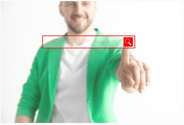
1. Search Bar
It’s so important to include a very visible search bar in the most prominent location on your ecom store. That’s why it’s usually on the homepage near the logo—a location where it cannot be missed.
Most users who see your product on a social media platform are going to come to your store wanting to buy that product or looking for something similar. If they can easily find what they want on your store, they’re probably going to buy from you.
For this to go smoothly, they need to use the search bar to query the product name or use a keyword to search for a similar product. For a search to be fruitful, the product name or keyword must match or be closely related to the product title, tags, or description.
That’s why you, as an ecommerce store owner, need to make sure that you have the search function properly dialed in so that it works well for your potential buyers. For example, use a search app that autocompletes the user’s search terms and that displays and updates the search results below the search bar while the user is still typing. That makes it very easy for users to find the product they want without having to search through an entire collection page.
2. Search Results Page
Once you produce a search results page showing all hits for that search term on your store, you should offer users the option to organize and pare back those results. They can do this by using filters, which I discuss in more detail in the next section. If you don’t offer these important navigation elements, users will have to scroll, potentially for a long time, through page after page, one product after another.
If the search results page doesn’t return any results at all (not because of an error but because no products match the search term), don’t simply present a “No results found” page. This can confuse the user and end up creating a navigation “gap” (meaning users aren’t sure where to navigate next). That kind of dead-end response can push users to bounce off your ecommerce site.
Instead, replace the “No results found” style of response with suggestions for the user’s next step. For example, provide a link on that page so users can navigate to your best-selling collection, to your homepage, or to have a chat with live support for quick help.
3. Filters
Filters in an ecommerce store also improve the user experience by acting as a navigational assist. The results of filtering give the visitor an efficient way to navigate to the products they are seeking:
- “Sort by” drop-down filters are typically generic filters that allow people to sort your ecom store products—and the results of a search of any size—into a specific order by broad category. Options include sorting from newest to oldest product and from highest to lowest price. Despite being so broad, these filters are still very useful because they allow visitors to find and then navigate to their desired product more quickly.
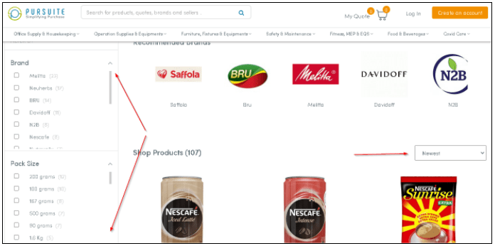
This is a sidebar filter (on the left) and a “sort-by” drop-down filter (on the right).
- Sidebar filters offer more granular filtering options. They capture main categories and subcategories (for example: Color: Blue, Green, Red, Black) with which users can reduce the number of search results. There are fewer products for a user to scroll through, and the remaining products are more specific to the user’s interests.
Without filters, your store users scroll through multiple pages, seeing all possible products (including products they don’t want to see). Faced with that, many visitors end up abandoning their shopping journey because they’re overwhelmed by the product choices. They also don’t want to wade through the potentially large number of products that don’t reflect their interests.
4. Quantity Box
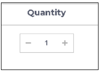
Whether a user wants two, three, or twenty of a particular product, it should be possible to easily add to and subtract from any quantity of a product that’s already in the cart. The quantity box allows this on both the product and cart pages. It’s having the quantity box on the cart page that’s the big navigational timesaver. It means users don’t have to navigate back and forth between the cart and the product page to change the quantity of each of the specific products they want to buy.
5. “Continue Shopping” Button
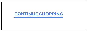
The “Continue Shopping” (or “Back to Shopping”) button is usually found on the cart page. It allows users to return to the homepage, product page, or collection page to continue shopping after adding a product to their cart. This is a very important navigation element and should be included on your store’s shopping cart page.
Many users haven’t completed their shopping when they add a product to their cart. If you don’t provide this button, you’re interrupting their shopping experience and making it more difficult to continue. If users are comfortable with how ecommerce stores work, they can probably find their way back to actively shopping. If they aren’t knowledgeable, they will probably get frustrated and bounce.
6. Navigational Buttons
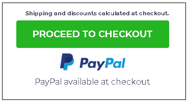
Any prominent navigational button, like the one shown above, encourages potential customers to move confidently toward the desired action—to purchase products on the checkout page. Consider them to be signs along the route that can help direct the visitor’s journey. If this button doesn’t function properly—for example, if it leads users to a 404 error page—that’s a dead end that could encourage someone to abandon the checkout process at the very end of the process.
Note: In addition to confirming that all navigational buttons function correctly, make sure that what the button “promises” is fulfilled. In the example above, the checkout page should contain only the information directly related to the checkout process.
Conclusion
When designing the different navigation elements in your ecommerce store, keep users and their differences in mind. Cover any gaps that leave users unsure of where to navigate to next. Improve your store’s navigation so that you know users can get from point A to point B without any problems. Once these navigation pointers are implemented, getting your visitors to the checkout page will get easier and easier.


About the author
Irene Wanja
Irene, a skilled Revenue Optimization Specialist for Build Grow Scale, combines an unparalleled focus on user research and a deep understanding of the ecommerce customer journey to orchestrate optimal shopping experiences. With an uncanny knack for detecting and addressing customer pain points through meticulous user testing, she utilizes tools such as moderated user tests, heatmaps, scrollmaps, and clickmaps to fast-track improvements in user experience and usability. Her keen eye for detail aids in swiftly spotting potential issues and implementing solutions, all while working closely with store owners and applying her intricate comprehension of user interactions. Passionate about software and technology, Irene immerses herself in enhancing her clients' business clarity, efficiency, and user satisfaction. Even though the value of user experience doesn't conform to a conventional numerical scale, the tangible outcomes of her work—improved user experience, amplified retention rates, and reduced customer support issues—are testaments to her prowess. Beyond her revenue optimization skills, Irene is a skilled writer and copywriter. She weaves her profound insights into engaging prose, crafting content that not only resonates with diverse audiences but also demystifies the complexities of user experience, consequently benefitting businesses worldwide.