I get it … The 404 page is probably the last page on your mind that you want to focus on optimizing, but don’t discard it yet!
What if I told you that if you follow the optimization suggestions below, you will not only increase customer satisfaction and improve your SEO, but also boost conversions and revenue!
I know that’s hard to believe, but stick with me and I’ll show you how.
First, we need to take a look at the world of 404 pages!
What Is a 404 Page?
If you have landed on this article and you are asking yourself—“What the heck is a 404 page, and why should I pay any attention to it?”—let me clear that up for you real quick!
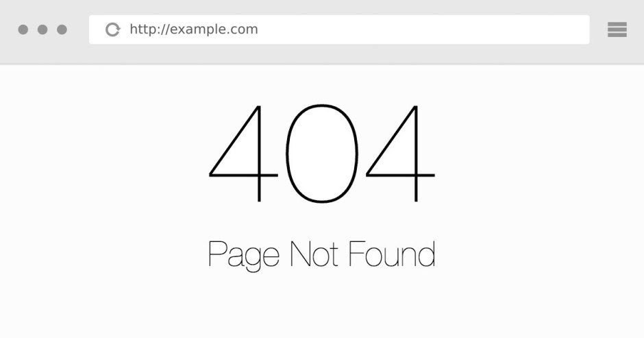
Have you ever been browsing Google or a website and clicked on a page that didn’t go to the page you expected? And instead you are faced with a dreadful message that reads something along the lines of “Page not found” or “Oops! We can’t seem to find the page you’re looking for?” It may look something like this …

That is a 404-error page. It’s frustratingly boring even to look at, I know. And when you see one, you’re left with no choice but to click the “Back” button or close your browser, ultimately ending your experience with that website.
Should You Care?
That depends on how much you care about your visitors. This not only agitates the visitor by disrupting their experience (and thereby lowering the trust factor of your business), but it can also damage other areas of your business, such as SEO (search engine optimization).
Yep, that’s right …
If multiple visitors click on a link from Google that takes them to a 404 page and then they click the “Back” button, it tells the search engine that the user isn’t finding what they were looking for by using that keyword. That results in your ranking for that keyword dropping!
And 404 pages aren’t all that uncommon either. As a website continues to develop, adding and removing products and content, users will click on broken links or mistype URLs, and they’ll land on the dreaded 404 page.
Unfortunately for a lot of users, this will be the end of their session. They grow frustrated when they don’t see what they expected and leave, unlikely to return. But it doesn’t have to be that way!
I’m here to guard against that happening on your website.
It’s so important not to make your problem—a 404 error—your customer’s problem too. Instead, provide a solution that makes everyone happy!
What Should You Do?
Design a custom 404 page that is branded with alternative options that give your visitors a solution!
Don’t believe me? Take Google’s word for it! Even Google, the all-knowing search engine, advises customizing your 404 page!

Also, instead of your SEO taking a dive, it will tell Google that your links are providing value and, in turn, will improve your search engine rankings.
Note: Google advises that you still make sure that your web server returns a 404 status code to users and spiders (web crawlers) so that search engines don’t accidentally index your custom 404 page.
Here’s more information in the screenshot below, provided by Google.

Now that we have the technical issues out of the way, let’s take a look at these three creative 404 pages that you can use as inspiration, and I’ll break down why each of these 404 pages are beneficial to your customers’ journey.
1. GitHub—Search Bar
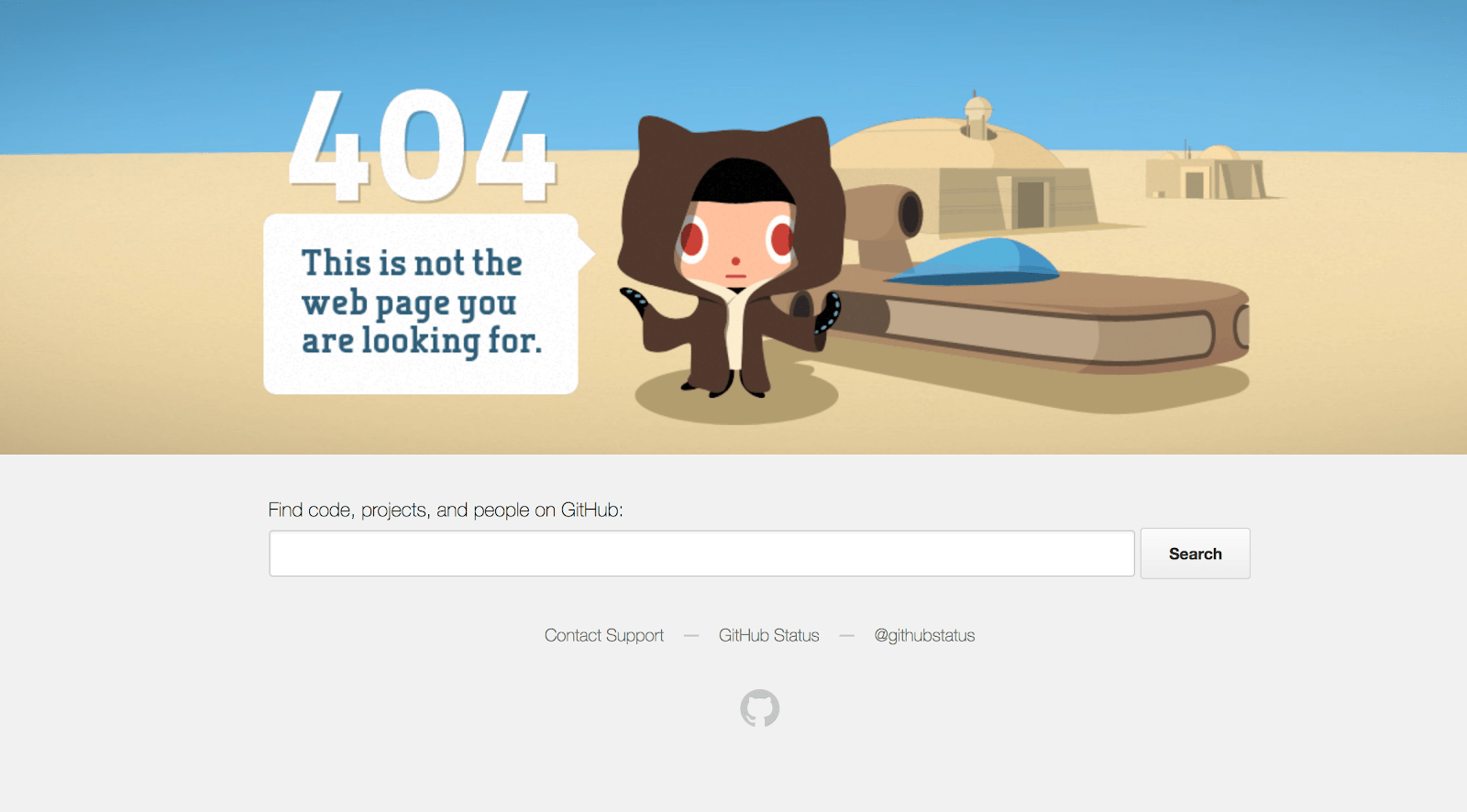
I like this example from GitHub mainly because they have utilized a friendly graphic that tells the customer that they are, in fact, on the correct site but that the specific content the customer wants does not currently exist or is unavailable. They follow this up with a big search bar that spans most of the page.

You may not be aware, but users who search also convert at a much higher rate than those who don’t—often over three times as much! Knowing how valuable search is, it’s a great idea to encourage visitors who hit an unexpected roadblock to use the search feature to find what they’re looking for.
Tip: Don’t forget to add placeholder text within your search bar to inspire popular search queries.
2. Lego—Homepage Redirect
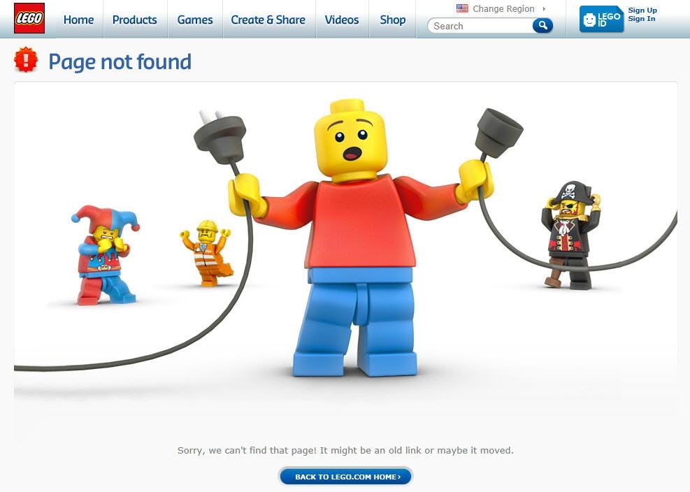
The next 404 page is famous in the land of the 404s. The simple-yet-effective use of its own branded products makes this 404 an absolute standout!

You will notice there is no mention of a “404 error” or any use of language that would confuse your visitors. Not everyone knows what that error means, nor do they really care.
Instead, their visitors have been presented with a neat, self-explanatory banner accompanied by a button that takes the customer back to the homepage.
This works so well because it satisfies the two main goals of the homepage. That’s it.
What are they?
- To provide trust
- To provide clear navigation
They have executed both of these goals: The trust factor is still intact because the page still resonates with the brand so seamlessly. And for the second goal, it’s well-known that the homepage is typically the starting point for any site. A lot of users will return to the homepage to look for different products or services.
So redirecting your visitors to the homepage will put them in the best place to navigate to other products or available content without feeling stuck in the mud.
“Leggo” to the next example!
3. ModCloth—Popular Collections or Products
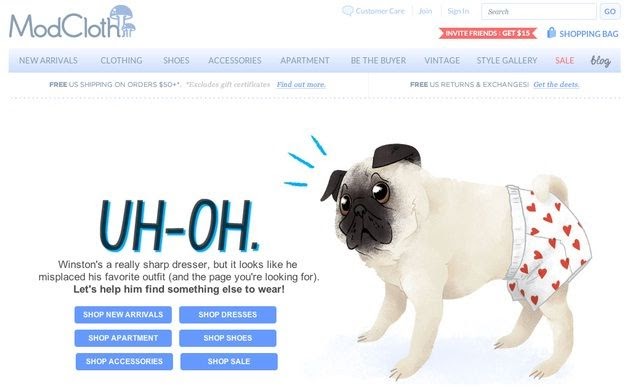
Another creative option to distract your visitors after they land on a 404 page is to add popular collections or products. You can even incorporate some humor if it suits your brand.
ModCloth has done just that.

Right away, they are making a great impression and providing their visitors with a quick transition to seeing another collection that is relevant to them! Talk about being helpful … Thanks Winston!
Humor can be a priceless way to grab the attention of your visitors and make your brand feel a little more human.
This doesn’t mean you should try to be funny on every page, but a 404 page can be a great starting place if it suits your brand.
Just remember it’s more important to be helpful than to be funny.
Conclusion
I have given you three great examples of some big companies creating some genius custom 404 pages that solve a pain point for their visitors.
It’s a straightforward concept: once you understand your visitors’ needs, you can give them a solution and reap the benefits. This goes far beyond 404 pages. This concept can be applied to many aspects of your business.
Before I go, I want to leave you with some functional elements that you can include in your custom page design that will help your visitors and provide a better user experience:
- A link back to the homepage (typically the best starting point for any website)
- A search bar with placeholder text that encourages the use of your most popular search terms
- A “Call to Action” (CTA) button to your best sellers, or a carousel
- Links to popular products or collections
- Exit-intent popups, which can include discounts in exchange for an email address
- Lead magnets, which can be in the form of a quiz, trials, or even training videos
- Interactive elements with gamification
Now that your creative juices are flowing, strike while the iron is hot and start piecing together your unique, custom 404 page!


