

Mastering the Art of Crafting Calls-to-Action and Best Practices

Are you wondering if a good call to action can make a difference for your business, but you’re not sure how? Don’t worry; we’ve got you covered!
This guide will introduce you to the art of creating a compelling call to action. You’ll learn how to design irresistible buttons, craft persuasive copy, and strategically place your call to action for maximum impact.
Let’s dive in and start converting those visitors into customers!
What exactly is a call to action?
So, what is a call to action exactly?
They’re the crucial buttons or links on your website that prompt your visitors to take a specific action, like ‘Buy Now’, ‘Sign Up’, or ‘Learn More’.
Understanding their significance and the psychology behind user behavior can help you optimize these CTAs for increased conversions. For instance Shein call to action button says ‘Get the looks’

Significance of optimizing CTA buttons for increased conversions
You’ve got to understand the importance of optimizing your CTA buttons, as they can significantly ramp up your conversion rates. A call to action, or CTA, is a prompt on your website that encourages visitors to take a specific action. The CTA button is the tool that drives your visitor to that action.
What is a call to action, you ask? It’s a crucial part of your marketing strategy that can guide users towards conversion, whether that’s making a purchase, subscribing to a newsletter, or downloading a resource. By enhancing the design, placement, and language of your CTA buttons, you can entice users to click, leading to higher engagement and more successful conversions.
In essence, optimizing your CTA is a simple yet effective way to boost your business. See for example the call to action from Ganttic.

Exploring the psychology behind CTAs and user behavior
Now, let’s delve deeper into the psychology behind CTAs and user behavior.
To do that, it’s crucial that you understand what exactly calls to action are. Essentially, CTAs are cues or signals, often buttons or links, directing users to perform a specific action.
The psychology behind it’s simple – humans are naturally driven to complete tasks. When you see a CTA, it creates a sense of urgency or curiosity, nudging you to click and find out more.
This is how CTAs influence user behavior and boost engagement on your website. The more compelling and clear your CTA is, the more likely users are to take the desired action. A good example is the CTA on CXL page as seen on the image below.

Designing Irresistible Call-to-Action Buttons
In crafting a compelling call-to-action button, it’s crucial for you to focus on the design as much as on the text. You see, the aesthetic appeal of a button can significantly influence click rates. A bland, unappealing button might be overlooked, while an attractive, eye-catching one can entice users to take action.
Color choice is one of the most important factors to consider. Choose a color that stands out from the rest of your site to grab attention. But remember, it’s not just about being bold; the color should also align with your brand’s identity. For instance, Coursera has implemented this very well on the website, as seen in the image below, by showing two CTA buttons with different colors so as to differentiate between the two.

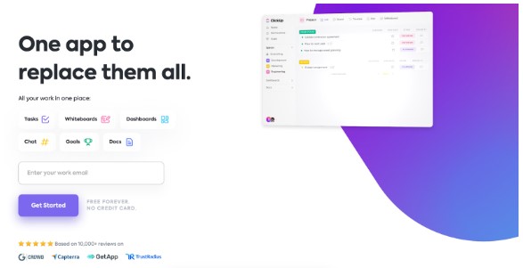
Size is another critical factor. Your CTA button should be big enough to be noticed, yet not so large that it’s overwhelming. Users should be able to spot it easily without having to search around your webpage. For instance, Clickup has implemented this very well on the website, as seen in the image below.
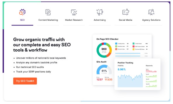
Positioning also matters. Your CTA button should ideally be placed in a prominent spot where users can easily see it. Above the fold is often a good choice, but it’s not a hard-and-fast rule. Experiment to see what works best for your site. For instance, Semrush has implemented this very well on the website’s homepage’s left-hand side, as seen in the image below.
Lastly, don’t forget about whitespace. Surrounding your CTA button with ample space can help it stand out and attract clicks.
Crafting Compelling Call to Action Copy
Ready to create a compelling call to action (CTA) copy that converts?
You’ll need to harness the power of persuasive language, carefully select the right words, and perform A/B testing to optimize your results.
Let’s get started on turning your average CTAs into irresistible click magnets!
The power of persuasive language in CTAs
Often, you’ll find that effective CTAs rely heavily on the power of persuasive language. It’s all about stirring emotions and creating a sense of urgency. Words like ‘now’, ‘hurry’, or ‘limited time offer’ can push your audience to take action immediately. Similarly, the use of first-person language like ‘I’ or ‘my’ can make your CTAs more personal and relatable.
But remember, it’s not just about the words you use. It’s about how you arrange them. A clear, concise message is key. Make sure your CTA is straightforward and leads your audience exactly where you want them to go.
Lastly, consider testing different phrases to see what works best for your audience. After all, there’s no one-size-fits-all in digital marketing.
Choosing the right words for your CTA copy
Before diving into the specifics of crafting your CTA copy, it’s critical to understand that the right choice of words can make or break your call to action.
The power of your CTA lies in its simplicity and directness. It’s not the place for fancy jargon or elaborate language. Instead, use clear, compelling words that inspire action.
Consider your audience and what motivates them. Is it fear of missing out? The promise of a reward? Use this knowledge to craft a CTA that resonates. For example, instead of ‘Submit’, try ‘Get your free ebook now.’ This creates urgency and offers a clear benefit.
Choosing the right words for your CTA can significantly boost your conversions and engagement.
A/B testing different copies for optimal results
You’ve crafted your call to action copy, but you’re not done yet; it’s time to perform A/B testing on different copies for optimal results. Creating two versions of your CTA, with slight variations, will let you directly compare their performance. This could be as simple as changing a single word or the color of your CTA button.
Track the click-through rates on each version. The one that garners the most interaction is your go-to. But don’t stop there. Regular A/B testing keeps your CTAs fresh and effective. Remember, what worked yesterday mightn’t work today. So, keep testing, tweaking, and refining.
Crafting compelling CTAs is an ongoing process. With A/B testing, you’re always optimizing.
Strategic Placement of Call to Action
In your journey to mastering the art of a compelling call to action (CTA), understanding the strategic placement is critical. You can’t just throw a CTA anywhere on your page and hope it works. It’s like a chess game; each move should be deliberate and strategic.
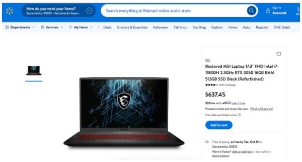
The first place you’d want to consider is the top of your page or ‘above the fold’. This is the first part of your website visitors see without scrolling. It’s an excellent spot for an attention-grabbing CTA. However, you don’t want to bombard your visitors immediately, so make sure it’s well-integrated and not overly pushy. For example, Walmart’s call to action button on the product page follows these guidelines.
Another key placement is at the end of a quality piece of content. After providing valuable information, your reader is often open to what you suggest next. That’s your cue to swoop in with a compelling CTA. But remember, it’s not about tricking them into clicking; it’s about providing further value.
Also, consider placing CTAs in the middle of your content, especially in longer pieces. These can be subtle nudges, reminding your reader of the action you’d like them to take.rop
Finally, the footer or very bottom of your page is another strategic spot. This is for those who’ve taken the time to scroll through your page. They’re interested. A well-placed CTA here could be the final push they need.
Conclusion
So, after all that, you’re probably wondering where to start, aren’t you? Let’s conclude by recapping the most crucial takeaways.
Creating an effective Call to Action (CTA) isn’t just about slapping a ‘Buy Now’ button on your website or email. It’s about understanding your target audience, their needs, and how your product or service can solve their problems. Your CTA should be compelling, clear, and concise. It should create a sense of urgency and provide a clear path to the action you want your audience to take.
Remember, a successful CTA isn’t just about increasing clicks; it’s about increasing conversions. Use actionable language that motivates your audience to take the desired action. Make your CTA stand out by using contrasting colors and keep it above the fold where it’s easily visible.
Test, measure, and optimize your CTAs. Use A/B testing to experiment with different designs, placements, and copy. Analyze your results and make adjustments based on what works best for your audience.
Finally, don’t forget about the power of persuasion. Use testimonials, case studies, or social proof to build trust and credibility. Show your audience the value of your offer and why they should take action now.
In conclusion, creating an effective CTA is a process that requires time, effort, and constant optimization. But with the right approach, your CTA can be a powerful tool in driving conversions and achieving your business goals.
Frequently Asked Questions:


About the author
Irene Wanja
Irene, a skilled Revenue Optimization Specialist for Build Grow Scale, combines an unparalleled focus on user research and a deep understanding of the ecommerce customer journey to orchestrate optimal shopping experiences. With an uncanny knack for detecting and addressing customer pain points through meticulous user testing, she utilizes tools such as moderated user tests, heatmaps, scrollmaps, and clickmaps to fast-track improvements in user experience and usability. Her keen eye for detail aids in swiftly spotting potential issues and implementing solutions, all while working closely with store owners and applying her intricate comprehension of user interactions. Passionate about software and technology, Irene immerses herself in enhancing her clients' business clarity, efficiency, and user satisfaction. Even though the value of user experience doesn't conform to a conventional numerical scale, the tangible outcomes of her work—improved user experience, amplified retention rates, and reduced customer support issues—are testaments to her prowess. Beyond her revenue optimization skills, Irene is a skilled writer and copywriter. She weaves her profound insights into engaging prose, crafting content that not only resonates with diverse audiences but also demystifies the complexities of user experience, consequently benefitting businesses worldwide.