

Are Your Ecom Store’s Visitors
Ignoring Your Product Descriptions?
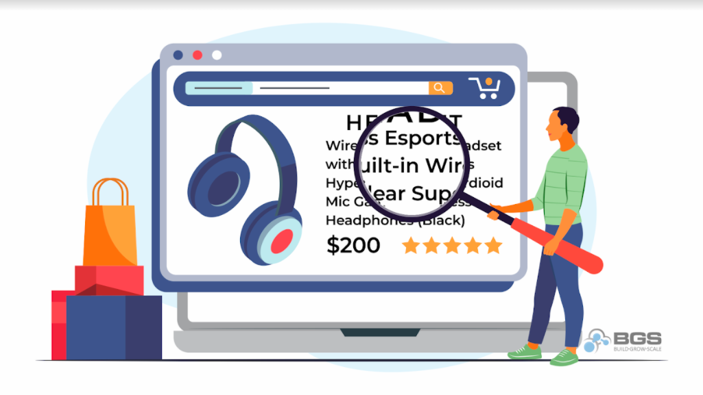
With today’s generation having an attention span of eight seconds, what are the chances your visitors are reading those huge walls of text in your ecom product descriptions?
Clue: Close to ZERO. Blame it on the world … where answers are immediate, and choices are infinite. (I personally blame Siri and Alexa.)
Product descriptions are expected on any ecommerce site. They act as the in-store salesperson, helping you find the information you need and hopefully closing the sale. But are your visitors ignoring (scrolling past) your store’s salesperson (product descriptions)?
What Is a Product Description?
Product descriptions are an essential part of the product page. If a visitor wants to know details about a product in order to make a buying decision, the product description will be their go-to for finding the information they’re looking for.
However, product descriptions aren’t the most immediately utilized element on the product page. Visitors tend to browse through the images, check prices, and read user reviews before checking out the main product info … if they make it that far at all.
But don’t fret! Your efforts in crafting the perfect product descriptions do not go to waste. According to a study conducted by Baymard Institute, 35% of 3,967 adult US online shoppers considered “better product information online” the most important reason to shop online vs. brick and mortar. It totally makes sense, considering that at physical stores, you’re at the mercy of the information provided on the back of the product’s packaging or how well a store employee knows their stuff.
Why Do You Need Product Descriptions?
Based on the many user testing sessions I’ve watched, once a user lands on the product page, their eyes immediately go to the images, especially for a visual product like clothing or jewelry. When users need feedback about the product, they go to user reviews. However, if they need more information about the length and width of a study table, for instance, or perhaps the functionality, features, and compatibility specs of a Bluetooth speaker, they go to product descriptions.
Ecom store owners are fortunate to have the opportunity to provide thorough and valuable information through their product descriptions, because the information they provide there plays an important role in leading visitors to complete a purchase.
How to Get Visitors to Read Your Descriptions
Visitors often feel overwhelmed when confronted with walls of text and can come away from the reading experience (or reading “attempt” if they decide it’s too much to handle) feeling that the information provided was insufficient and that their questions were not answered.
Below are my suggestions to make your product descriptions easy to digest.
1. Pair bullet lists with small blocks of text.
Bulleted lists are a quick and effective way to communicate product information in bite-size pieces. They quickly present product features but lack context when standing alone. Pairing your bulleted lists with small/short blocks of text to offer more details prevents your visitors from abandoning the page.
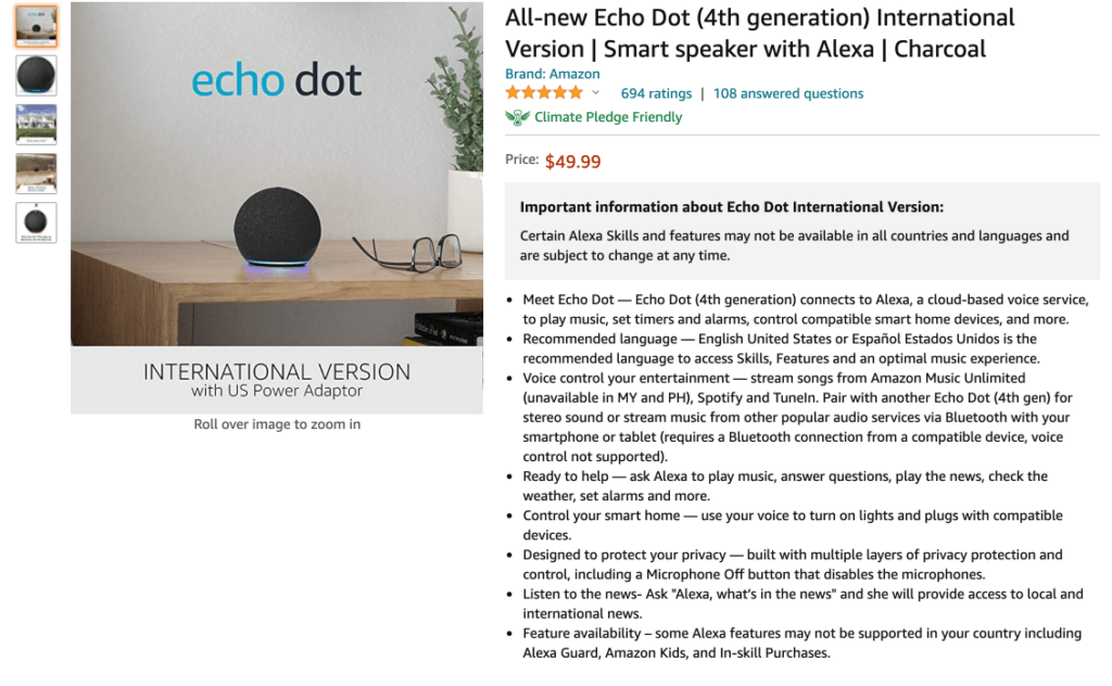
Take Amazon’s style, for example. Their product descriptions use bullet points and small blocks of text on their pages. However, they could definitely be improved by implementing more spacing to make the bullets stand out.
2. Use headings to break text into sections.
As store owners, we want to give visitors ALL the information we have about our products. However, when faced with long product descriptions, some people avoid reading them altogether. By the time they land on your product page, they already have specific questions they need to be answered. To help them find those answers easily, create headings and subheadings, providing adequate spacing to make it easy on the eye, and bold headings so the reader can pinpoint relevant information more quickly and ignore irrelevant information or information they already know.
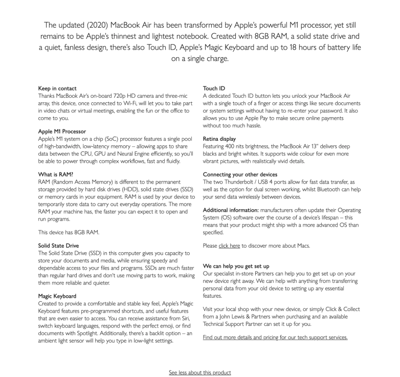
Check out this product description for Apple’s MacBook Air 2020. It has several sections and bolded headings that are easily skimmed, and provide nice “breathing room” around the text (i.e., adequate spacing) so things don’t feel cramped or chaotic.
3. Consider using “product highlights” as your subsections.
Now that we know visitors are easily discouraged when faced with long product descriptions, consider dividing yours into subsections that contain product highlights. Using images, videos, and short descriptions of the highlights serves as a powerful, superior substitute for long descriptions. Apple did a great job giving the highlights of the iPhone 13 Pro in the image below.
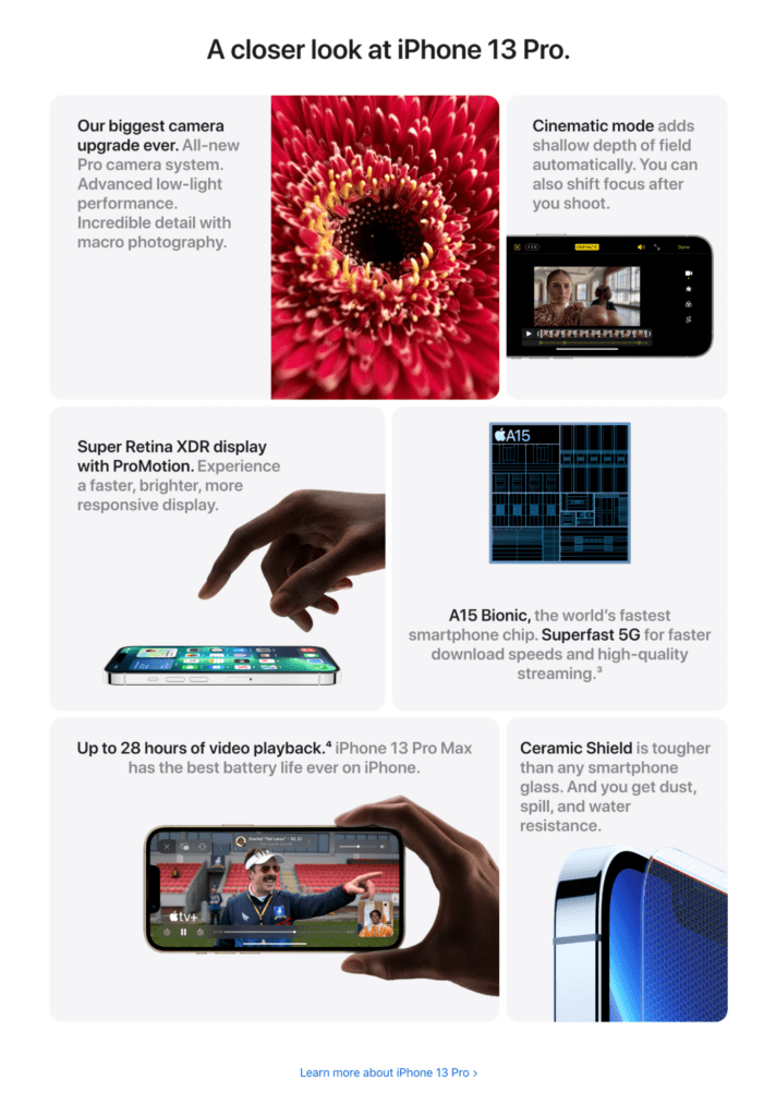
However, a word of caution: When using a format like the above image, be sure to use it only for your most important products, such as your best sellers, rather than for every single product on your page. You don’t want your store to cause unnecessary or extra cognitive load.
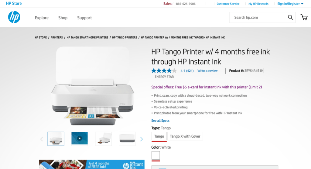
4. Include a product description snippet above the fold.
Give your visitors the option to read a snippet, or bite-size segment, of your product description, along with the option to read more. This style typically works best above the fold (i.e., on the portion of a webpage that’s immediately visible without scrolling). You wouldn’t believe how many users make their buying decisions based on this partial information.
Let’s take a look at HP’s product page, where they share what this printer’s features are but still have that “See All Specs” link available at the bottom of their short description.
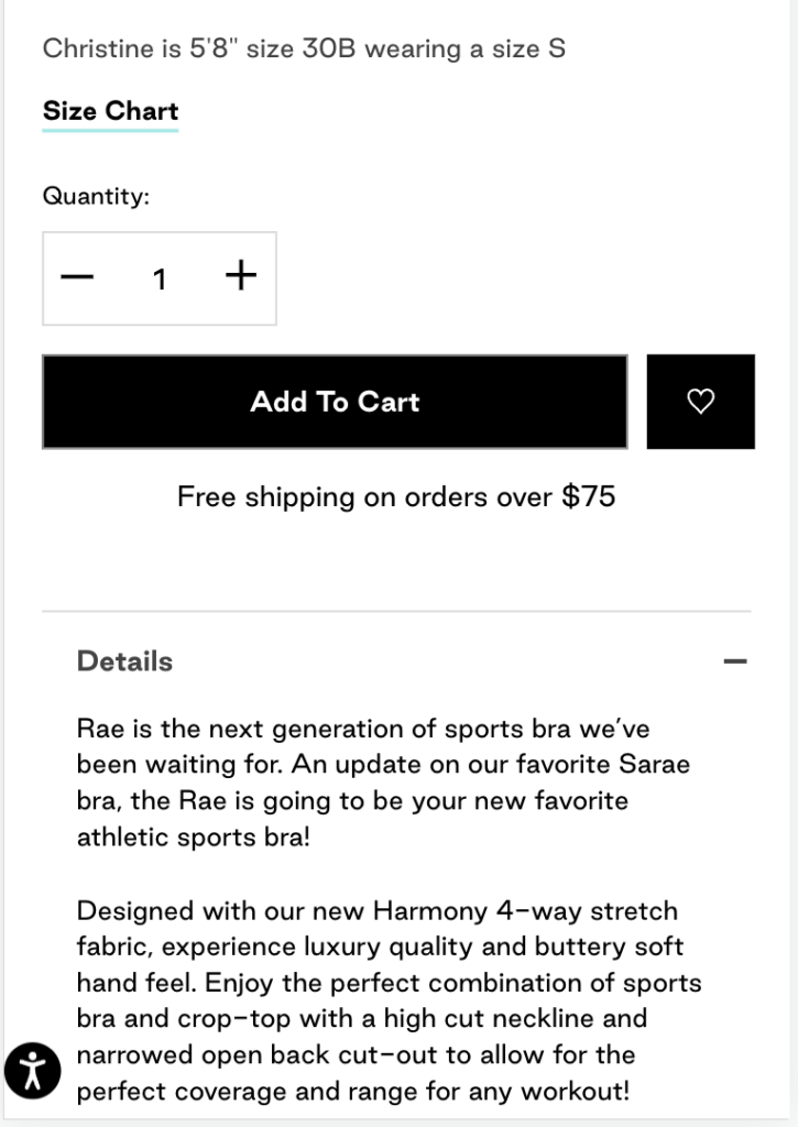
5. Put your product description near the “Buy” section on mobile.
Remember that product descriptions are typically the next go-to section once your visitors are done browsing the images. You’d be surprised by how people miss the product descriptions on mobile because of long product pages.
Make sure that you put your product description near the “Buy” section: Add to Cart, Add to Bag, Shop Now … Whatever button you have to close the deal, place your product description near this button.
Why, you ask? If visitors who are still in the early stage of their product search or still doing product comparison are not able to easily find the product descriptions, they lose interest and end up abandoning the product. Putting the description near the most prominent button on your page makes it easy for visitors to notice. It’s like invisible arrows pointing to your details tab. Pretty clever if you ask me!
As an example, this store has the details of their product right under their “Add To Cart” button: very easy to find and quick to go back to once they’ve decided to buy.
Wrap-Up
Every ecommerce business owner faces the challenge of writing engaging product descriptions that convert. And perhaps the bigger challenge is ensuring that visitors actually read what you put so much time and energy into writing. But if you implement the above suggestions in your store, there’s a really good chance you’ll see a drop in the number of CS queries about the details of your products. And the fewer questions people have, the more confident they’ll be to complete their purchase, and the more money you’ll make!
Resources
Baymard Institute. (2017-2021). Ensure a Consistently High Level of Detail in the Product Descriptions. Guideline #841. Baymard Institute.
Baymard Institute. (2017-2021). Use Both “Bullet Lists” and “Blocks of Text” for Product Descriptions. Guideline #843. Baymard Institute.
Baymard Institute. (2017-2021). Subdivide Long Product Descriptions with Sections and Headings. Guideline #845. Baymard Institute.
Baymard Institute. (2021). Product Descriptions. Baymard Institute.
Baymard Institute. (2017-2021). Consider Structuring Product Descriptions by ‘Product Highlights.’ Guideline #861. Baymard Institute.
Baymard Institute. (2017-2021). Consider Including Some of the Product Description ‘Above the Fold.’ Guideline #847. Baymard Institute.
Baymard Institute. (2020). Place the Product Description within 1–2 Viewports of the End of the “Buy” Section on Mobile. Guideline #1226. Baymard Institute.
John Lewis. (2021). Retrieved 9 November 2021, from https://www.johnlewis.com/2020-apple-macbook-air-13-3-inch-retina-display-m1-processor-8gb-ram-512gb-ssd/p5233987.
John Lewis. (2021). Retrieved 9 November 2021, from https://www.johnlewis.com/2020-apple-macbook-air-13-3-inch-retina-display-m1-processor-8gb-ram-512gb-ssd/p5233987.


About the author
Dolly Tomas
Dolly, Revenue Optimization Expert at Build Grow Scale! With a wealth of experience in eCommerce and an extensive background in Customer Service as an Operations Manager, Team Leader, and Project Manager, she's got the secret sauce to boost your bottom line. Armed with a Bachelor's degree in Electronics and Communications Engineering, she's a master of numbers and problem-solving. Balancing her professional achievements with her cherished role as a devoted mother to two cute kiddos, Dolly shows her unwavering commitment to driving revenue growth and her ability to navigate complex challenges make her an invaluable asset to any organization.