
When I was a student, I worked as a part-time waitress in a local restaurant, trying to make ends meet. I was paying for my small rented room as well as my school fees and expenses, and I would end up with so little money that I was forced to cut costs so that I could save up for my business.
Trying to balance my part-time work at the restaurant with my studies was not easy, and I felt like I was spending all my time doing something that I didn’t like. The biggest problem was that, despite all the effort I was putting into doing extra work at the restaurant and helping other students, I wasn’t getting any closer to my business goal.
In fact, I was experiencing serious burnout.
I sat down one day, went over things, and made a decision to let go of my work at the restaurant, to take fewer assignments, and to focus on my studies. That meant I wouldn’t have money for tuition, my utility bills, food, and other expenses. And I wouldn’t have money to start my business, which by now seemed like an unachievable goal.
Then, by chance, something amazing happened …
I discovered ecommerce and Shopify.
I found it really interesting, so I started reading more about how to make money online and run a successful business from my room! Instantly, it became crystal clear to me how to come up with my own product that I could sell.
I joined Shopify and created my first online store, which was print-on-demand. I designed shirts, hoodies, and caps and then fulfilled the orders when they came through. But most of the time, I was breaking even or taking a loss, and this became very frustrating. Despite going the extra mile to open up my business, I was barely making ends meet.
I kept on researching, reading so many articles and watching a lot of videos on how to improve my sales and increase my profit. I discovered that I wasn’t targeting the right customers and that my store was not intuitive enough for my users to navigate.
My plan was to start redesigning my store and testing as I went, learning how to convert a huge number of my store visitors into buyers. I started by fixing the navigation path of my store, reducing the number of actions a user had to take to get to the checkout page. But I didn’t stop there.
I did more research and then set up advertisements that targeted potential customers and used incentives. I wrote product descriptions that helped buyers make the “Yes” decision to buy my products. I added reviews to gain my customers’ trust. And, after that, I connected my store to Google Analytics to gain more insights about my customers and which products they liked most.
Building on that success, I decided to maximize my learning and to share my knowledge with people about why they should never give up on the dream of starting their own ecommerce stores.
I called it “The Power of Never Giving Up.” And with this power, I was motivated to keep going. I ran my business confidently and even managed to finish college debt free!
And that’s why I’m so excited to share with you the seven clever ways I used to turn my Shopify store browsers into buyers—so that you can get these types of results too!
Seven Ways to Turn Your Browsers into Buyers
Whenever we send traffic to our ecommerce stores, there’s a huge chance that some visitors have no intention of buying but were lured by the good, engaging advertisement that made them want to see or learn more about the product.
In this case, one of two things is bound to happen when they land on your store: they will either continue browsing or they will drop off.
If they continue browsing through, that’s a good sign. If they drop off, there could be a number of problems. To solve these, let’s look at each of the points that helped me convert my store’s browsers into buyers.
1. Design an optimized landing page
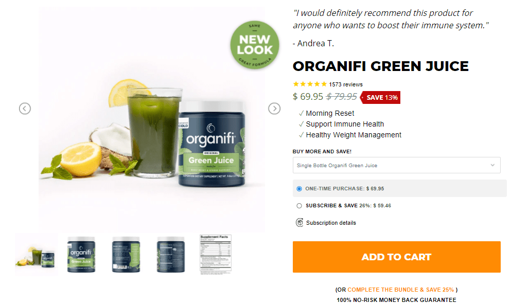
The landing page that you drive your visitors to really matters. It’s the transition they get from an advertisement to a more detailed page that allows them to take action—the buying action.
- Be consistent in color choices and style of page design. It matters because visitors need to see a landing page as a continuation of the ad that brought them to the store.
- Make the product description clear and indicate the features and benefits that explain why they need to purchase this product.
- Place the click-to-action buttons above the fold and make them noticeable colors so that they stand out from the rest of the colors in the store.
- Make sure that the landing page focuses on one product—the same product that brought visitors to that page. Don’t present unrelated products on a landing page when an ad suggested only one product.
- Make sure that your visitors can easily navigate through the different parts of the page and that your message from the top to the bottom of the page is consistently about the features and benefits of the product that brought them there.
2. Help make buying choices
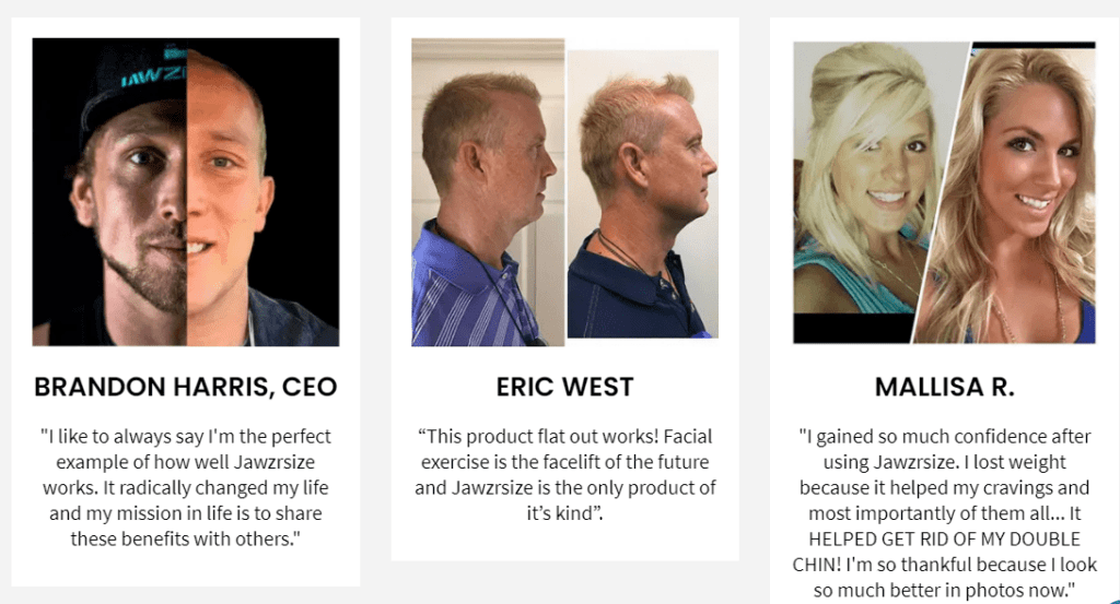
Should I buy it or not? Is this the best time for me to purchase this product? Is it relevant for me at the moment? These are but a few of the questions that come to mind when thinking about buying a product. Considering that a huge percentage of visitors to your store wanted to see more but did not have the intention of buying, make sure that you’ve given them enough of a reason not to leave your store empty-handed.
When your visitors answer yes to all the questions mentioned above, they’ll go ahead and click the buy button. To help them make this decision more quickly, you can introduce things like the following:
- Before-and-after images: These show users how effective the product is and what it can do.
- A feature table: These can distinctly describe the features of the product.
- A “buy now, pay later” or installment payment option: This allows visitors to easily purchase the product even if they had no intention of buying it right away due to a lack of funding.
3. Offer incentives
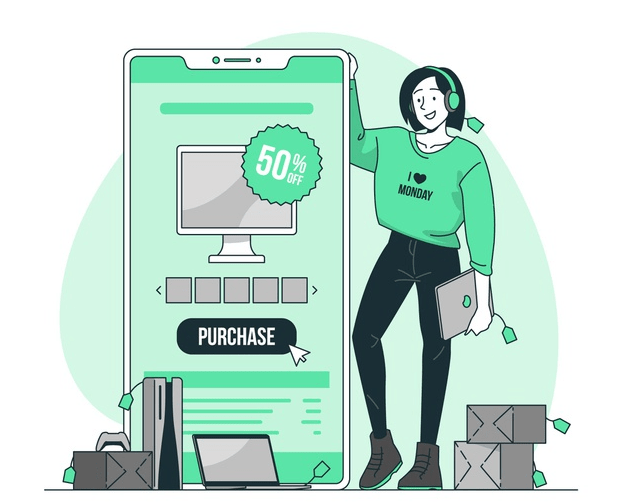
Incentives come in different forms and are very powerful as they encourage store visitors to take an action. Depending on the action you intend your visitors to take, you can choose to offer urgency incentives (such as “Limited edition,” “$25 today only,” offering coupons that expire in two days) or scarcity incentives (such as “Only 10 left in stock,” “Buy now before we run out of stock,” “In demand—Only two orders per person allowed”).
You also need to find where best to use the incentives on your store and to be sure you don’t overuse them as well. Overused they will overwhelm store visitors, confusing them because they don’t know which one to use and which one to ignore. The worst-case scenario is that a visitor can’t use two coupons you’ve offered at the same time and will simply drop off your website, making you lose the conversion of that browser into a buyer.
Following are a few examples of incentives that you can use:
- Add a sale badge next to each sale product so visitors can see which products are discounted.
- Give discounts to first-time buyers or a discount code to use for their next purchase.
- Create a promotion of “buy one, get one free.”
- Give gift cards to visitors who participate in a survey.
- Offer free shipping for orders above a certain price.
- Offer reward points that can be used as credit for the next purchase.
4. Offer a free sample of your product
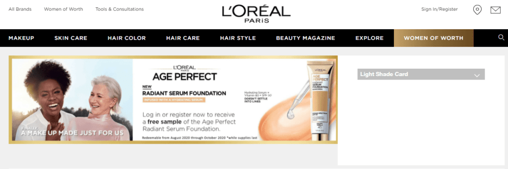
Offering a free sample of the product is a strong incentive. Not all products can be sampled, but if they can, you’re taking the initiative to give visitors who had no intention of buying your product a way to try it without buying.
Giving a free sample to customers can also introduce them to a new product that you’ve added to your store. This creates awareness, and if a customer ends up liking your new product, it can result in a sale.
According to the Shopify Retail Blog, “Science says samples help create a sense of brand loyalty amongst existing customers and can help incentivize new ones to make a purchase, which is great for your business.”
You may not want to give a free sample because you’re concerned that customers won’t return to buy. And this may be true. But in most cases, if you’re selling a product that’s worthwhile, you are likely to win over customers by providing a free sample, and some of them could become lifetime customers.
What if a user does not buy after sampling? If they don’t, ask them to give you feedback on what they think about your product and what stopped them from making a purchase. These findings can help you discover what you need to improve about your product and/or how you package it, both of which can improve conversion.
5. Create bundles
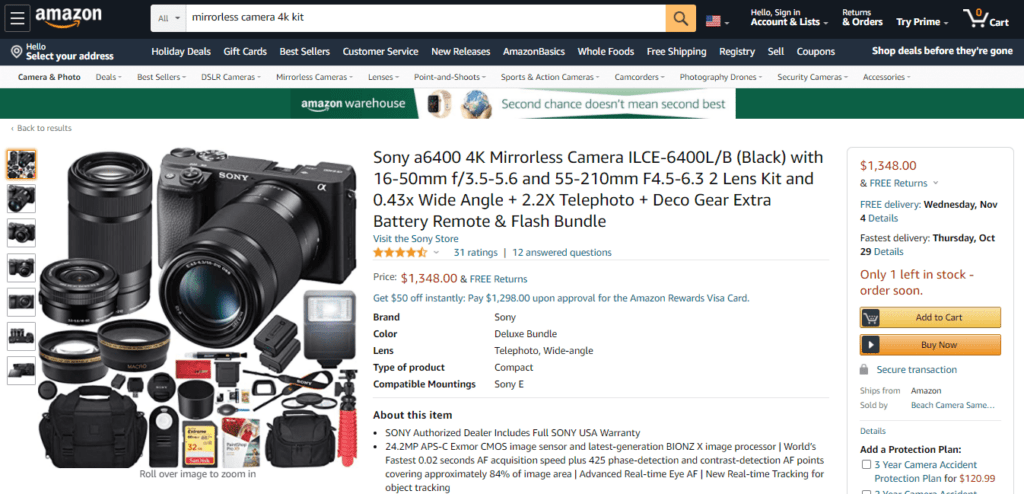
Bundling products improves conversion in a huge way. It also boosts the average order value.
According to Reference for Business, consumers typically save 7% to 15% of the price they’d be paying had they bought items individually.
Visitors who come to your store to buy two different products and find that those two are already bundled at a discount—or that they can bundle their own selections—prefer getting products in bundles to buying them separately.
The marketing strategy of bundling, where consumers are buying a couple of items for a single price, makes them feel like they’re getting a great deal. The price of bundled products may be significantly lower, but the fulfillment of getting the entire selection for a single price is often what makes consumers prefer bundled products.
Reference for Business describes one of the best-known examples of bundled computer products: computer, monitor, mouse, keyboard, and software (already loaded on the computer). A customer could make individual purchases, but buying the bundle could save them up to 30% of the cost.
You can choose how to implement bundling in your store by offering mixed bundling (products can be purchased individually or in a bundle) or pure bundling (products are only available in a bundle).
6. Add reviews
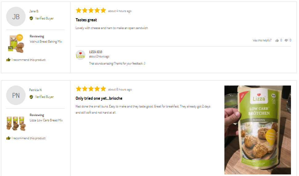
Reviews are the opinions of others about your product. When a visitor comes to your store with the intention of only getting more information but not buying (due to fear, uncertainty, and doubts), reviews can persuade them, converting them from browsers to buyers.
Genuine unbiased reviews of what your previous customers think about your products and their shopping experience increases the motivation of your new buyers and builds their trust in you.
Ensure that you add both positive and negative reviews. For each case of negative feedback, respond to the review to show that you have solved the problem. This shows that you are not afraid for the world to see that you are not 100% perfect. It also shows that while you may have faults, you can address them, and that’s what matters most to buyers (for example, they can trust that if their order is lost or arrives broken, you will fix the problem).
7. Target the right customers
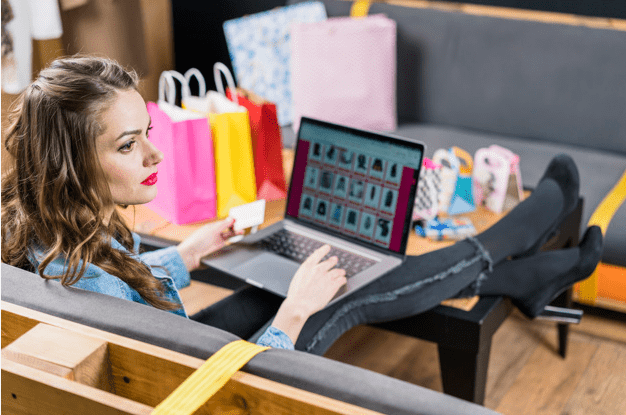
Last but not least, you need to target the right customers. To send the right visitors to your store, you need to understand your product, the market, and the people who are attracted to your product.
When you have this right, you can be sure that the visitors you’re sending to your store are really interested in what you’re selling.
To get to know your customers better, you can use tools like Google Analytics, which will give you more data about your customers. This information helps you learn the demographics and interests to use when targeting customers.
Conclusion
It’s great to bring shoppers to your store, but you then need to help browsers become buyers. I have described seven ways to do this: optimizing your landing page; providing good reasons to buy as well as positive and negative reviews; offering incentives, free samples, and bundles; and making sure you’re targeting the right customers.
With that, I’d like to leave you with an excellent saying from author and speaker Shep Hyken: “All your customers are partners in your mission.” Let’s keep that in mind while working on great strategies that can help you and your “partners” achieve your mission.
Are there different ways that you converting your browsers into buyers? We would like to hear from you, so please share with us in the comment section below.
Resources
Hawlk, K. (2017).The science of free samples: How freebies can keep customers coming back for more. Shopify Retail Blog.
Reference for Business. (n.d.). Bundled goods and services. Encyclopedia for Management. Advameg.

