One of the most important tools on your ecommerce store is the search functionality. When people visit your site, they won’t always know how to navigate and/or have the patience to browse around to understand more about the layout or how information is provided.
The search function allows users to save time and easily go after the specific details they’re looking for. “Great,” you say “… but what’s in it for me?” Well, I’m glad you asked. Customers who interact with the search functionality tend to convert from three to five times higher than average customers!
But, for that to happen, there are several things to consider to ensure you provide a great search experience for users, and avoid this functionality having the opposite effect.
In this article, I’m going to present clear steps for achieving the perfect search tool implementation … which, when completed, is sure to increase your overall conversion rate (because the more people use your search tool—and have a good experience doing so—the more money you will make)!
1. Make your search bar prominent
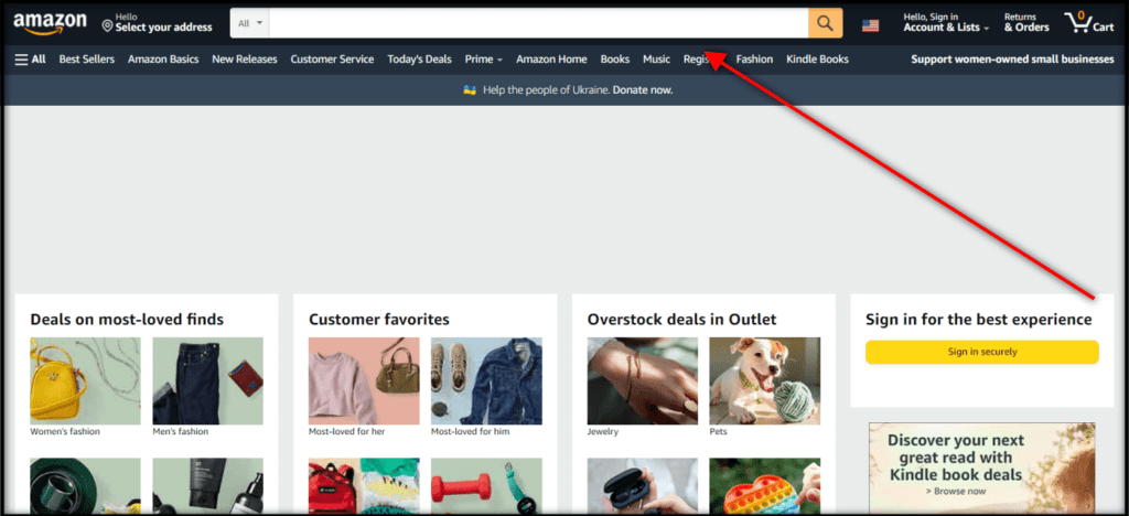
Plain and simple, if people cannot easily see your search bar, they probably won’t use it. You want to have an actual search bar (not one that opens when an icon is clicked) that is prominent below the header on the page. The same thing goes for mobile: ensure you have an actual bar that people can easily access, and also include it on your mobile sticky header to incentivize usage.

2. Optimize your search bar
When someone uses your search bar, the following things should always be present:
- Dropdown menu with products that match the term
- Thumbnail images
- Prices
- Suggestions for popular collections and keywords
It’s also important to make sure your store supports abbreviations, symbols, and slang relevant to the niche in order to make the search process easier. If users include any of these and get no results, they’ll simply assume you don’t carry those items. Some examples are “º” for “degrees,” “shades” for “sunglasses,” and “bike” for “bicycle.”
Going through your search logs and talking to your customers and customer support team are amazing ways to find out what needs to be added and prioritized, based on the usage, conversion rate, etc.
It’s also very important to make sure your search works with both synonyms and misspellings. There are plenty of apps that allow these updates, and you can choose from the ones that have the best cost, that cover the number of products you offer, and that might have other functionalities you find interesting. Product Filter & Search and InstantSearch+ are just a couple examples of such apps.

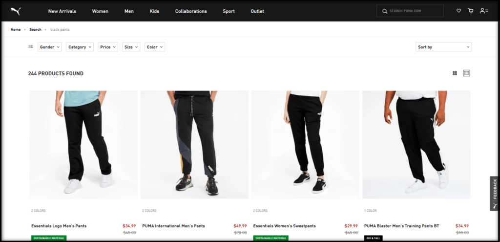
3. Add filters and sorting options to search results pages
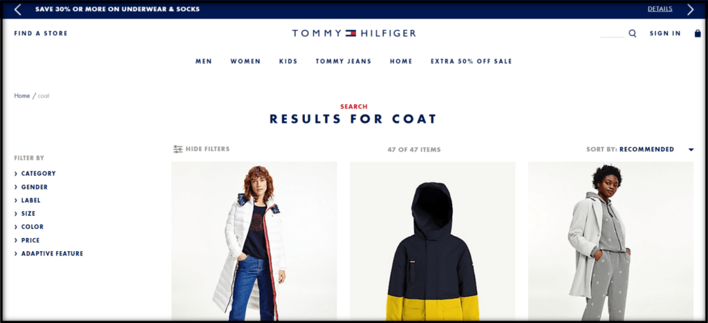
Filters and sorting options are extremely important elements when it comes to both collections and search results pages. Users should be able to keep narrowing down their options, even if they’re not using the traditional categories. So, be sure to add the same options to search results pages.
4. Configure “no search results” pages
You should never show your customers nothing, even if you don’t offer exactly what they’re looking for. If there are no results that match their query, you can show them your best-selling items, alternative navigational paths, or search query refinements/suggestions. For instance, something like, “Your search didn’t yield any results. Check out our best-selling products instead!” so they have something to keep working with.
5. Load search and main navigation faster than homepage content
Some groups of users—like ones who are not interested in homepage content, want to browse a certain category of products, or that have prior experience on the site—will go directly to the search bar and main navigation, so be sure they load faster on your site to satisfy these customers.
6. Support non-product search
Part of your audience expects to have access to auxiliary pages (i.e., return policy, shipping, order tracking, etc.) through the search bar. Make sure they’re able to find that content when using the search tool as well. In general, if there’s any non-product content that can be accessed through the navigation, it should also be accessible through search. I also recommend that these pages be styled differently from the product-based results to avoid any confusion.
7. Provide relevant alternate paths
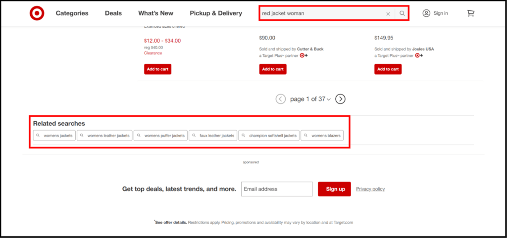
Some users might search for approximate terms or even too-specific ones, which can make the search process much harder. By suggesting alternate queries, you provide appropriate instructions on the best way to proceed with the search and avoid them getting stuck for not knowing how to update or broaden the terms.
This will help them understand the logic and terminologies the site adopts and will provide more insights on the store catalog, even if they don’t actively interact with the suggestions. It can also make them aware of complementary items to the product they are currently searching for, which can help boost your AOV.
8. Maintain users’ search terms on the results page
Whenever users type the terms and proceed to the search results page, make sure they don’t have to type them again, in case anything needs to be added or updated. Being forced to retype can be extremely frustrating, especially on mobile. You can also add an “X” that will delete the query, in case you want to avoid users wasting time manually erasing the terms. Keep in mind that there needs to be enough space between the “X” and the actual terms to avoid usability issues.
9. Provide the total number of results
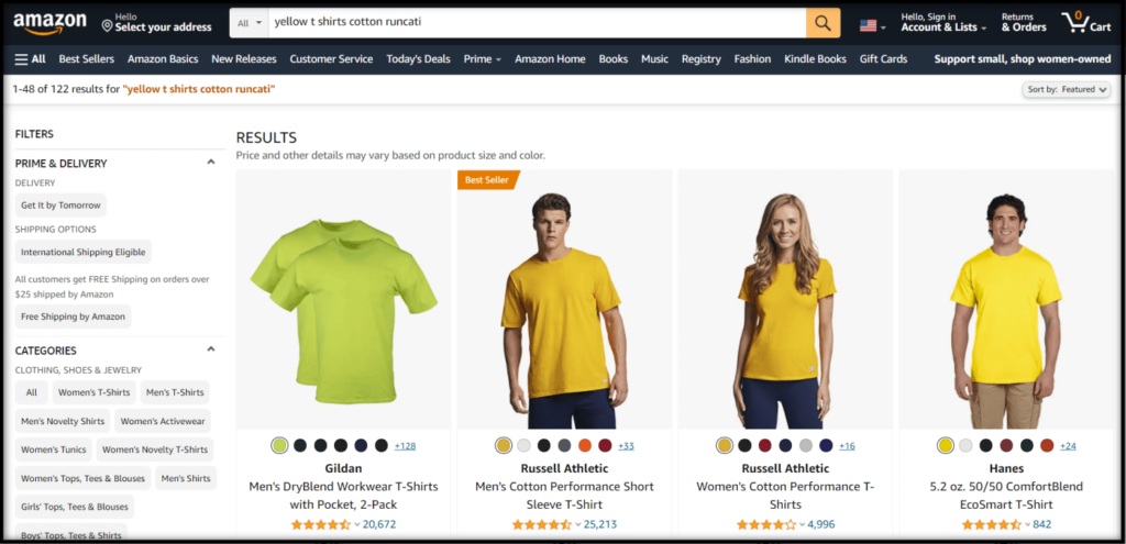
Not knowing exactly how many results the search yielded can be extremely frustrating because users won’t know if they should use filters to narrow down the results (for instance, if they used incorrect terms).
The number of results should be close to the list items, prominent, and displayed at the beginning and end of the list.
10. Support terms copied and pasted from other sources
It’s possible that some users will get terms from external sources and paste them on your site, especially when doing price comparisons. This can result in longer or differently formatted queries. Not cutting anything off by allowing special characters and symbols, and supporting a minimum of 70 characters is a good solution. If anything has to be removed, you should let users know. The results should also incorporate different versions of the item’s title and model numbers, which include international variations.
11. Allow feature and thematic search
Users might add product attributes in the search in hopes that doing so will automatically narrow down the results, which is why you should allow features like brand, size, color and material on the search.
They can also search for thematic attributes, like “summer dresses,” “shoes on sale,” or “office table.” Take this logic into consideration, prioritizing the most searched terms and most relevant to your segment.
12. Lead users to matching categories/subcategories
It’s common to get insufficient or too broad of results when the search term used is the same as a site’s collection page name. For example, the results users will find by searching for “women’s pants” will differ from the items on a “Pants for Women” collection page. This situation can be especially detrimental when the category pages include guides, wizards, and other specific tools that are present only on collection pages.
Whenever users add search terms that match or are very close to the categories or subcategories on your site, you should either automatically take them to these category pages, or indicate their existence and offer a path to get there. However, when the search results are very few (less than 12 for example), there’s no need to redirect or lead them to other pages, as the previously mentioned relevant alternate paths will guide them if needed.
Wrap-Up
A great search tool is a crucial path to success.
Providing an optimal search experience might not be an easy process, but it’s definitely one of the key points for a successful ecom store. As a side note, make sure you prioritize the most relevant terms and categories/products to optimize the time spent on this task. Understanding how your customers typically use the search functionality will allow you to optimize it and improve your store’s performance overall. Usually, combining automated and manual updates is the best choice (for example using great search apps and manually going through the terms your audience utilizes, then adding those to the search tool).
Resources
Baymard Institute. (2014–2021). Autodirect or Guide Users to Matching Category Scopes. Guideline #370. Baymard Institute.
Baymard Institute. (2019–2021). Ensure That Mobile On-Site Search Is Prominently Displayed and Highly Visible. Guideline #934. Baymard Institute.
Baymard Institute. (2014–2021). Support Queries Copy-Pasted from External Sources. Guideline #351. Baymard Institute.
Baymard Institute. (2014–2021). Non-Product Search. Guideline #342. Baymard Institute.
Baymard Institute. (2014–2021). Load Search and the Main Navigation Before the Homepage Content. Guideline #235. Baymard Institute.
Baymard Institute. (2014–2021). Always Provide Highly Relevant Alternate Queries. Guideline #358. Baymard Institute.
Baymard Institute. (2014–2021). Abbreviation, Symbol, and Slang Search. Guideline #344. Baymard Institute.
Baymard Institute. (2014–2021). Always Persist the User’s Search Query on the Results Page. Guideline #346. Baymard Institute.
Baymard Institute. (2014–2021). Feature Search. Guideline #340. Baymard Institute.
Baymard Institute. (2014–2021). Thematic Search. Guideline #335. Baymard Institute.


