

The Importance of Information Foraging Theory in The Ecommerce Industry
With new technologies gaining traction in every aspect of daily life, and the looming rise of our digital existence in the metaverse, it quickly becomes apparent that understanding the psychology of how users interact with and are influenced by this technology is an important aspect of ecommerce.
Even with just a simple store, understanding how your customers interact with and consume the store’s information can be a source of inspiration in building engaging and useful customer experiences.
Today, we’ll be focusing on one aspect of this research into Digital Psychology known as Information Foraging Theory. Don’t worry, it’s not nearly as scary as it sounds. I’m confident you’ll be saying, “I never really thought about it like that, but it is like that.”
Note: This article is a companion piece to a recent podcast episode I did with Build Grow Scale’s founder and CEO, Tanner Larsson. The article goes into additional detail, but if this topic seems intimidating, the podcast can serve as a good entry point.
What Is Information Foraging Theory (IFT)?
IFT is a core theory of how users make decisions about what to do when looking for information on the internet. It often equates itself to the same practices animals use in the wild, only instead of information, the animals are looking for food. The goal is to get enough food (information) in the least amount of time and expending the least amount of energy necessary.
Imagine that you’re a wolf, and you are starting to hunt for some tasty deer or rabbits. How do you make your decision about how to start? There are prey in your forest, but you don’t know where they are. You can’t just perfectly choose where to get a meal quickly.
It’s likely you’d start looking in an area that, in the past, has yielded good results. It’s not too far away, so it’s not very costly to head over and see what’s around.
This is nearly the same way internet users will search on Google when looking for information, or on Amazon when starting a product search. These two options regularly yield decent results, at least to get started, and people know how to use them and what to expect.
Information Scent
But, alas, the clearing in the forest you’ve chosen is empty. No immediate signs of food are present. So, what do you do now? Of course, you’d probably take a bit of a look around the clearing, hoping to catch the scent of a deer that left the area recently so you can follow it.
Similarly, if you’re unlucky and Google doesn’t immediately show you the perfect result, you might slow down and skim through the available results to see what makes the most sense for what you’re trying to accomplish. Like the wolf hoping to catch the scent of a deer, you’re hoping to catch some information scent that can help you judge which results are most likely to get you where you want to go.
Of course, all of this is done mostly subconsciously. You take these actions without working through the process and actively scoring the results based on how good you think they are. You just do it without thinking too hard.
Our brains are quite lazy, and they’ve developed a lot of strategies for quickly finding a decent path forward. Users may skim in an F-pattern (reading the first few words of every paragraph/result), just look at the images, etc.
I’m sure it comes as no surprise that the entire SEO (search engine optimization) industry is all about building strong information scent to let searchers know a site does in fact have what they’re looking for.
It Doesn’t End Once the Customer Visits Your Store
As we at BGS like to repeat, the whole process of marketing doesn’t end once the potential customer clicks through to your site. It doesn’t stop with your ad creative. It doesn’t stop at the search engine result page. And neither does IFT.
Potential customers and browsers continue to employ these same foraging strategies as they move through your store.
Message Continuity
The first thing that can create issues for users when visiting an ecommerce store after clicking on an ad or search result is having a disconnected message. If users are presented with a message and idea on the ad that isn’t connected with what is shown on the site they land on, alarm bells sound. “Did I click the right thing? This isn’t what I expected.” I’m sure we’ve all encountered this at some point in our own online shopping and/or searching adventures.
This is why it’s common advice to echo parts of the ad creative in the above-the-fold aspects of the page customers land on after the click. Whether it’s an image, headline, or something else, maintaining that continuity makes things easier on the customer.
Without it, prospects may just bounce and return to endless scrolling or search results pages thinking, “This link didn’t work, but surely, there is one that will.”
When Information Scent Goes Wrong
The best way to illustrate the power of IFT and information is to give extreme examples of the misapplication of these principles.
Imagine you’re looking for beauty products, like moisturizer or hair dye. You click a link that looks promising but ends up at the website pictured below.
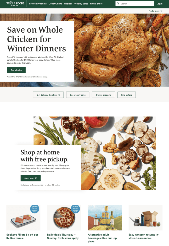
How quickly would you turn around and head right back to where you came from? Probably pretty quickly. Whole Foods does sell beauty products, but there is no indicator that anything other than food is available. If you don’t know that they also sell beauty products, you’d think you clicked on the wrong button.
This can happen very easily as a store increases the breadth of its product variety. While simple product lines allow focused messaging, more broad product selection requires a more nuanced message. You need to convey the breadth of your product line to help users understand what they can expect to find (and how to find it), while still having a compelling core message.
What Whole Foods could do to help solve this issue is have the main navigation more directly communicate the various product categories, or reserve a portion of the home page for communicating that breadth, possibly by showing some hints of the various product categories.
This can be a tight balance between focusing on and emphasizing the revenue drivers and ensuring prospects get a decent enough overview of their options. For Whole Foods, it could very well be that beauty products are not something they are pushing whatsoever and that those types of products are intended to be simply an additional offering for customers who already know they carry them.
On-Site Information Scent
Until now, we’ve mainly talked about behavior before the click and immediately after the click that leads prospects to your store.
At this point, it shouldn’t come as a shock, but users will continue to use these information foraging strategies multiple pages into your store.
Link Scent
Every link on your page is giving off a “scent” to your users—some strong, and some weak. And this can affect how users choose to navigate your store.
We commonly point out that links need clear and accurate labeling. Users are very hesitant to click links that don’t provide clear expectations. If a button is just floating alone with a “View All” label, you can expect many users to avoid the button … because, “‘View all’ of what?” Such a link would have a weak information scent, and users won’t be confident it will get them where they want to go.
By comparison, a label like “View All Sweaters” near an image of a spread of sweaters would have a strong, or high, information scent (at least for those interested in sweaters). It’s clear what the user will get, so if seeing a collection of sweaters is among someone’s goals, they can have high confidence this link will get them there.
Many factors can contribute to the strength of this information scent:
- Labels and icons
- Proximity to other elements on the site
- Style and color
- Overall context
Past Experience
Quite a bit of how users implement these strategies is linked to their past experience. Even when devoid of good labeling or context, users can still determine a plan of action for finding some types of information.
For example, it’s common for product pages to feature user reviews near the bottom of the page. When a prospect decides that is information they’re interested in, they will often quickly shoot down the page to find it. You don’t need to tell them reviews are further down the page. They’ll likely figure it out, but I absolutely caution against relying on this behavior. Without extensive experience watching your audience move through your site, it can be very easy to make inaccurate assumptions about what a user will expect.
This is what can make a site prototypicality very important.
As Jakob’s Law states:
“Users spend most of their time on other sites. This means that users prefer your site to work the same way as all the other sites they already know.”
—Jakob Nielsen
Your designs should typically default to the way all other sites do things in the absence of compelling evidence otherwise. Not because the perfect site design has already been found, but because it eliminates the issue of having your design actively violate your users’ expectations.
However, just because some elements, like menu icons and carts, are extremely common, it’s best to properly label them. This ensures they aren’t misinterpreted, and also ensures that the buttons can be used by those not using the typical inputs of a mouse or finger.
Note: For more information on web accessibility, check out this podcast: How Important Is Web Accessibility to Your Ecom Business.
If It’s Important, Repeat It!
While the goal with your design and sales copy is to perfectly satisfy prospects’ curiosity, answer their questions, and address their concerns as needed, every user is different. They come up with questions in different orders. They care about different things. They have different methods of finding content on the page.
These differences mean that they’ll have different information foraging strategies and try to find information in different ways. You can’t purely rely on a single method of communication to handle everyone.
So, if it’s important (i.e., conversion critical), put it in many places on the page. Put it in description summaries. Put it in core description content. Put it in bullets, UVP (unique value proposition) icons, etc.
Make sure nobody can leave the page not having seen the most important information about the product.
Frequently Asked Questions (FAQ) Sections
It’s fairly common to see FAQs utilized as some kind of a band-aid method of solving this issue, but they’re heavily misused.
If you’re getting questions so frequently that they need to be called out in an FAQ section, you should be doing your utmost to answer those questions in many places throughout the page.
Essentially, FAQs should be rendered redundant. Users should have all these questions answered properly elsewhere.
However, that doesn’t mean the frequently asked question should be removed every time.
Users employ different foraging strategies, and if a user knows exactly the piece of info they are looking for, they may jump to looking for an FAQ-type section to get that information.
Wrap-Up
See? That wasn’t so scary. It just makes sense, and I’m sure you’ve started to recognize some of the ways you yourself forage for information, both on and offline. Now it’s time to apply what you’ve learned today to your own ecommerce business.
Making a point to gain a better understanding of how people who visit your ecom store are interacting with it and consuming its information (and acting accordingly) can go a long way in creating valuable and engaging user experiences that will equate to happier customers and a healthier bottom line.


About the author
Eric Kwoka
Eric Kwoka is currently a BGS Revenue Optimizer and Coach for the Store Audit Team. He has a history of service with the United States Marine Corps and is learning while traveling the world with minimal adult supervision. He once committed to a multi-day horseback ride through the Tien Shan (Celestial) Mountains in Kyrgyzstan, despite never having rode a horse before.