

Magnetize Leads with Effective Email Capture
Despite the fantastic results email campaigns can get and the comparative ease of getting a strong campaign working, many stores (especially smaller ones) totally neglect this aspect of marketing to new prospects. Instead, they focus entirely on using Facebook and paid search to capture new customers. However, email is effective with new customers too.
Email campaigns that are properly set up can easily drive over 25% of your sales. Excellent campaigns could drive over 50%! And these all have significantly lower variable costs than Facebook or influencer marketing.
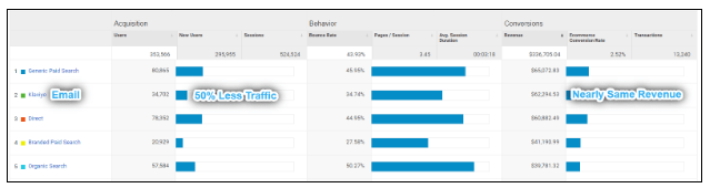 This partner store gets about 20% of their revenue from only about 10% of their visitors via their email campaigns! (Note: Data is from the last week of June 2020.)
So, if new users haven’t bought anything yet, how are you supposed to send them emails?
Email Capture Doesn’t Matter If Your Emails Suck
This article is not about email marketing specifically, but a small refresher on how email campaigns can connect with new prospects can help put our main topic—designing great sign-up forms and email captures—into context.
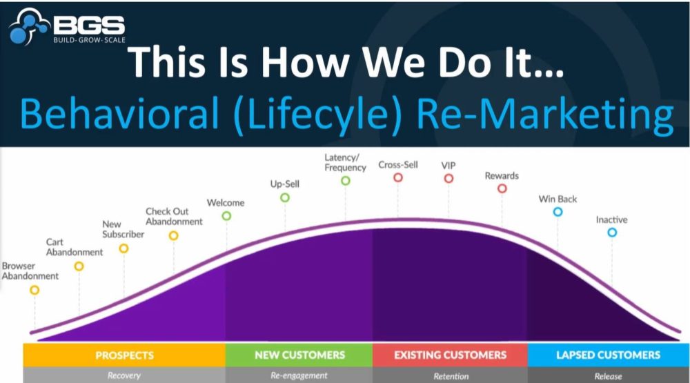
In the left-most section, there are four types of email campaigns that can nurture prospects into becoming customers. These all take place before a first purchase.
While the benefits of selling to existing customers is a strong basis for getting your email marketing system set up, that setup can also be used to secure first-time buyers.
As the infographic above shows, there are four campaigns that apply to prospects:
- Browse abandonment
- Cart abandonment
- New subscriber
- Checkout abandonment
These campaigns all focus on nurturing the relationship between the prospect and your company, reinforcing why your company and products are great, and gently urging the prospect to buy. While all of your emails should have some element of brand indoctrination, these emails specifically can form a very strong base for the customer’s future relationship with your brand.
Most sites only capture a prospect’s email at the first step of the checkout, but this is a mistake! You should be trying to capture the email earlier in the process to help secure abandoned carts and bring users into your fold. It’s no secret that many users will need to visit a site multiple times before they buy and that some users may leave with the intent to return later and simply forget. You probably spend quite a bit of money on retargeting ads to these very prospects, so don’t give up: just because they left doesn’t mean they won’t buy.
Note: I’ll be covering this in a future article, but it’s worth saying here: If you don’t have the prospect email campaigns set up, make it a major priority!!! You need these campaigns! Until you have them, don’t worry too much about trying to get users’ email addresses. Just slap a small sign-up in the footer, maybe with a coupon code, and get to work writing those emails! Come back here once your campaigns are ready to go.
Let’s Get This Out of the Way: Pop-Ups Work!
The debate has raged on since the 90s and, according to Forbes, even the inventor of pop-up ads has publicly apologized, but pop-ups absolutely get the job done. They force the user to make an active decision about whether or not to give you their email, while footer or sidebar sign-up forms can be easily ignored. Nothing beats pop-ups in terms of getting prospect emails.
However, this comes at a cost, as uninvited pop-ups disrupt a user’s current activity, and this will cause some users to abandon entirely, thinking your brand is too pushy. You’ll get some prospects emails, but you’ll also make some users leave.
This is why it’s important to have your email campaigns set up, and set up properly. If you are missing key campaigns, especially for prospects, then you aren’t getting any value out of capturing the prospects email, but you will be losing value by pushing some users away.
However, thoughtful design can reduce the negative impact that pop-ups and other disruptive email captures might cause. How aggressive you want to be to capture prospect emails will be about establishing a balance based on how successful your email campaigns are as well as the image of your brand.
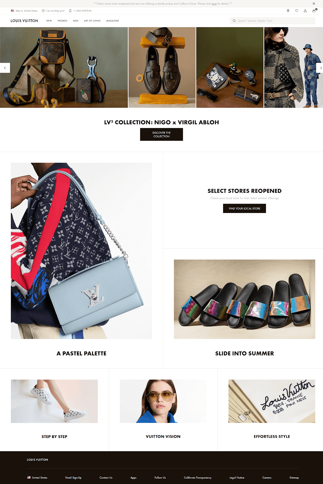
You aren’t going to find any pop-ups begging for emails on Louis Vuitton or other ultra-premium brands. Note: Louis Vuitton’s email marketing is abysmal. Don’t be like them.
Designing a Great Email Capture
To minimize disruption and maximize effectiveness, we’ll be taking a lot of considerations into account. We want to communicate the value of subscribing, keep the offer relevant, avoid disrupting committed users, limit the amount of information requested and keep the user in control. Let’s break these down!
Communicate the value
Regardless of the mechanics of how you capture the email, it’s very important to clearly communicate the value to the user. If the user doesn’t understand what you’re offering, why would they give you their email address?
It’s a no-brainer to incentivize an email sign-up with a discount code. Whether it be a few dollars off, a few percent off, or free shipping, discount codes work extremely well. You’ll generally see around four times the sign-ups when including a basic incentive. While a higher-value incentive does increase sign-ups, the biggest lift is just in the difference between no incentive and a small incentive.
But value isn’t only limited to the objective value a discount provides.
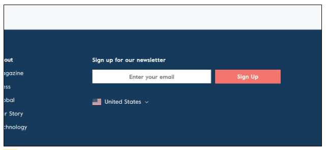 This newsletter sign-up from LARQ is far from motivating. Why would anyone want to hand over their email?
Many stores, often because they’ve never given real thought to email marketing, have extremely poor messaging when it comes to their email captures. They use standard messaging of “news, updates, and special offers” or, even worse, simply “our newsletter.” Yuck! Nobody wants a lame, generic newsletter.
If you’ve spent the time making a kick-ass email marketing campaign and strong prospect flows, then you should have a clear idea of the value a user will get from signing up. Sure, it could be described as “news, updates, and special offers,” but be more specific!
If you’re a workout supplement brand, your flow likely includes (or should include) at least one email with awesome protein-smoothie recipes. Mention it!
If you are a craft-beer reseller and your selection is always changing, highlight that those who sign up will be the first to know about new releases and you could probably work that into offering a few days of early access for subscribers.
There are one hundred different ways to ensure your newsletter has clear value and to communicate that value. Unfortunately, I can’t say that any one description works best, since markets can be totally different—but your newsletter content itself has to support the description you provide. A simple blanket discount is the easy way to go.
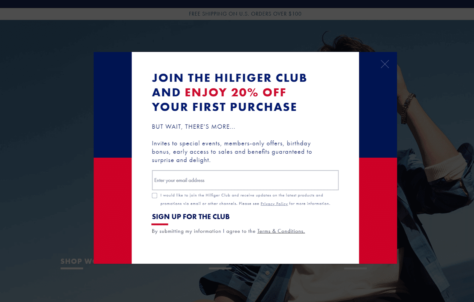
Here, Tommy Hilfiger clearly highlights the massive 20% discount but also lays out the benefits of the newsletter itself. While somewhat vague, it does include a few more unusual offers, like a birthday bonus and early access to sales.
Keep the offer relevant
One step many stores neglect but that can really ramp up the quality of your email capture is tailoring offers to what users are viewing. Stores with a very limited selection of product types can get away with skipping this, but the more variety there is in your store, the more important this becomes.
Why offer every visitor the exact same thing, when different users have different needs and wants? Instead, fine-tune the offer to current page contents. For example, on a collections page for men’s pants, you can provide a different discount than on a collections page for women’s purses. It’s very likely that not all products you offer have the same margins, so offering different discounts allows you to provide deeper discounts for the email sign-up when users are buying certain products as indicated by what they’re currently browsing.
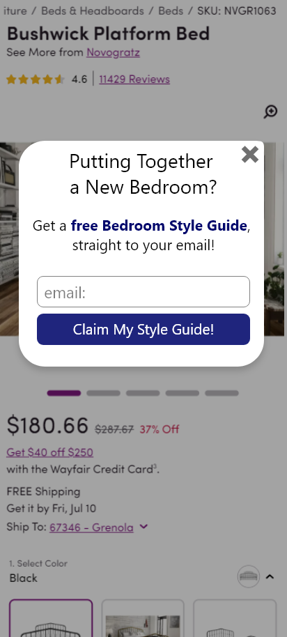
In this mock-up, a user viewing a bed product page is targeted by an email capture promising a bedroom style guide.
Another benefit of doing this is that you can have different newsletter sign-ups add the user to different lists so that you can target campaigns to specific kinds of users. For example, the aforementioned buyer of men’s pants likely has minimal interest in women’s purses. Segmenting is a very important part of strong email campaigns, and it can start with how you capture the user’s email in the first place!
To do this, you can use your favorite app to trigger different email pop-ups on different pages or to dynamically change the fixed email capture as well. Just be sure not to trigger every new pop-up every time a user goes to a new segment of pages! If you’re using an app like Hotjar or Lucky Orange, tagging users after their first pop-up should allow you to suppress any future pop-ups. Other apps should have similar options, and if you cannot find them, contact the app developers for help.
Avoid disrupting committed users
The last thing you want to do is distract a user with a pop-up when they are ready to buy. It can hurt their motivation when they’re already trying to buy. And giving them a discount at that point, while welcome, is just giving away money!
Luckily, Shopify doesn’t allow lower-tier plans to do much to the checkout page, so we don’t see stores having email pop-ups in the middle of checkout, but some stores do still put them on the cart page!
Absolutely do not have email pop-ups show in the cart page or beyond. Users buying will already be providing their email at the start of the checkout process, so there’s no benefit to throwing a pop-up in their face.
It’s also important not to show pop-ups immediately when a user arrives on any page. Users are looking over a given page to understand the scope of the store, the content of the landing page (if that’s the page they’ve arrived at), and to decide if they want to continue. A pop-up will break their attention and prevent them from evaluating the content and from understanding if the offer is even important to them.
Like I mentioned before, nobody wants to join a generic newsletter, and they really don’t want a generic newsletter from a company they don’t yet understand.
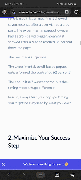
There’s a lot of debate about the sweet spot for how long a user should be on a page before a pop-up appears—or even if the user should have to view multiple pages before encountering a pop-up, but this likely differs from store to store. A good rule of thumb, according to WisePops, is that the less time you wait, the more people sign up but the lower the subscription rate will be. This means that showing a pop-up quickly to users will get you more emails for your list but will have annoyed many more users who weren’t yet ready (although they might have been had your store given them time to understand your products).
Now, you might still be wondering, “Hey, wait a minute: if more people sign up the earlier I show the pop-up, why wouldn’t I want to show it right away anyway?” The logic is that these sign-ups will be less active on your site because they’ve given you their email before they’ve understood whether your brand and your products are for them.
So, ensure that the pop-up doesn’t trigger in the first seven seconds but will some time before one minute and you’ll be golden. If you want to test it, be sure to segment the sign-ups so you can also track engagement over time to see what timing is the best. If you start to see your email opens drop below 20% engagement, you’ll want to switch to fewer pop-ups as well as less-disruptive email-capture techniques, along with reviewing your campaign and flow designs.
Keep in mind, Google punishes websites that show disruptive pop-ups and interstitials (marketing content that prevents users from seeing the page they came for) shortly after page load, so prevent pop-ups from appearing on the first page a user views after coming from a search engine.
Limit the amount of information requested
One major thing to do is to limit the amount of information the pop-up requests. Ideally, limit it to the email address only. A pop-up can be pushy, but a pop-up asking for your life story is over the top!
There’s a lot of other information you can get about users’ preferences without inundating them with loads of questions. For example, you can pass the current page segment through as meta data on the user or use code from your email service provider (EPS), like Klaviyo provides, to be able to segment users with even more information.
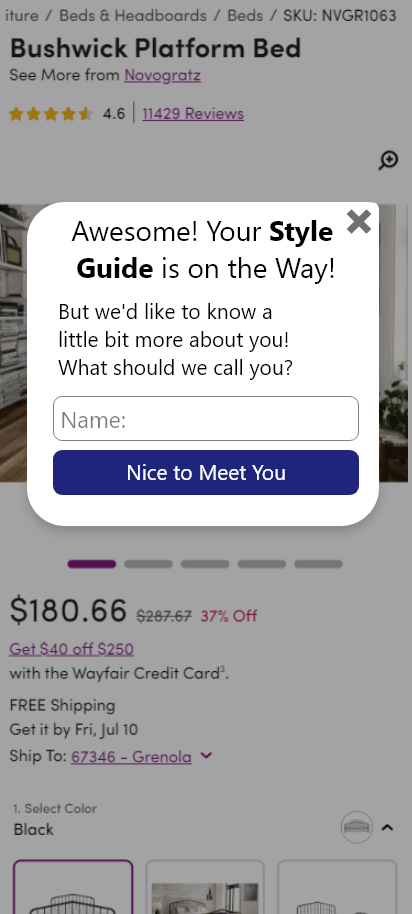
Picking up from the earlier bedroom mock-up, after a user submits an email, the confirmation clearly states that the user has already gotten their “reward” and then asks for some additional information.
If you really want more information, like a name, ask that question after the user submits their email. Then the user can freely leave the pop-up while still having submitted their email. This should be clearly communicated. Provide any promised coupon codes after getting the email and explain that the additional questions are not required.
Keep the user in control
Now this is the part that’s most dependent on good user experience design. Users don’t like it when stores or websites do something on their own without the user first taking an action. This is the main reason pop-ups have such a bad reputation: they can be perceived at the store deciding to shove something in front of the user’s face, when the user wants to do something else.
We already went over the fact that pop-ups work despite this. So we know the benefit can outway the harm, when done right.
While we may take some control away from the user by having a pop-up appear, there are some design decisions we can make to help provide the experience of user control.
The “Back” button
One really simple, but critical, implementation of any overlay that covers a significant portion of the screen, including email-capture pop-ups, is to respect the browser/OS “Back” button. This is important for overlays that offer product-image zoom, review, and live chats—really anything that covers a significant portion of the view.
By default, the browser “Back” button moves a user one page back, with the “page” being defined as a literal web page. The overlay isn’t a new page, so the “Back” button won’t remove it. However, while this is the technical reality, the user’s feelings may be different. The larger an overlay is as a portion of the user’s view, the more likely the user is to interpret it as a new page.
When this is the perception, users expect the “Back” button to remove the pop-up. They press the button only to be taken to what they consider “two steps back,” to the page they were on before the overlay appeared. This can be a major problem if the pop-up was on their landing page, as the “Back” button takes the user entirely off your site!
Note: The HTML5 History API provides developers with options to solve this, and a good email pop-up app should be doing this already. In the event it isn’t, you’ll likely need your own developer or will have to bug the app developers to help since this is JavaScript, which isn’t the easiest thing to learn in an afternoon.
If it isn’t possible to properly respect the “Back” button—that is, to have it work in the way the user is expecting it to work—then ensure any overlays or pop-ups you have are small in relation to the total viewport. This minimizes the likelihood of a user believing the “Back” button is the way to remove the overlay.
Scroll depth
Having a pop-up trigger on scroll depth is a good way to ensure a user has evaluated a portion of the information on the page and is interested in what is being shown. If a user is interested in your products, then that user is primed to give you an email.
Virtually every pop-up app or pop-up builder offers this as a trigger option. You’ll be able to select how far down the page the user needs to scroll to trigger the pop-up. This depth should be based on the page contents and the normal user behavior. You’ll want it to show fairly early yet after users have hit core information that should pique their interest and clarify the value you provide.
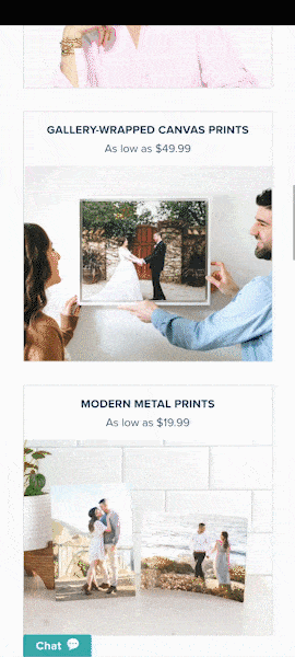
Here, Mixbook has an advanced email capture that appears to be page content at a specific scroll depth and then sticks to the screen as the user scrolls past it.
When a user scrolls down and the pop-up has an animation or sticky behavior that shows it arriving from the bottom of the screen, the user can easily understand that their action of scrolling has caused the pop-up to appear. The site hasn’t forced this upon them—instead the site has responded to their actions.
Compared to a timed pop-up, it’s less likely that users will see this and therefore fewer users will provide their emails. However, this is balanced by these users having demonstrated a greater interest.
Floating buttons
Having a sticky button (as opposed to pop-ups that take up the whole screen based on various indirect rules) is another way to further reduce the disruption to a user’s activities. Instead of taking over the main view space, the button sits just out of the way, waiting for user interaction.
Sleeknote uses a small sticky button at the bottom of the screen that triggers the larger email overlay.
When users interact with the sticky element, you can provide them with additional information and the form in a conventional pop-up or overlay.
As before, this likely translates to fewer sign-ups than prior methods (as a user isn’t ever forced to deal with the email request) but, when the user does interact, they are showing a higher intention, and this will likely show itself in engagement with your emails. If you try a test of these different methods, be sure to pass some meta data to your ESP to be able to segment the users for analytics purposes later.
On desktop, you can have the email form be directly stuck to the page, but on mobile, have just a button with a short CTA.
Fixed overlay trigger
Now, this one I just want to show because it is really cool and can fit well with certain brands that want to be as nondisruptive as possible. You can have a trigger for your email capture be part of the main design of the page as well as placed prominently.
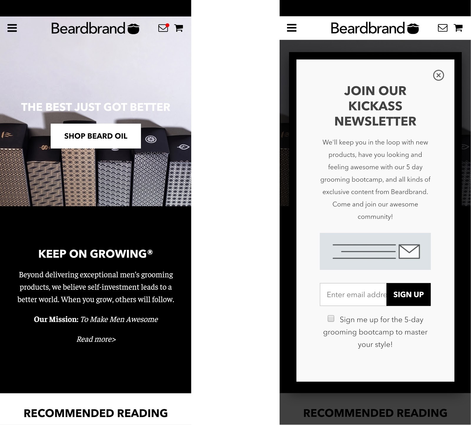
Beardbrand uses a small notification icon at top right, with the characteristic red bubble to indicate that there’s a message for the user. When tapped, the email-capture overlay appears.
Using prototypical elements like the “new notification” bubble, can trigger users’ standard psychology for checking out new notifications in their apps. Also, since it’s a minor element, this is an even less disruptive option for users.
Get It Done!
Of course, the first step is to design kick-ass email campaigns and flows!! If your emails suck, you don’t want to be hurting your reputation by sending them to customers, let alone prospects.
Once that is done, you can work on your email captures:
- Determine what your emails will offer to prospects and communicate that value clearly.
- Segment your email-captures copy and even your newsletter content to keep the offer relevant.
- Ensure your captures do not disrupt customers on critical pages.
- Pick a design implementation that best satisfies your brand goals and keeps your emails at a high engagement level.
If you get all this done right, your email system can be a constant low-cost revenue driver that runs on autopilot!
Resources
Google. (2016, 2017.) Helping users easily access content on mobile. Google Webmaster Central Blog.
McGregor, J. (2014). The man who invented pop-up ads says “I’m sorry.” Forbes.
Wertz, J. (2018). Don’t spend 5 times more attracting new customers, nurture the existing ones. Forbes.
WisePops. (n.d.). The ultimate guide to email popups.


About the author
Eric Kwoka
Eric Kwoka is currently a BGS Revenue Optimizer and Coach for the Store Audit Team. He has a history of service with the United States Marine Corps and is learning while traveling the world with minimal adult supervision. He once committed to a multi-day horseback ride through the Tien Shan (Celestial) Mountains in Kyrgyzstan, despite never having rode a horse before.