

Five Quick-and-Easy Conversion Tactics That Increase Store Revenue (Part 1)
As ecommerce entrepreneurs, we often wonder if the changes we make to our stores will increase the conversion rate or lower it: “Will change X help or hurt?” For example, should we focus more of the copy on safety features or reliability? Should we include a long, detailed video or a short, sweet one? It’s impossible to predict the future, so questions like these are often answered with the dreaded, “I don’t know. Test it.”
If you’re Amazon or Costco, “Just test it” is great advice. These websites receive about a million visitors a second (slight exaggeration), so you can get an answer from your test very quickly. But what if you aren’t Jeff Bezos and your website doesn’t receive hordes of visitors?
Unfortunately, A/B testing requires a lot of visitors to yield statistically significant results. Depending on your website’s traffic, it can take weeks or months to get concrete answers.
Wouldn’t it be great if there were tactics you could implement right now on your ecommerce store that were practically guaranteed to be an improvement so you don’t have to spend weeks and months testing?
Well, this article is about just that! I’ve been running A/B tests incessantly, like a mad scientist, for close to three years now. In that time, I’ve noticed that some things—regardless of the niche or type of product being sold—always resulted in a win.
This article is part 1 of a two-part series on quick, easy, actionable, conversion-rate–boosting techniques you can implement on your Shopify store to see results almost immediately. This article features five techniques (and part 2 features five more). Let’s begin!
Technique #1: Providing Comparison Charts
Products like the ones you sell solve problems. A fat-burner supplement can help you lose weight. So does a gym membership, a low-carb diet, liposuction, a workout video, a personal trainer, and so on. There are many products—aka solutions—to address a weight-loss problem.
Let’s pretend that the solution you sell is a fat-burner supplement. How does your solution stack up against the other solutions on the market? And perhaps an even better question: How does your fat burner compare to other fat burners on the market? What is the unique value offered by your solution: Is it safer, cheaper, more potent, all of the above?
Your customers want to know why your solution is unique and better than the competition. Telling them over text is great but may go unnoticed. A much better way to accomplish this is to graphically represent the data via a comparison chart.
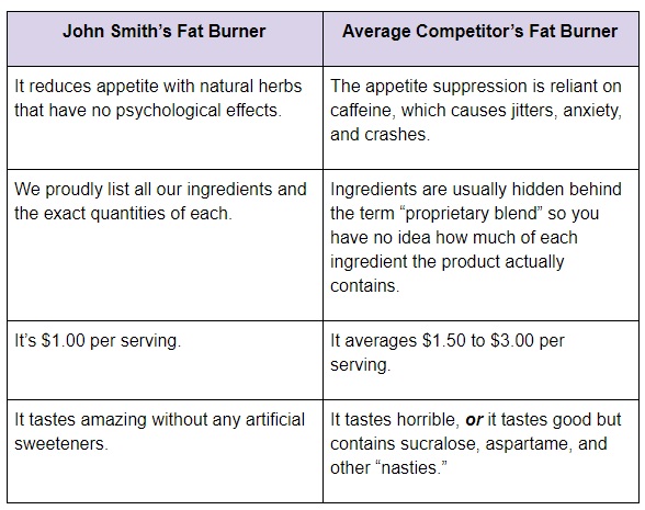
Providing an honest comparison chart that, like the one above, compares your product to other solutions on the market, does your customers a huge favor.
The next example of a comparison chart will get the creative juices flowing. While the chart above used text, this one uses simple check marks and red Xs instead. The product is Breath Rox, which is similar to the candy Pop Rocks, only it’s sugar-free and actually kills bad-breath germs. The unique selling point (USP) of this product is that it has the benefits of gum (leaves a pleasant taste in your mouth) and also of mouthwash (kills germs rather than just masking their odor).
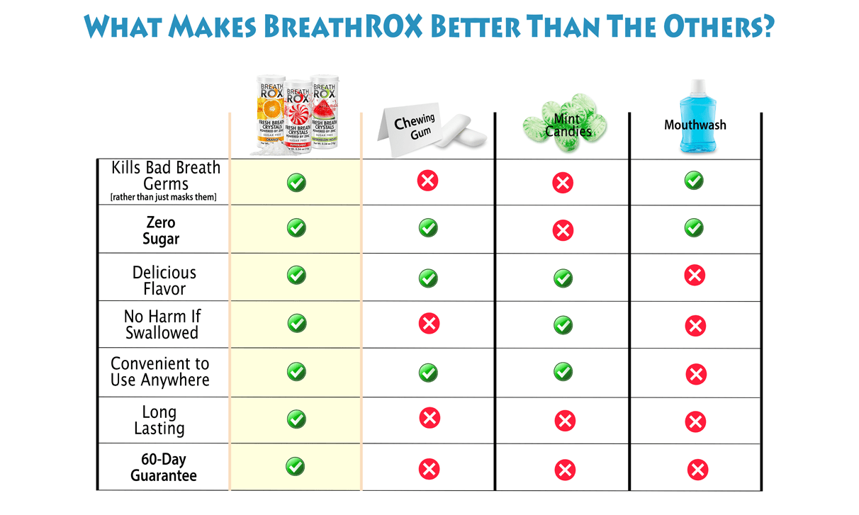
Notice that we didn’t give only red Xs to the competition. Had we put a red X under the “Kills Bad Breath” for mouthwash, that would have destroyed all of our credibility. These charts only work if they are honest. If not, they’ll have the opposite effect and turn people off from your brand by destroying trust.
Technique #2: Social-Proofing a Headline
Think about the last time you bought something. Did a friend recommend it to you? Did you read any reviews online about it first? Did you see positive comments on social media about the company and/or product?
You likely answered yes to at least one of these three questions, and there’s a reason for that. We greatly value the opinions of others when making a buying decision.
Reviews on an ecommerce website are essential. Unfortunately and surprisingly, a lot of people don’t read reviews (take it from me—I’m privy to the Google Analytics data of hundreds of ecommerce websites). This is a shame because, assuming they’re good reviews, they offer so much that could persuade someone to buy your product.
If only there was a way to practically force someone to read your most complimentary review, the one that addressed the most common objection to the product, highlighted its main unique selling point, or otherwise made the product seem awesome …
Well, you probably guessed it—we’ve found a way to do that.
By adding a customer quote above the fold (where people can see it right away without having to scroll down), you are almost guaranteed that your website visitors will read it.
Take a look at this screenshot from an ecommerce site in the health and beauty niche:
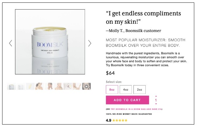
Here, the quote is above the product title, but I’ve found it works just as well below the product title. Its exact placement doesn’t really matter as long as the quote is in a prominent position above the fold where customers will see it.
I’m sure the owner of this website tested several headlines, and this one was the winner. For your website, you may want to try something more specific. For example, you can try a customer quote that either addresses a common objection or highlights a specific benefit.
This example quote from a customer addresses a common objection: “I thought it would be a hassle to assemble, but it was actually very easy. I did it in about five minutes without any help.”
This example quote from a customer highlights a benefit: “These spices made me a superhero at Thanksgiving. The difference with these fresh-ground spice blends is real and noticeable. I’m never going back to stale supermarket spices again!”
You get the idea: add a customer quote that handles an objection or highlights one of your product’s main benefits, place it under the product title, and you’re almost guaranteed to have your visitors reading it and being persuaded in a positive direction.
Technique #3: Adding a Video Sales Letter
When I started getting passionate about cooking, I began sharing recipes with friends. I quickly noticed that people like to consume content in different ways. Some people love recipes in video format because of the extra detail and clarity it provides. Other people prefer a recipe in the form of an article, because it allows them to scan and go at their own pace.
Your visitors are the same way. Some people love reading text, while others prefer video. You don’t want to leave anybody out, so I highly recommend making a persuasive video sales letter (VSL), which is simply a video that persuades someone to buy a product.
Video is powerful: in addition to simply offering a different format, it demonstrates certain things more easily than a pure text can. Imagine someone trying to explain, in written form, how a Swiss Army Knife works versus just showing a video of it. The clarity of video can’t be beat.
In addition to providing clarity, the video is awesome at showing benefits. Remember those infomercials for OxyClean? They would stain a piece of carpet with red wine and show how the OxyClean magically made it vanish with just a quick squirt. That’s a lot more powerful than the words, “It gets red wine out in seconds.” It just doesn’t have the same power as actually seeing it.
Now, I know what you might be thinking. You’re intimidated at the idea of making a VSL. Don’t worry—there are a few shortcuts.
Shortcut #1 is simply to hire an agency that specializes in this. With a quick Google search or a freelancer website such as Upwork.com, you can find a company that makes awesome sales videos.
Shortcut $2 is to reach out to your best customers and request that they send in a video testimonial explaining why they liked the product and your company overall. Splice together a few good testimonials, and—boom!—you’ve got a decent, budget VSL.
Technique #4: Addressing the Biggest Objection in a Image Carousel
I’ve spoken about the importance of handling objections ad nauseam in another article. To summarize the main points briefly: People have all sorts of objections when it comes to buying a product online. “I can’t afford it,” “I don’t trust the company,” “I don’t believe it will work as claimed,” and so on. Work with your customer service people to find out what the most common objections are, and create thoughtful, convincing counters about each one on the list. “An objection missed is a sale missed” is a good phrase to remember.
Okay, now we’ve briefly recapped the importance of handling objections, let’s move on to the next tactic, which is to address your most common objections within the image carousel. If that sounds confusing, see the image below for a better explanation.
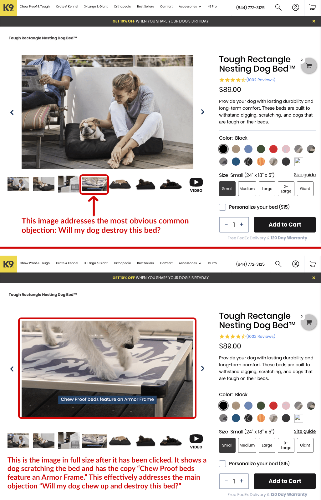
Now, I know some of you might be saying to yourselves, “This doesn’t really apply to me. I already addressed all of the main objections in the product description.” That’s great if you’re already addressing them in the product description, but I still urge you to put them in the image carousel also. Why? Remember what I said above in “Technique #3: Adding a Sales Video” where I talked about how people consume content differently? The same applies here. Some people will read the copy, but some people are more visual and will instead gravitate toward the images. And it never hurts to repeat your main objection handlers or unique selling points (USPs) multiple times on the same page.
To further drive home the importance of this technique, I’ll leave you with this: In my entire career of working for Build Grow Scale, running hundreds of A/B tests across 50+ Shopify stores, my biggest win came from using this technique. The result was a whopping 33% lift in conversion rate from a single test. And mind you, this was done on a store that had already been heavily optimized over the preceding two+ years. Of all the techniques listed here, this will likely yield you the best results.
Technique #5: Offering Wizards
Wizards really do have magical powers. To clarify, I’m not talking about Gandolf from Lord of the Rings. A wizard, in this context, is an interactive questionnaire you fill out online. Based on the information you provide, the wizard generates a custom solution just for you.
For example, a company called ThirdLove built their entire brand around a wizard. The USP of this company is that they claim to make women’s bras that are more comfortable that anything you can find in a regular store because each bra is custom made for that particular woman. It works like this: you answer a series of questions about your breasts, and, based on your responses, they’ll send you a custom-made bra that supposedly fits better, since it was built just for you.
According to TechCrunch, ThirdLove is generating over $100 million in annual sales. and the company is now valued at over $750 million. If that doesn’t grab your attention—and get you thinking about just how powerful wizards can be at boosting sales in ecommerce—I don’t know what will!
So, why do wizards work so well? The short answer is simply that people don’t want a one-size-fits-all solution. They want to feel heard and to get a tailor-made solution for their specific needs. Even if customers aren’t “beautiful and unique snowflakes,” they probably think they are, and they want to feel like you’ve listened to their symptoms before you prescribe their medication.
Picture the stereotypical “sleazy used-car salesman.” He’ll sell anything to anybody without regard to whether or not the car is the right fit for the customer. He’d gladly sell a sports car to a 45-year-old parent of two and a minivan to a 21-year-old recent college grad. He just wants to make a quick buck. You want to be the opposite of this guy.
So, how can you implement wizards in your business? The following are a few ideas to get the creative juices flowing. But keep in mind: wizards won’t work for every product or niche, so don’t try to force it if it doesn’t work for your niche.
Here are a few examples of wizards at work:
- Size/fit—ThirdLove does an excellent job with this, as described above.
- Taste—Bright Cellars has a survey. Based on the types of food and the aromas you like, they recommend wines you are likely to enjoy.
- Supplements—Cellucor recommends a preworkout supplement that’s based on your tolerance for stimulants, fitness goals, and more.
- Style—Thread recommends fashion styles based on your responses to a questionnaire.
- Grooming—Function of Beauty recommends shampoos and conditioners based on questions you answer about your hair.
Conclusion
In the world of revenue optimization for ecommerce, the conventional wisdom of “test everything” is BS. This is a very polarizing opinion, I know. While you definitely want to test most things (especially if you have the luxury of enough traffic to get statistically significant data), there are nontesting winners that have been proven time and time again. They don’t need to be tested. You can just implement them:
- Providing comparison charts is an excellent way to quickly communicate why your product is different, unique, and special as compared to the competition’s product. Comparison charts are more graphical or visual than text. They stand out, draw attention, and can be consumed very quickly.
- Social-proofing a headline is a great way to support your biggest claims or address the biggest objections customers may have about buying your product. Because you are quoting a customer and not making the claim yourself, it’s a lot more believable.
- Adding a video sales letter (VSL) is an incredible way to demonstrate the benefits of your product. Some products almost have to be shown on video to get the point across. Imagine me telling you, “This phone case is extremely durable” over text versus you seeing a video of someone dropping a bowling ball from a ten-story building onto that phone, and the phone inside being just fine. Seeing is believing.
- Addressing the biggest objection in the image carousel almost guarantees it won’t be missed. People scan text quickly and often overlook things. By having the biggest objection handler in the image carousel, you’ll greatly increase the odds your customers won’t overlook these critical bits of information.
- Offering wizards is a great way to convince your customers that you’ve “listened to their symptoms before prescribing the medication.” People do not like one-size-fits-all solutions. When offered something that’s tailor-made just for them, they’re far more likely to perceive it as something that will actually work for them.
That’s it for now! Stay tuned for part 2 of this series.
Resources
Lunden, I. (2019). ThirdLove, the direct-to-consumer lingerie startup, gets a $55M boost. TechCrunch.


About the author
Casey Brown
Casey Brown has been with BGS since 2017. As a former Shopify store owner and full-time direct response marketer for many years, he understands the challenges experienced by “ecompreneurs”. Casey has earned the reputation for being a master A/B tester. Inspired by cold hard data, experience, and a little bit of gut instinct, it’s not uncommon for Casey to get clients huge wins quickly. According to Casey, waking up to this job and working with people you love is a luxury few are blessed with.